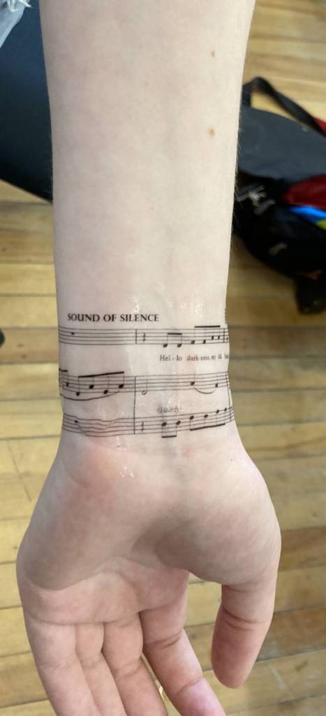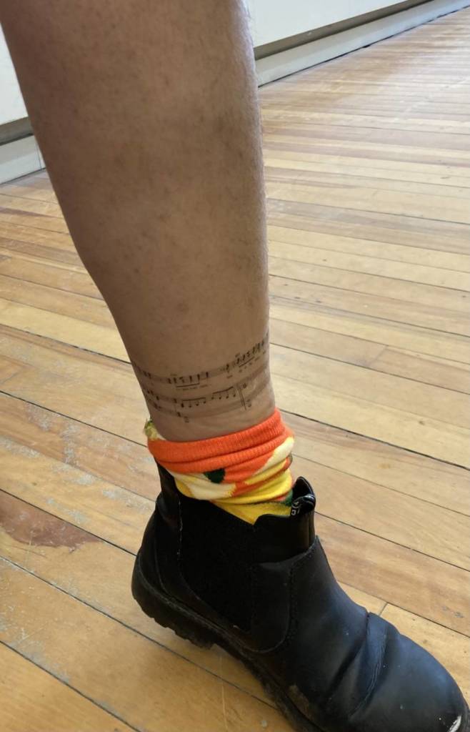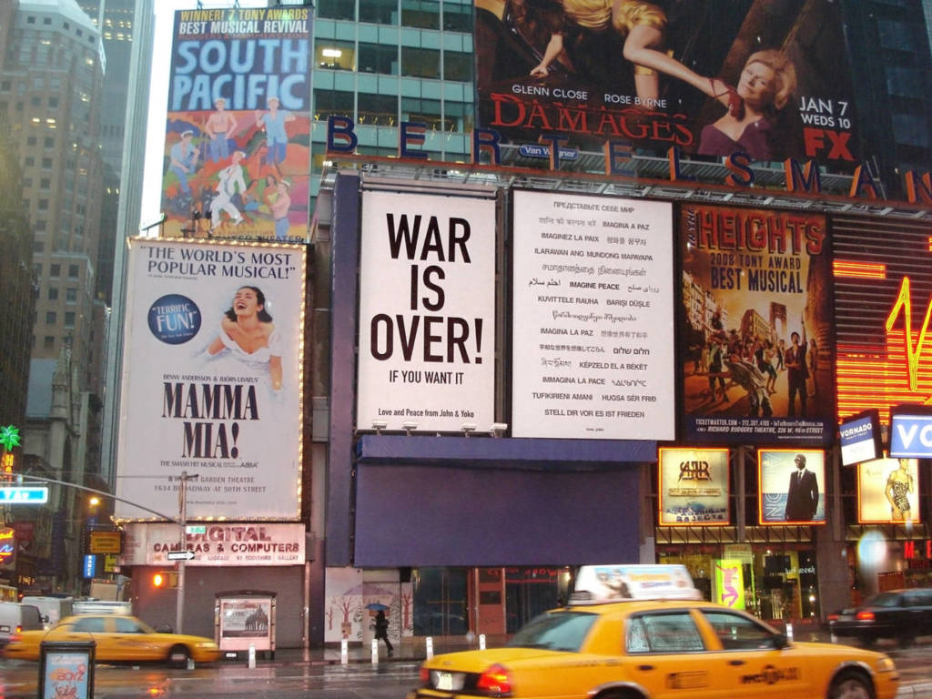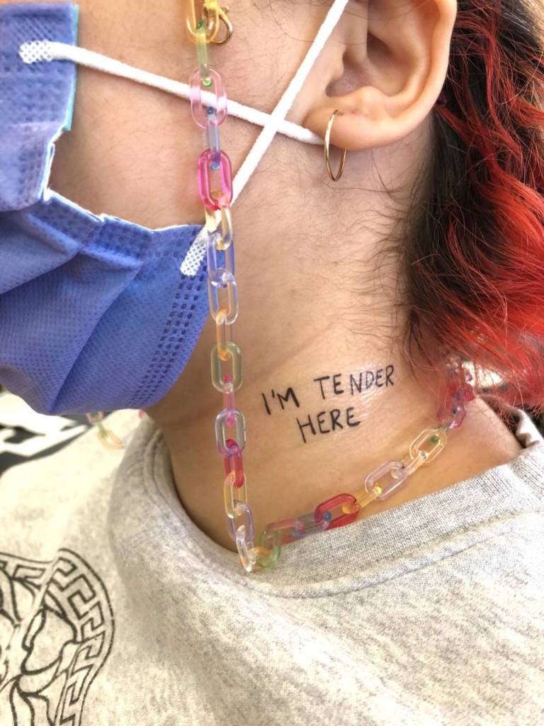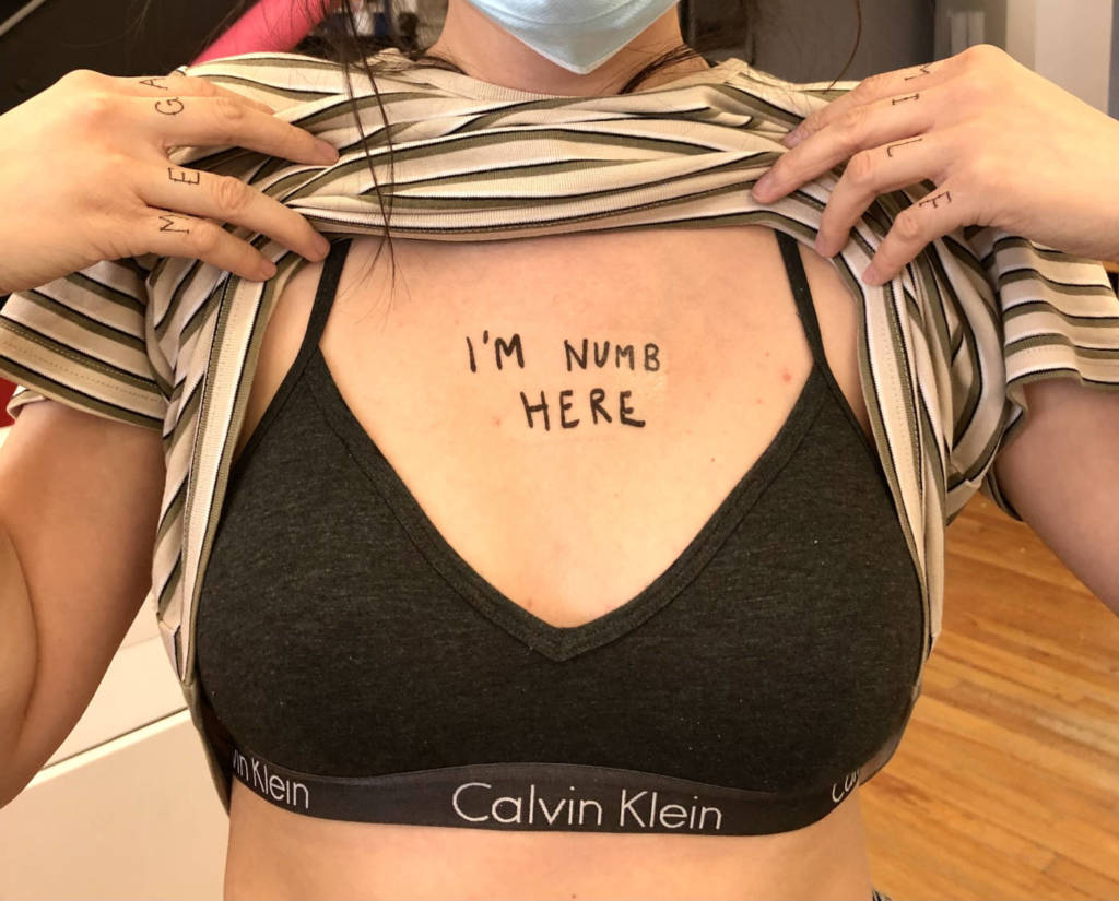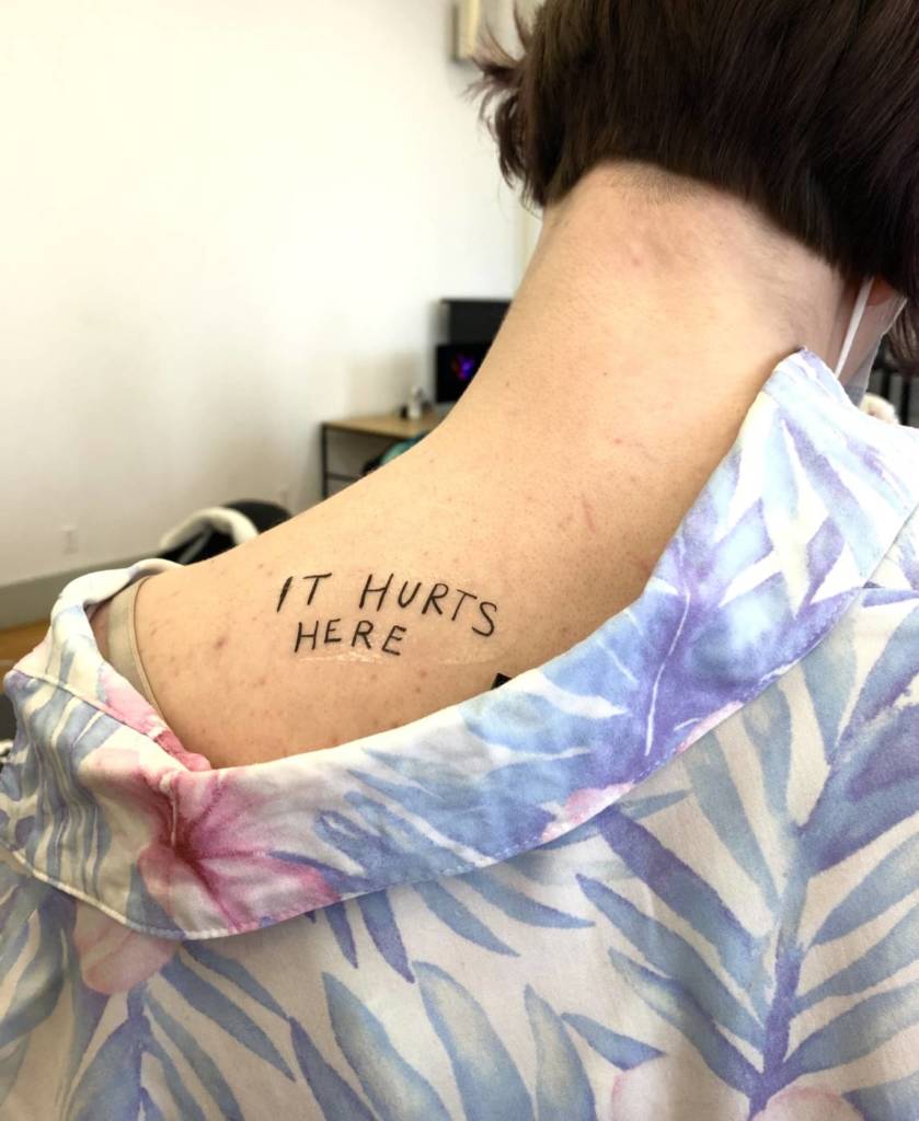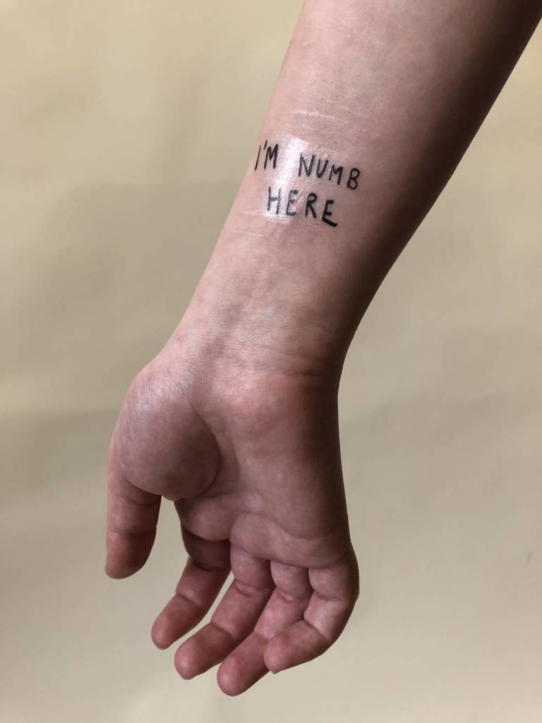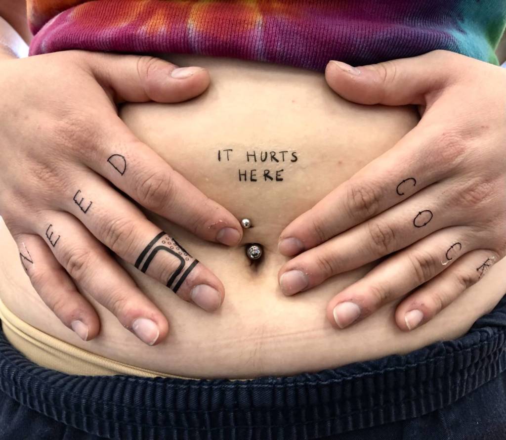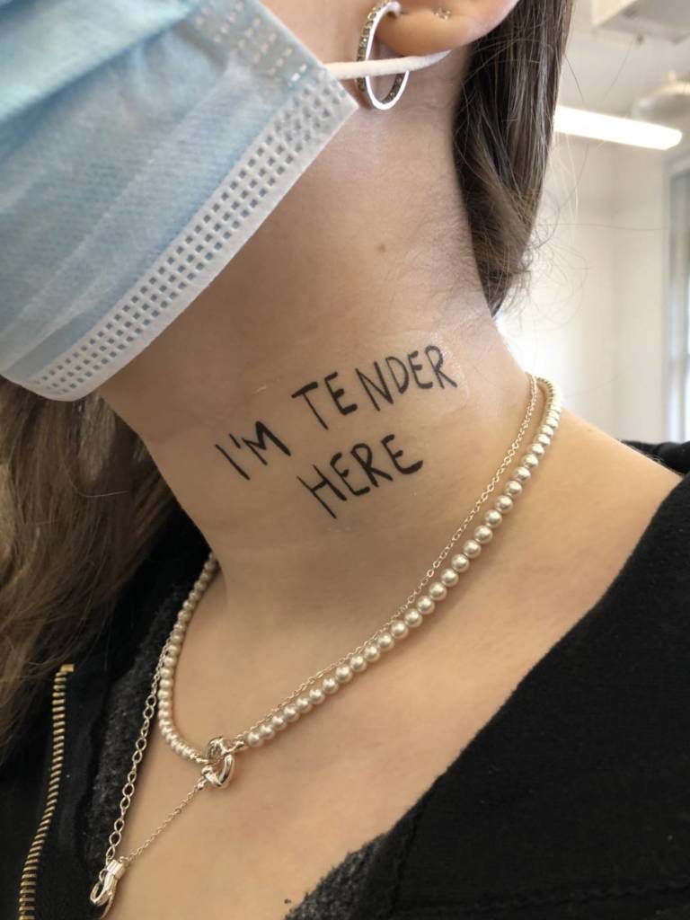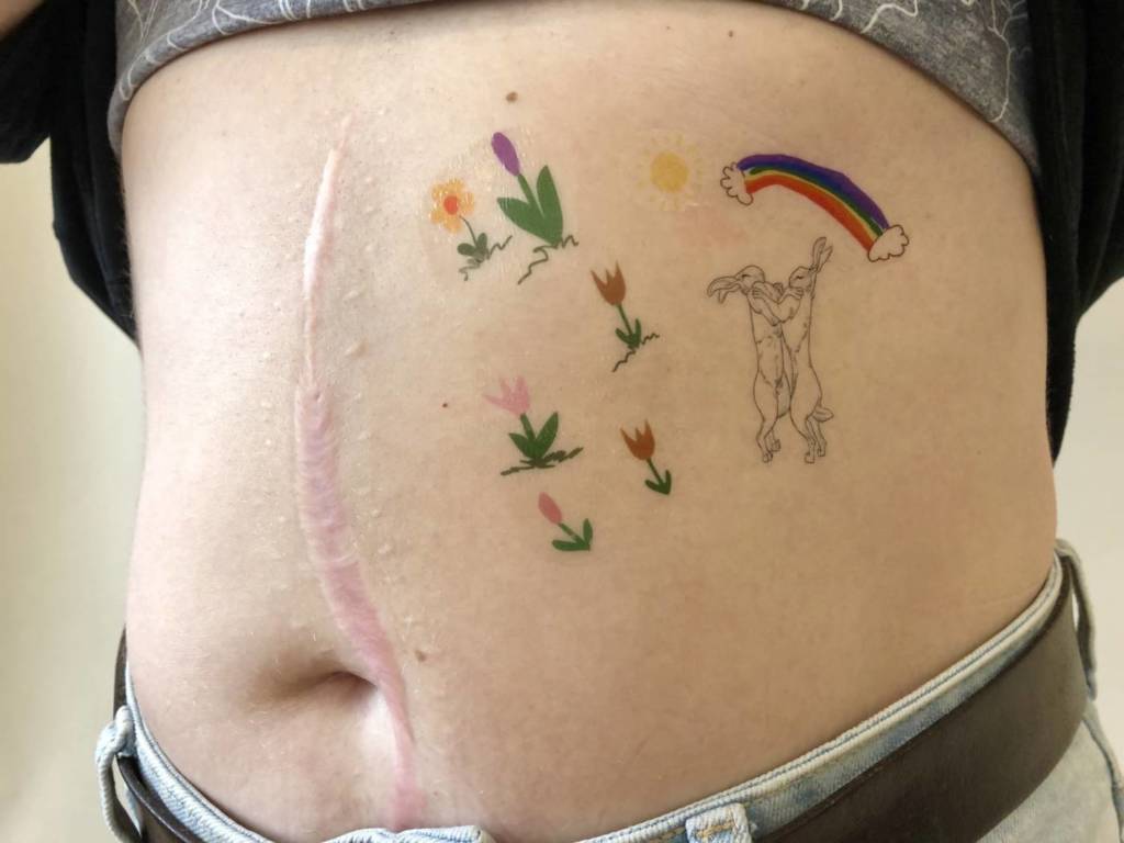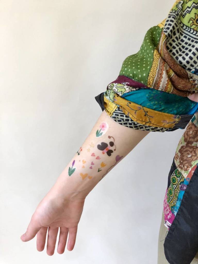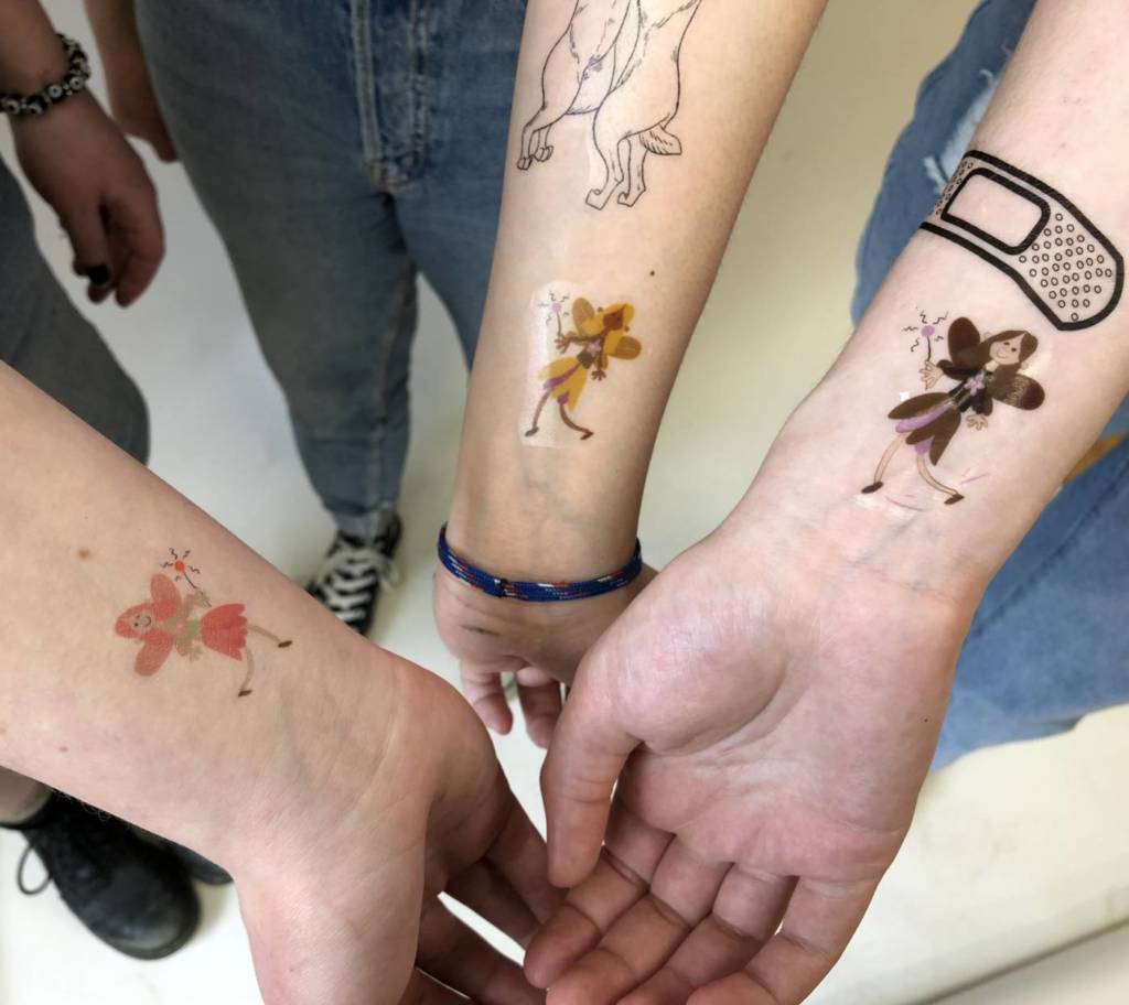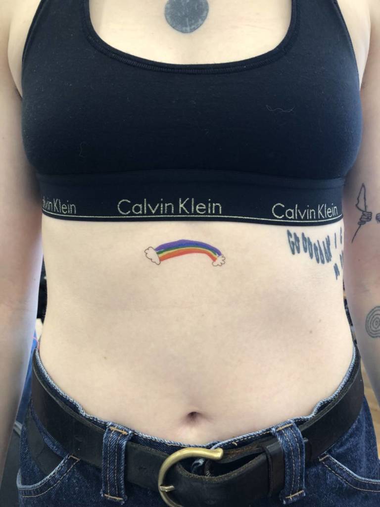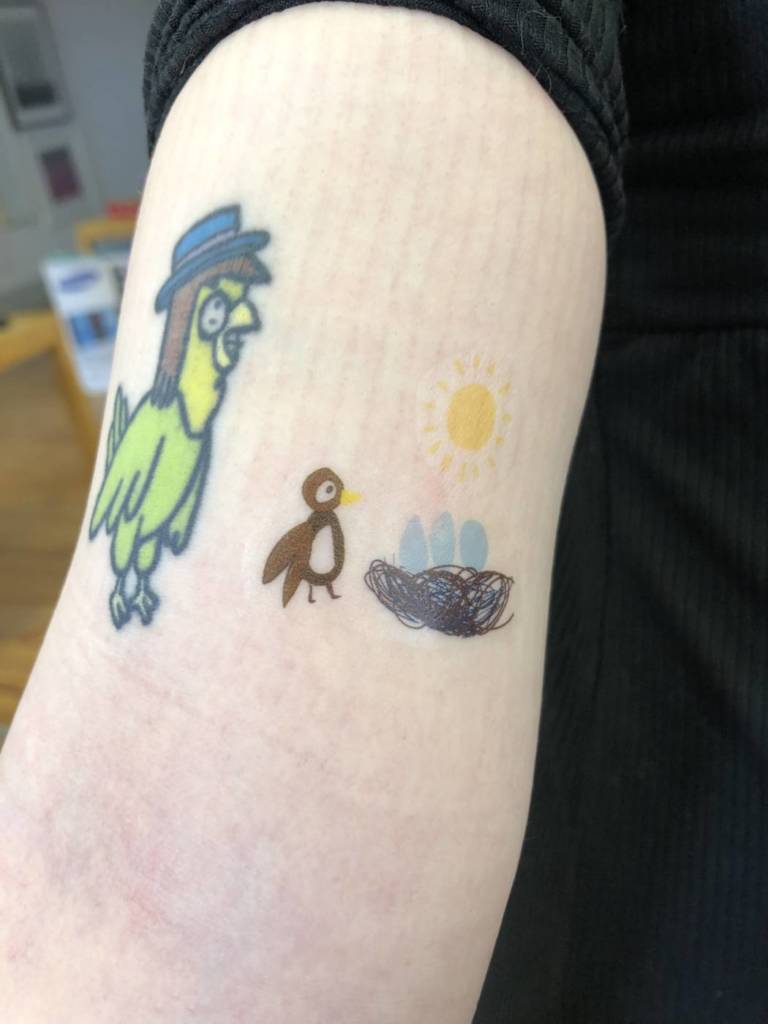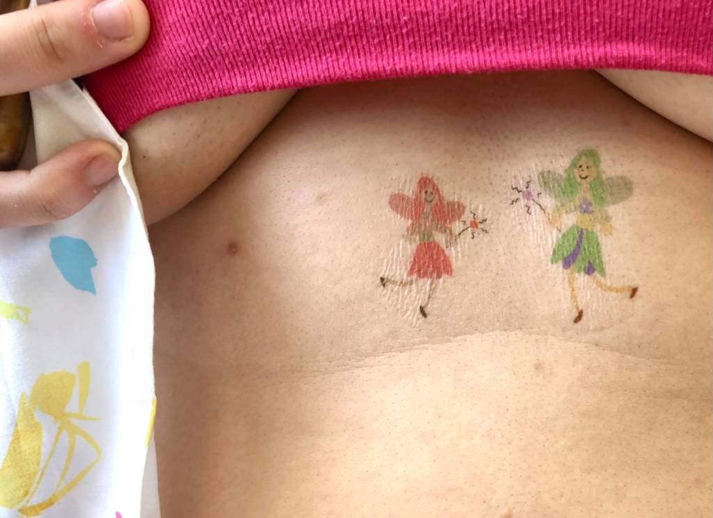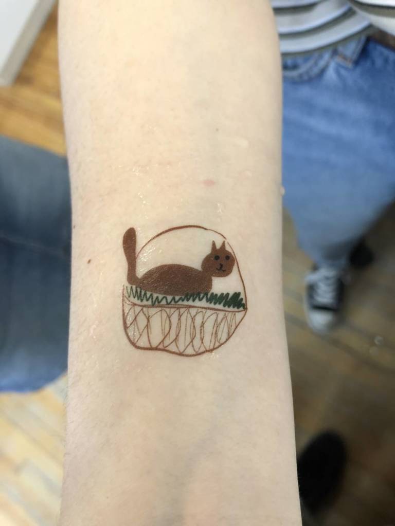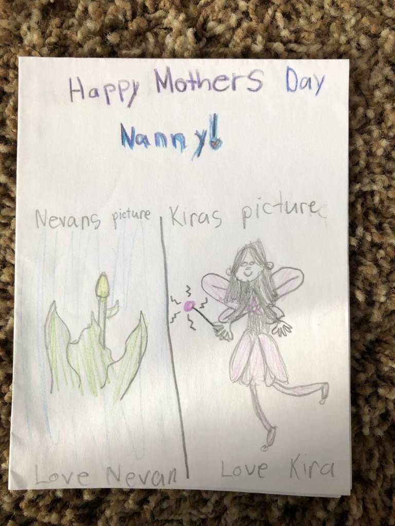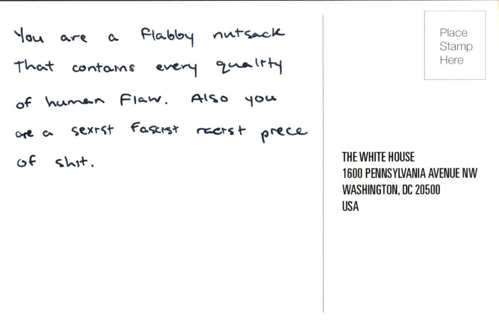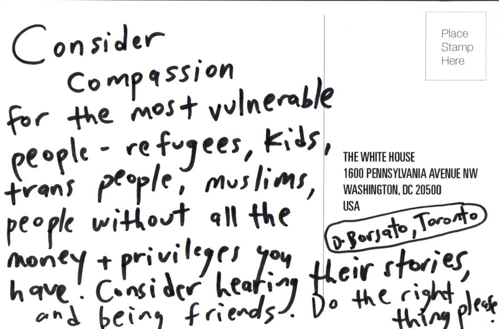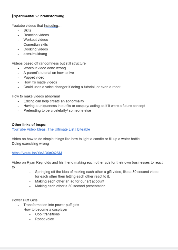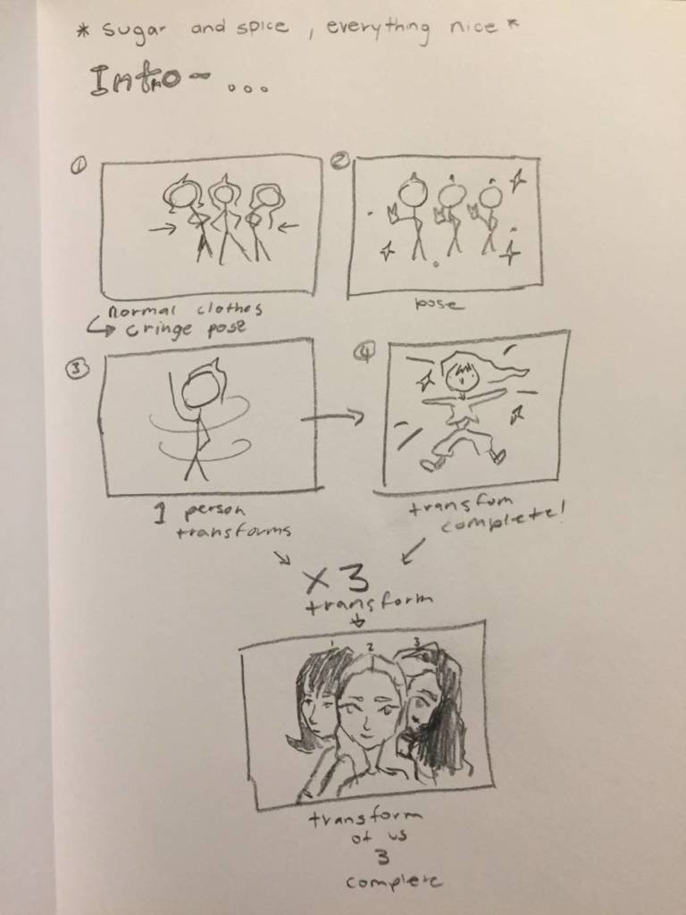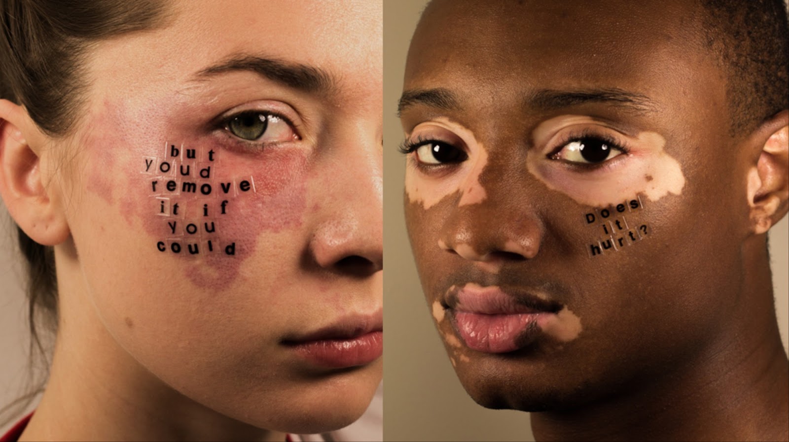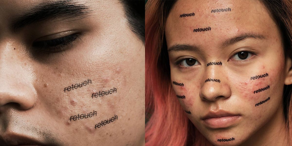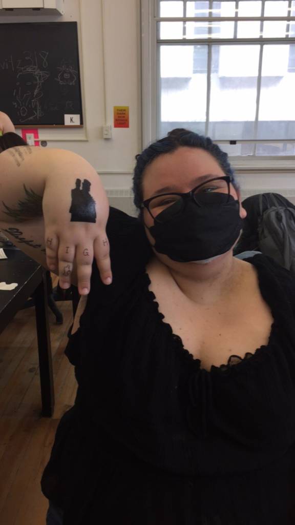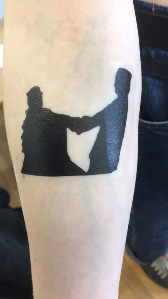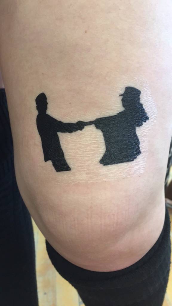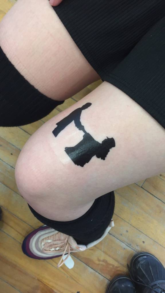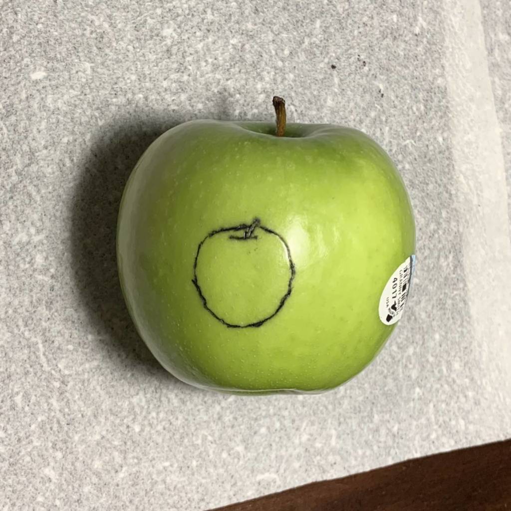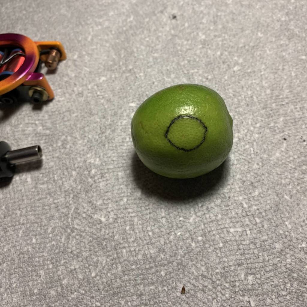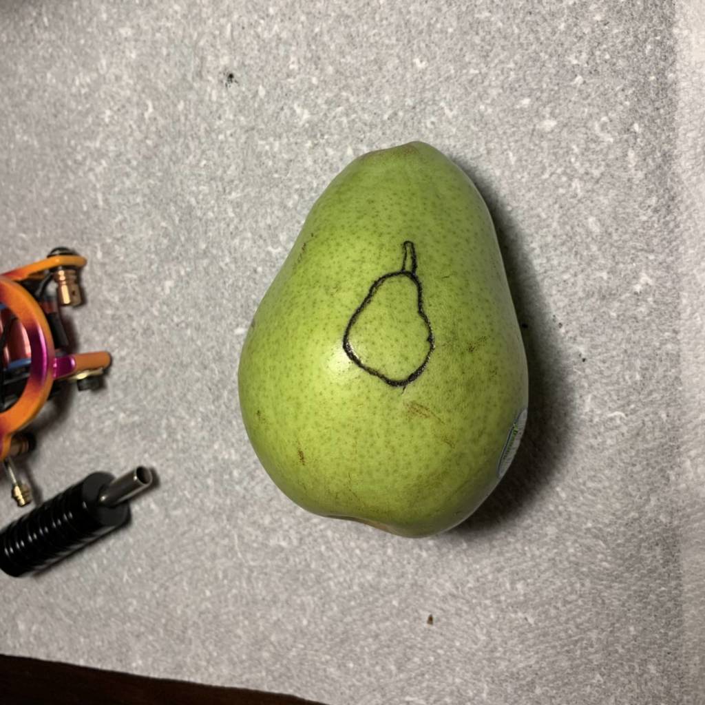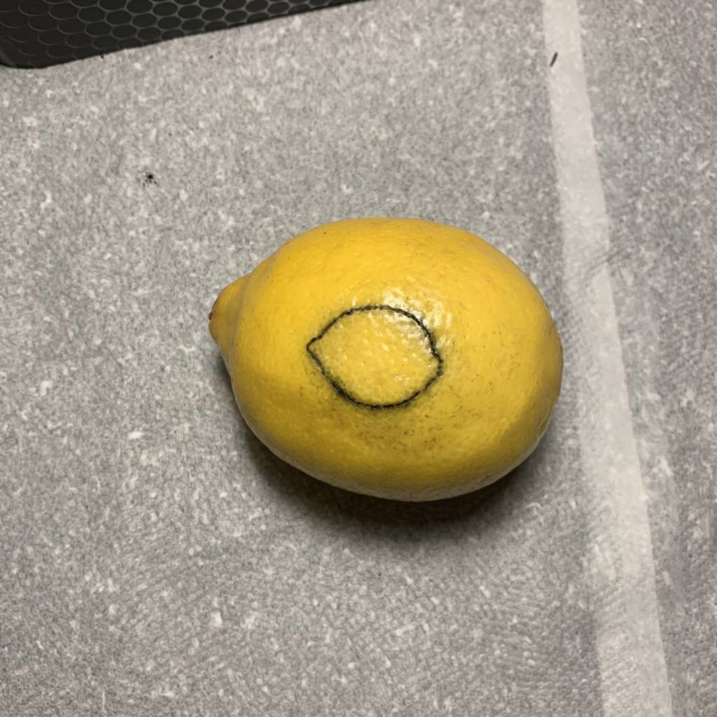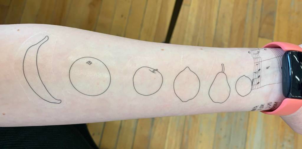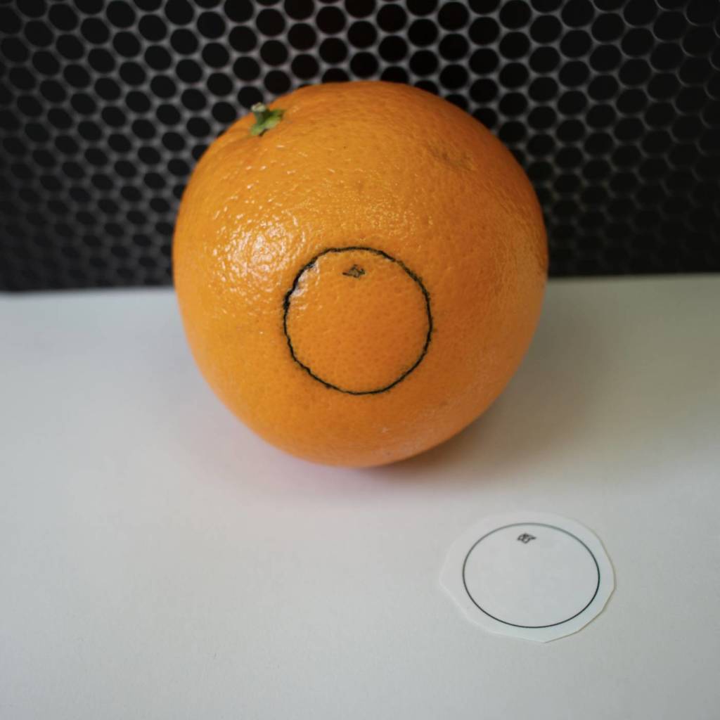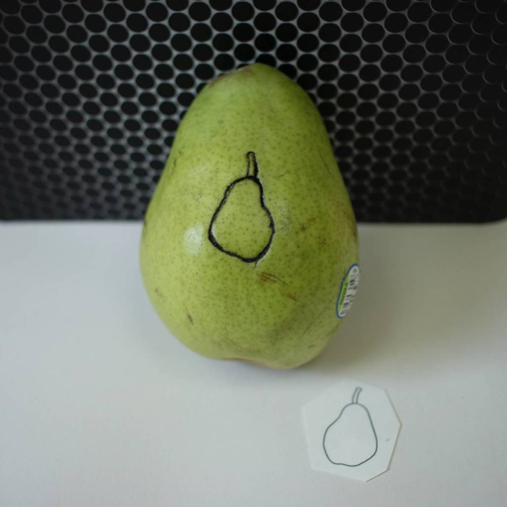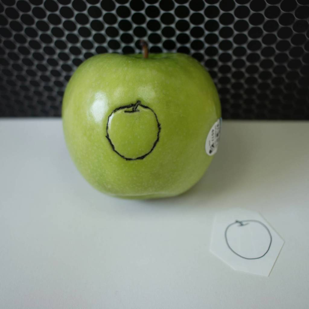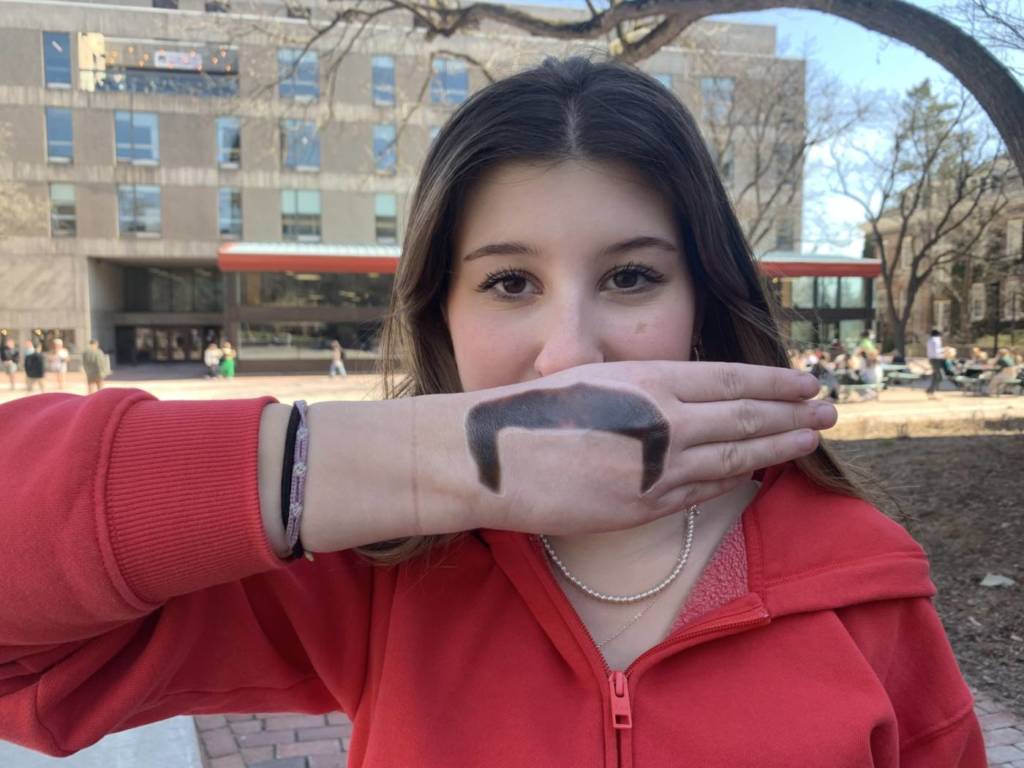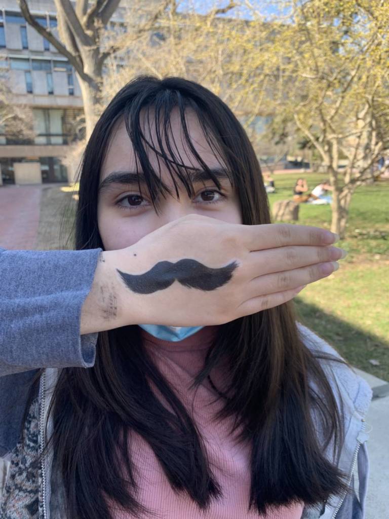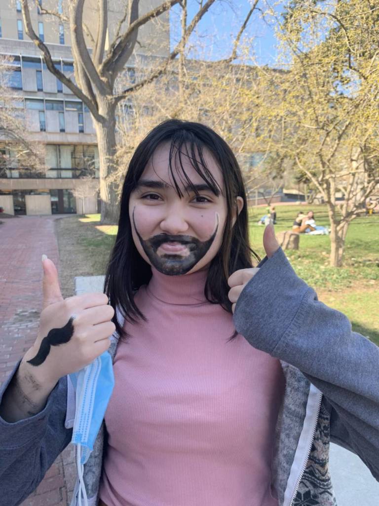
Tattoos
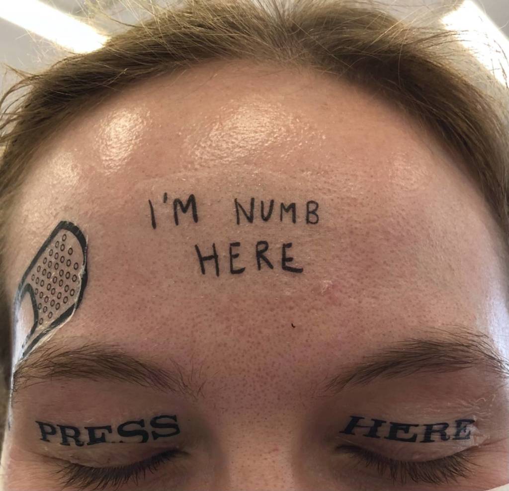
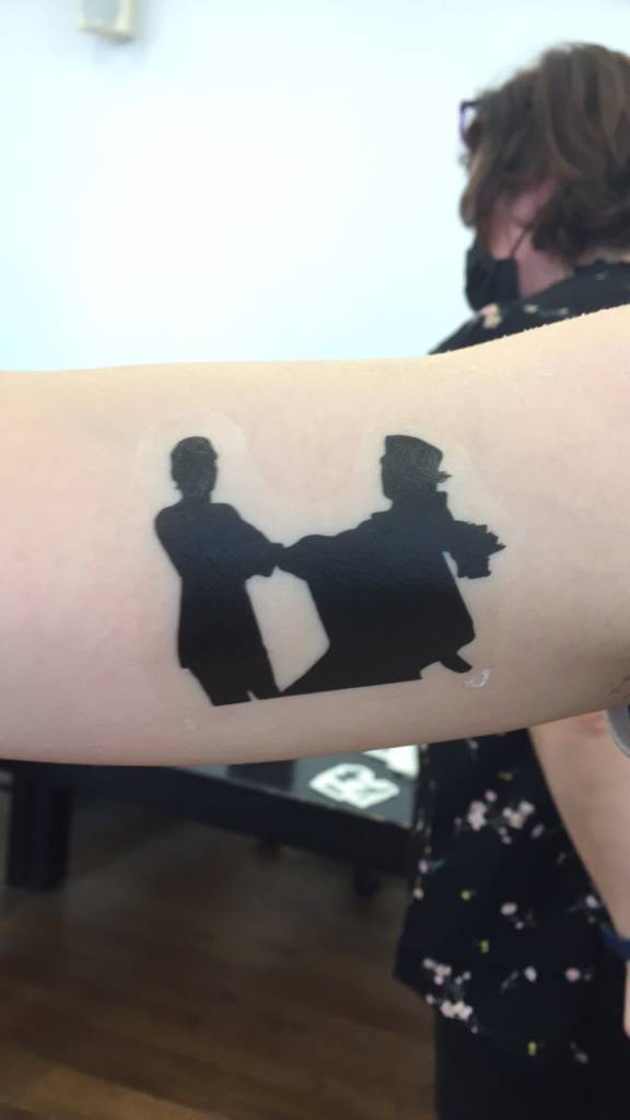
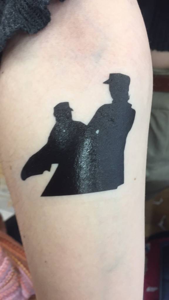
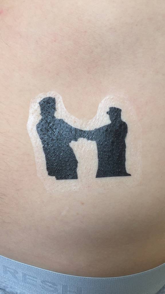
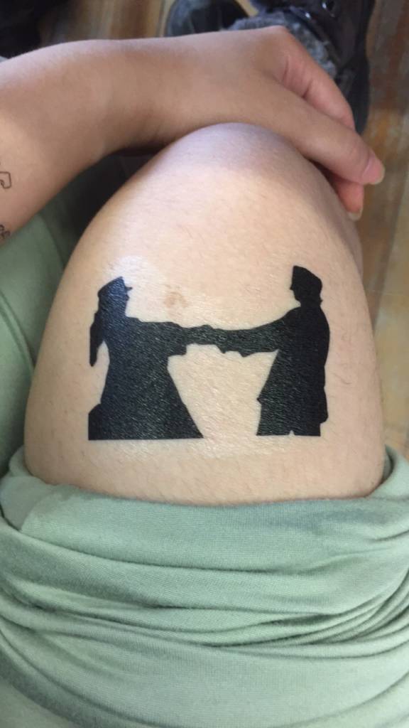
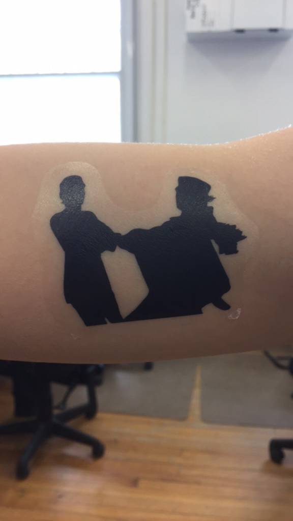
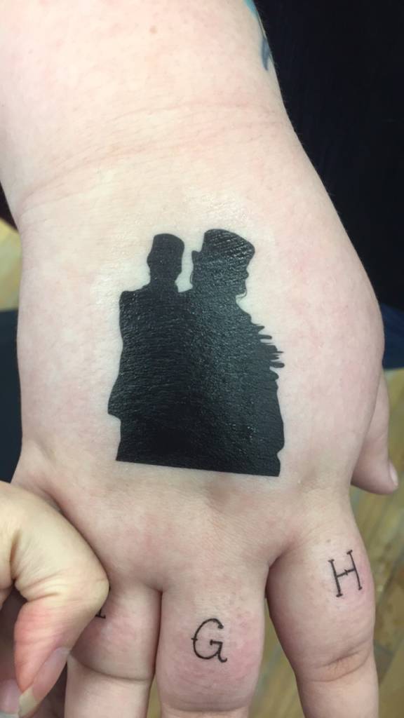
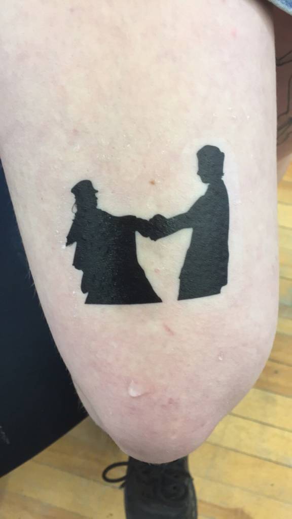
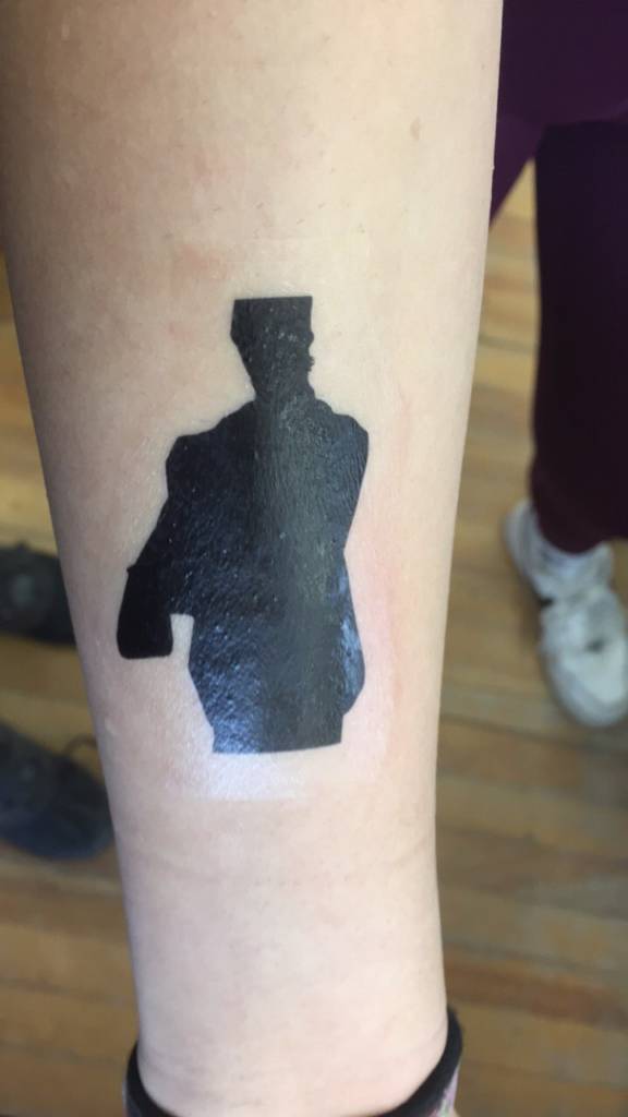
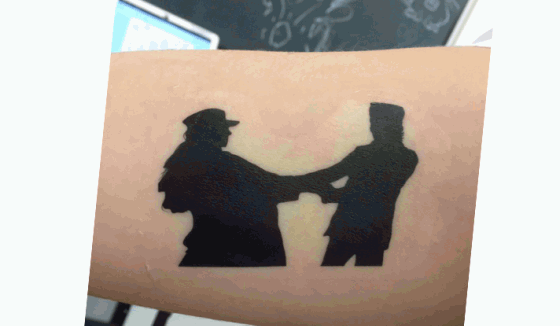
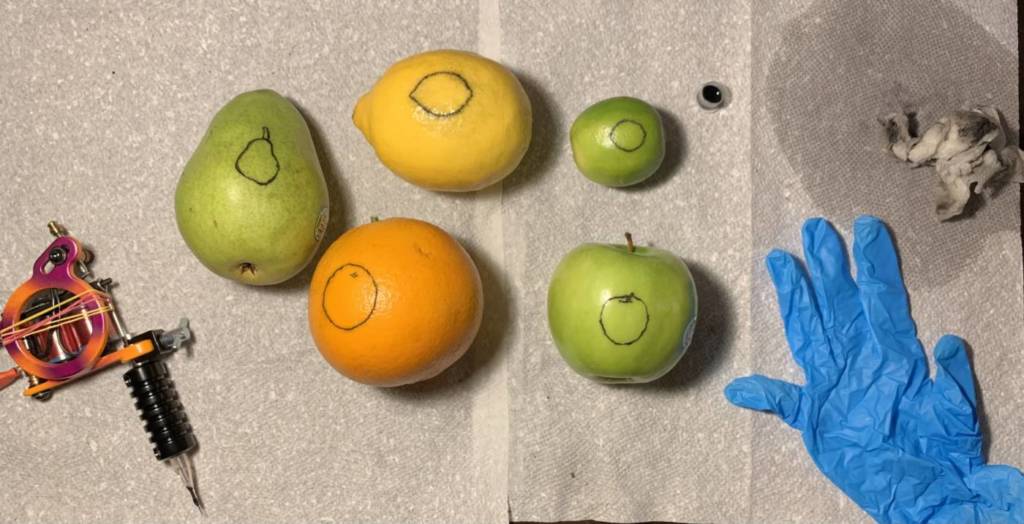
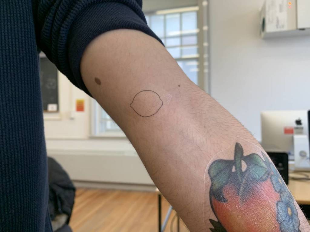
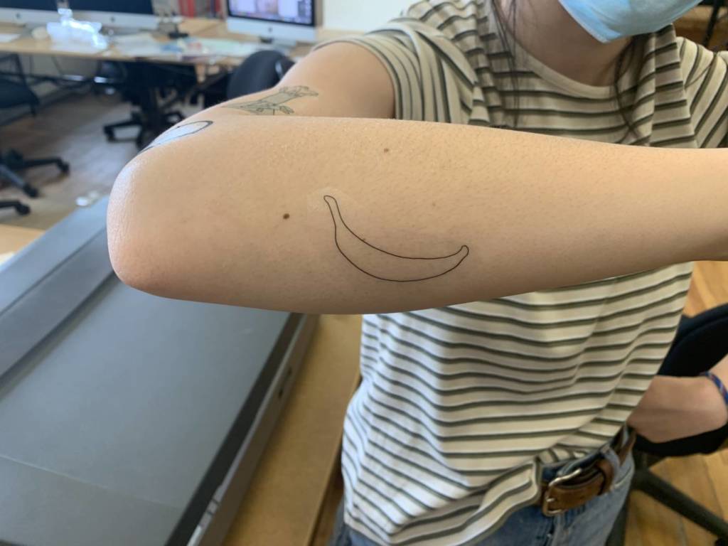
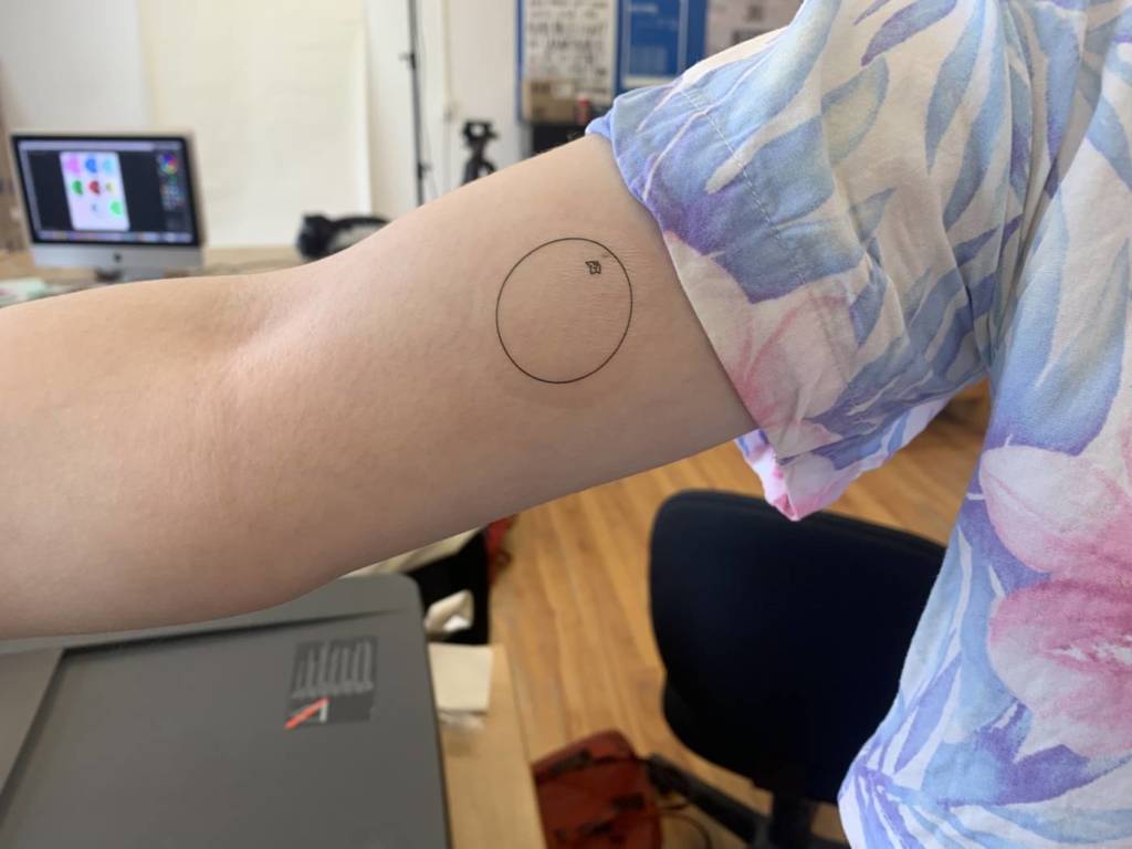
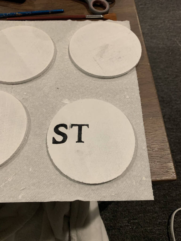
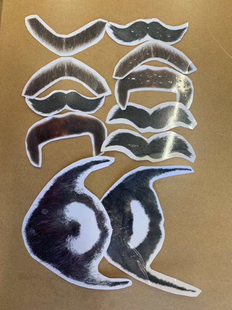
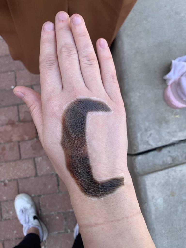
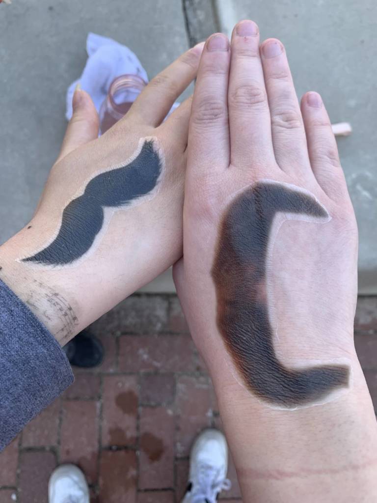
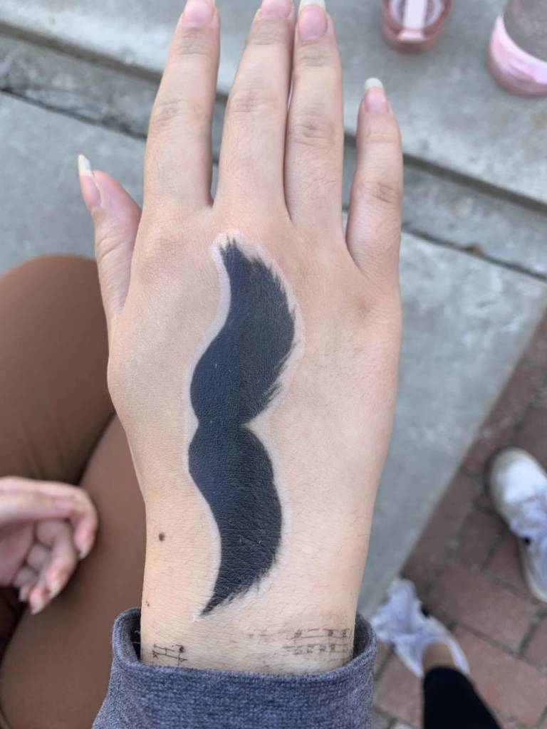
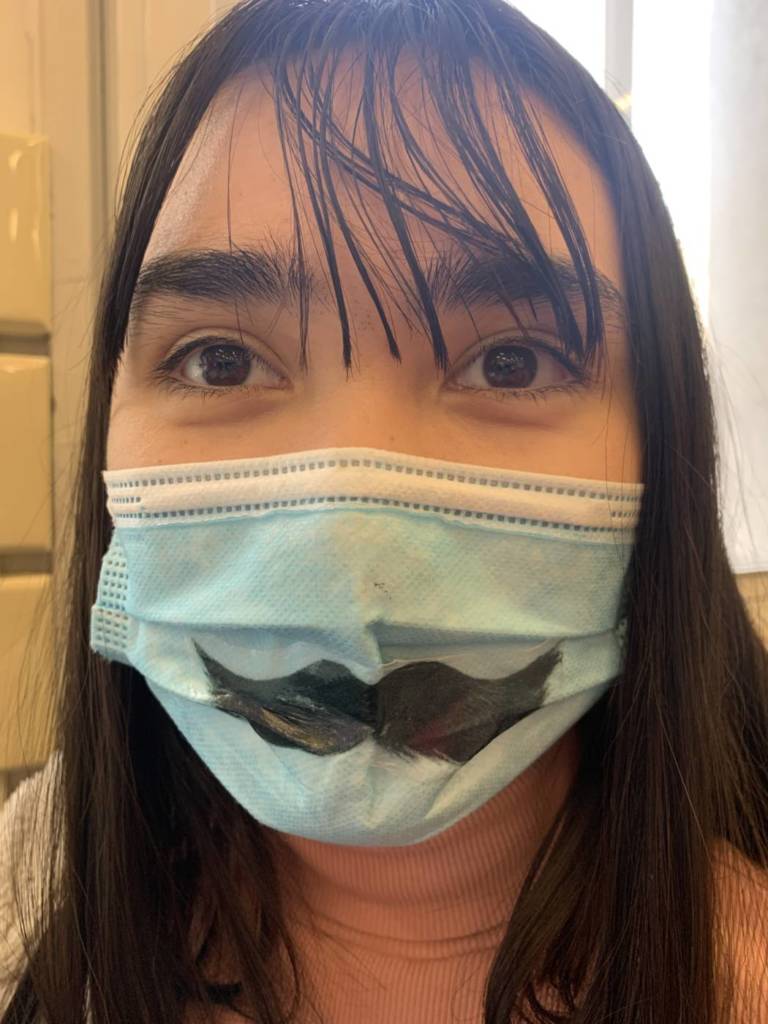
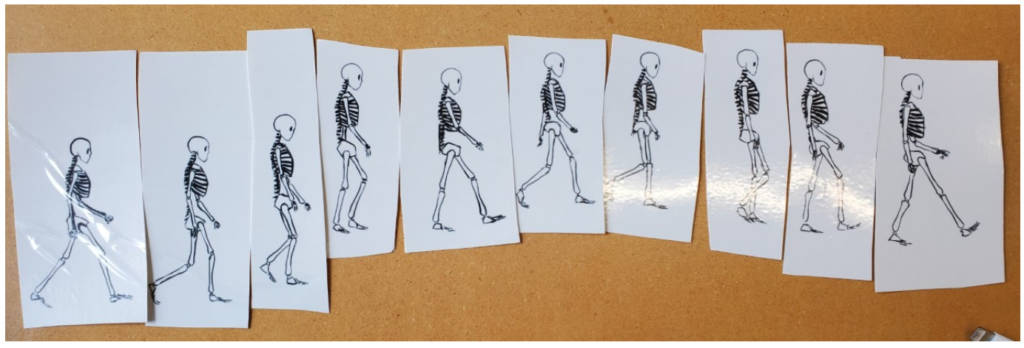
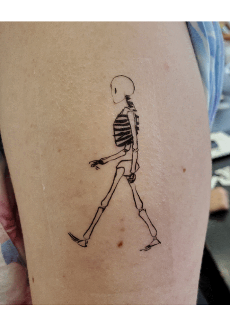
Although I had a lot of trouble deciding on a tattoo, I really enjoyed this assignment. After a lot of experimenting, I decided to do a skeleton walking animation tattoo. It is 10 frames of a skeleton. I thought it would be interesting to put a GIF of all the tattoos together at the end to show an animation.
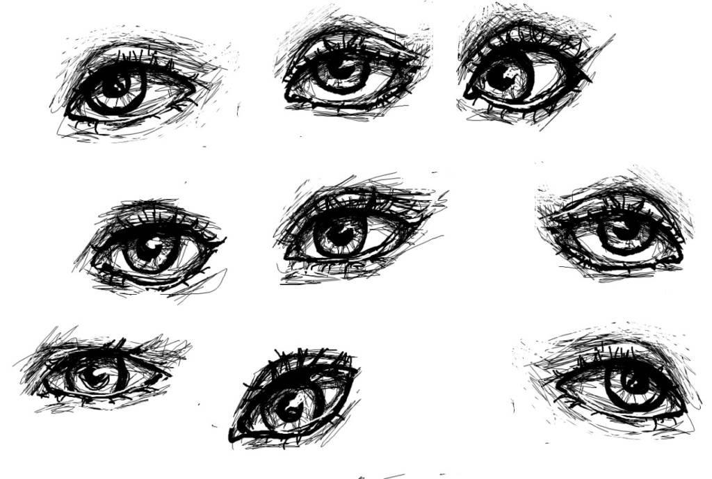
I also ended up printing out some eyes that I drew as well (forgot to take a picture of them printed out)
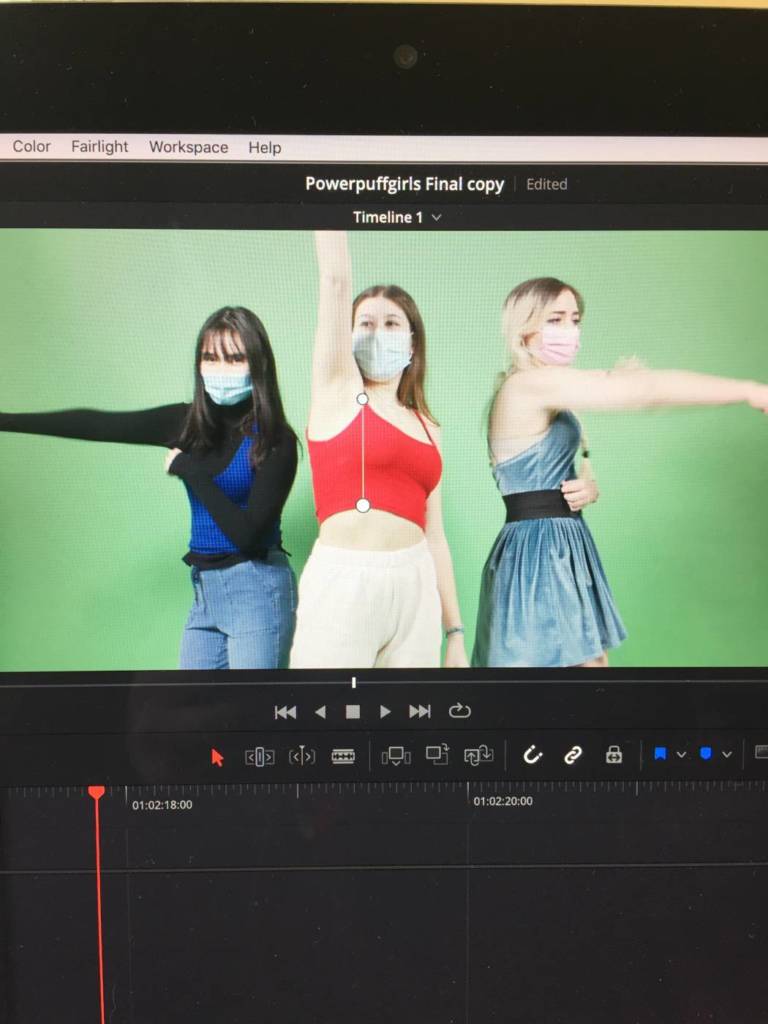
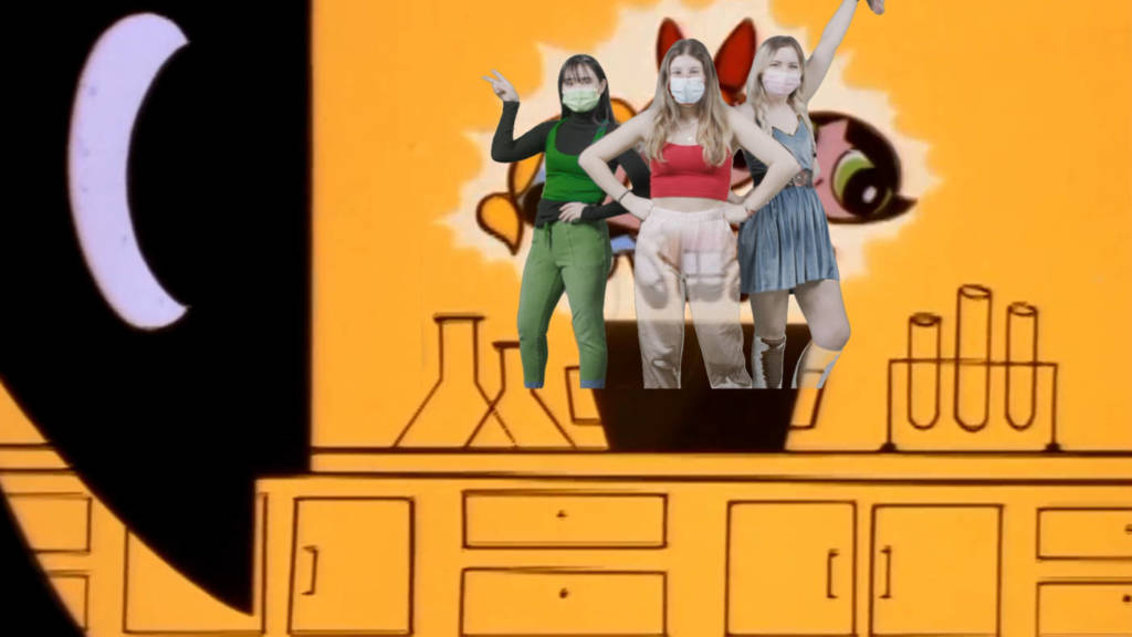
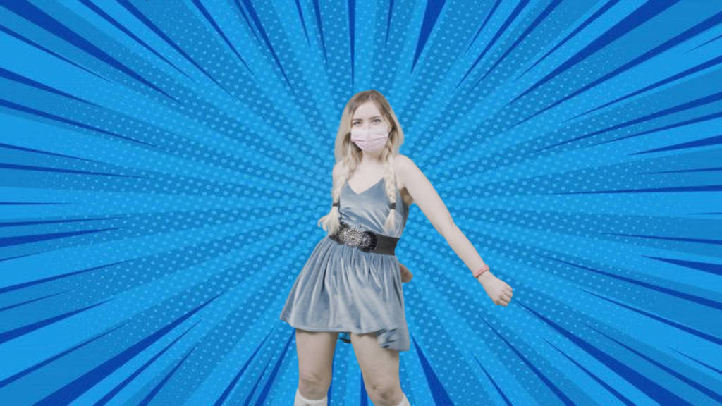
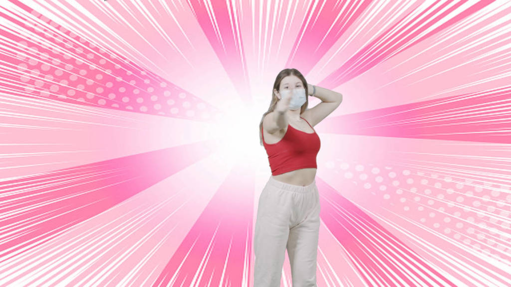
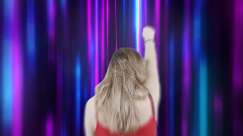
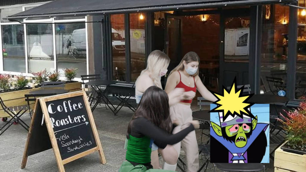
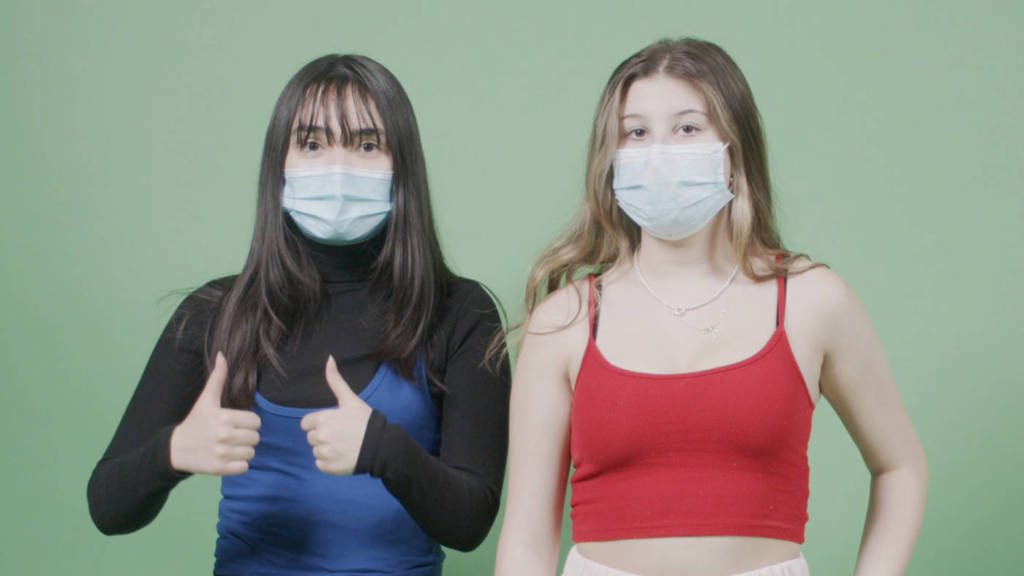
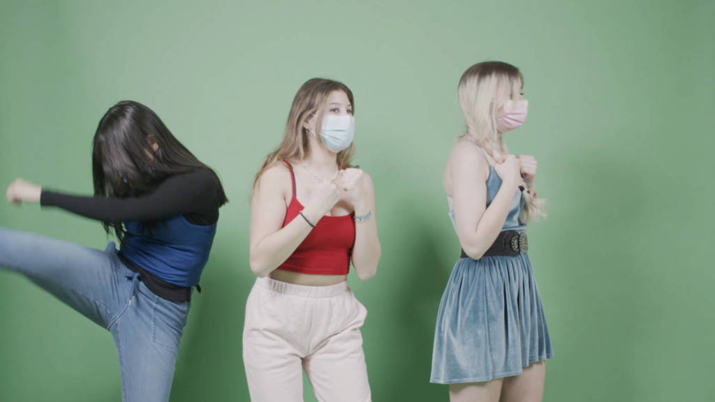
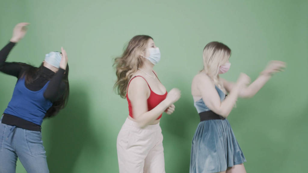
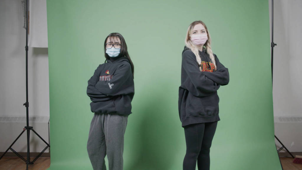
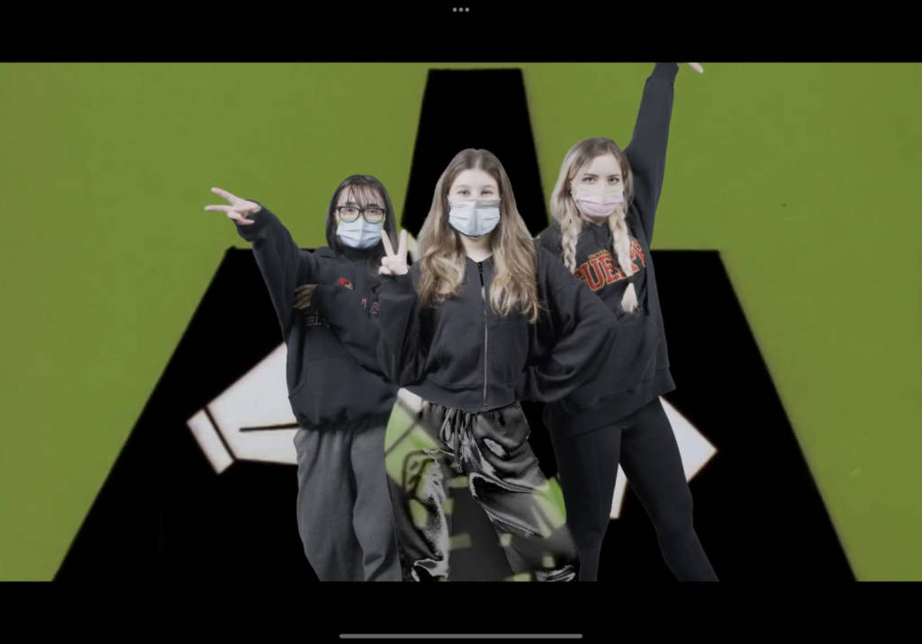
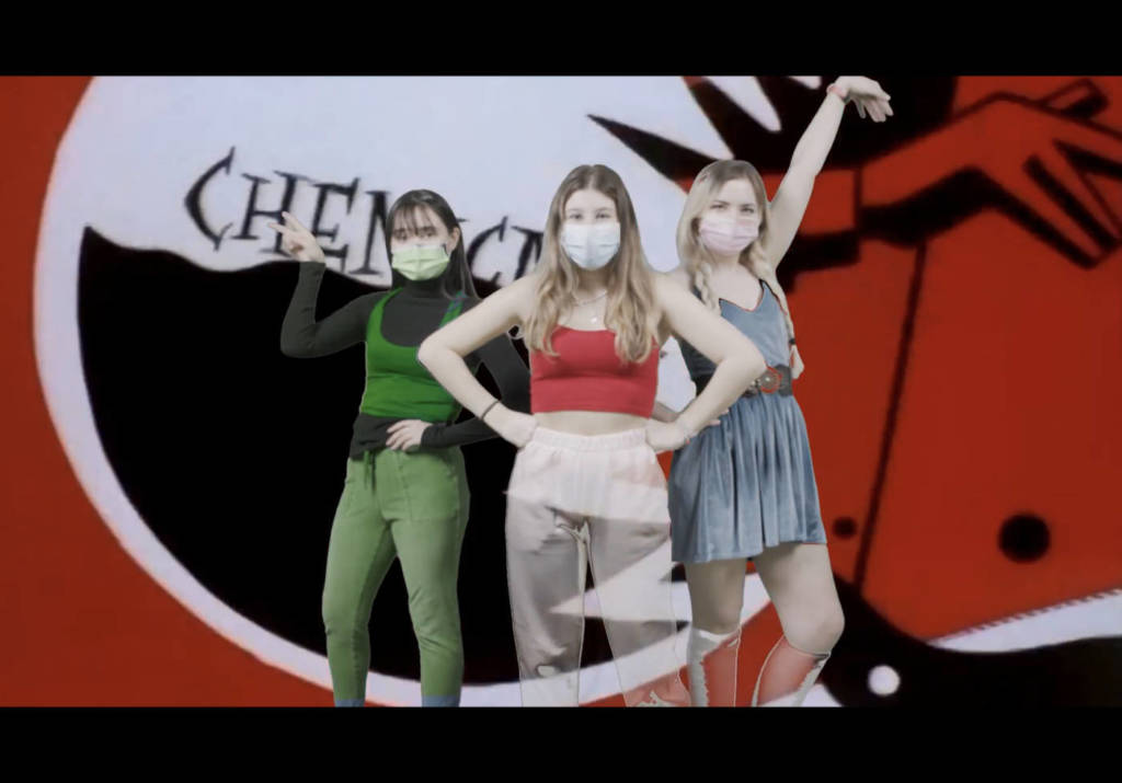
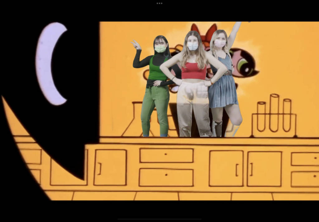
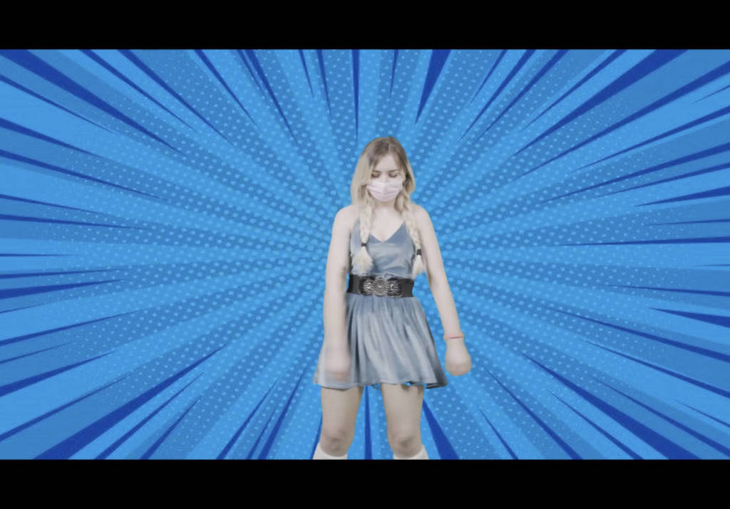
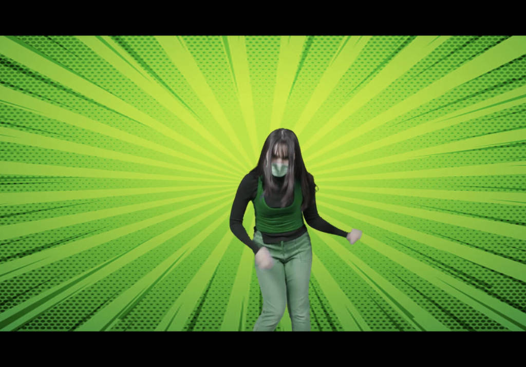
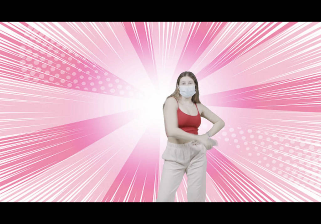
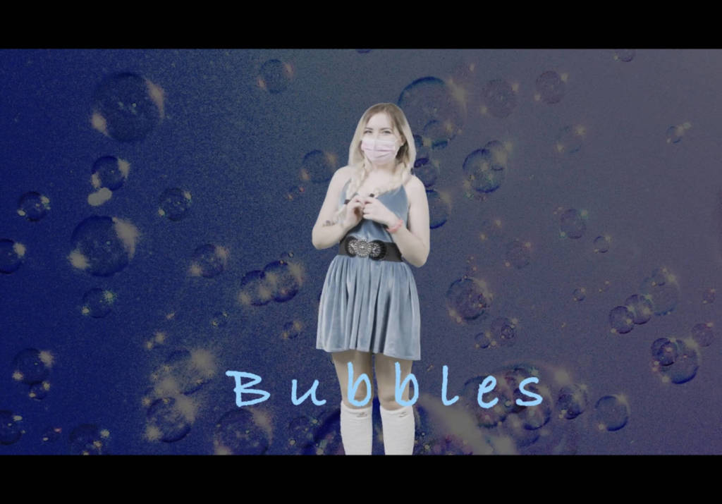
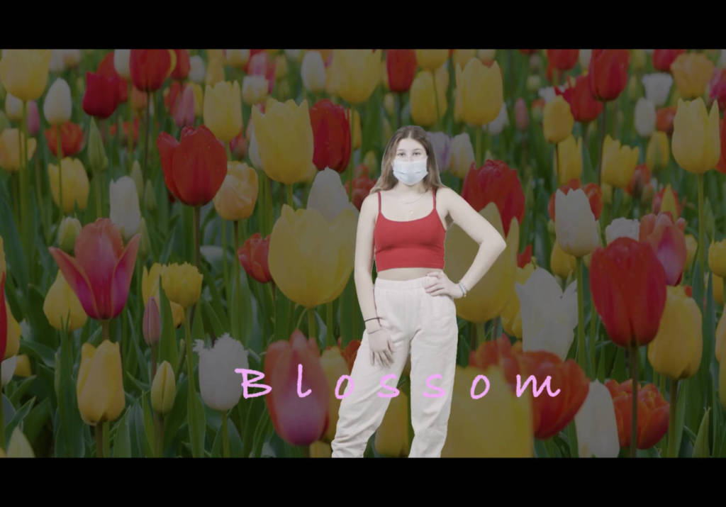
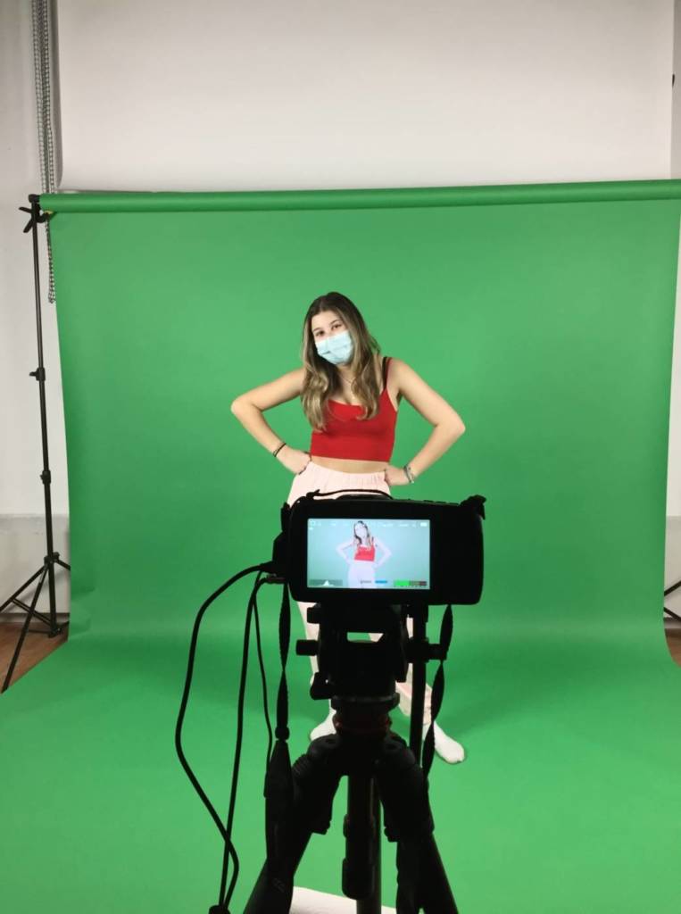
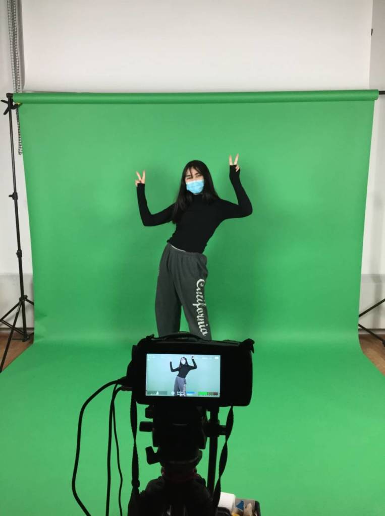
Video Art Presentation
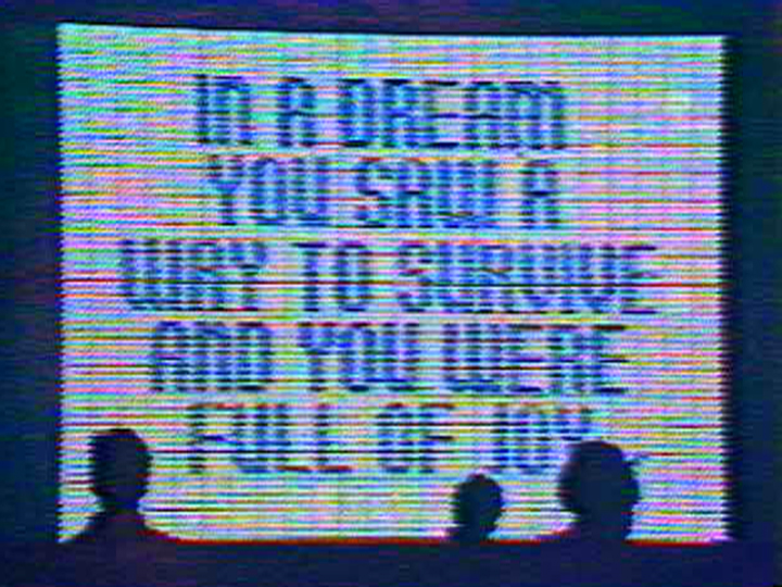
Oblivion NPC videos
The videos originate from the game oblivion, which is known to have awkward and unpredictable NPC interactions, often due to glitches, as well as amusing dialogue and voice acting:
Oblivion NPC memes usually take a short out of context clip and overlay music from the game oblivion onto it. When the person in the video becomes aggressive, the audio usually switches from peaceful music to combat music. Almost every video I’ve seen is shot on a phone of random strangers in public, usually having an unreasonable altercation. There usually isn’t any visual editing, although I’ve seen some videos where a health bar or subtitles are added.
I personally haven’t played oblivion, but I know people that have seen these videos have commented on how they are nostalgic. I find these videos hilarious, and especially love the ones that properly switch between the music to fit the things that are happening in the video.
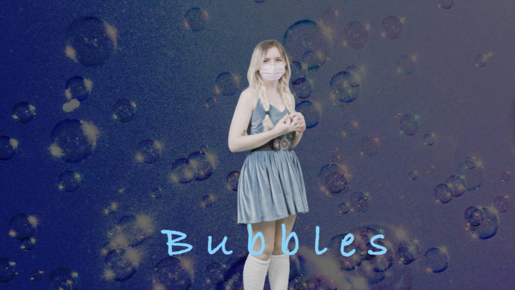
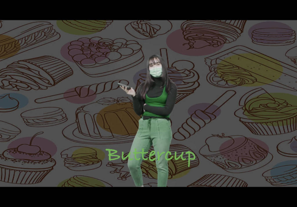
Parents Video
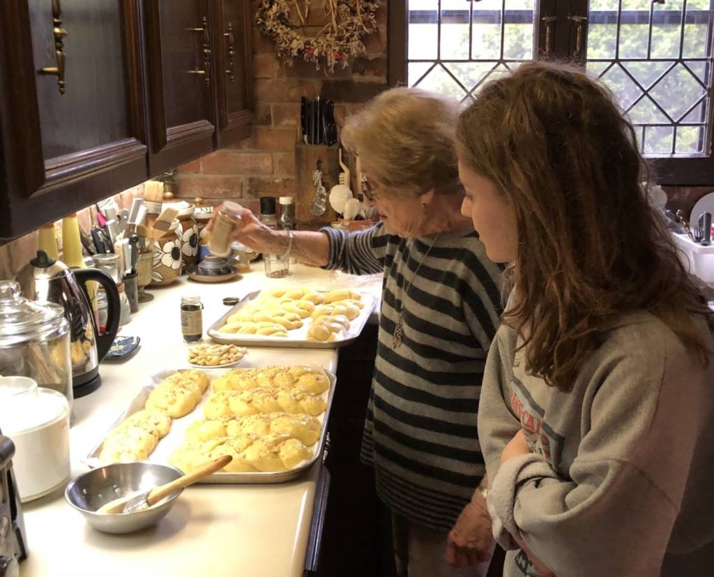
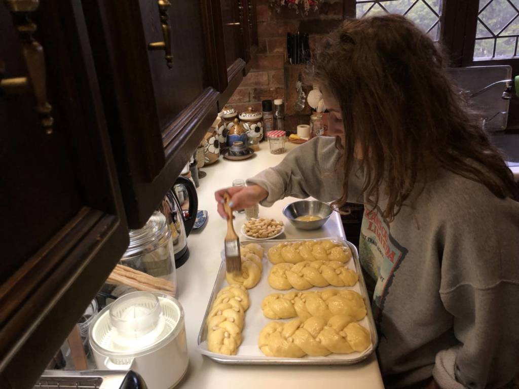
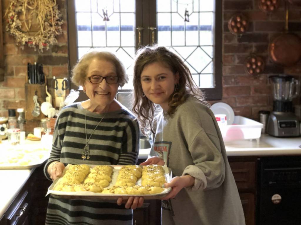
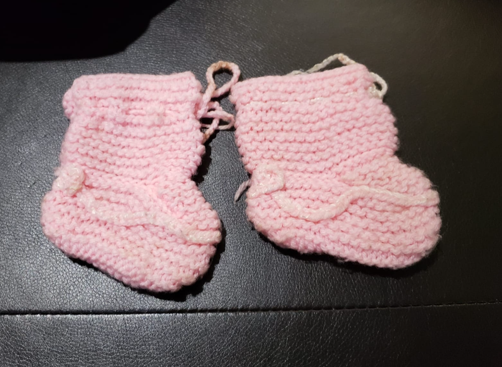
I spent a lot of time trying to think of something that my mom identifies with and is passionate about. I walked around the house looking for inspiration, and searched through old photo albums. Looking through drawers of her old clothes that she had brought from India (and then never got a chance to wear) I found these tiny knitted sweaters. I asked my mom about one and she spontaneously started telling me its story. She talked about how she dressed me in a full pink wool set she knitted herself when she took me to India to see her family. Her brothers called over their neighbors to show them what I was wearing, thinking it was an expensive set she bought. I asked her if she could tell me the rest for a video.
She said that there were a lot more things she had knitted, but had given them away or lost them, which she really regrets. The ones in this video are the clothes she loved the most and had to keep, except for these socks which were lost.
Before filming, I tried different poses – sitting on a chair or on the couch, standing, and sitting on the floor. In the end I decided that sitting on the rug would be best; it reminds me of old home videos (for example those videos of everyone opening their Christmas presents on the floor, or someone going through forgotten stuff in their grandma’s attic). I did not want to film more than once because I felt that the memories my mom was telling would become more rehearsed/less natural. This is also why I wanted my mom to be able to speak Urdu. I wrote subtitles for the video, although I am debating whether to add them to the video or not. I primarily wanted her passion, love, and longing for the days she used to knit to be in focus, and I feel that adding subtitles might be distracting. However, I do realize that it is difficult to personalize this video when you can’t see facial expressions, which might eliminate my reason for not adding subtitles. Other than this, the video has minimal editing. I struggled with this, because I did want to edit it, but I preferred this format of raw footage.
After a while, I became increasingly unsatisfied with this work. It seemed fairly plain and did not convey the feelings that I wanted it to. I was tremendously inspired by the aesthetics of the works of others in the class, and came up with another idea. I remembered part of a conversation I had with my mom after filming the previous video:
Mom: I really miss knitting…it’s so sad that we lose our talents and enthusiasm as we become old.
Me: Why don’t you knit anymore? You should.
Mom: I’ve forgotten how…I would never be able to make something like this again
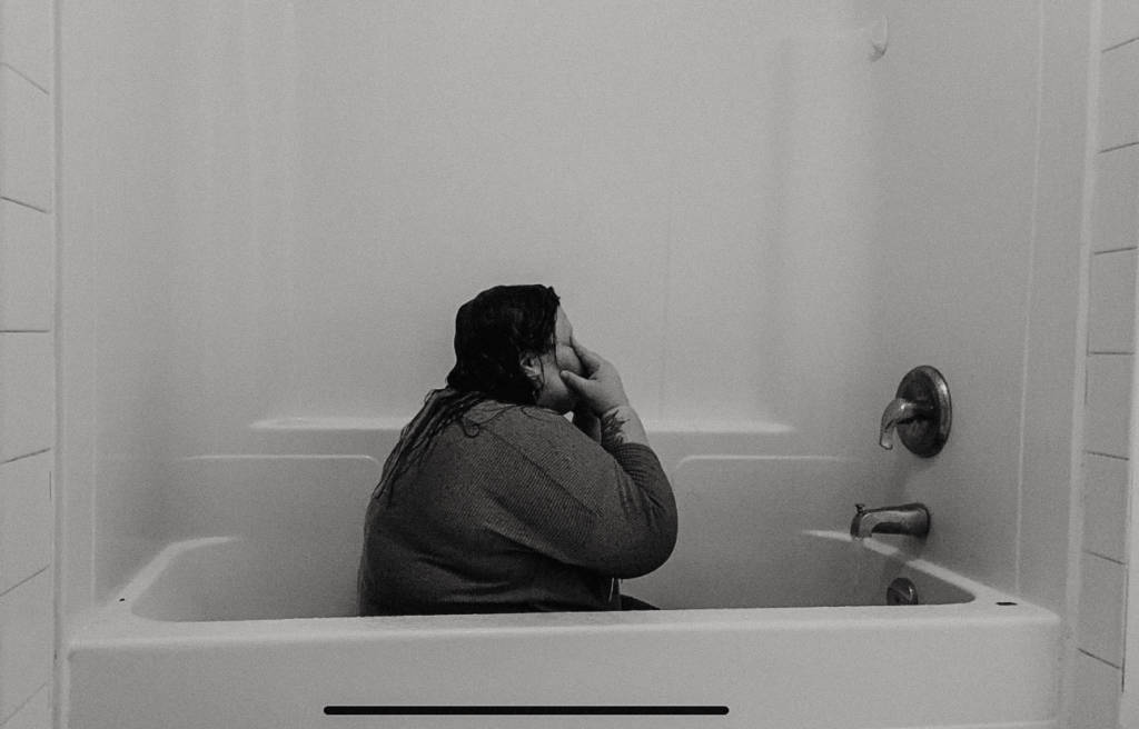
So I asked my mom to try to knit, and I would record one take of it, however it came out:
I couldn’t decide whether to use the voiceover from the first video as background noise, or just keep the natural sounds of the knitting needles, but I decided that using the voiceover would better transmit the emotion of regret of losing her eagerness to create art. When she came to Canada, she gradually stopped doing things for her own enjoyment. I find it incredibly painful that she is so talented but can’t express it after becoming a mother and taking on all the responsibilities that she did. She used to sing very well, and sew and paint. All of it stopped in time, and now she doesn’t do anything fun for herself. I like that this video portrays how she is struggling to do what she once used to do so easily, but after some practice, she could gain her skills back.
Other ideas:
-collection of cartoon representations of parental figures (cartoons that show depiction of the perfect parents/what every young child thinks their parents are vs the contrast of the imperfection of reality)
-Driving- dad taught me driving/still takes me out to teach things/practice – wanted to record footage of it but winter
-Mom is always trying to teach me how to cook and bake
-Wear mom’s wedding clothes, and match to wedding photos
-Sound of footsteps: was thinking of how I can recognize my parents’ footsteps
-Footage of my dad driving a car vs my mom driving, and then me and my brother driving (how parents affected our driving style)
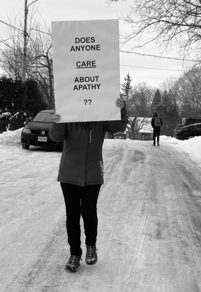
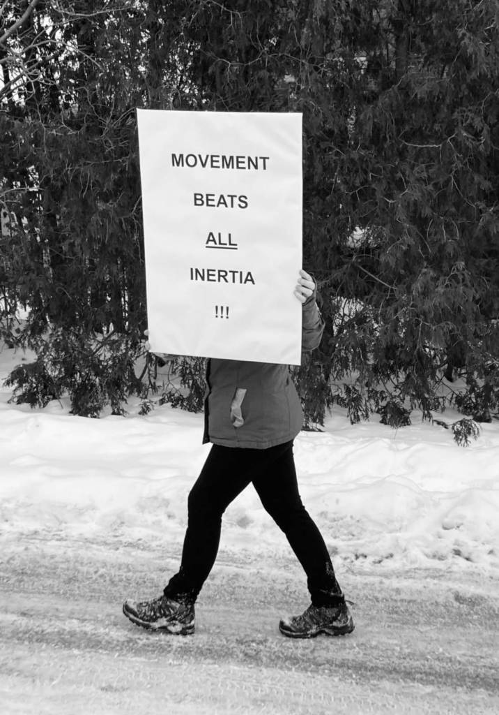
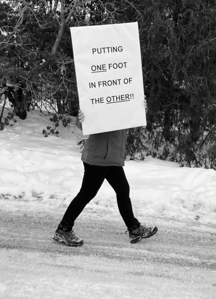
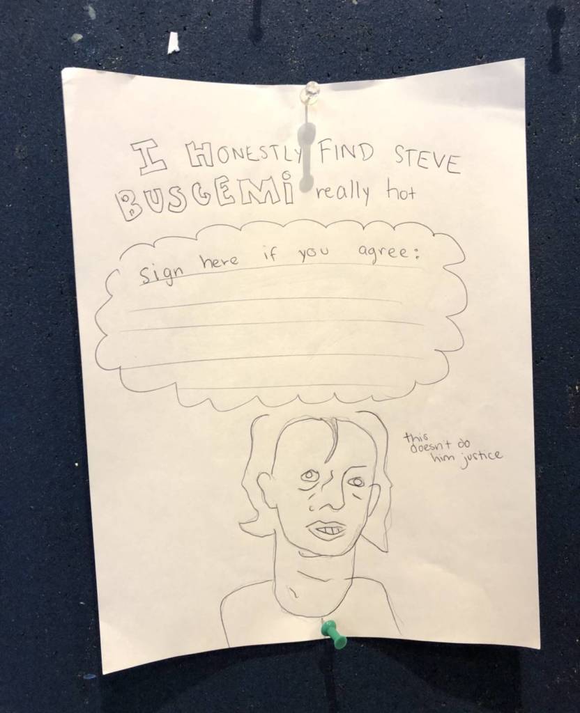
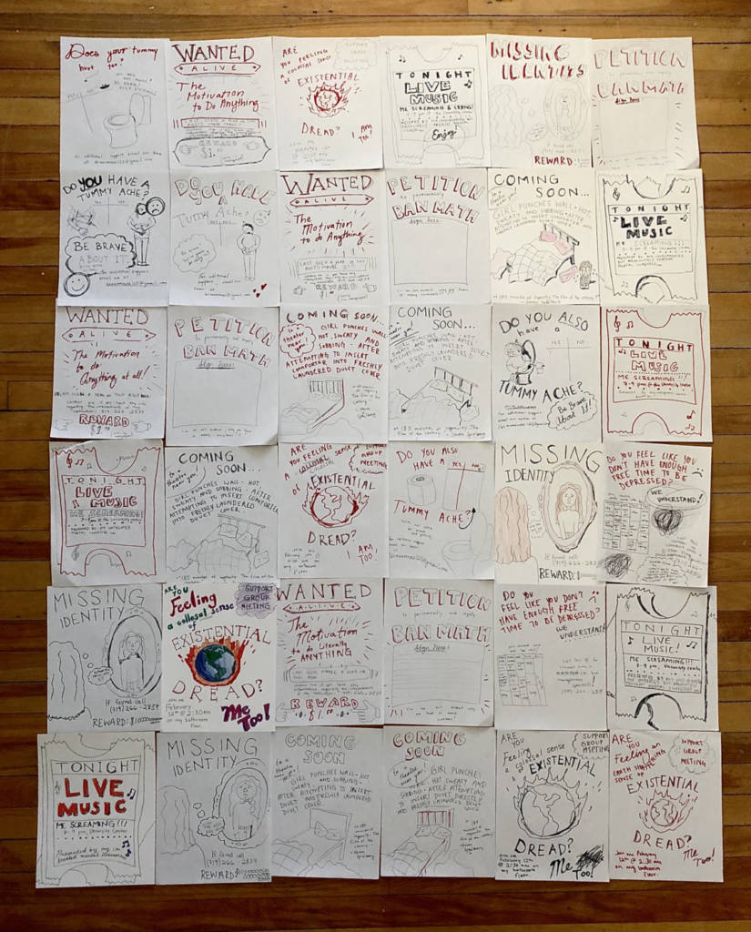
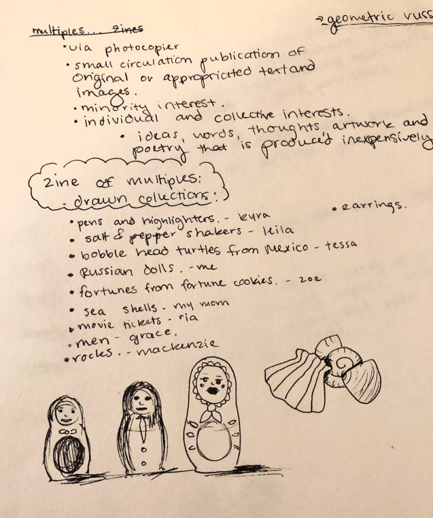
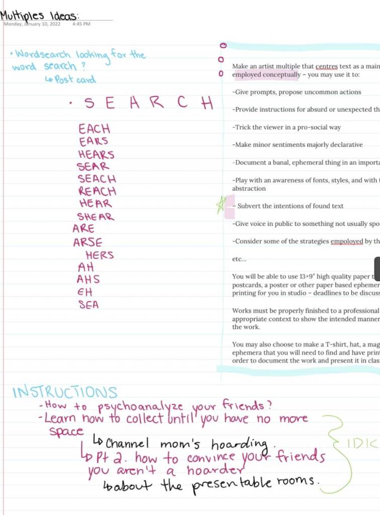
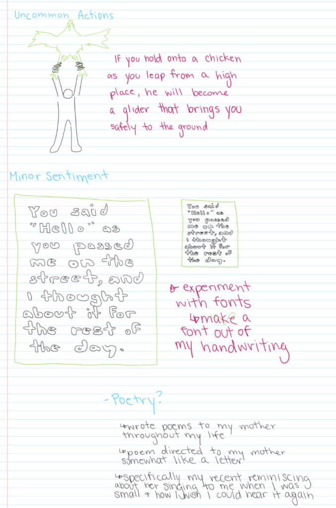
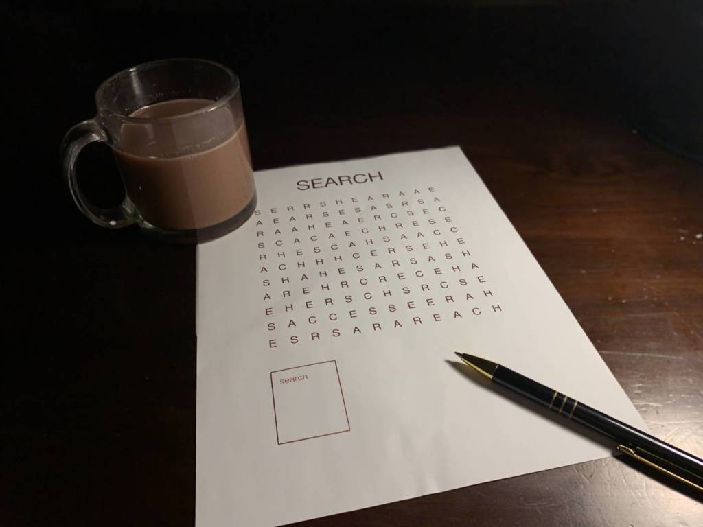
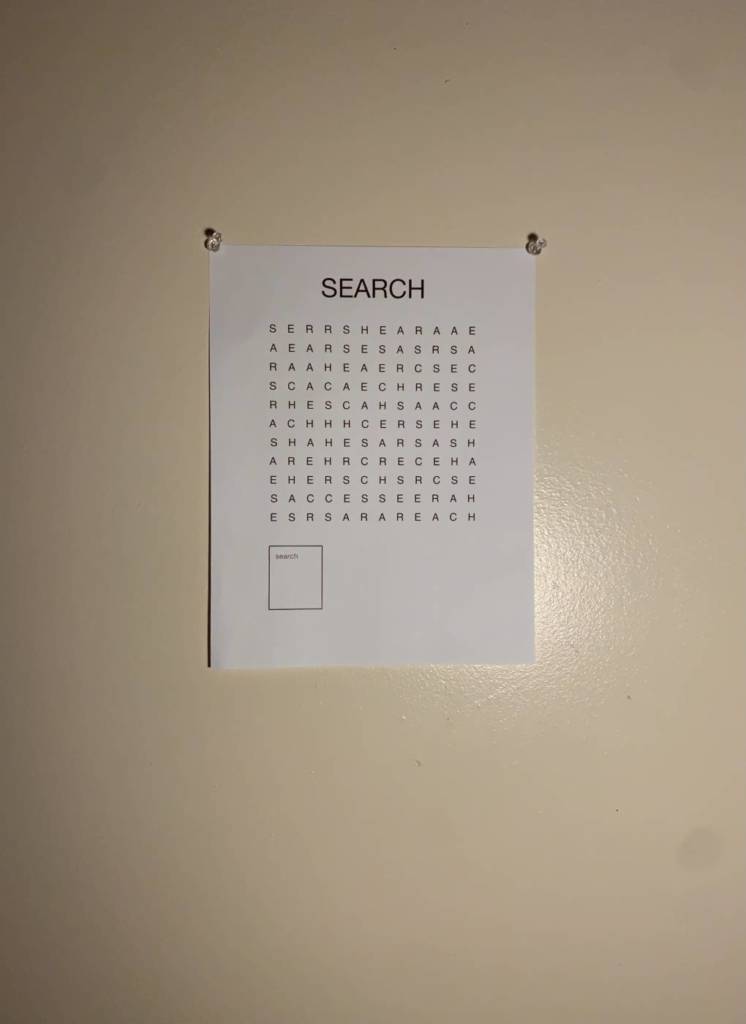
Multiples
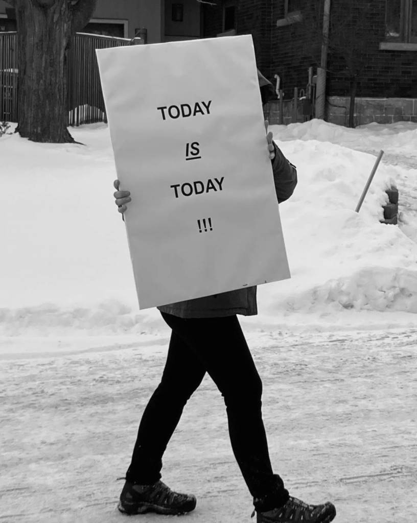
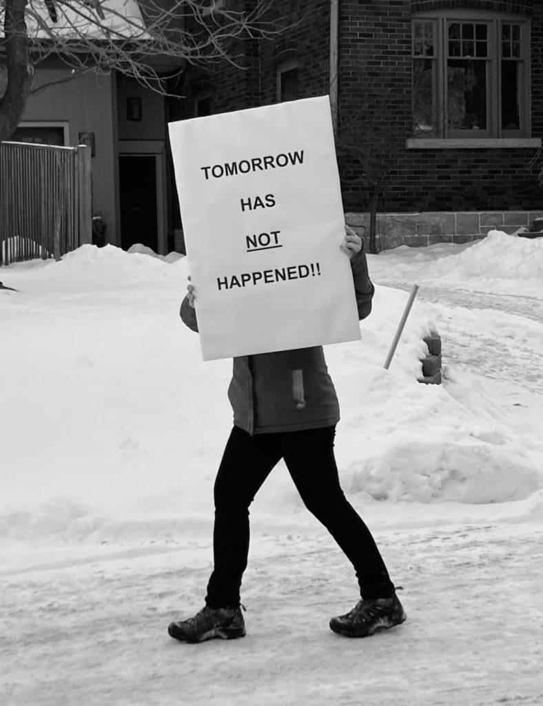
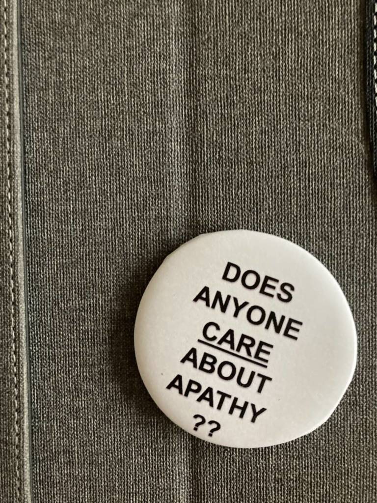
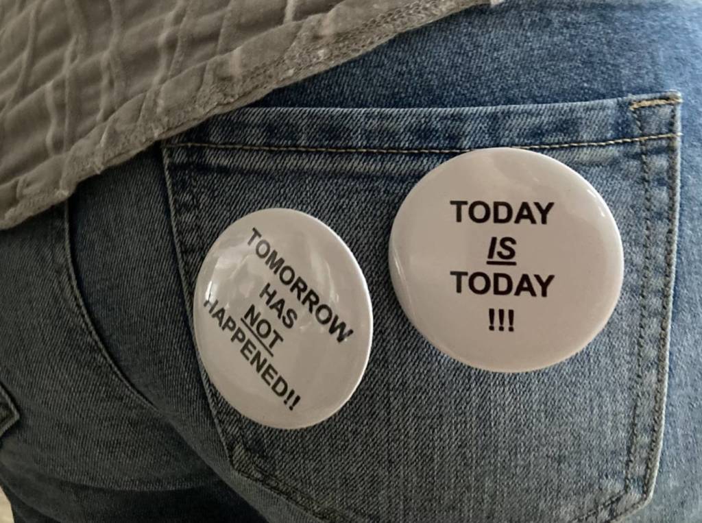
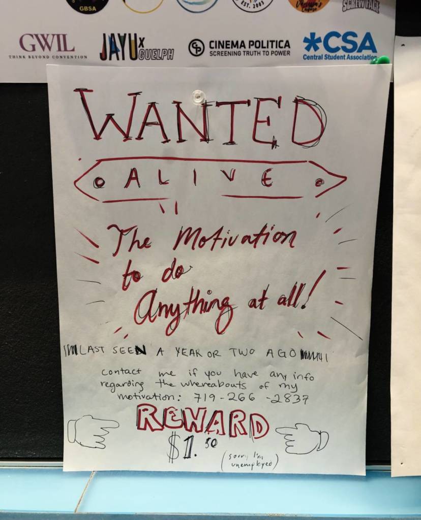
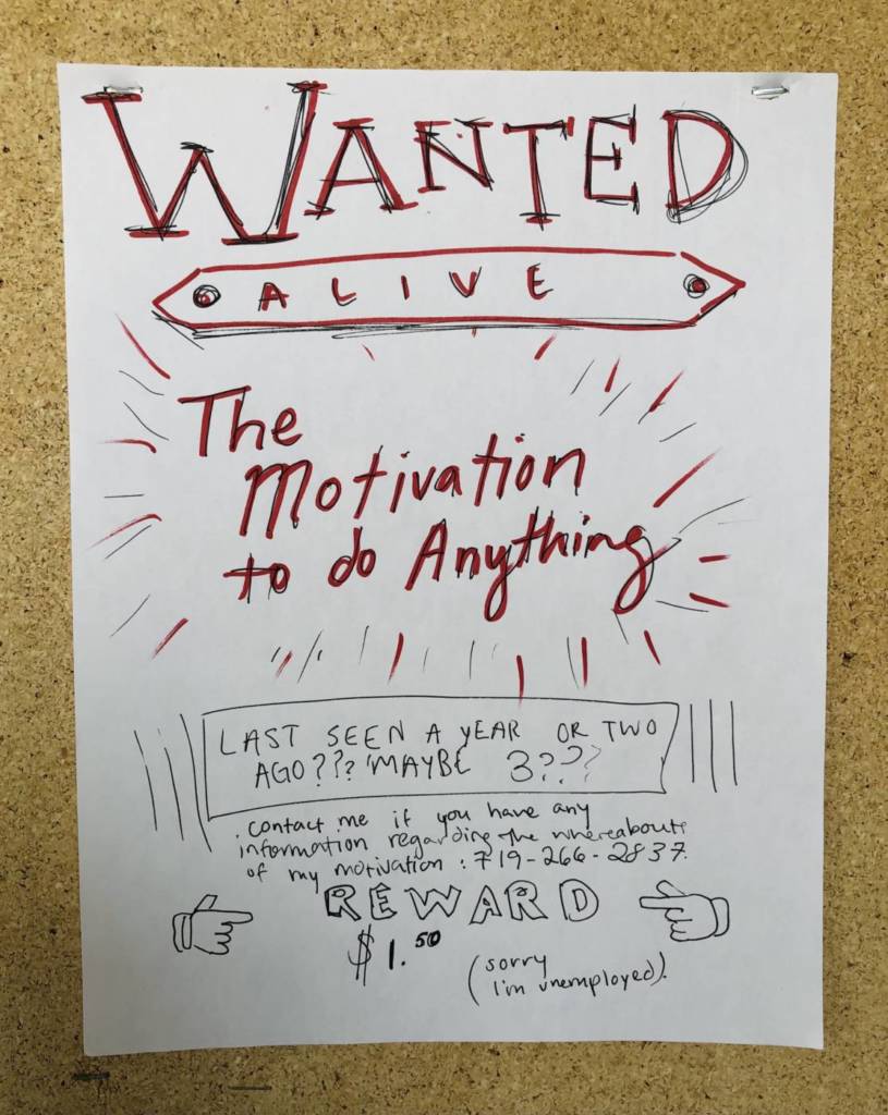
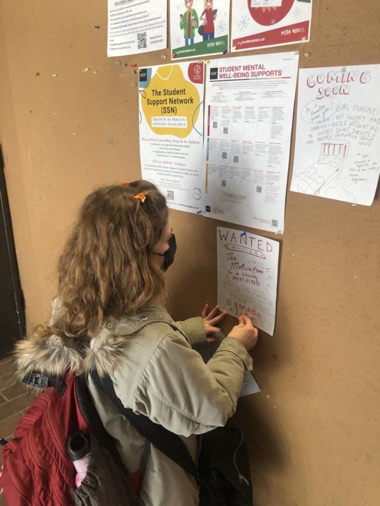
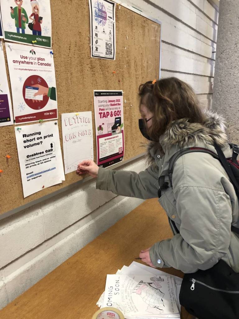
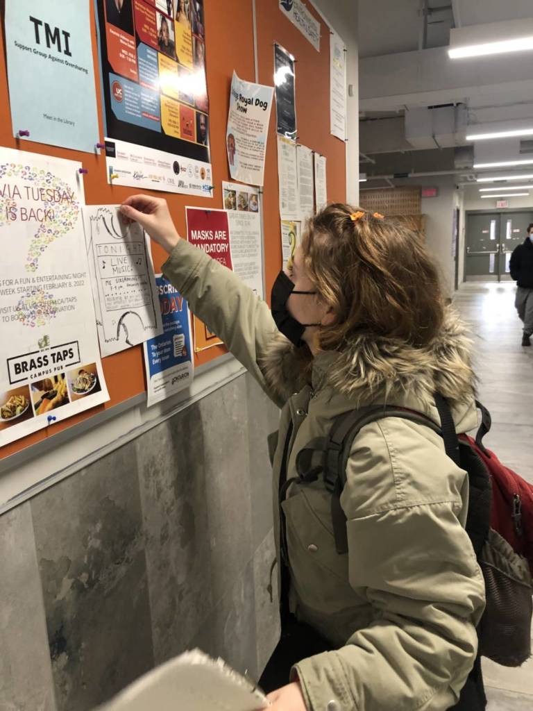
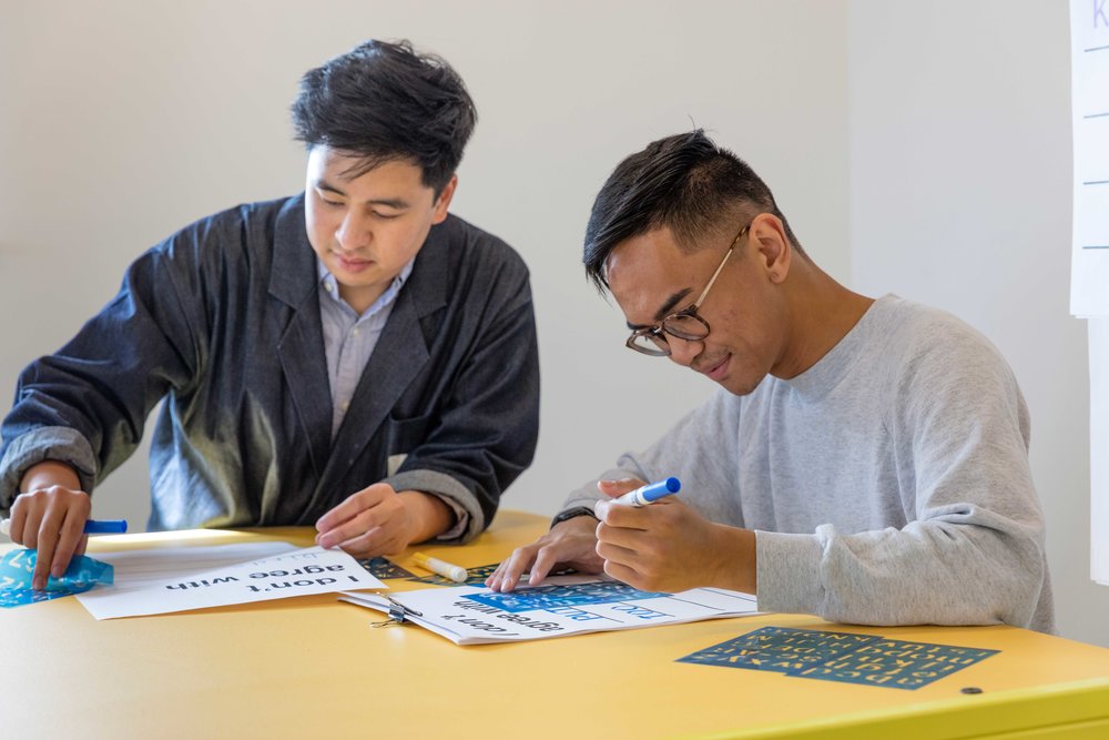
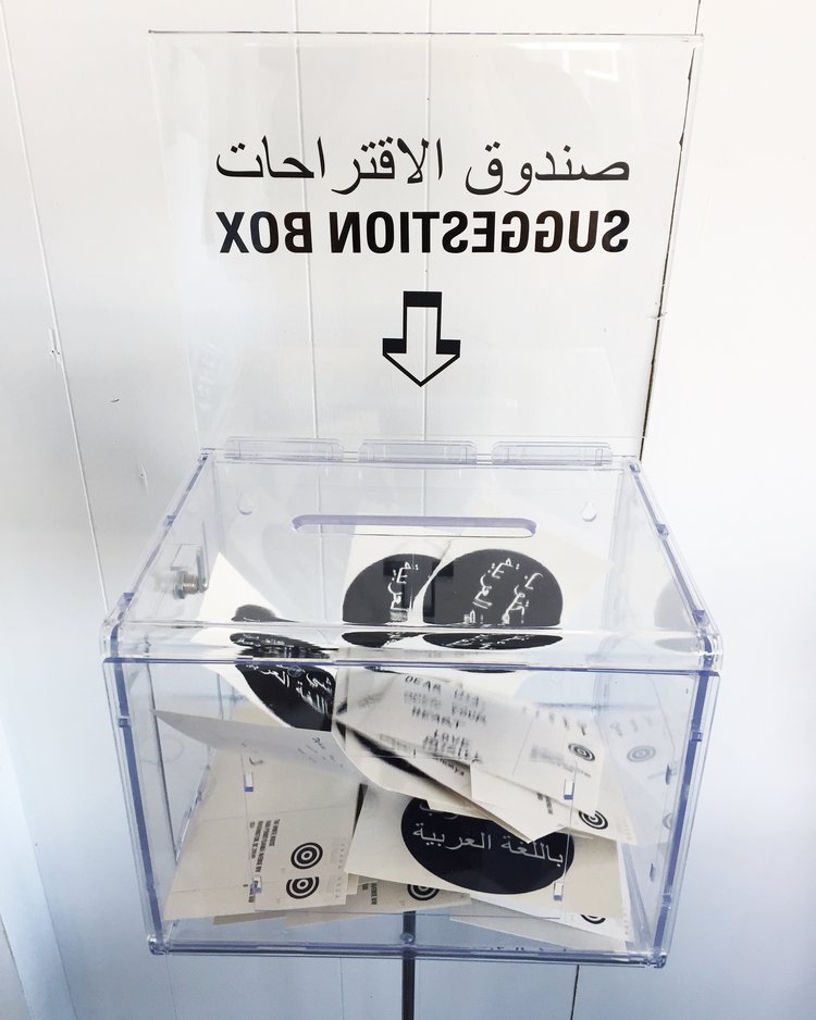
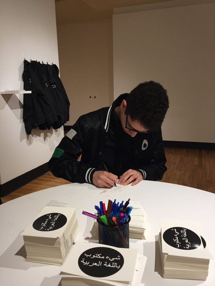
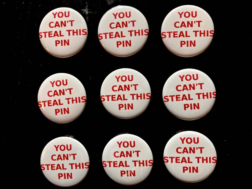
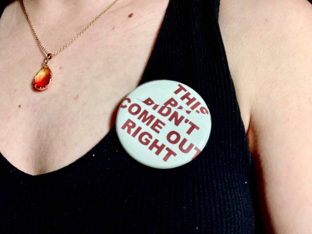
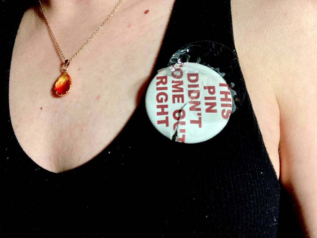
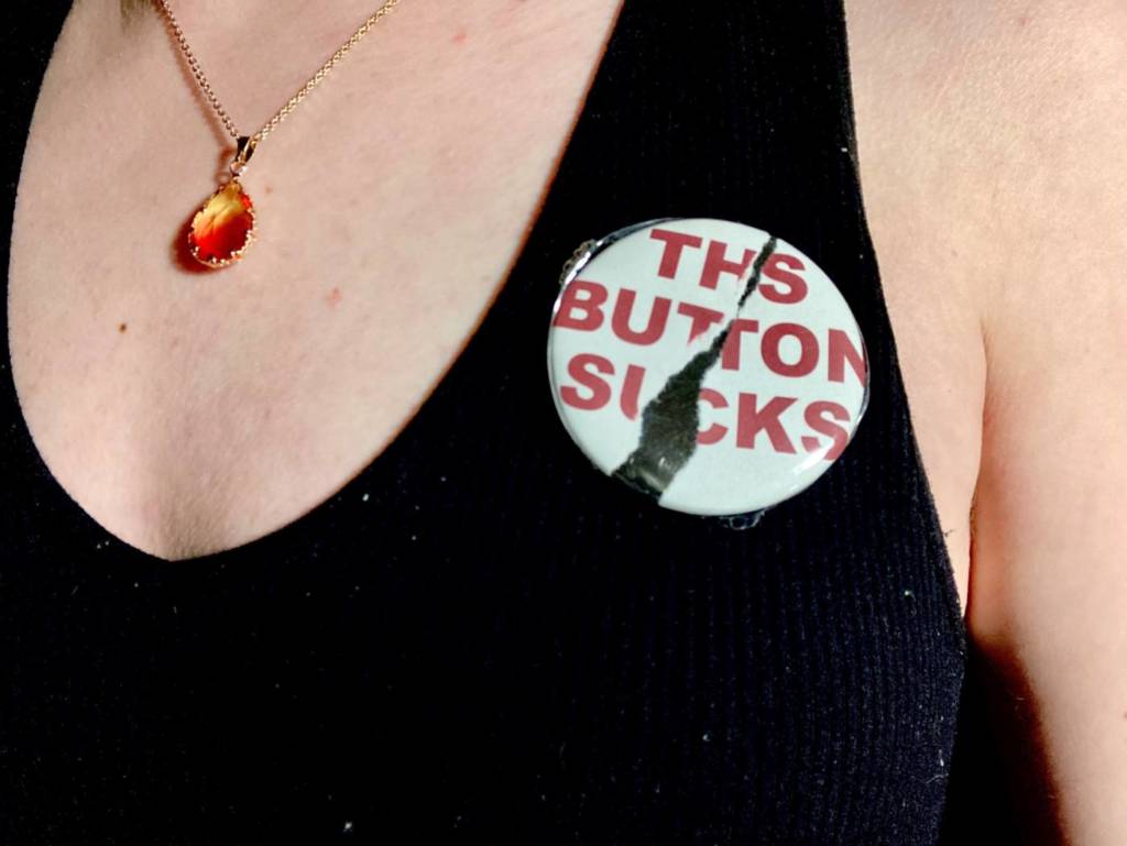
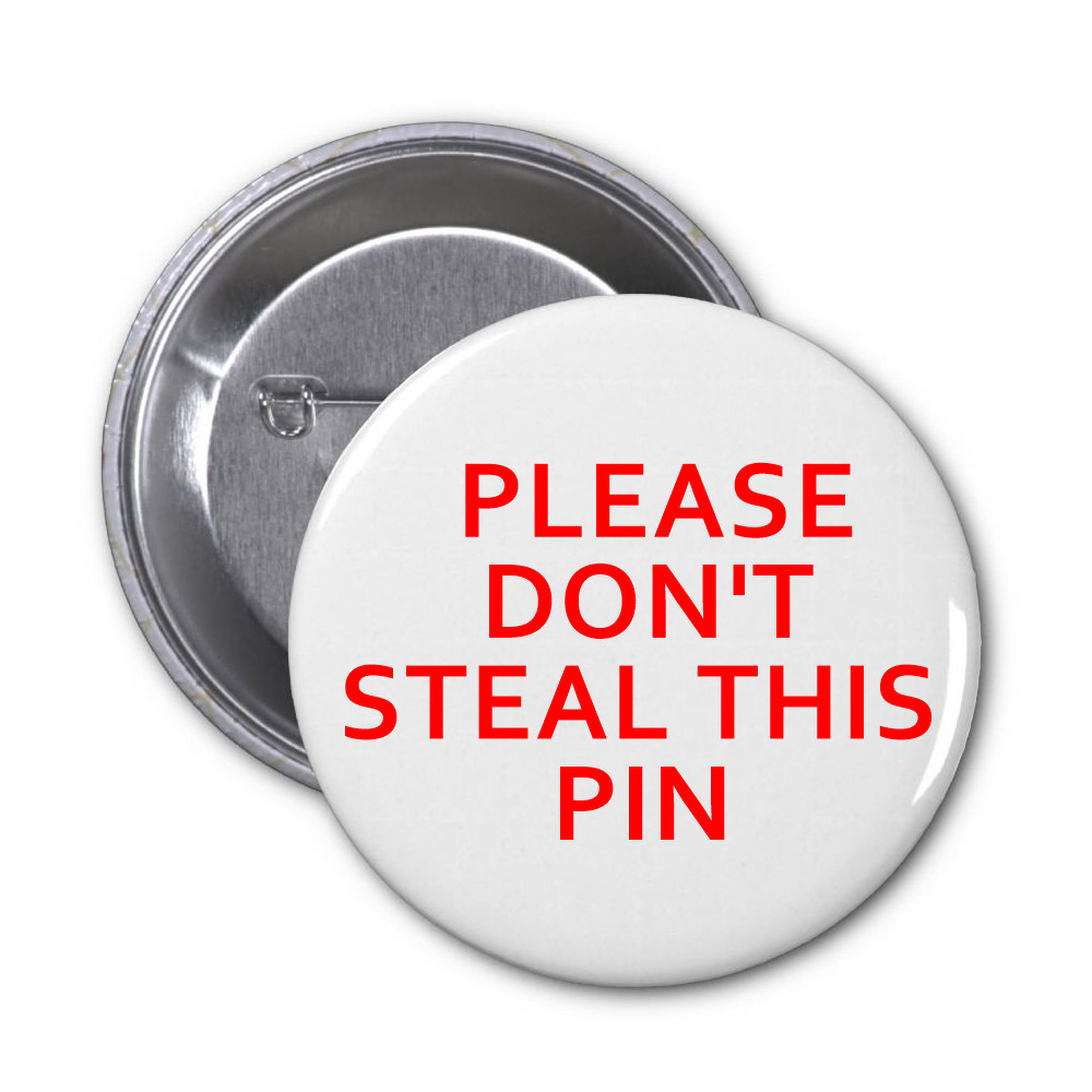
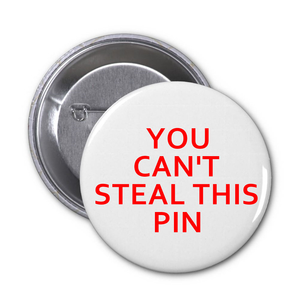
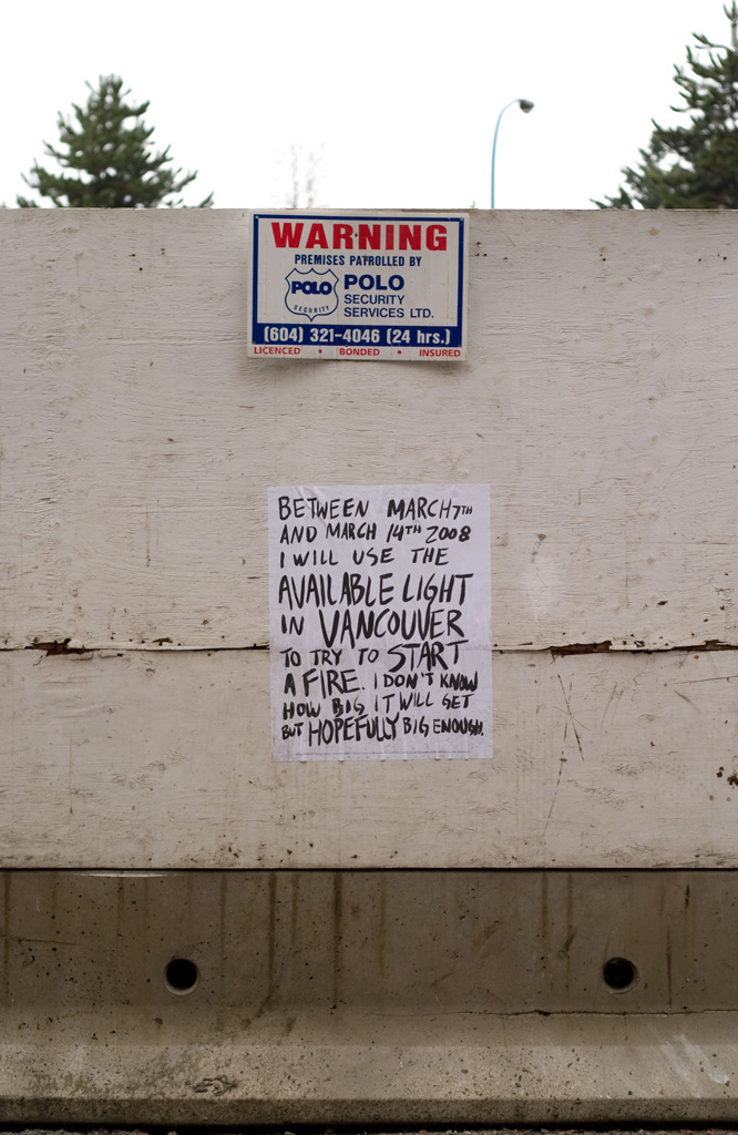
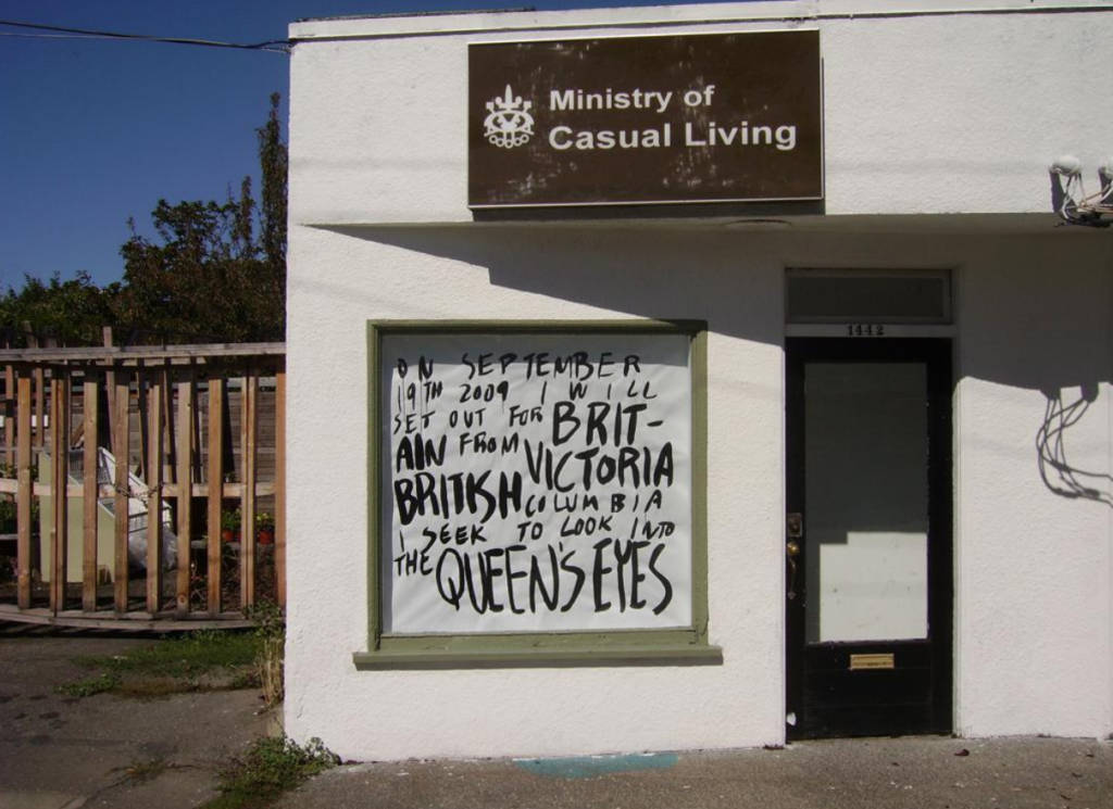
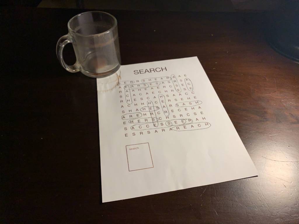
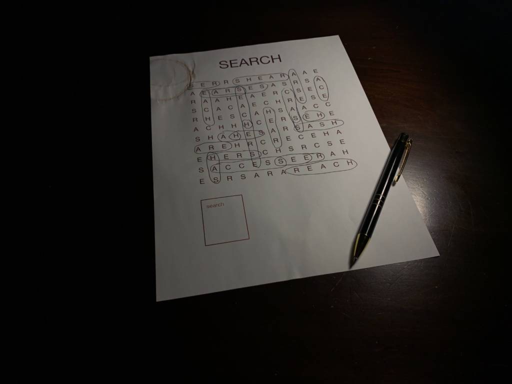
From the examples of multiples shown in classes, I really liked Please Don’t Take This 1000 Yen by Jon Sasaki. I was intrigued by the idea of leaving something out in public where it is so easy to steal without consequences. No one stole his money, so I tried to think of something even easier to “steal” such as information.
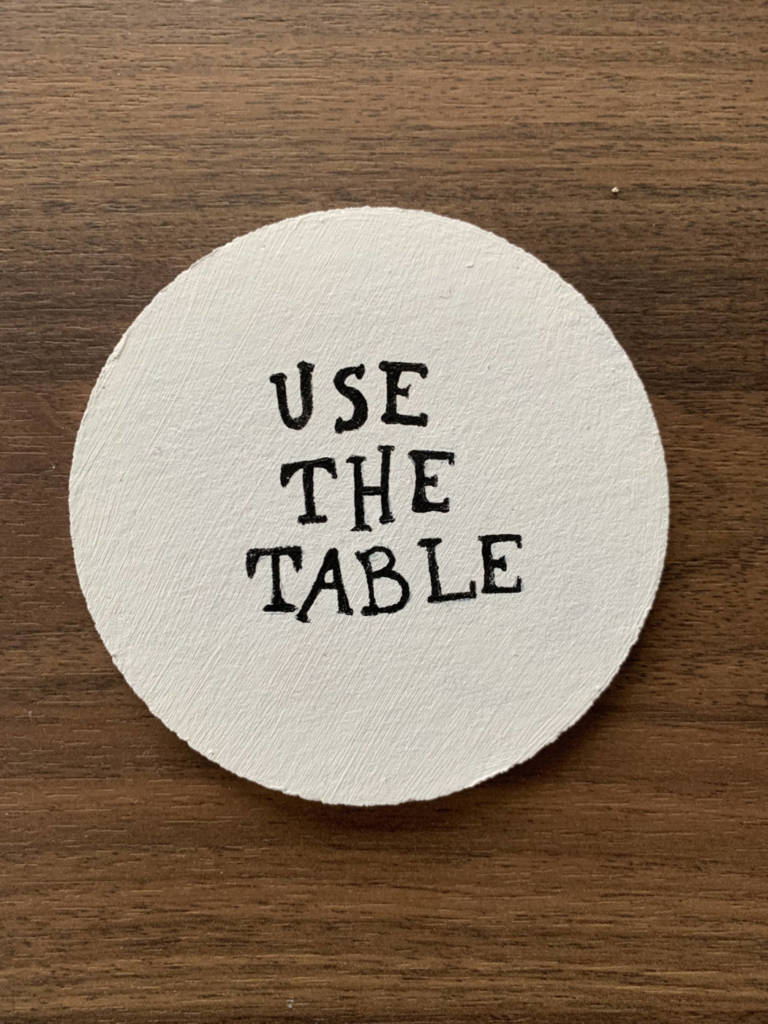
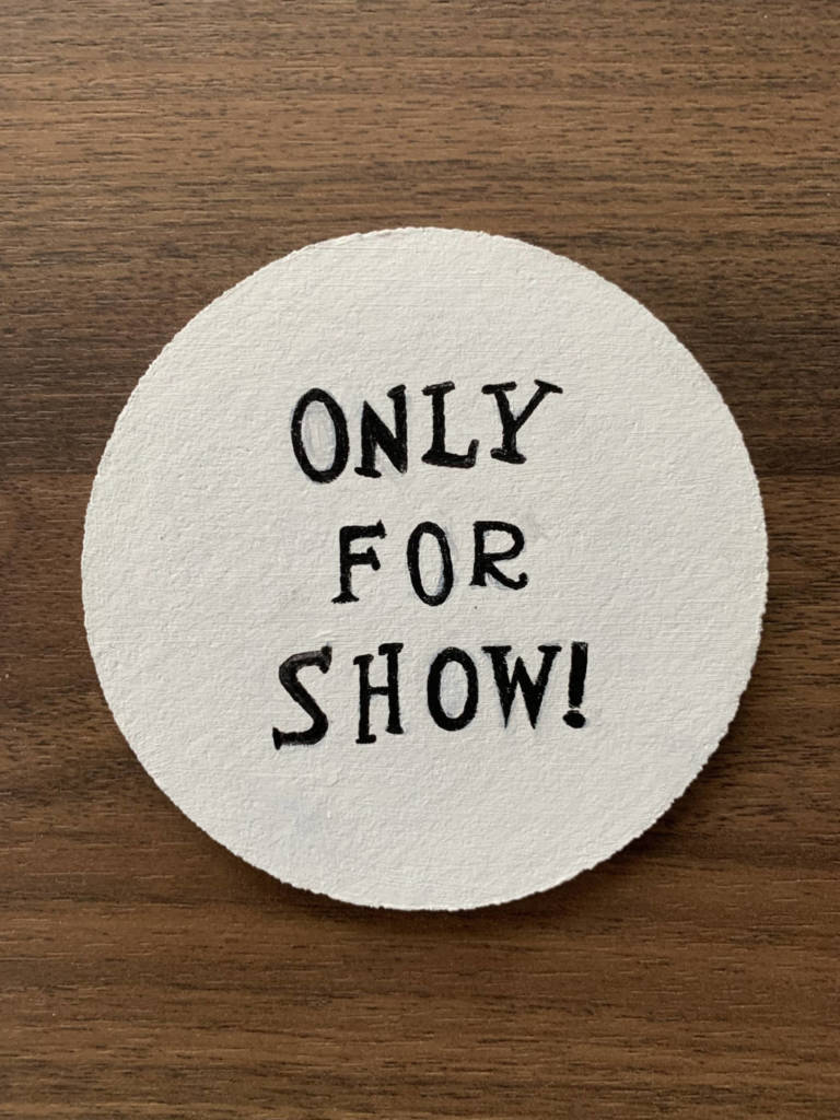
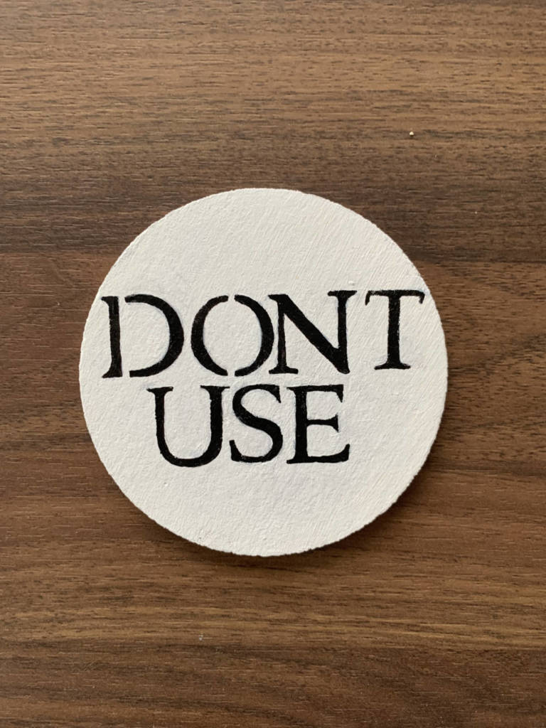
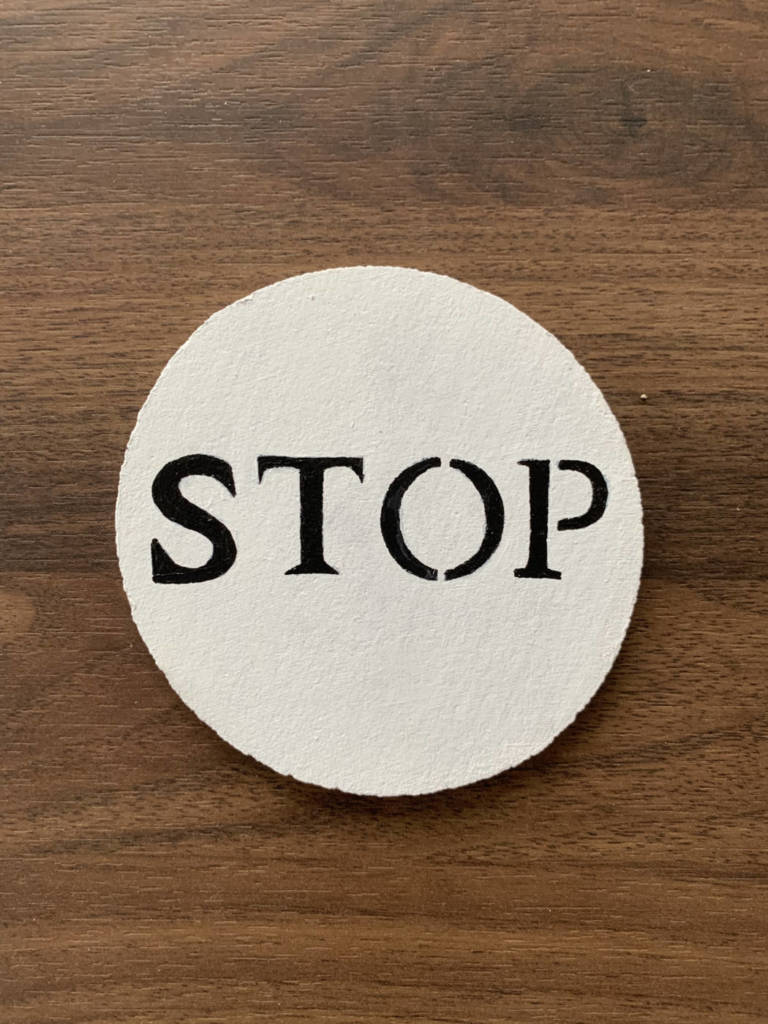
Classified documents
- Folders/papers that say classified on them
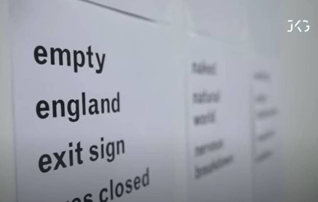
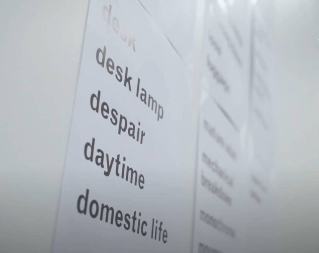
- Lots of random text inside (text that is hard to read: unreadable font/colour/ different language)
- If you have found this message, contact …
- If you are reading this, contact …
- Next page “why are you reading this”
- font gets smaller every page
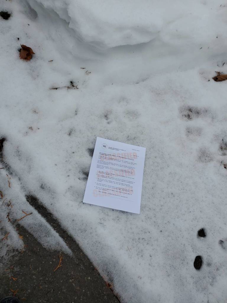
For this idea, I was thinking of movie scenes where someone leaves top secret information for their partner on a public bench, and the person who is supposed to receive it always does. I wondered what would happen if someone else picked it up instead.
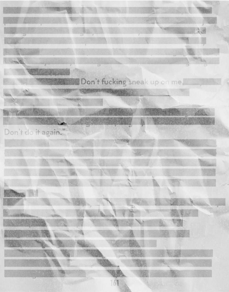
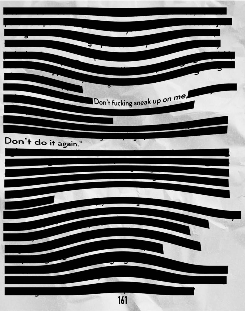
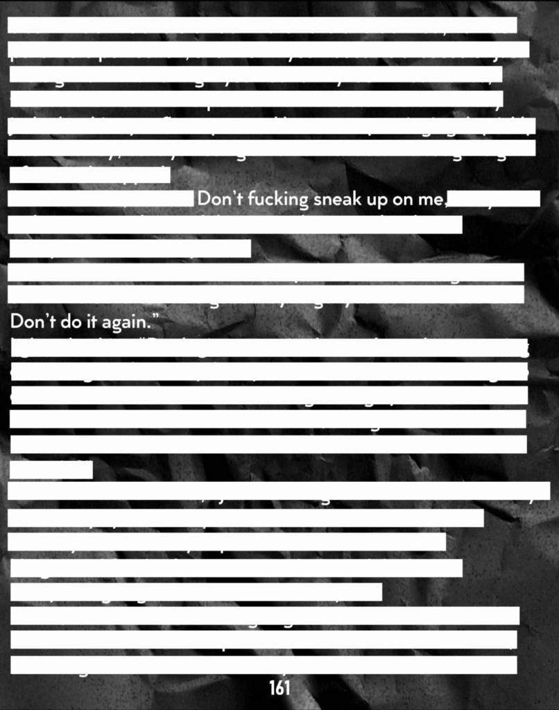
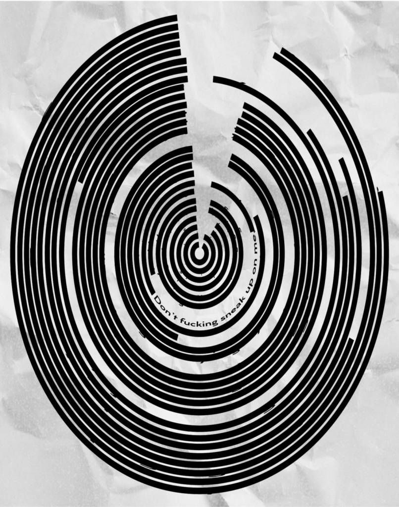
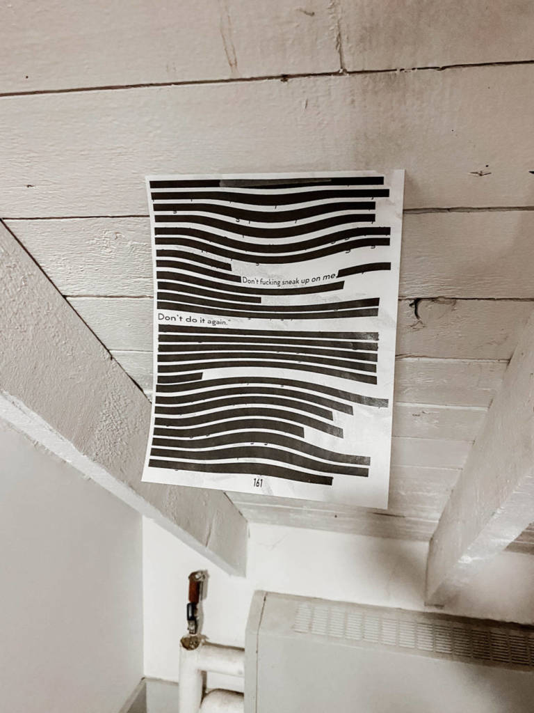
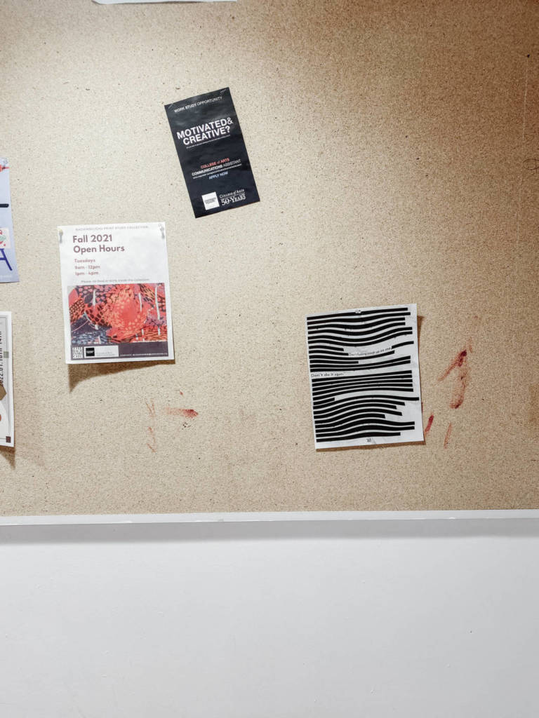
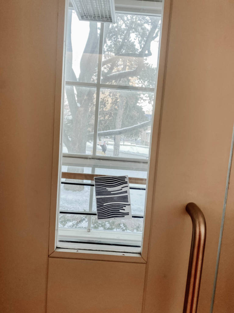
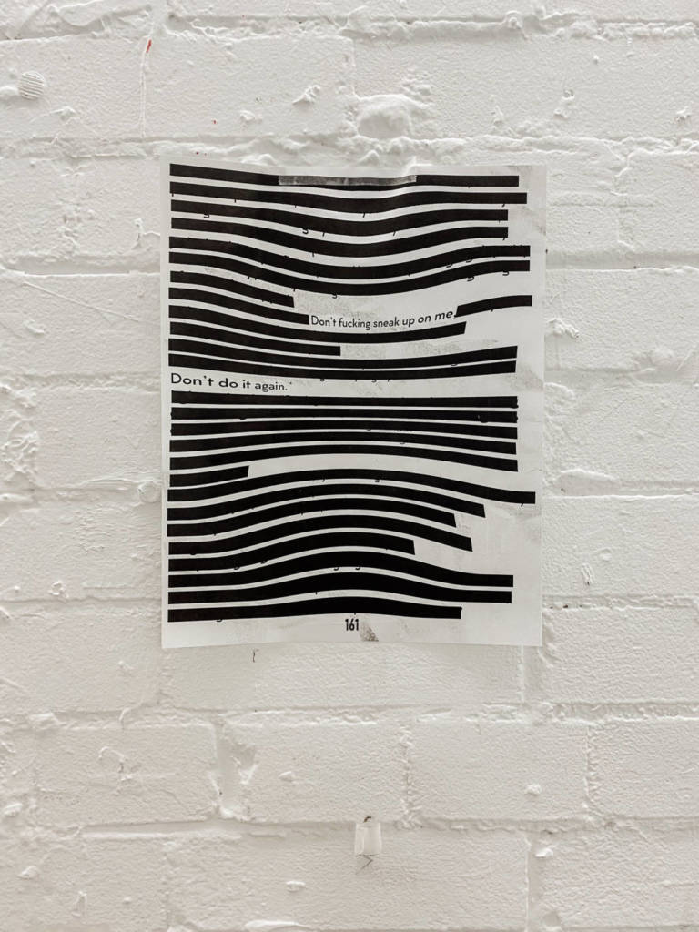
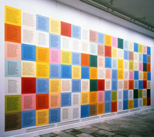
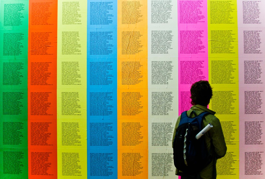
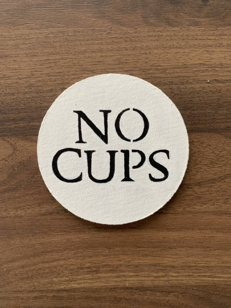
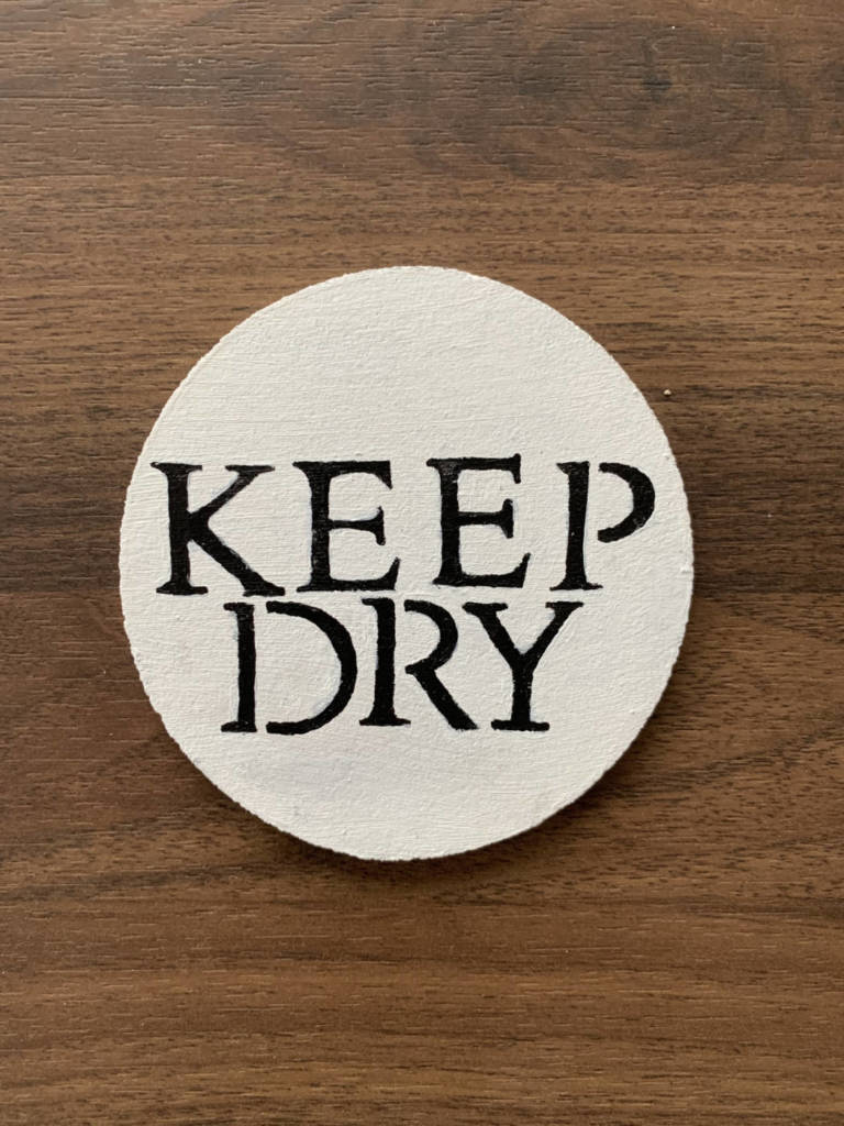
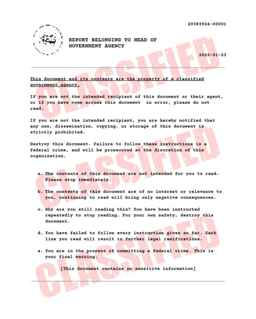
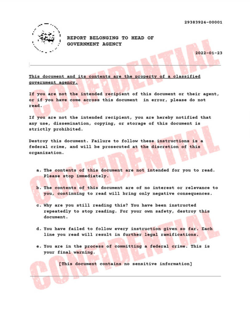
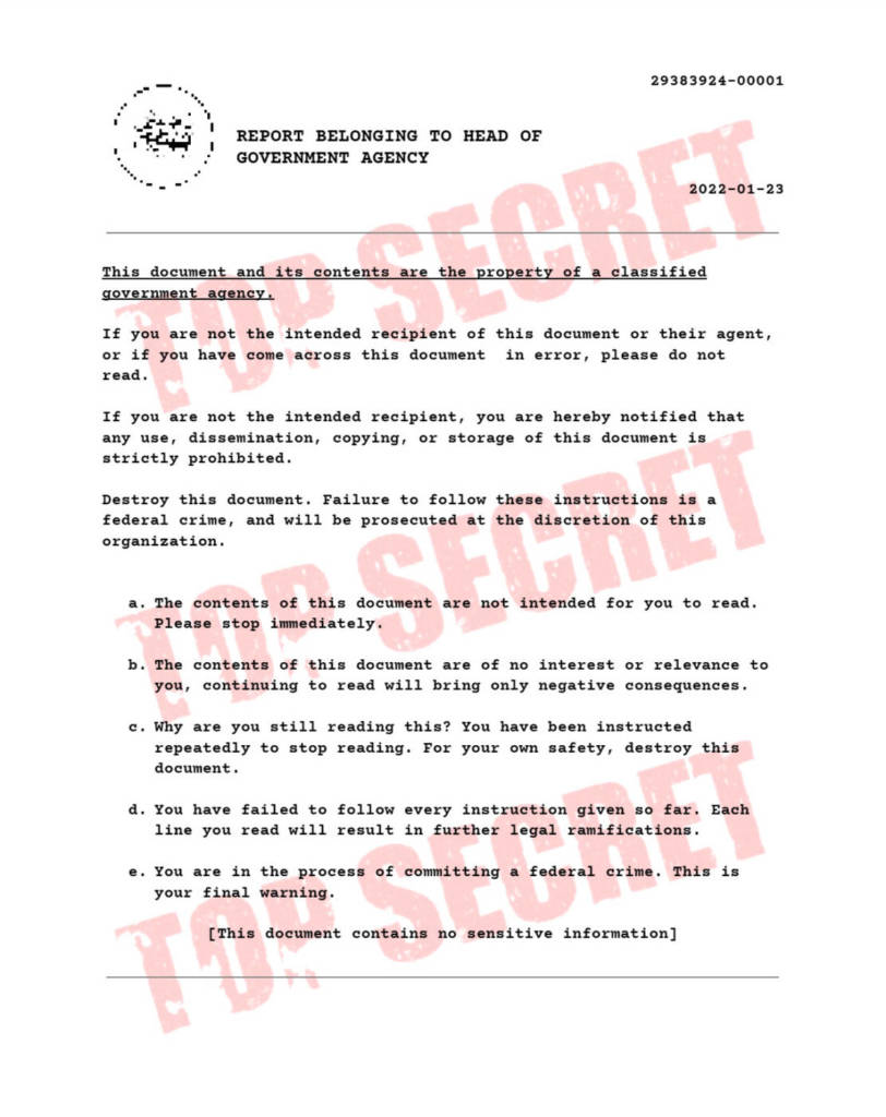
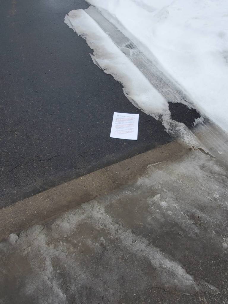
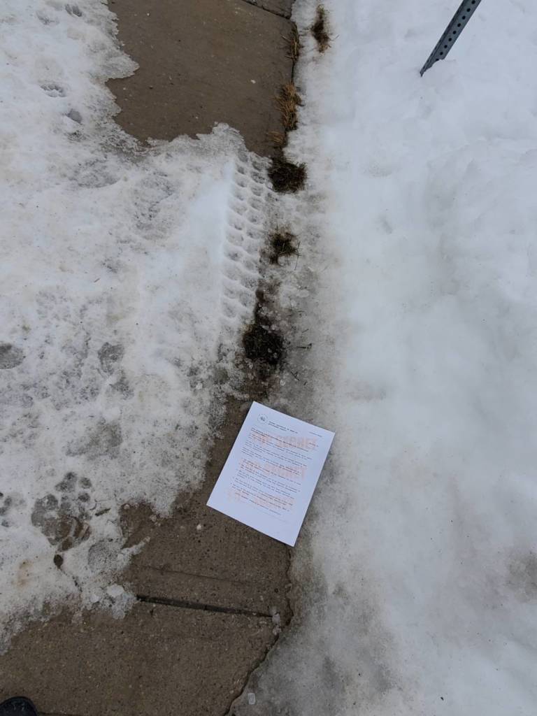
I created a page that looks official, but it is also very vague and doesn’t name any actual agencies. I decided to fill the page with text that prompts the reader to stop reading. The idea is they will keep reading until they reach the bottom, where it acknowledges that the document is not real. I attempted to keep the text short enough that someone wouldn’t lose interest or catch on to what the document really was, but also long enough for the reader to feel a little mislead once they reached the end.
The text on the documents was initially inspired by the text at the bottom of an email I received:
“CONFIDENTIALITY NOTICE: The contents of this email message and any attachments are intended solely for the addressee(s) and may contain confidential and/or privileged information and may be legally protected from disclosure. If you are not the intended recipient of this message or their agent, or if this message has been addressed to you in error, please immediately alert the sender by reply email and then delete this message and any attachments. If you are not the intended recipient, you are hereby notified that any use, dissemination, copying, or storage of this message or its attachments is strictly prohibited”
The way I designed the page was inspired by documents similar to these, as well as the folders used in movies that say “Classified”, etc. with a very large, obvious font. I also used various images of actual declassified documents for reference. I wrote with the courier font that is commonly seen in these documents.
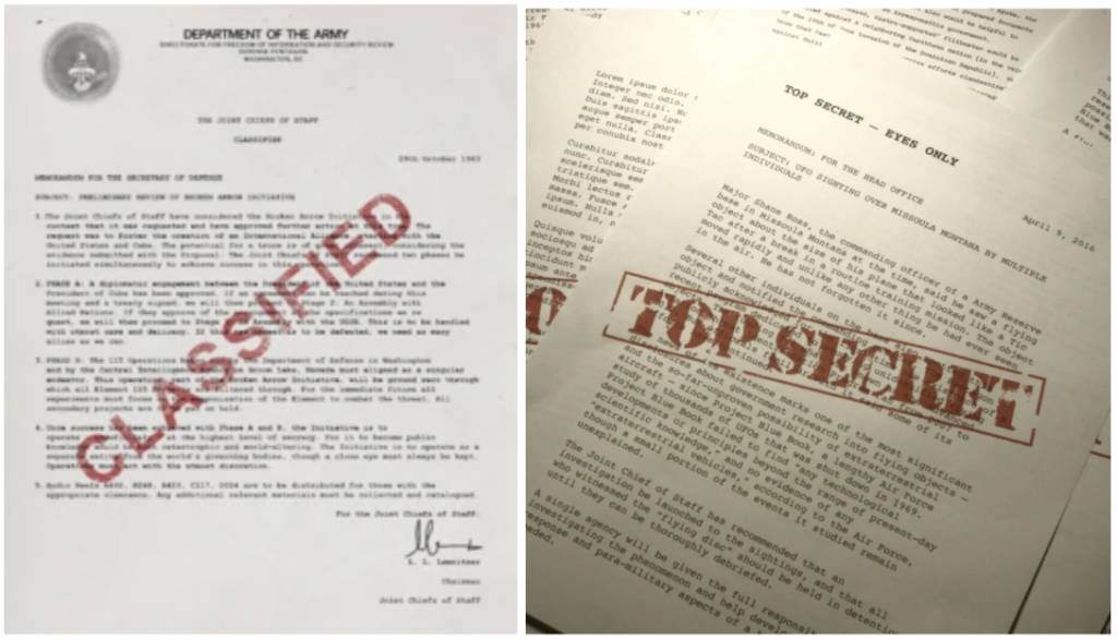
I also experimented with different watermarks: Classified, Top Secret, and Confidential. I thought it was interesting how “classified and “confidential” sounded more believable than “top secret”, which sounds more like it’s from a kids movie, and if people would react differently to these documents in the real world.
I initially wanted to leave contact information within the text at the bottom of the page to see how many people would read that far, but decided against it.
This is the text written in the document:
“This document and its contents are the property of a classified government agency.
If you are not the intended recipient of this document or their agent, or if you have come across this document in error, please do not read.
If you are not the intended recipient, you are hereby notified that any use, dissemination, copying, or storage of this document is strictly prohibited.
Destroy this document. Failure to follow these instructions is a federal crime, and will be prosecuted at the discretion of this organization.
- The contents of this document are not intended for you to read. Please stop immediately.
- The contents of this document are of no interest or relevance to you, continuing to read will bring only negative consequences.
- Why are you still reading this? You have been instructed repeatedly to stop reading. For your own safety, destroy this document.
- You have failed to follow every instruction given so far. Each line you read will result in further legal ramifications.
- You are in the process of committing a federal crime. This is your final warning.
[This document contains no sensitive information]”
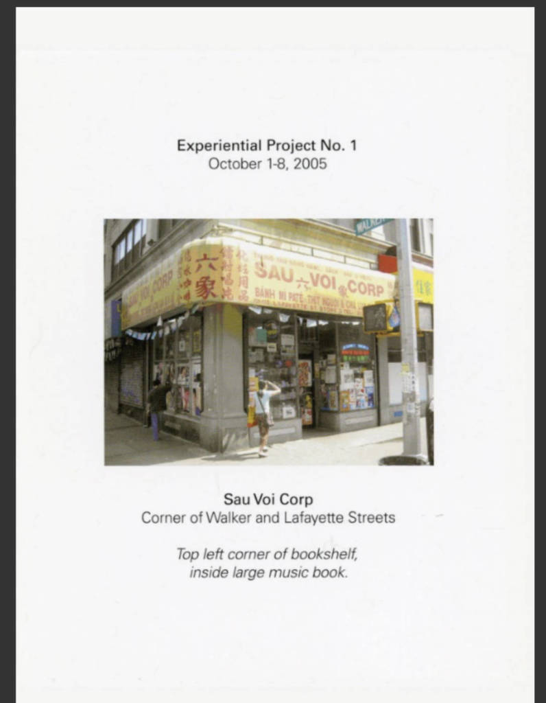
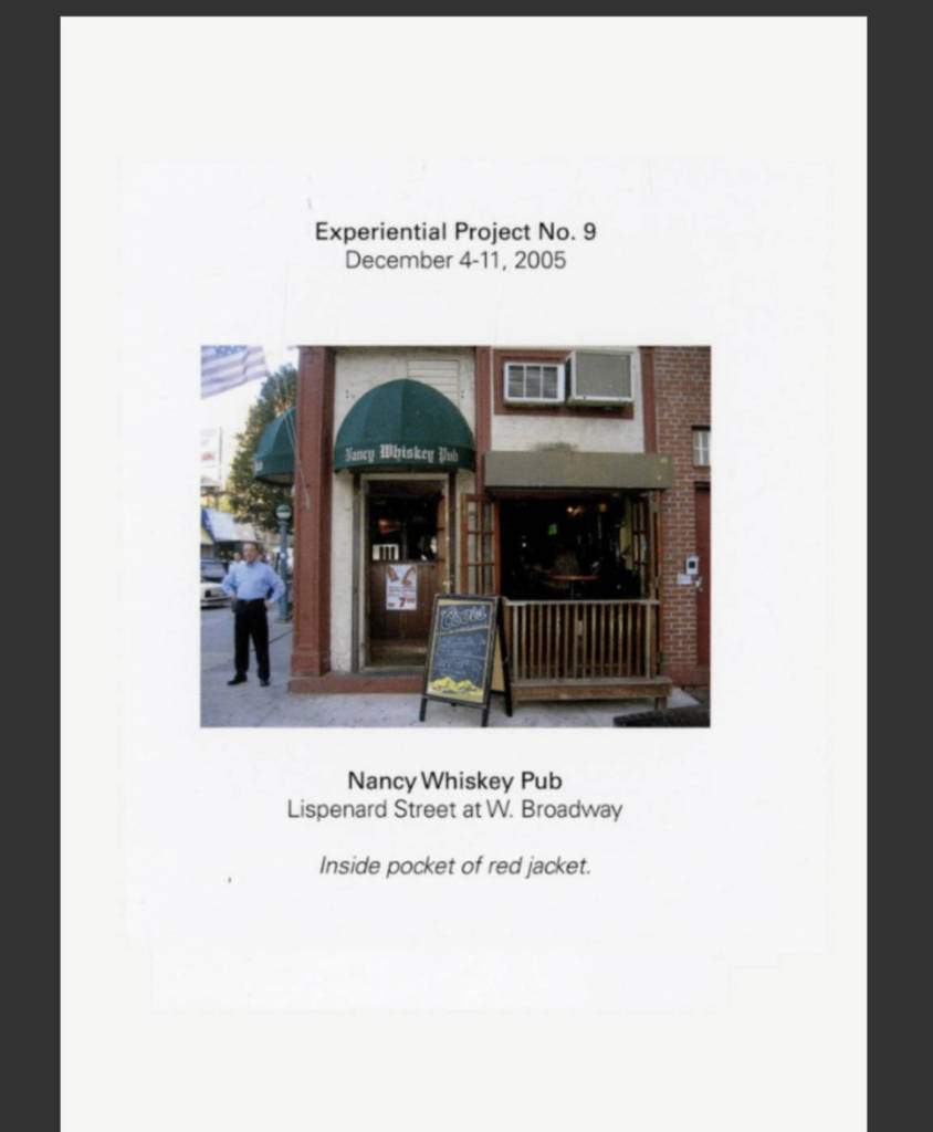
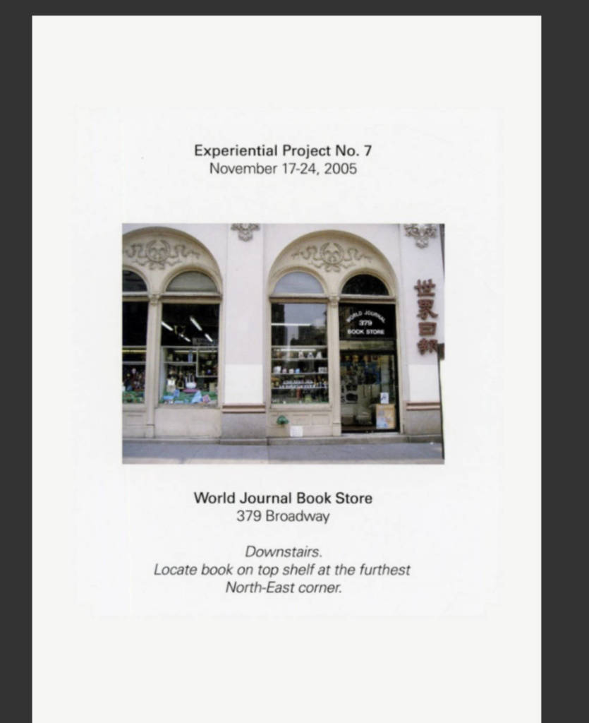
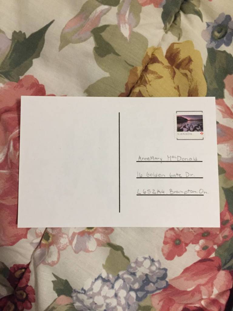
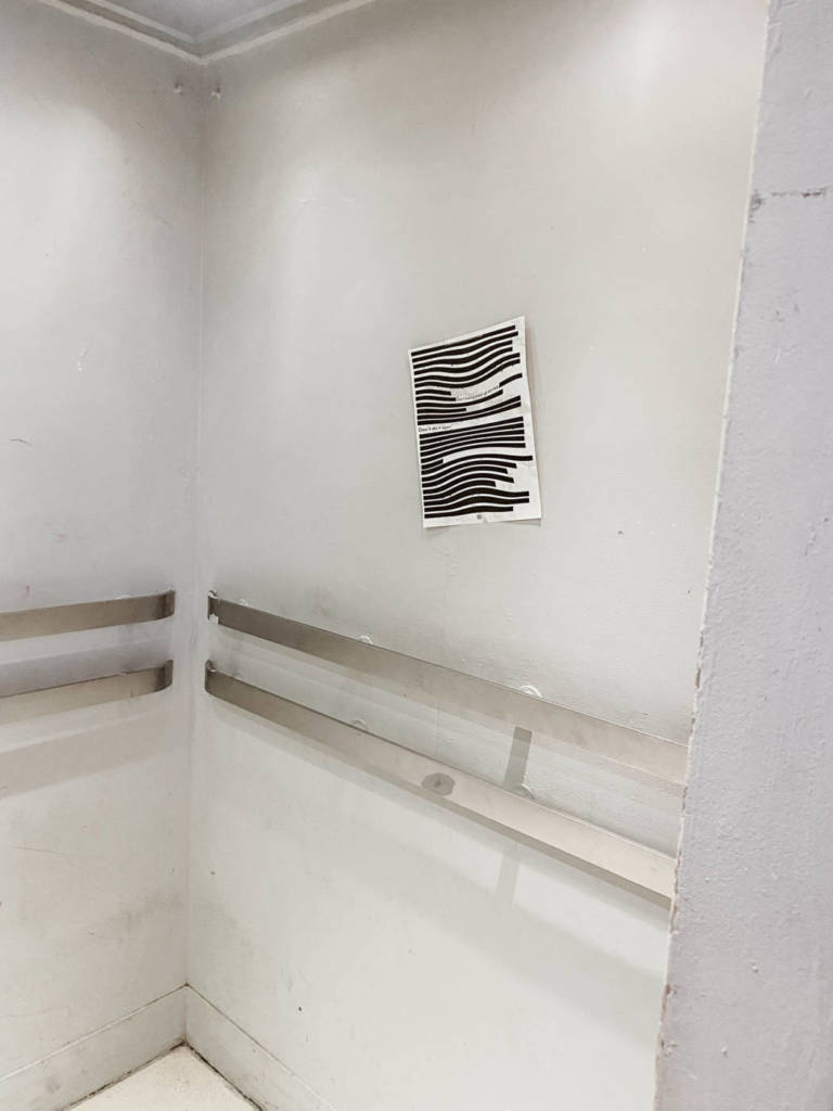
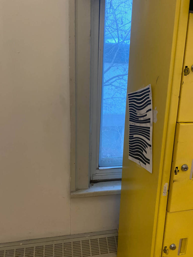
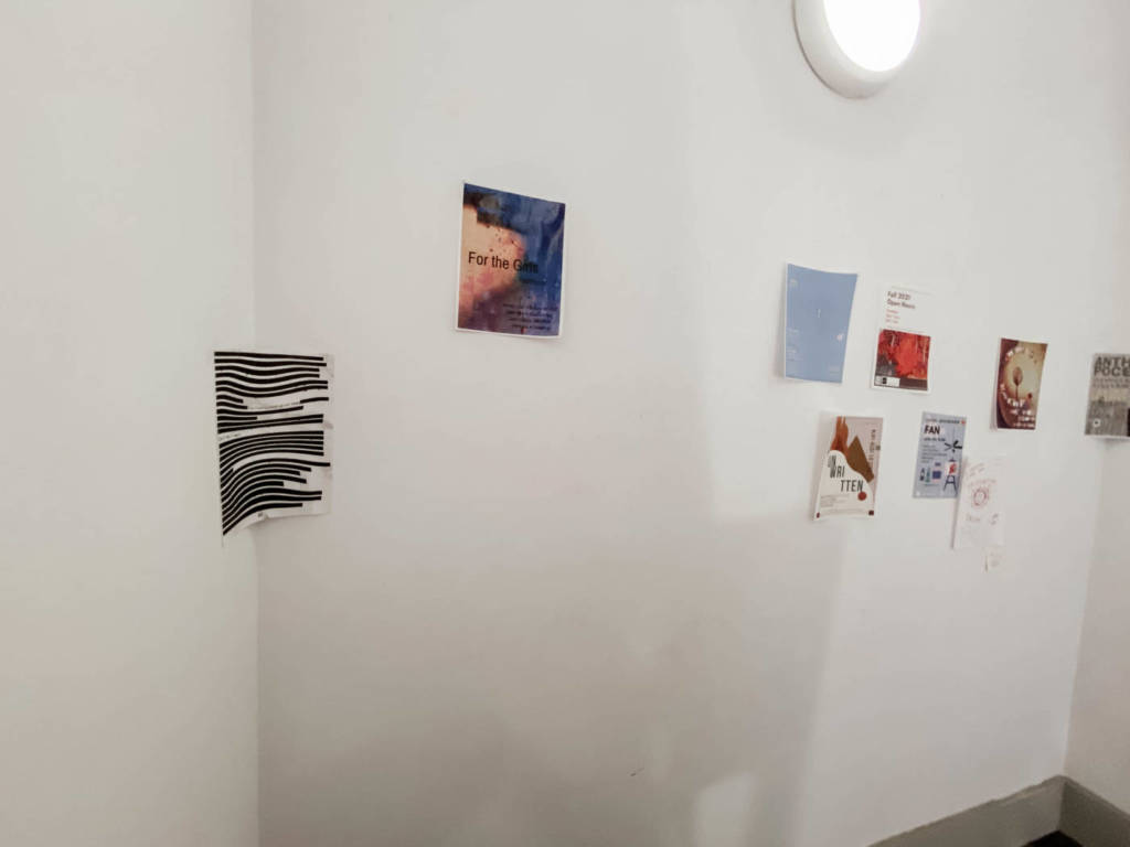
I left the pages in various public places:
Other ideas…
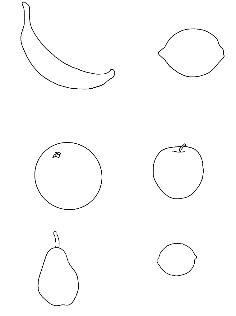
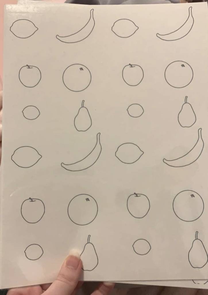
Rorschach tests
- But backwards
- I offer text of lots of peoples responses, and people have to think of the image.
- matching? different cards?
I thought it would be interesting to see what people thought of when doing Rorschach inkblot tests backwards and if they would still see the same things. When I did research on these, there weren’t as many official tests as I had originally thought there would be. There were 4-5 images and all of these had very similar answers from people.
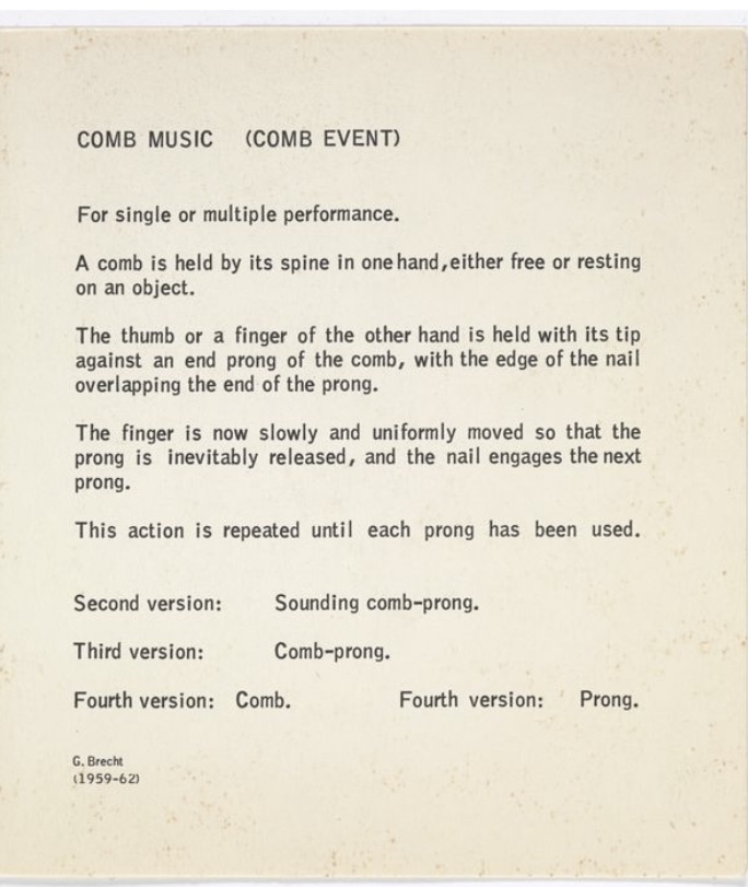
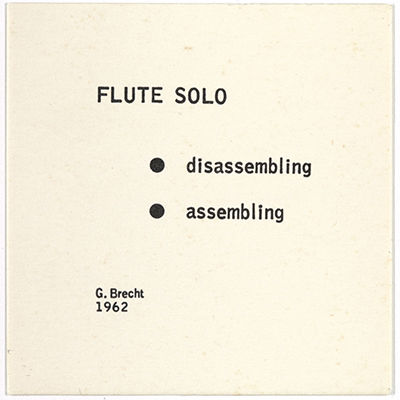
Yoko Ono
Grapefruit
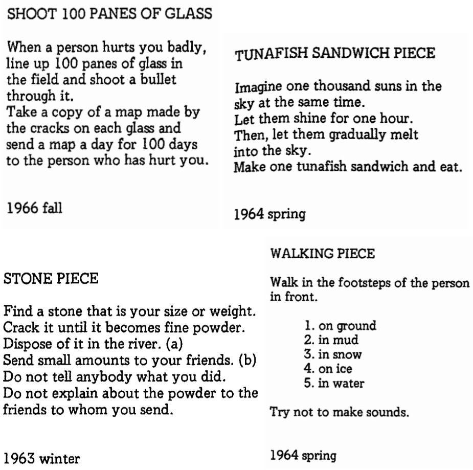
In her book Grapefruit, Yoko Ono provides her audience with seemingly random instructions, ranging from vague commands to absurdly specific directions. It is mainly presented as a text based work in a book, but Ono has also offered a performance video of her reading through the book.
I loved how unpredictable every line was. Each instruction contains something different, and makes the audience anticipate what’s coming. The instructions go from simple to almost impossible, becoming conceptual in some ways, yet staying engaging the whole time.
I particularly found Tuna Fish Sandwich very amusing, as the line it ends on is absurd and sudden, suddenly changing topics and switching the entire mood of the passage.
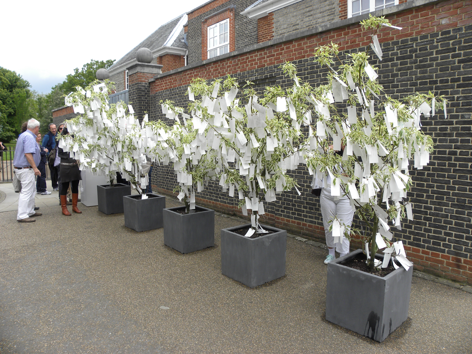
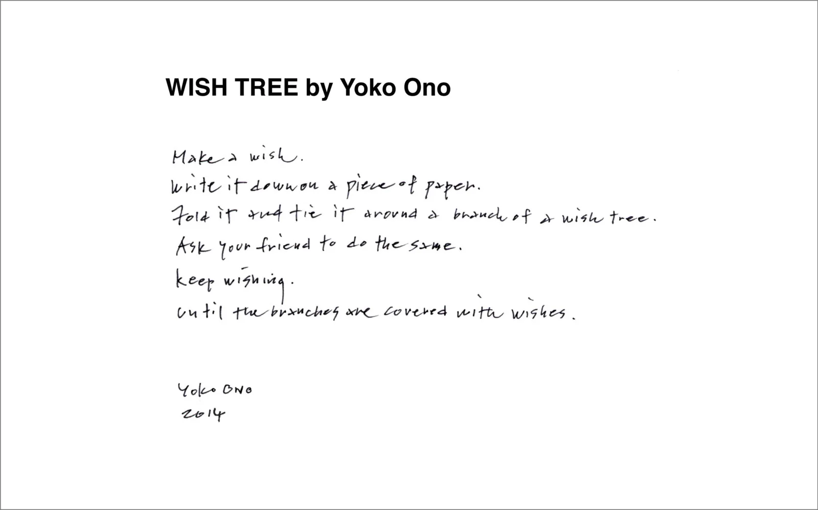
Wish Tree
Wish Tree is a collection of written wishes provided by the public displayed hanging from a tree. Ono shares a related backstory to this, where as a child in Japan, she would write her wishes on a piece of paper and tie it onto the trees of the temple’s courtyard, because the wish knots people would tie on the trees would look like flowers. Yoko Ono has ensured participants that she does not read any of the wishes. The tree exhibits more permanence than a wishing well, as people’s wishes are written down, and, although they are not read by anyone once they are tied onto the tree, they still remain in an easily accessible state.