TATTOO PARTY


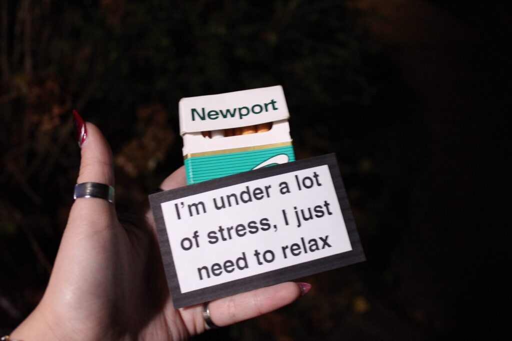
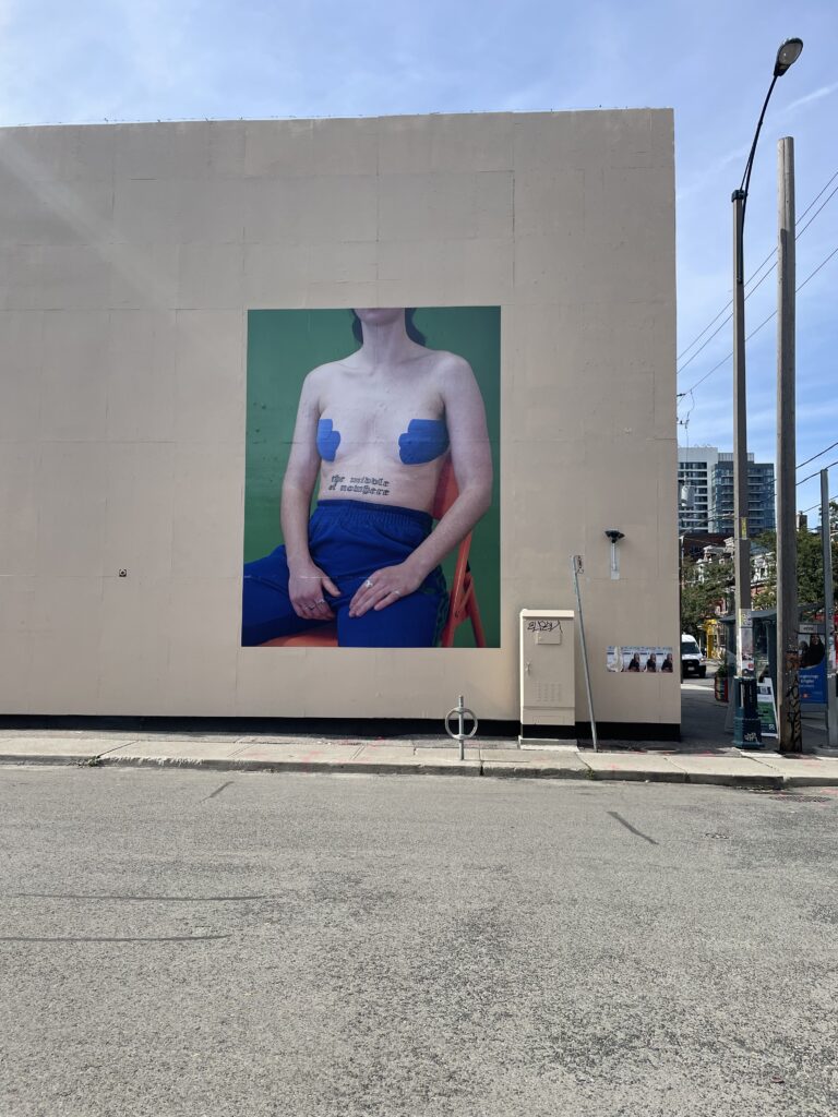
Tattoos are symbols of identity but for decades, Western tattoo culture has borrowed Chinese characters without understanding their history or their true meanings. I created four different tattoo designs of Chinese insults using the font that is typically used for these “cool” Chinese tattoos to expose the irony of aestheticizing a language one does not understand. Through this series, I challenge the casual exotification of Chinese script, where words meant to carry wisdom, strength, or spirituality are often mistranslated or stripped of context. Not to mention people who mistakenly get Chinese characters that mean something completely different from what they think. The people who wear these symbols believe they embody something profound, yet they may unknowingly brand themselves with nonsense or ridicule. By reclaiming the visual language of tattoo are and embedding it with unexpected meaning, I want the wearer or viewer to think about what it means to wear a language you don’t speak. I wanted to turn this form of cultural appropriation into a parody. The process of these tattoos only allows the wearer to learn what the tattoo they have chosen really means. This project is not just about humour or shock factor when you realize what you are wearing, but a reflection on cultural literacy, respect, and the permanence of choices made in ignorance.
Translations:
傻笨蛋 shǎ bèn dàn – “stupid idiot”
狗屁 gǒu pì – “bullshit”
混蛋 hún dàn – “asshole/scumbag”
小白脸 xiǎo bái liǎn – “little white face” slang for calling someone naive
PARENT VIDEO ART
This video art piece examines the intersection of cultural identity, humor, and intergenerational relationships through the reactions of my friend’s mom. She watches a curated compilation of humorous videos that exaggerate stereotypical portrayals of Asian parents—depictions of strictness, high expectations, and unconventional expressions of love. But rather than presenting these clips in full, the video is edited so that their context is fragmented, leaving only her reactions, spontaneous commentary, and the slight shift of facial expressions as the primary focus. I specifically chose to request this specific friend for this piece because her mom is very different from the stereotypical characteristics and behaviours of older generations. By obscuring the full scope of what she is reacting to, the piece shifts attention away from the stereotypes themselves and toward her personal experience—how she engages with, resists, or embraces these narratives. The interaction between her and her daughter becomes central, revealing their history, inside jokes, and moments of dissonance. Laughter and knowing glances give way to unexpected reflections, exposing the ways cultural expectations shape familial bonds. This work invites viewers to consider how media representations influence personal identity and family dynamics. It questions how humor can both reinforce and challenge stereotypes, and how meaning shifts when context is removed. Ultimately, it is a meditation on the evolving relationship between parent and child—one shaped by cultural memory, generational gaps, and the intimacy of shared laughter.
BRAINSTORMING:
- my parent’s journey of having me
- immigrated to Canada to evade the one child law
- doctor said the chances of my mom having another child are extremely low, close to zero
- my mom got pregnant with me
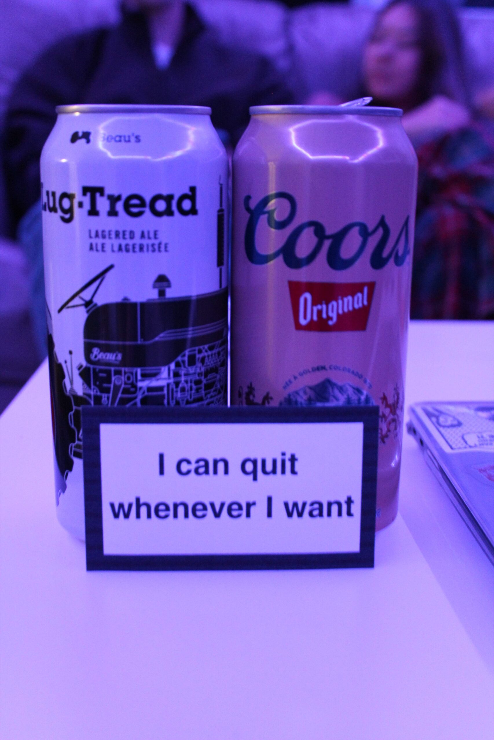
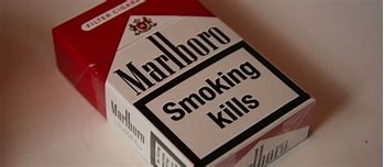
- my dad was a heavy smoker but made a promise to quit smoking if I was a girl
- spoiler alert I am a girl
- stereotypical asian parents
- found footage from the internet
- tv shows, movies, social media
- My Golden Kids — episode 169
- (talking about his mother) “I think she doesn’t like me”
- start as a compilation of “stereotypical asian parents” relatable humorous videos
- ends with the golden kids clips — the sad outcome of these stereotypes
INTERNET VIDEO ART
“Rage Quit”
Amelia Matthews, Kathryn Zhang
“Crashing out” or raging to the extreme over some pixels on a screen is unfortunately a very prominent aspect of the culture and community of video games. Amelia and I explored the internet for video clips of these extreme negative reactions of Twitch and Youtube live streamers playing video games and compiled a handful of chosen clips into one overwhelming and frankly terrifying video. On the surface level, these videos are often seen as hilarious and entertaining, gaining millions of views for this performative violence. Whether or not these raging reactions are genuine or faked, these kinds of violent behaviours are often normalized in the gaming community and written off for being funny and entertaining while ignoring the serious connotations behind their actions. It is even more worrying to know that these live streamers are individuals with a large platform and millions of youth and children are able to watch these live streams and Youtube videos. The younger generations who grow up watching these kinds of content creators are extremely impressionably and will inevitable learn from these people and act in a similar way. This video emphasizes the absurdity of these behaviours without the full context of the video games they’re playing and honestly begins to seem like content that should be age-restricted, but all of this found internet content is not age-restricted because of this common dismissal of violent behaviour.
BRAINSTORMING:
- POV videos (tiktok)
- gamer/streamer crashouts
- “pov: you’re a girl”
https://vm.tiktok.com/ZMkq799rC
https://vm.tiktok.com/ZMkqWKCsg
https://vm.tiktok.com/ZMkq7U37t/
https://vm.tiktok.com/ZMkq79CGk/
https://vm.tiktok.com/ZMk9XwYmy/
https://vm.tiktok.com/ZMkq7QHEU/
https://vm.tiktok.com/ZMkq7XQrn/
“Crashing out” → extreme rage
– explore Youtube and TikTok for “viral” videos of these video game rage moments
– order the clips so they increasingly get worse
– multiple ongoing videos at once, maybe 4? → inspiration from the video art of parents filming their children crying
– max 5 minutes, 2-3 minutes probably enough since the video content is very intense throughout the entire video
BRIDGET MOSER
MY CROPS ARE DYING BUT MY BODY PERSISTS
After watching a couple times, I am still unsure how I feel about this work. Moser’s performance is both incredibly unsettling and comical. The gestures and facial expressions are extremely exaggerated, making the work seem disarming but slowly reveals its deeper intentions. The entire exaggerated performance conveys her physical and emotional exhaustion as a display of the tension between fragility and survival. She is able to blend absurdity with dark humour as she explores themes of resilience and decay.
The title also contrasts the dying crops with the persistence of the human body as a metaphor of the inevitable collapse of the environment and humanity’s stubborn will to survive.
The visuals and audio together provide a sense of isolation between the human body and the natural world, reflecting the dissonance of our current ecological crisis.
Overall, this work serves as a reminder that even as the world crumbles, the body will continue to persist. Moser challenges us to reckon with the paradox of our own resilience. What will we do when the foundation beneath us falls apart? Will we persist? Will we endure? There is a lot to think about in relation to our world’s environmental state and this work.
PIER 2 ART CENTRE, TAIWAN
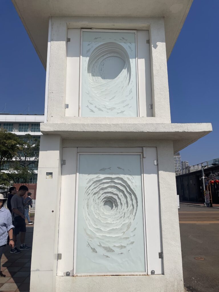
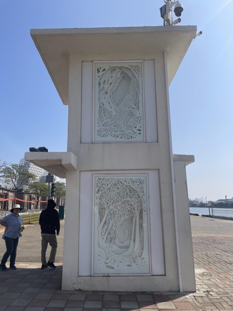
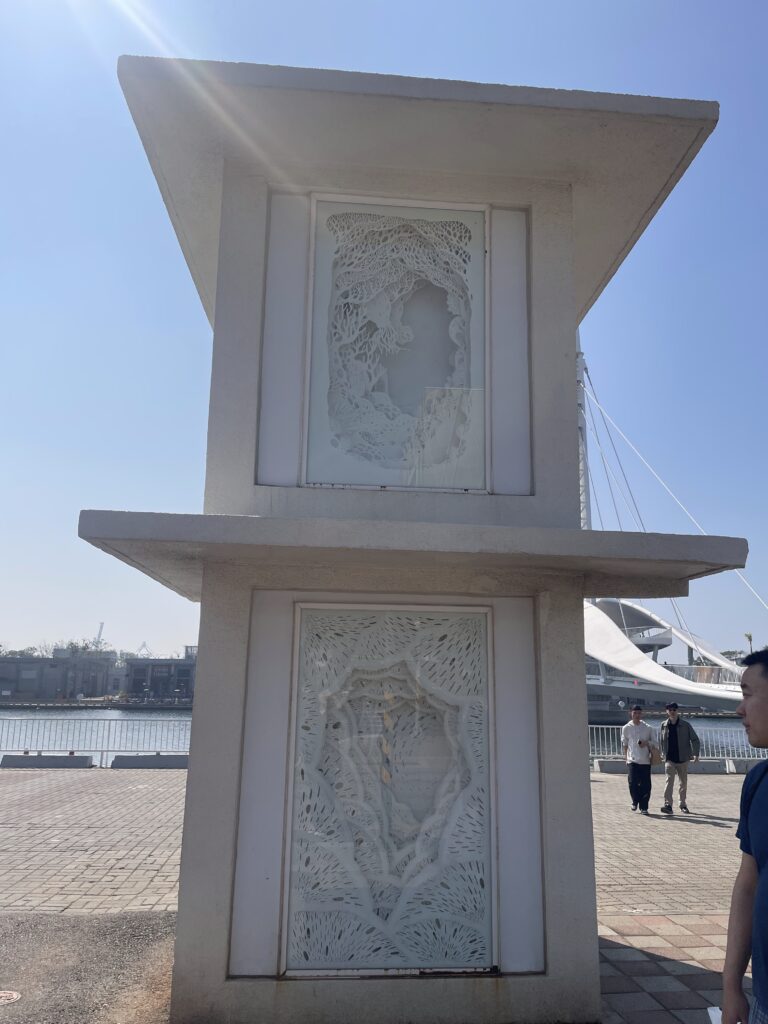
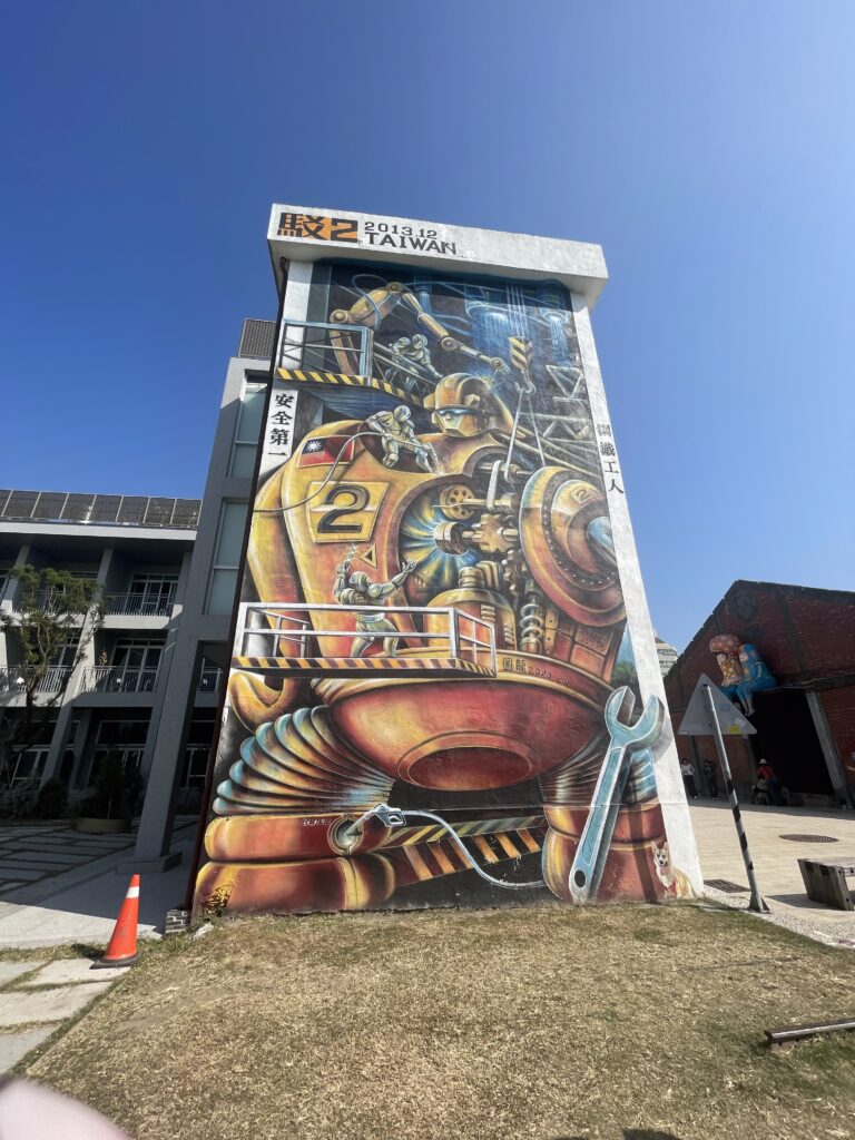
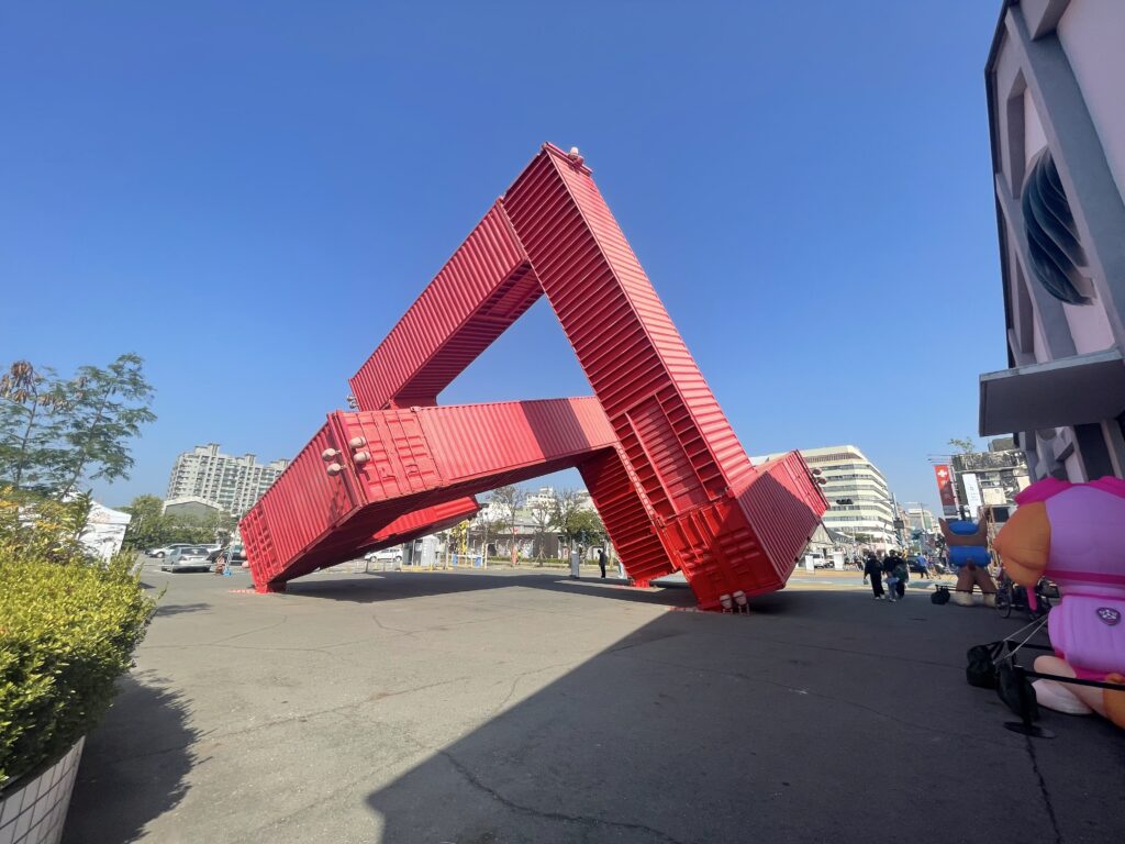
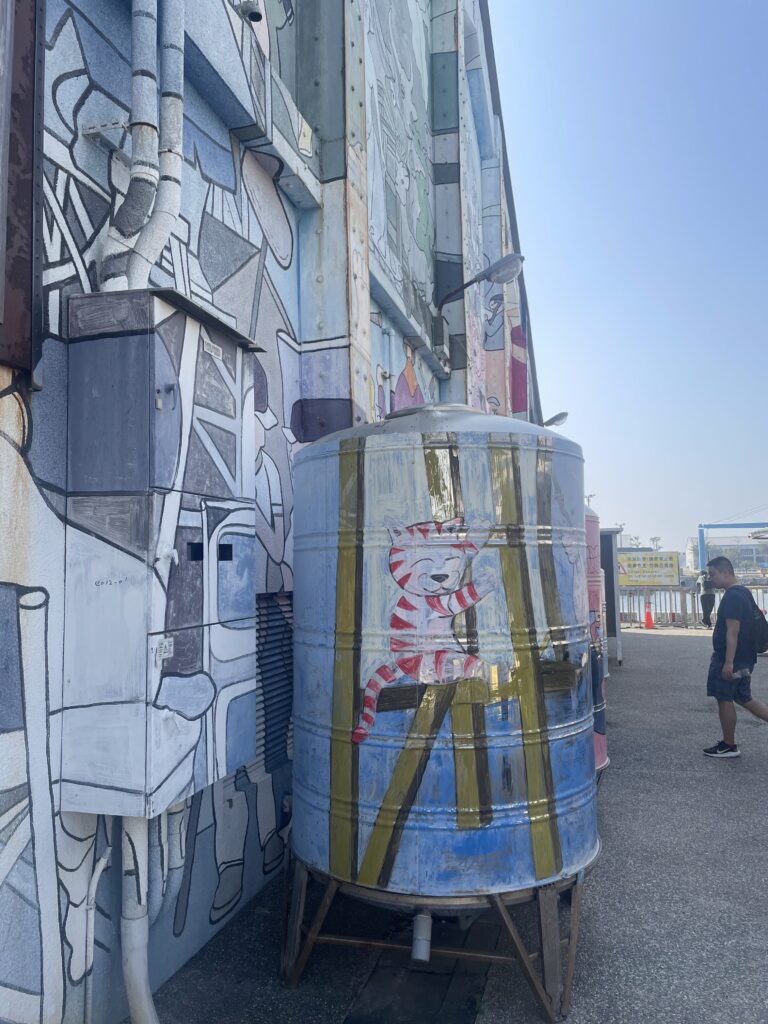
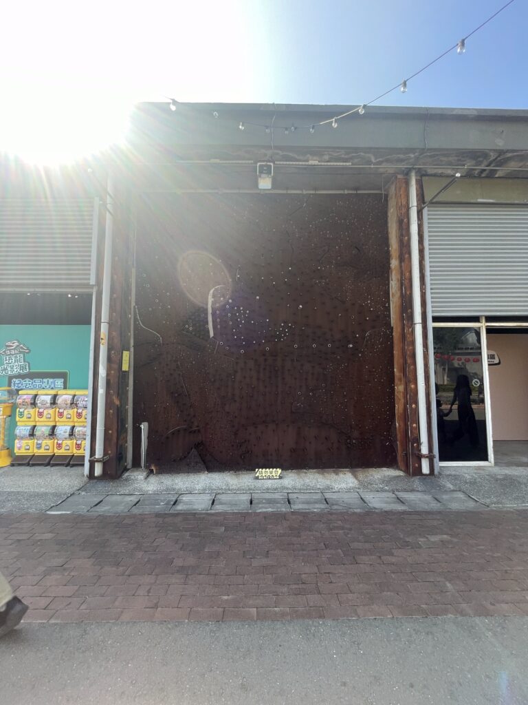
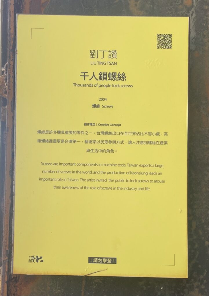
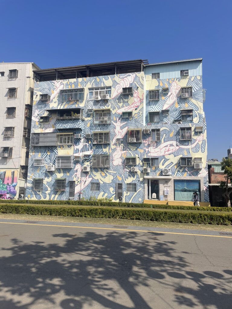
Unfortunately, I had to miss the Toronto art galleries trip because of my trip to Taiwan. I was able to still surround myself with art at the Pier 2 Art Centre in Kaohsiung. This beautiful boardwalk has many incredible art pieces all around and it was so amazing to see. From huge murals to sculptures, this Art Centre had so much to offer. I really loved the piece titled “Thousands of people lock screws” because of its creative approach to bring awareness to Taiwan, and specifically Kaohsiung’s significance in the production and exporting of screws to the world. A screw is such a small module on its own, but also such an integral part of architecture and engineering. I found it very beautiful that, although the work was created in 2004 and the interactive aspect of the work was done over a decade ago, the work is still up for everyone to see and for the future to see.

NEIL POSTMAN
AMUSING OURSELVES TO DEATH
Although published in 1985, Neil Postman’s ideas and arguments in this book are still very relevant to our current decade, if not more. He writes about how television and entertainment culture have fundamentally reshaped social discourse by prioritizing amusement over intellectual thought. He argues that modern society is controlled by distraction and pleasure rather than oppression, which is still heavily prevalent in our current society as we reach newer and more advanced levels of technology. He discusses how we understand information through the way it is delivered. In the past where print dominated over technology, society valued complex debates and logic. He states “Typography fostered the modern idea of individuality, but it destroyed the medieval sense of community and integration.” However, as television rose in that decade and as advanced technology and the internet rose and still rises in ours, the information we consume has been transformed into shallow entertainment. As technology evolves, individual intellectualism fails to maintain itself in society. Serious topics like politics, religion, and education are presented as spectacle, negatively impacting society’s ability to engage in deep, critical thinking.
The decline of meaningful political discussion is a big point he makes. He argues that political debates have become about style over substance, where candidates are judged more on their appearance and charisma than on their policies. Television viewers often focus more on the appearance of the subject while radio allows listeners to focus on the arguments and dialogue. This idea is also extremely relevant in our current political situation but in a different way. Because of our advanced technology and specifically the internet, many citizens can and will learn about politics through social media platforms in which most of that information is not fact-checked and often does not come from credible sources. However, this information is easy to access and easy to digest, so as today’s society grows lazier and lazier, they are strayed away from intellectual analysis and research. Instead, it is unfortunately significantly more common for people to just believe whatever they see on the internet, specifically on social media platforms. “Television gives us a conversation in images, not words” I really liked this quote because, although it was meant to speak on the advancement from radio to television, it still applies in our current technological state. However, instead of it being a result of the television offering images instead of just words, it is a result of ignorance and lack of individual intellectualism of society itself. Neil Postman definitely predicted this new age of media personalities in positions of great power, as you can see in the US presidential election.
This book has definitely influenced the way I see visual and video culture in my everyday life. This concept relates closely with the fast-paced “brain-rotting” content that most people experience every single day. Social media platforms like TikTok and Instagram offer perfectly curated and often invaluable content available for everyone to consume thoughtlessly. This overflow of accessible information and entertainment makes our society less credible, healthy, and intellectual. Current technology is an incredible advancement for society and humanity, but will ultimately be humanity’s downfall and has already proven that.
BANNER ASSIGNMENT
BRAINSTORMING:
– MORAL BOUNDARY
– PASSAGE OF TIME
– SPOT THE DIFFERENCE
– LOOK OR MOVE

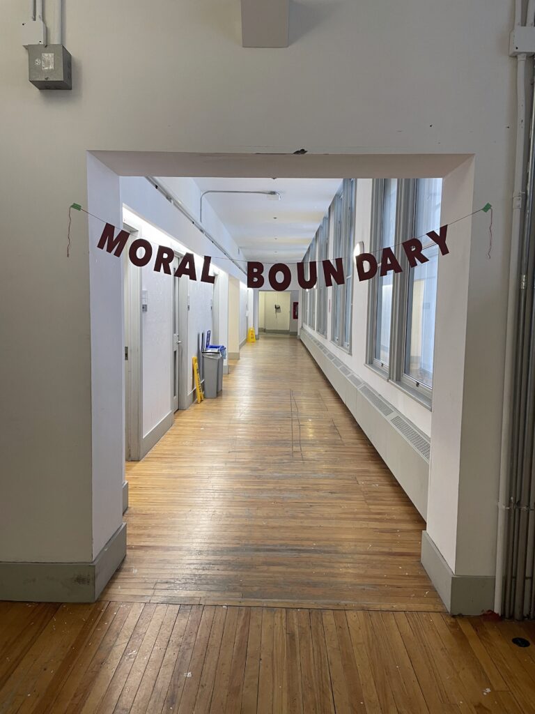
“MORAL BOUNDARY”
For my banner text project, I decided to use the words “moral boundary” found in the article we read. I chose it because I really love art that can be versatile and used in many different places (similar to my artist multiple project in Experimental II). I chose to use a bold Arial font in all caps for simplicity but also because the simple and large bold letters create the impression of a warning sign as if there really is a physical boundary there. I also used a dark red colour to go with this theme of danger and caution. As for location, I hung the banner up in the hallway of Zavitz (floor 3) at the end of the hallway but facing the shorter end in order for the length of the hallway to be see behind the banner. This way, the boundary feels much more compelling as it allows the audience to feel like there is more past this so-called boundary, rather than the banner just being hung on a wall.
