All work (from week 1-5) due AT THE LATEST: Tuesday Feb. 23rd (before next class, after reading week!)
Complete your video art work and post on the blog with a title and description. Include references to lecture materials and artists studied in class.
Make sure all of the work assigned from weeks 1-5 is complete – notes and exercises should all be on your blog page by next week.
—-
I will be checking your Student page on the blog to find the work from the past 5 weeks. If work is incomplete, your will be deducted according to the amount of work incomplete. If everything is complete and the minimum requirements of each assignment are met – you will automatically receive a 75%. If it is completed with above-average level of curiosity, investment, effort and understanding of ideas – you may receive a higher grade.
See each week’s post to find a summary of work that should be on your blog.
Notes for weeks 1-5 (worth 20% of final grade)
Notes will be evaluated for completion, evidence of curiosity and full engagement with material, level of understanding of critical ideas at play.
Exercises for weeks 1-5 (worth 20% of final grade)
Exercises will be evaluated for completion, evidence of historical precedents for the work, understanding of conceptual ideas at play, evidence of technical investment and effort, evidence of experimentation and adventurousness.
TECH TALK TIME: In this week’s class, Nathan will talk about formatting your videos for uploading to the blog, and how to upload media to WordPress. Bring your questions – Nathan will join us for the last 20 minutes of each class.
Look at the works of artists relating to trees and other natural phenomena.
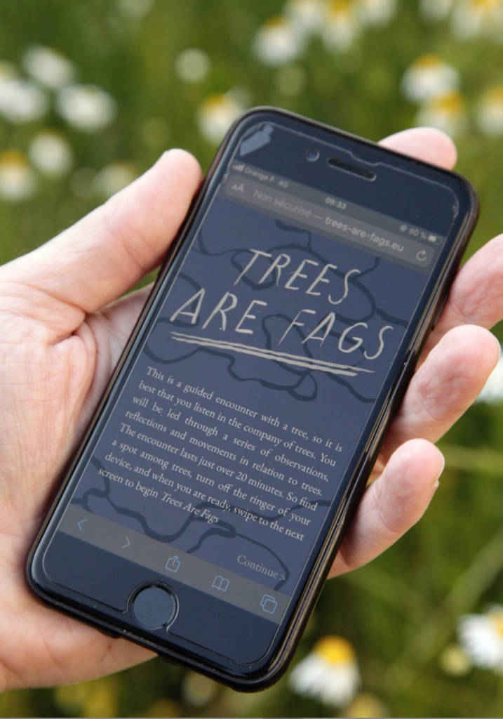
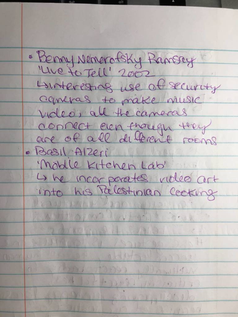
Actively explore the work of Benny Nemerofsky Ramsay, including doing the guided audio walk, among trees.
Propose a gesture or exercise of your own to relate intimately with a tree, or other natural object for a work of video art. Include images and notes to discuss with class next week.
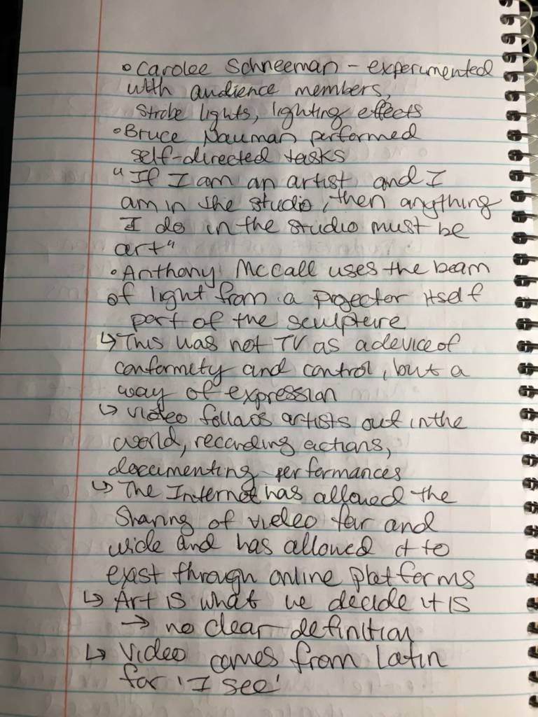
Artists commune with nature:
Considering we are all in strict lockdown conditions, and prevented from being close to other people, we are going to explore recent works of contemporary art involving TREES – and make a new work based on a gesture performed with trees and other natural phenomena.
Look at these projects by artists involving encounters with plants, trees and nature.
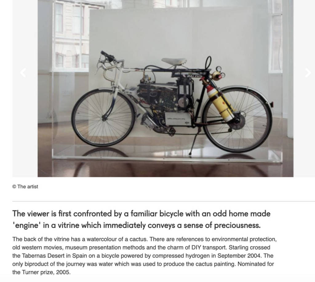
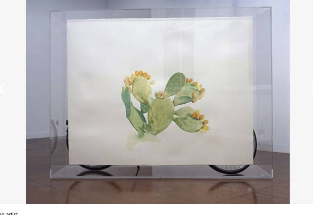
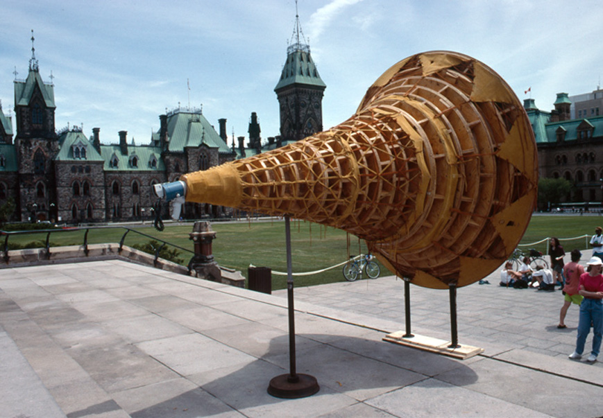
Belmore wanted to make a huge, loud megaphone for protest – and developed this work at the Banff Centre for the Arts. The work functions as a sculpture, and a functional megaphone for Indigenous people to speak to the land – “to our mother, to the earth” and to feel connected, and unafraid to express an urgency to care for and protect the land. See the video below as the artist discusses the impetus for the project.
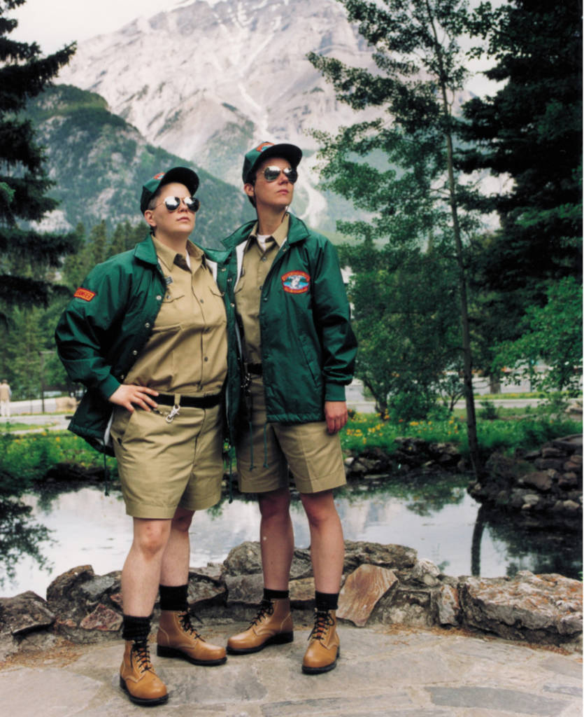
Shawna Dempsey and Lori Milan: Lesbian National Parks and Services
Lesbian National Parks and Services was founded in 1997 to insert a lesbian presence into the landscape. In full uniform as Lesbian Rangers, Shawna Dempsey and Lorri Millan patrol parklands, challenging the general public’s ideas of tourism, recreation, and the “natural” environment. Equipped with informative brochures and well-researched knowledge, they are a visible homosexual presence in spaces where concepts of history and biology exclude all but a very few.
Shawna Dempsey and Lori Milan: Lesbian National Parks and Services
Lesbian National Parks and Services: A Force of Nature follows the intrepid Lesbian Rangers as they patrol, educate, and illustrate lesbian survival skills. This documentary about the Force archly parodies the so-called objectivity of educational films, while playfully recasting the wilds from a lesbian perspective, calling into question prevalent notions of nature and normalcy. Scenes from tours-of-duty in the Arctic, Banff, Australia and Manitoba are interwoven with interviews, in a style reminiscent of National Film Board documentaries of the 1960s. From Junior Ranger boot camp to the perils of a deep-sea rescue, this valiant team roves the world, asking, “What is natural?” while serving and servicing the lesbian wilds. Premiered at the 2002 Sydney (Australia) Gay/Lesbian Film Festival. 24:00 min. Digital video. 2002. (From Dempsey and Milan)
Wolfgang Laib
Watch how Wolfgang Laib relates to flowers and his wider environment:
Benny Nemerofsky Ramsay
Explore the video and audio art of Benny Nemerofsky Ramsay on his site:
Trees Are Fags is designed to be experienced on a dedicated website, with programming and sound design by Nikita Gaidakov. The piece is narrated by the artist, along with Matt Carter, Oskar Kirk Hansen, Bastien Pourtout, Ed Twaddle, Alberta Whittle, and Virginia Woolf. Bassoon performance by Ronan Whittern..
MAKE: Show prep work, and proposal with images, for a new work of video art on the blog:
You are going to draft a visual proposal for one new video – up to 5 minutes. You will find a safe (according to public health guidelines) way to relate to trees, or other natural phenomena – which may include earth, bushes, clouds, or even houseplants. You may or may not need to be physically present in the video to perform your gesture. You might choose to use voice-over to narrate the action, or represent the action in different ways. You may need to invent props or new arrangements, play with possibilities and post your ideas, images, and prep work for a video.
We will discuss your video proposals and share feedback in the next class.
(Note: The videos will be shot and edited next week – due in Week 6. )
Strictly follow all public health guidelines during the pandemic at all times – and when you make your work.
Consider the above examples, and your own need to commune and connect.
It may be practical, social, playful, spiritual, aesthetic or absurd. Create instructions for yourself to follow, and see what happens.
You may need to work on writing or text for your video – post all your prep work and we can workshop it together.
Reference works by artists in the lecture and readings in your proposal.
Consider what new insights or meaning about the moment, about yourself, or about nature do you hope to bring with your gestures?
3. Make a banner, hang it, and put a photo and description on the blog. (details below)
______________________________________
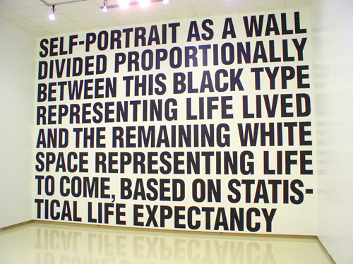
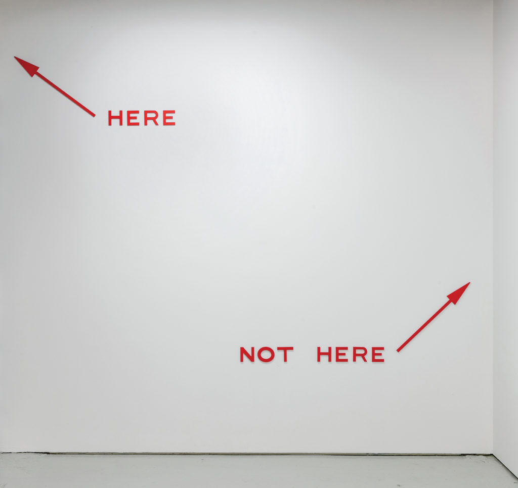
LOOK AT: Artists who use text in their work including: Micah Lexier, Lenka Clayton, Laurel Woodcock and Hiba Abdullah.
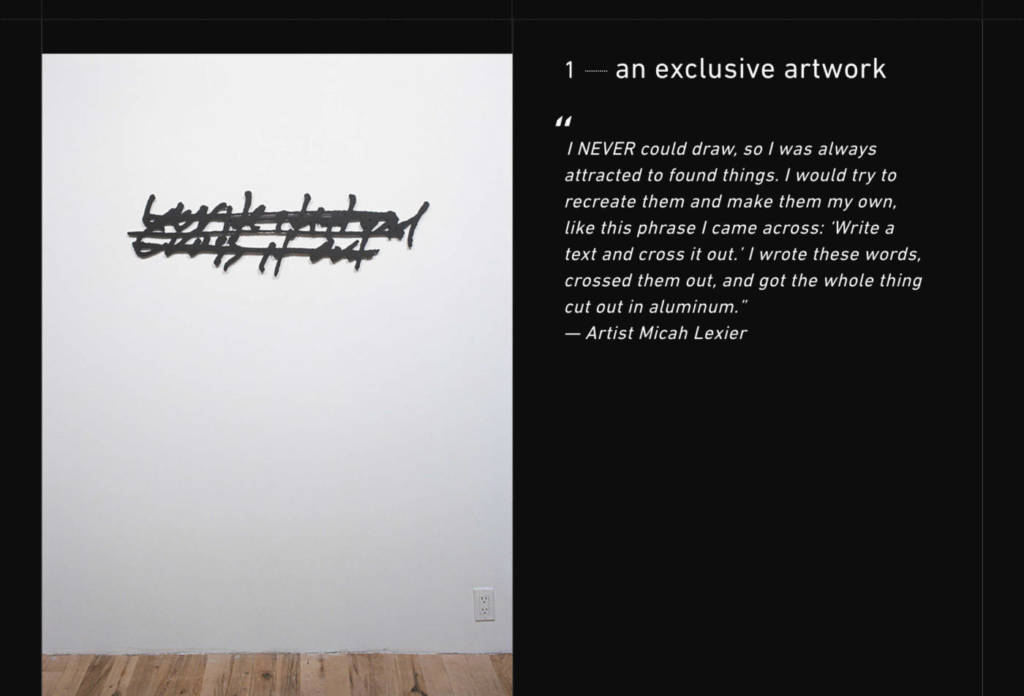
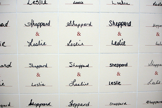
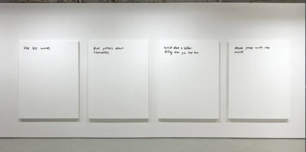
Micah Lexier:
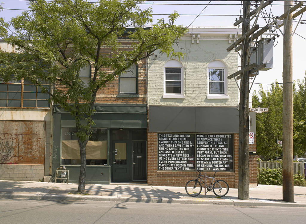
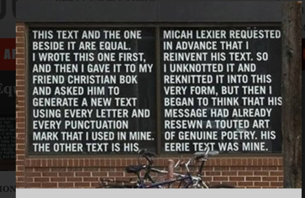
“Ampersand” is a collaborative installation on the walls of Toronto subway stop Sheppard & Leslie. In this project, Micah Lexier, asked locals to write the name of the station onto the tiles, which he later had installed. 2014Two Equal Texts sets up the same situation, as each author invokes or points to the other in “his” text. Though one text preceded the other, neither is primary. Lexier emphasizes their equivalence so that resolution to the binary tensions of the work may not be found in the piece itself. It is instead left to the reader, who is positioned within a series of mediating states: between the right- and left-hand columns of the work’s design, between its visual and the verbal tactics and amidst its inquiry into the original and the derivative. From Lined & Unlined. https://linedandunlined.com/archive/at-least-you-can-read-it/Micah Lexier, Notes-To-Self. 2007, Silkscreen ink on acrylic on canvas.
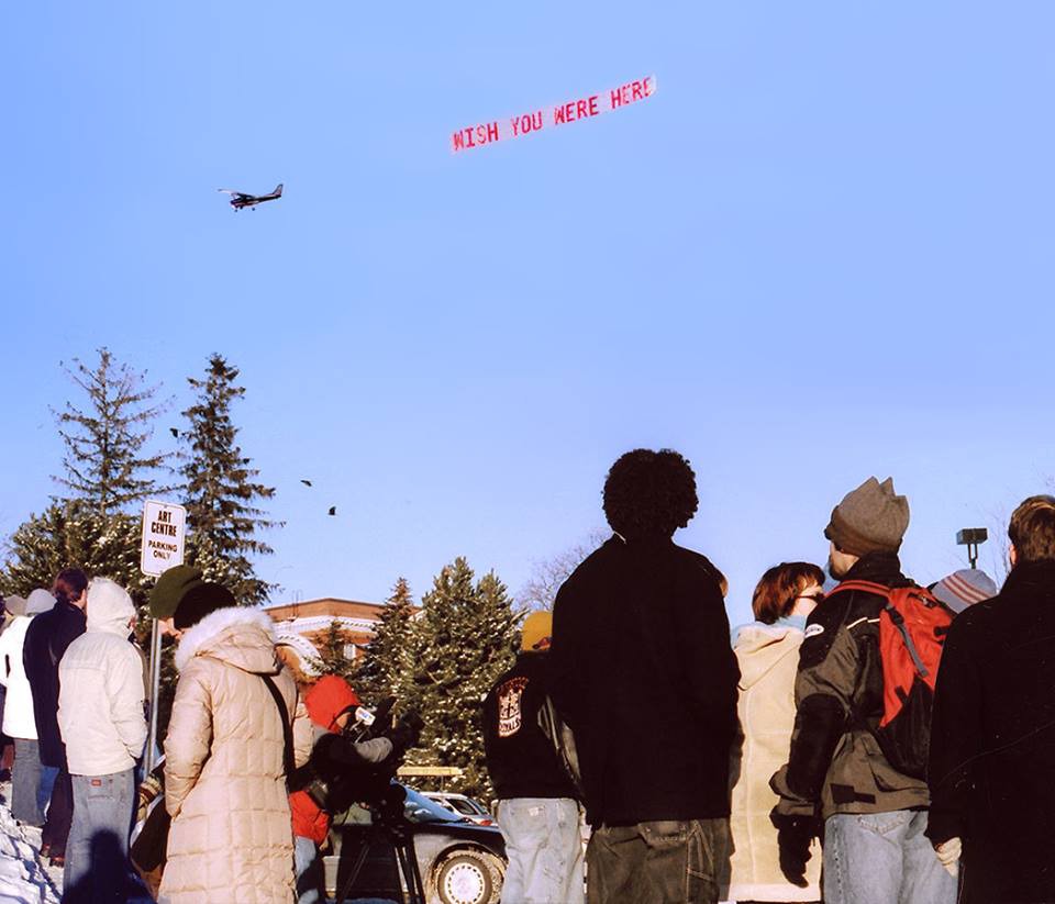
Laurel Woodcock, wish you were here, 2003
“wish you were here (2003), a series of aerial-banner letters, references the popular postcard message. Woodcock draws our attention to ubiquitous phrases and words whose definition we take at face value, and we are happy to find that in a contemporary context, old phrases can be given new life. With her characteristic wit, the artist reveals that nothing is static.”
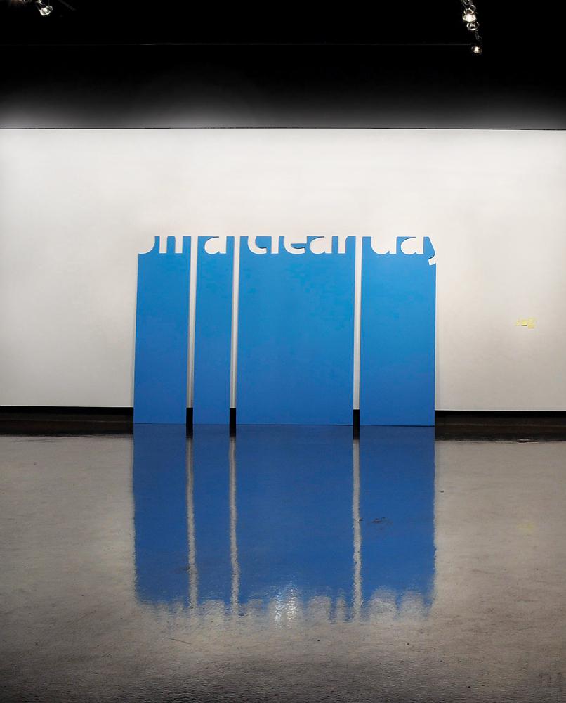
“Language is more than inspiration for Woodcock: it is raw material, awaiting manipulation and reinterpretation. Rather than invent new phrases or author original prose and poetry, Woodcock explores the ability of common language to become layered with multiple and unexpected meanings; when presented in new contexts, familiar words, symbols and sayings acquire new significance while retaining reference to their primary definitions. Woodcock treats words as ready-made or found objects, often lifting phrases from songs and screenplays. on a clear day (2010), four sky-blue aluminum panels originally produced for the Toronto Now space at the Art Gallery of Ontario, borrows its title phrase from two films:Gaby Dellal’s On a Clear Day (2005) and Vincente Minnelli’s On a Clear Day You Can See Forever (1970).”
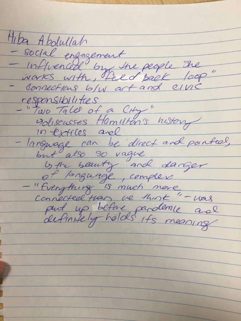
Hiba Abdullah: Watch the whole interview below – Hiba makes text works and social practice works – she is also former Guelph grad. She discusses several of her projects pictured below:
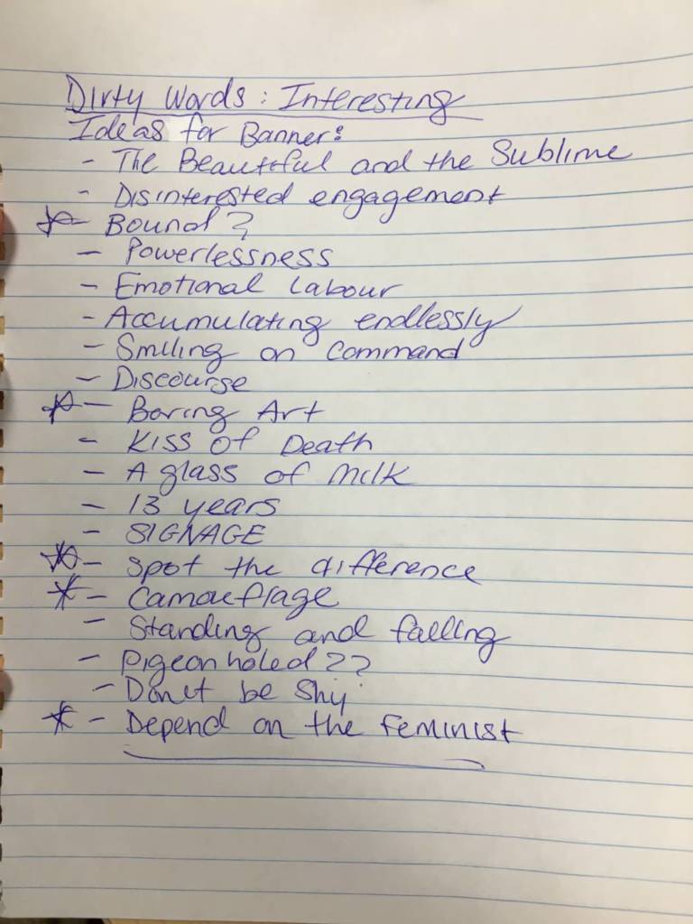
Using the article from Canadian Art above – isolate a few words, or a prhase, or a sentence to make a banner. Each letter should be on a separate piece of paper, and the letters should be strung onto a string or support of some kind. Use any colour, materials, and size of banner, but be ambitious and thoughtful – consider where you intend to hang the banner.
Take your words out of the context of the article, and put them into a new context in your home or neighbourhood. See how the chosen words, the look of your letters, and the scale of your banner affect meaning. See how putting your banner in different contexts expand/inform the meaning in surprising and evocative ways.
Make a banner, hang it up, and document it. Post a photo with a short description on our blog.
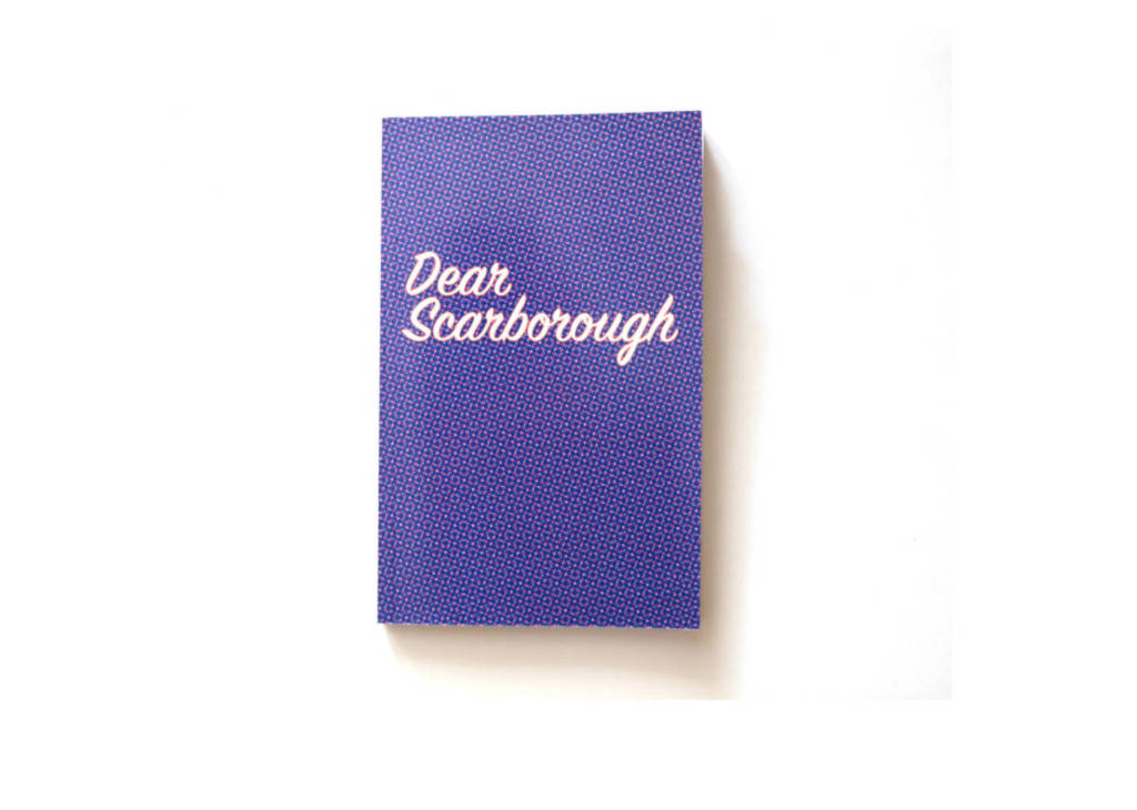
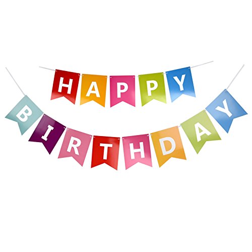
Here is a generic “banner” as an example:
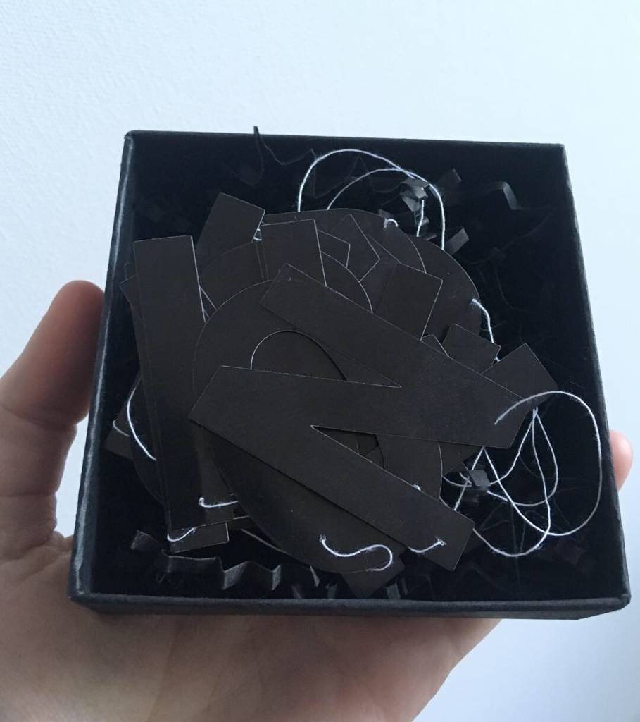
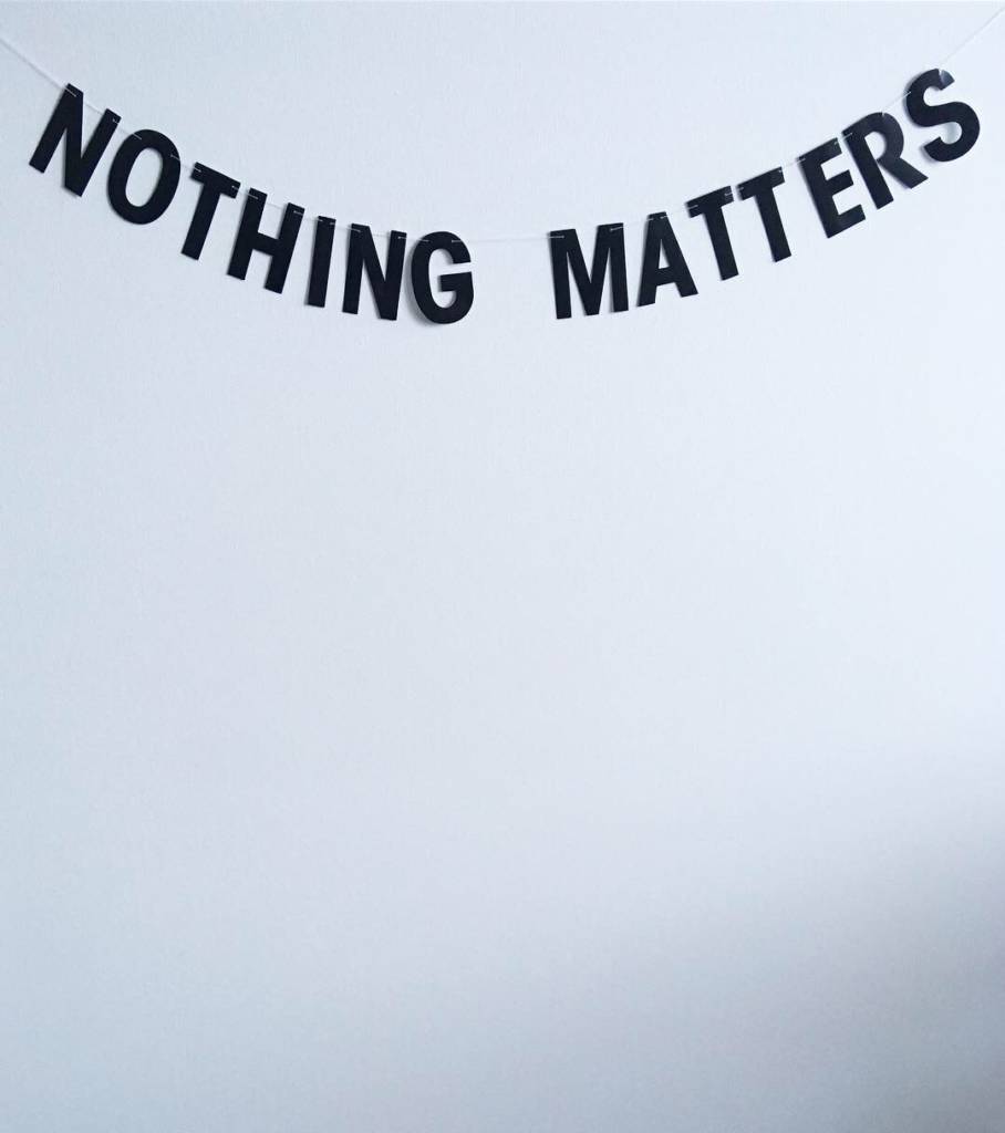
Here is one with individual letters, made by a former student:
A small version of a banner made as an artist multiple by Shay, called Nihilist Celebration.
As always be safe and respectful to yourself and others, and follow public health guidelines. Be creative within the restrictions of the moment.
2. WRITE: See reflection questions on text as art at the end.
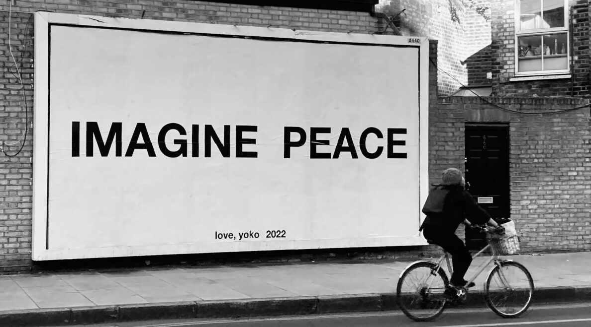
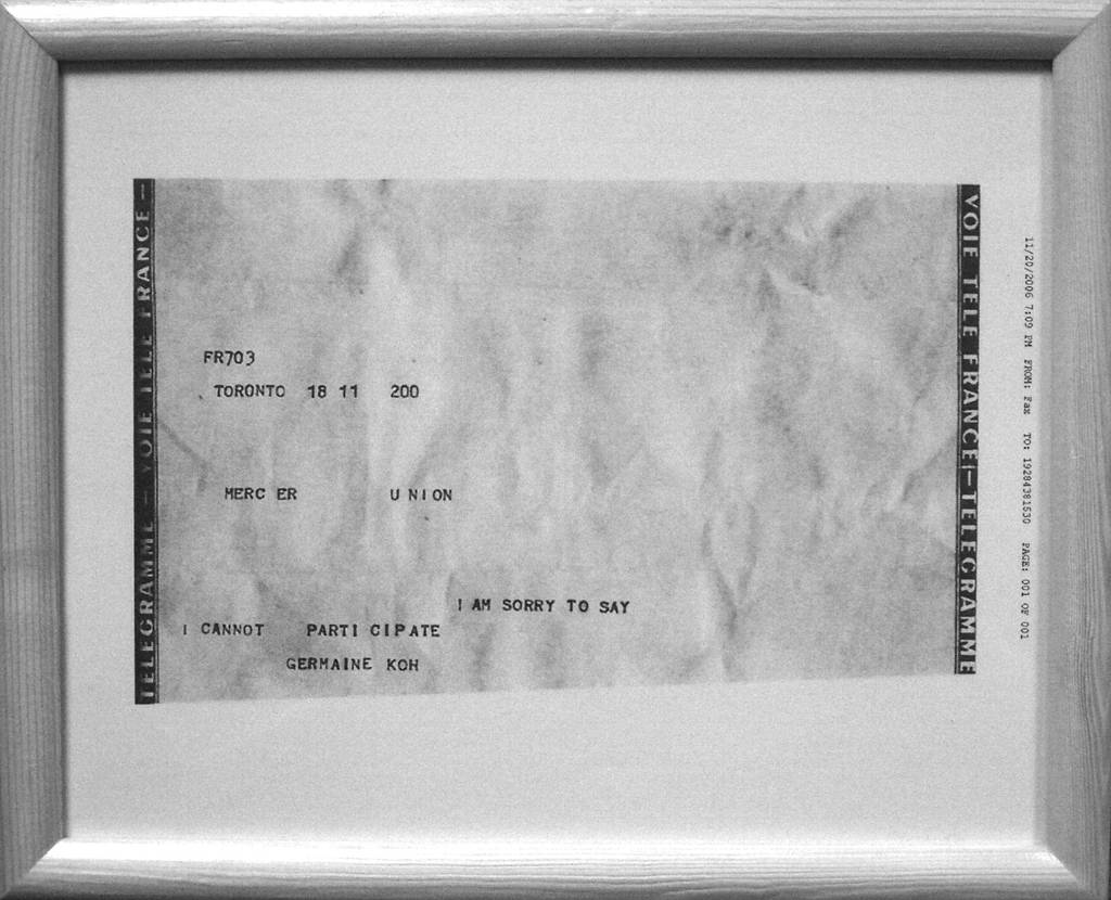
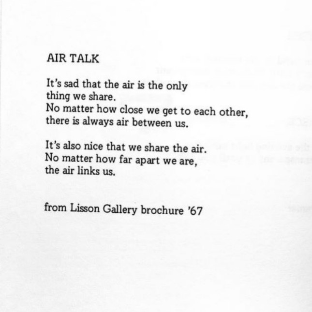
LOOK AT: Artists who use text in their work including: Yoko Ono, Jenny Holzer, John Baldessari, Barbara Krueger, Geurilla Girls, and Shelly Niro. And more contemporary examples including: Nadia Myre, Joi T. Arcand, Jon Rubin, Eleanor King, Micah Lexier, Lenka Clayton, Alisha Wormsley and Germaine Koh.
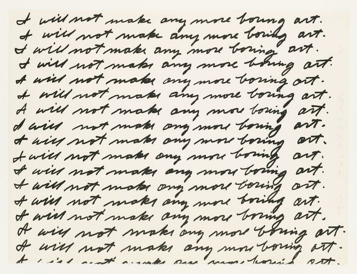
In 1971, the Nova Scotia College of Art and Design, Halifax, invited John Baldessari to exhibit his work. However, the college did not have the funds for Baldessari to travel to Halifax, so the artist proposed that the art students in Halifax act as his surrogates. The students were instructed by Baldessari to write “I will not make any more boring art” on the gallery walls for the duration of the exhibition (April 1-10, 1971). By enlisting the art students to slavishly write the phrase over and over, Baldessari poked fun at the entire system of art education, which he felt encouraged students to imitate rather than experiment and innovate. The artist also sent along a handwritten page of the phrase, from which the students produced prints. After the work’s completion, Baldessari committed his own version of the piece to videotape. The subversive, graffiti-like action of drawing directly on the gallery walls reflected the artist’s dissatisfaction with the limitations of traditional painting in the early 1970s. His interest in language-based performative actions that could be realized by others was a hallmark of early conceptual art. (From Whitney.org)
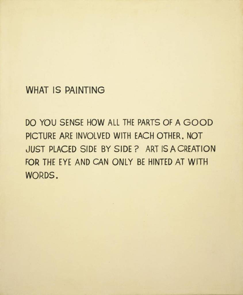
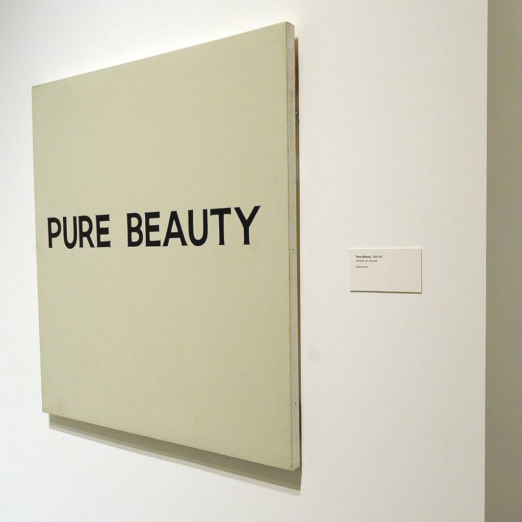
From the exhibition Pure Beauty, works from the late 60’s.
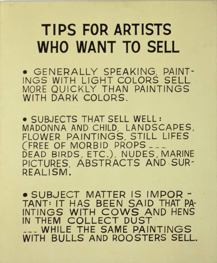
John Baldessari, Tips for Artists Who Want to Sell, 1966-1968
By 1966, Baldessari was using photographs and text, or simply text, on canvas.[2] His early major works were canvas paintings that were empty but for painted statements derived from contemporary art theory. An early attempt of Baldessari’s included the hand-painted phrase “Suppose it is true after all? WHAT THEN?” (1967) on a heavily worked painted surface. However, this proved personally disappointing because the form and method conflicted with the objective use of language that he preferred to employ. Baldessari decided the solution was to remove his own hand from the construction of the image and to employ a commercial, lifeless style so that the text would impact the viewer without distractions. The words were then physically lettered by sign painters, in an unornamented black font. The first of this series presented the ironic statement “A TWO-DIMENSIONAL SURFACE WITHOUT ANY ARTICULATION IS A DEAD EXPERIENCE” (1967).” text: https://en.wikipedia.org/wiki/John_Baldessari image: https://imageobjecttext.com/tag/john-baldessari/
Lenka Clayton, Fruit and Other Things, 2018
Fruit and Other Things Collaboration with Jon Rubin / Carnegie International 57th Edition 2018, Carnegie Museum of Pittsburgh
“From 1896 to 1931 the Carnegie International selected artworks for its exhibitions from an international competition. The museum kept meticulous records, not only of all the works accepted, but of those rejected as well. Only the title, artist’s names, and the year of each work were recorded, no images exist. Over this 35 year span, 10,632 artworks were rejected from the exhibitions. For the duration of the 57th Carnegie International, each of the 10,632 rejected titles were made into individual hand-lettered text paintings. Each text painting was exhibited for a day, and then given away to visitors.”
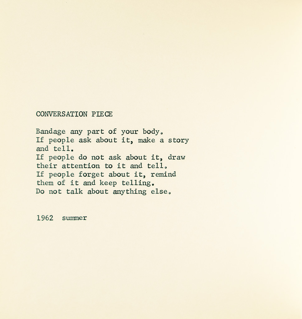
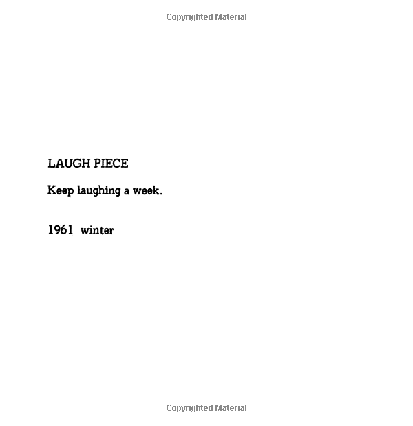
Conversation Piece, an event score from Grapefruit, 1964.
“Ono’s event scores were intended to replace a physical work of art with written instructions or suggestions for acts that the person experiencing them could create. Pulse Piece, for example, suggests, “Listen to each other’s pulse by putting your ear on the other’s stomach. 1963 Winter.” The activities usually highlight a simple day-to-day activity. Often considered a Fluxus work, Grapefruit has become a monument of conceptual art. The title comes from the way Ono felt about herself: a hybrid between American and Japanese identities, the way a grapefruit is a hybrid between a lemon and an orange.”
Text and Image: https://www.swanngalleries.com/news/art-press-illustrated-books/2017/06/grapefruit-yoko-ono-guide-living-art/
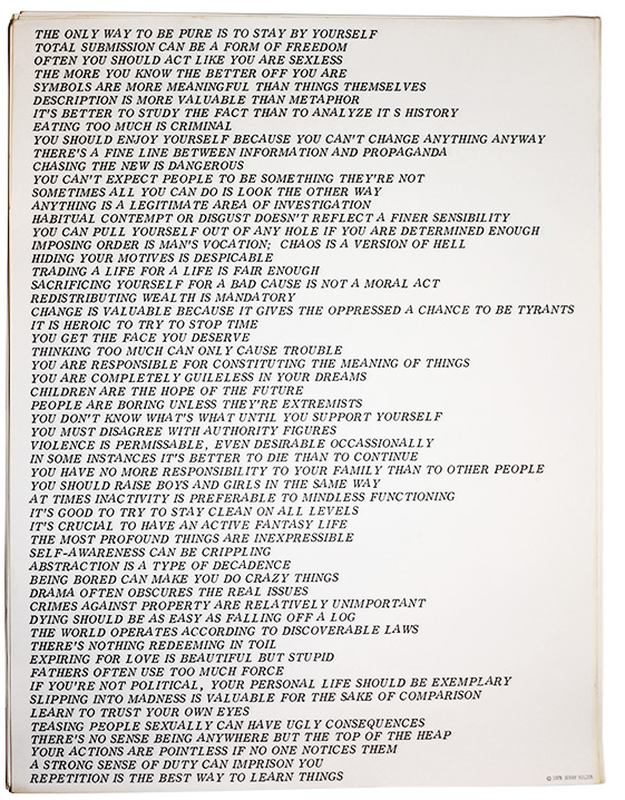
Holzer’s Truisms have become part of the public domain, displayed in storefronts, on outdoor walls and billboards, and in digital displays in museums, galleries, and other public places, such as Times Square in New York. Multitudes of people have seen them, read them, laughed at them, and been provoked by them. That is precisely the artist’s goal.
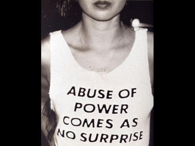
The Photostat, Truisms, seen here presents eighty-six of Holzer’s ongoing series of maxims. Variously insightful, aggressive, or comic, they express multiple viewpoints that the artist hopes will arouse a wide range of responses. A small selection of Truisms includes: “A lot of professionals are crackpots”; “Abuse of power comes as no surprise”; “Bad intentions can yield good results”; and “Categorizing fear is calming.”
Holzer began creating these works in 1977, when she was a student in an independent study program. She hand-typed numerous “one liners,” or Truisms, which she has likened, partly in jest, to a “Jenny Holzer’s Reader’s Digest version of Western and Eastern thought.” She typeset the sentences in alphabetical order and printed them inexpensively, using commercial printing processes. She then distributed the sheets at random and pasted them up as posters around the city. Her Truisms eventually adorned a variety of formats, including T-shirts and baseball caps. (From MOMA.org)
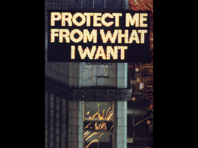
In the Survival Series, Holzer explores other methods of presentation. Survival Series (1983–1985), which warned about the dangers of everyday living, were blazoned on enormous electronic signboards in public spaces.
From https://walkerart.org/collections/artists/jenny-holzer
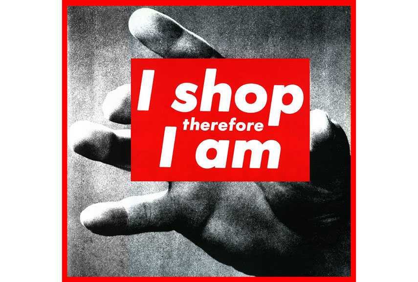
Barbara Kruger, Untitled (Your body is a battleground), 1989
“Much of Kruger’s work pairs found photographs with pithy and assertive text that challenges the viewer. Her method includes developing her ideas on a computer, later transferring the results (often billboard-sized) into images.[5] Examples of her instantly recognizable slogans read “I shop therefore I am,” and “Your body is a battleground,” appearing in her trademark white letters against a red background. Much of her text calls attention to ideas such as feminism, consumerism, and individual autonomy and desire, frequently appropriating images from mainstream magazines and using her bold phrases to frame them in a new context. Kruger has said that “I work with pictures and words because they have the ability to determine who we are and who we aren’t.”[15] A larger category that threads through her work is the appropriation and alteration of existing images. In describing her use of appropriation, Kruger states: Pictures and words seem to become the rallying points for certain assumptions. There are assumptions of truth and falsity and I guess the narratives of falsity are called fictions. I replicate certain words and watch them stray from or coincide with the notions of fact and fiction.[16]”
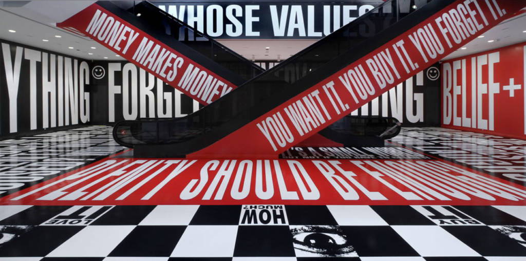
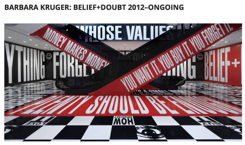
Part of an initiative to bring art to new sites within and around the building, this installation by Barbara Kruger fills the Lower Level lobby and extends into the newly relocated Museum bookstore. Famous for her incisive photomontages, Kruger has focused increasingly over the past two decades on creating environments that surround the viewer with language. The entire space—walls, floor, escalator sides—is wrapped in text-printed vinyl, immersing visitors in a spectacular hall of voices, where words either crafted by the artist or borrowed from the popular lexicon address conflicting perceptions of democracy, power, and belief.
At a moment when ideological certitude and purity seem especially valued, Kruger says she’s “interested in introducing doubt.” Large areas of the installation are devoted to open-ended questions (“WHO IS BEYOND THE LAW? WHO IS FREE TO CHOOSE? WHO SPEAKS? WHO IS SILENT?”), while the section occupying the bookstore explores themes of desire and consumption. At once addressing the individual, the museum, and, symbolically, the country, Kruger’s penetrating examination of the public sphere transforms one of the Hirshhorn’s key public spaces.
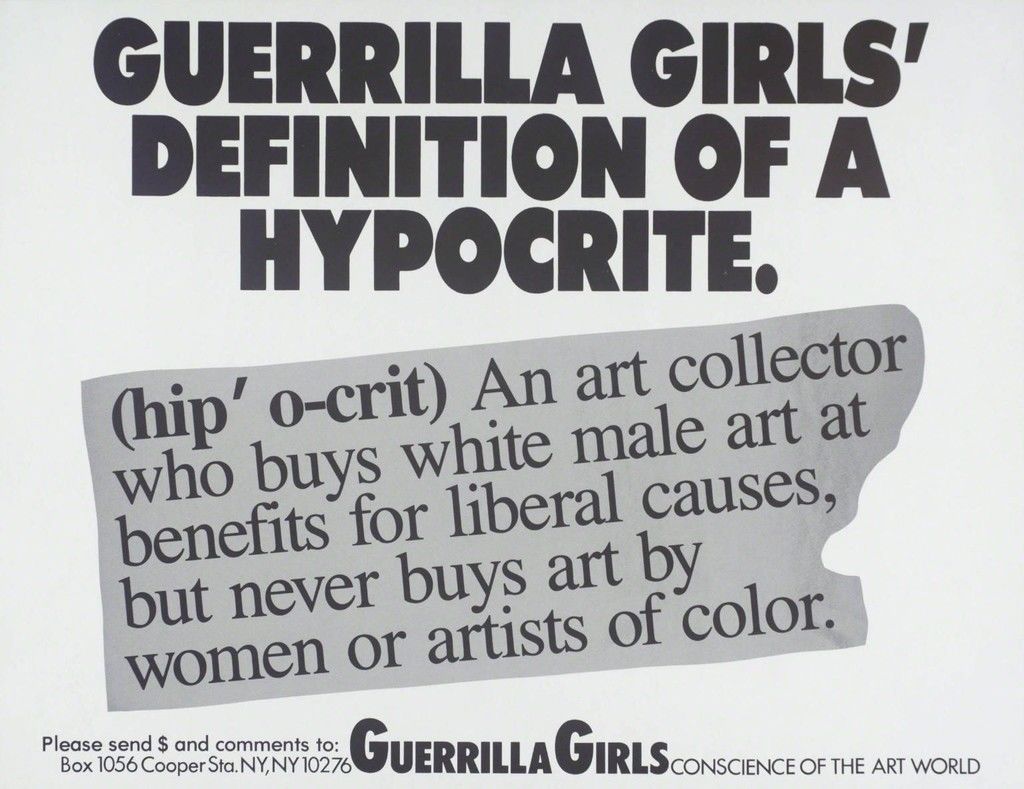
Guerrilla Girls, Guerrilla Girls Definition Of A Hypocrite, 1990
“The anonymous collective Guerilla Girls fits into a rich tradition of protest artists who employ words for explicitly political ends. In particular, the group uses language to reconsider gender discrimination and violence. “What do these men have in common?” one of their 1995 posters asks. Below the bold black wording, photographs of O.J. Simpson and minimalist artist Carl Andre appear. The answer to their provocation? The state accused both men of murdering women (Simpson: his ex-wife Nicole Brown Simpson; Andre: his wife Ana Mendieta). Both enjoyed acquittals and avoided jail time. The Guerilla Girls discuss the prevalence of domestic violence beneath the pictures. They also include a tagline at the bottom: “A public service message from Guerilla Girls conscience of the art world.” Another famous work, Do Women Have to Be Naked to Get Into the Met Museum? (1989), critiques the lack of art by female practitioners in major institutions. Across the Guerilla Girls’s oeuvre, wry ideology becomes an art form. Their messaging—and its situation within the institutions it critiques—supersedes all other aesthetic concerns.”
Roberts identifies dozens of Black names that Microsoft Word identifies as misspelled. Series of prints.
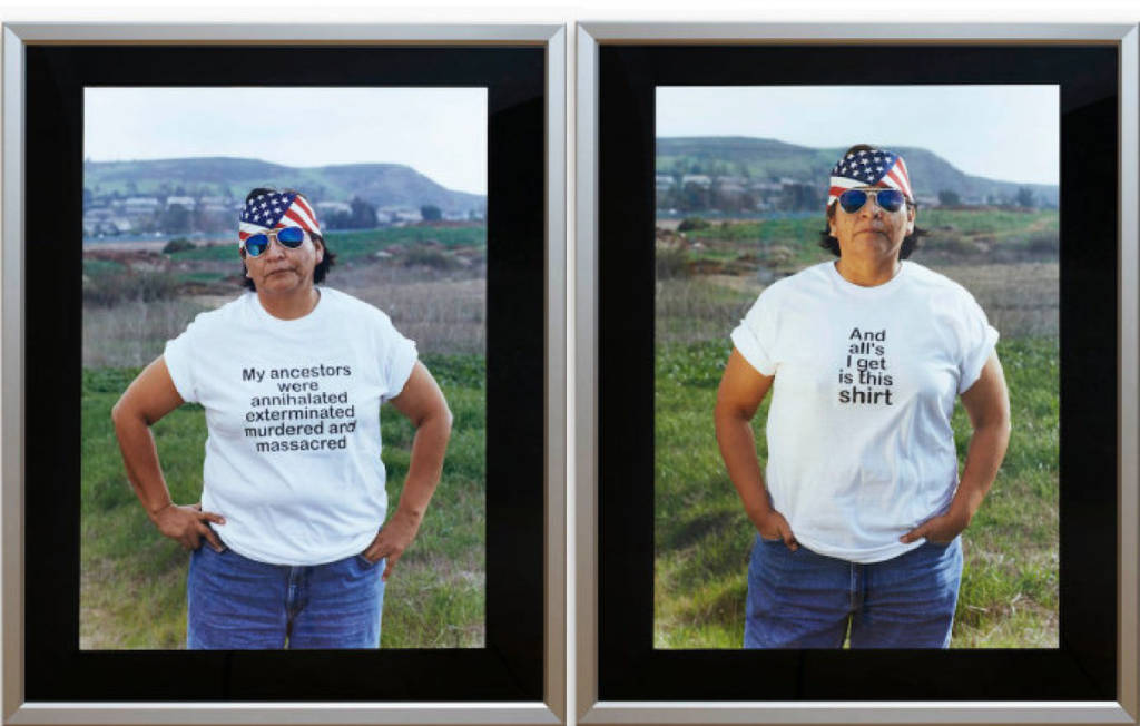
Shelley Niro, The Shirt (detail), 2003
Shelley Niro, The Shirt (detail), 2003.____ Uploaded by: Whyte, Murray
“In “The Shirt” – a video that debuted at the 2003 Venice Biennale – Kanien’kehaka (Mohawk) artist and director Shelley Niro parodies the archetypal tourist tee-shirt from the point of view of First Nations Peoples as an exploration into the lasting effects of European colonialism in North America. Facing the camera directly and poised against the landscape of “America”, an Aboriginal woman with biker-like accessories bears a sequential series of statements on her tee-shirt that together comprise a discourse on colonialism. The darkly ironic and yet brutally truthful messages of “The Shirt” draw attention to the history of invasion that indigenous peoples have experienced in North America. By presenting the tee-shirts as souvenirs and memories of these impositions, Niro’s work suggests that the consequences of colonialism are still active today. The Shirt is an ironic and humorous take on colonialism enacted through text on T-shirts worn by an Aboriginal woman (artist Hulleah Tsinhnahjinnie). Directly facing the camera with the landscape of “America” as a backdrop, the woman poses in shirts that bear a sequential series of statements that together comprise a discourse on North America’s troubled past.”
“Joi T. Arcand is a photo-based artist and industrial sculptor from Muskeg Lake Cree Nation, and she knows that words, that letter forms, shapes and glyphs, “change the visual landscape,” that they are how we go about practicing new ways of looking. Words are emotional architectures, and Arcand calls hers “Future Earth.”
Here on Future Earth is a series of photographs that Arcand produced in 2010. In a phone interview, Arcand explained to me that this is where her photo-based practice and her interest in textuality synched. Arcand wants us to think about these photographs as documents of “an alternative present,” of a future that is within arm’s reach.
For this series, Arcand manipulated signs and replaced their slogans and names with Cree syllabics. By doing this, Arcand images something of a present beside itself and therefore loops us into a new mode of perception, one that enables us to attune to the rogue possibilities bubbling up in the thick ordinariness of everyday life. Arcand wanted to see things “where they weren’t.”
Hers is not a utopian elsewhere we need to map out via an ethos of discovery. Rather, Arcand straddles the threshold of radical hope. She asks us to orient ourselves to the world as if we were out to document or to think back on a future past. That is, Arcand rendered these photographs with a pink hue and a thick, round border, tapping into what she calls “the signifiers of nostalgia.” Importantly, these signifiers are inextricably bound to the charisma of words, to the emotional life of the syllabics. The syllabics are what enunciate; they potentiate a performance of world-making that does not belong to the mise-en-scene of settlement.”
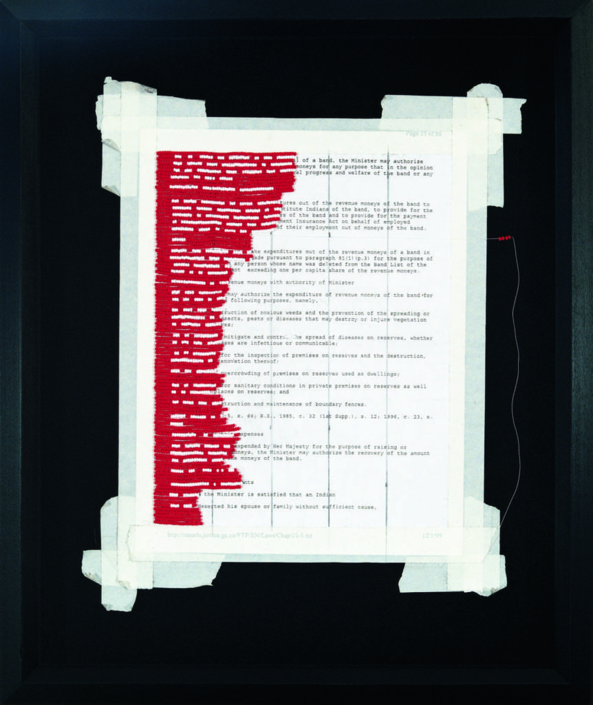
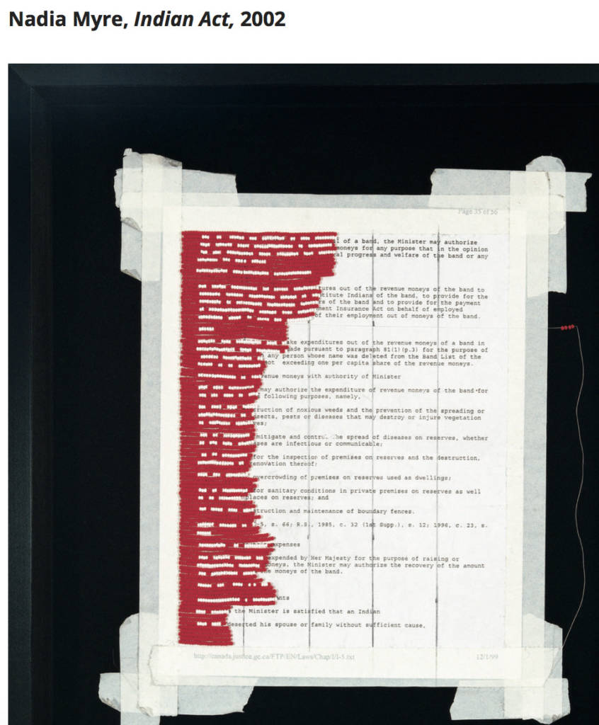
“Indian Act speaks of the realities of colonization – the effects of contact, and its often-broken and untranslated contracts. The piece consists of all 56 pages of the Federal Government’s Indian Act mounted on stroud cloth and sewn over with red and white glass beads. Each word is replaced with white beads sewn into the document; the red beads replace the negative space. Between 1999 and 2002, Nadia Myre enlisted over 230 friends, colleagues and strangers to help her bead over the Indian Act. With the help of Rhonda Meier, they organized workshops and presentations at Concordia University, and hosted weekly beading bees at Oboro Gallery, where it was presented as part of the exhibition, Cont[r]act, in 2002.”
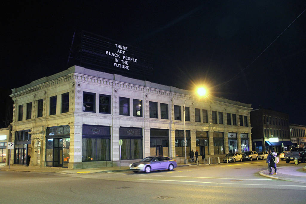
“Founded in 2010, The Last Billboard was a 36 foot long rooftop billboard located on the corner of Highland and Baum in Pittsburgh, PA, USA. Each month a different artist was invited to use the billboard. The custom designed billboard consisted of a rail system with wooden letters that were changed by hand.
The Last Billboard ended operations in April, 2018 after artist Alisha Wormsley’s text was removed from the billboard by the property’s landlord under pressure from area developers. “
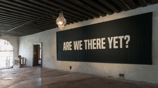
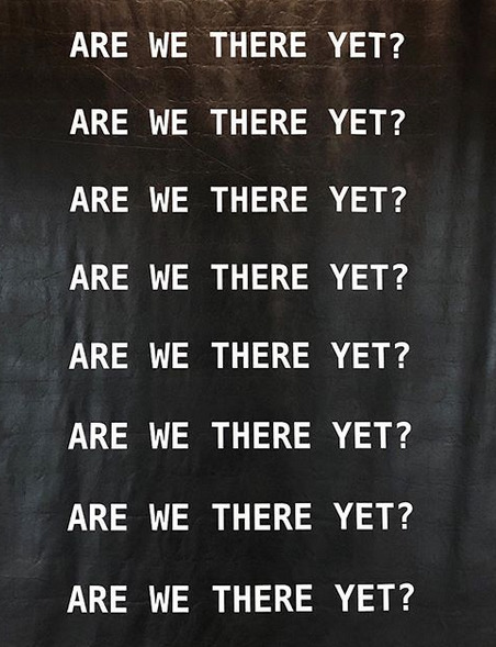
Image and text: https://www.thelastbillboard.com/aboutKameelah Janan Rasheed, Are We There Yet? (and other questions of proximity,destination, and relative comfort), 2017Kameelah Janan Rasheed, A QUESTION IS A SENTENCE DESIGNED TO ELICIT A RESPONSE. TODAY, WE WANT TO KNOW WHAT THE SLOPPY FUTURE HOLDS (detail), 2018. Installed and on view at the Brooklyn Museum
2. WRITE: Select TWO artworks from above to write about. Compare and contrast the different ways the artists use media (materials, platform, format) to express their message. How is the medium relevant to the message in each case? How are viewers expected to relate to the text in each case? (Write approx. 250 words).
Rafael Lozano-Hemmer: A Crack in the Hourglass, An Ongoing COVID-19 Memorial
October 29, 2021–June 26, 2022
Stephanie and Tim Ingrassia Gallery of Contemporary Art, 4th Floor
Use the Participate button to learn more and submit a photograph and dedication for your loved one via the project website.Participate Tickets
Note: This exhibition is available in four languages. View the exhibition description in Spanish, Russian, or Simplified Chinese.
How can we memorialize and visualize the extraordinary loss of life caused by COVID-19, even as it continues to rage throughout the world? Media artist Rafael Lozano-Hemmer (born Mexico City, 1967) responds with A Crack in the Hourglass, a transitory “anti-monument” for the time of the pandemic and the ways it has halted public rituals of mourning. In this participatory artwork, a modified robotic plotter deposits grains of hourglass sand onto a black surface to recreate the images of those lost due to COVID-19. After each portrait is completed, the surface tilts and the same sand is recycled into the next portrait, echoing the collective and ongoing nature of the pandemic.
Those seeking a way to mourn loved ones lost during the pandemic are invited to participate in this ongoing project. Submit a photograph of the deceased at www.acrackinthehourglass.net, accompanied by a personalized dedication. The resulting memorials will be available, via livestream and in archive form, on the project’s website. In our galleries, the robotic plotter and physical representations of the memorials serve as a space to collectively mourn, reflect, and connect, and to honor victims of COVID-19 in New York City—an area with one of the highest number of pandemic-related deaths in the United States—and worldwide.
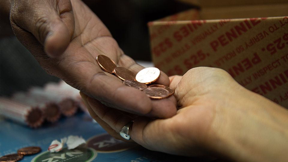
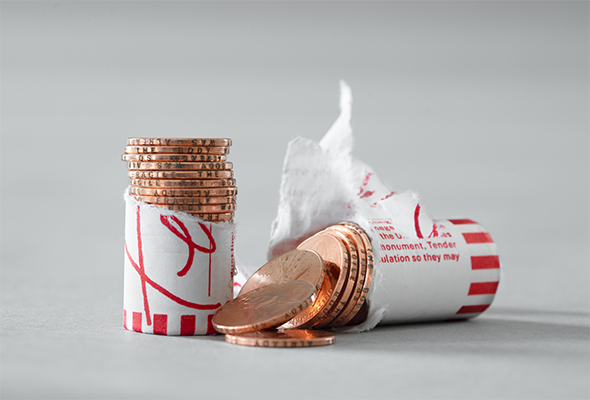
In Creative Time’s most widespread public art commission to date, Jill Magid intercedes in our national economy, responding to issues of value in the throes of COVID-19 with her first major U.S. public art project, entitled Tender. Magid disseminates 120,000 2020-issued pennies, the edges of which she engraved with the appropriated phrase, “THE BODY WAS ALREADY SO FRAGILE.” The text evokes both the human body and the body politic—and underscores their interconnection during the coronavirus pandemic. Via a white cash-in-transit truck, these altered coins enter our national economy through purchases at bodegas across all five boroughs of New York City. The number of pennies echoes the $1200 stimulus checks that were issued by the U.S. Treasury as part of The CARES Act, which provided financial relief to individual citizens during the coronavirus. As a voice from the public, the engraved phrase etched onto the edges serves as the antithesis to the propaganda stamped onto the coins’ faces.
Magid utilizes pennies—whose newly minted copper surfaces are antimicrobial—as a dispersed monument that will spread discretely across the country, beginning in New York, to explore the contradictions between the dissemination of currency and COVID-19. With an average circulation of 40 years, this project will exist as long as the pennies are in use, and as rumor. In this way, Magid reimagines public art as not a static entity, but rather as a phenomenon that circulates freely among the population; each transaction builds social relations in networks of exchange and interconnectivity.
As the U.S. government uses metaphors of American power fighting the virus as a war waged against an “invisible enemy,” the project speaks to human vulnerability and the effects of the virus on both a personal and national scale. In this time of global political and social uncertainty, during which COVID-19 denies us all intimacy and direct exchange, Tender offers an opportunity to take pause and reflect on the permeability of borders, value, and intimacy. From: https://creativetime.org/tender-jill-magid/?fbclid=IwAR261NjomRpMvOG8do2LXsu_8-Umh20J45MuVCgu0ojC_J5p35Ma8RQ5G1Q
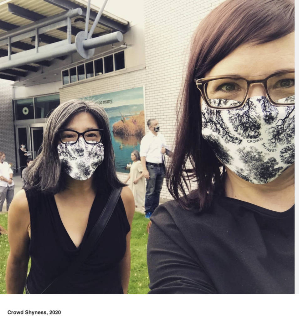
Crowd Shyness, 2020
Germaine Koh, 2020
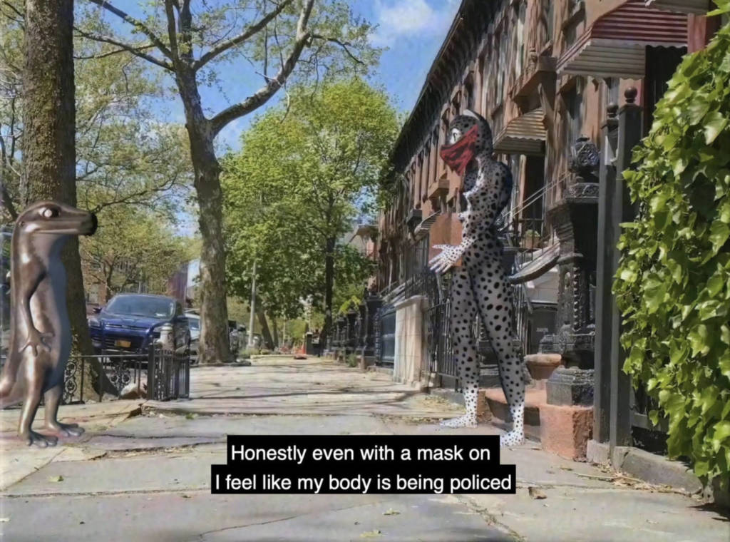
Crowd Shyness In crown shyness, trees grow with distinct space between their crowns, to avoid spreading pests, to avoid damaging their own fragile tips, and to leave room for their peers. They make small individual sacrifices for collective health. These natural processes are analogous to societies making adaptations rooted in mutual care: “crowd shyness” as a form of conscious citizenship.
Guided by a vision of collective care, Germaine Koh has been working alongside the Belkin staff to workshop a comprehensive approach to public interaction. This includes communication, tools and protocols for re-opening the gallery during the COVID-19 pandemic, but also ongoing workplace procedures that emphasize teamwork and acknowledge both the essential work done by visitor services staff and the fraught character of the gallery threshold. It is a framework for the team to look widely at topics such as exhibition staging, the gallery’s location on traditional Musqueam territory, and how the gallery can open itself, represent and be responsible to a diverse public.
The Belkin invited Vancouver-based artist Germaine Koh to consider new pandemic protocols facing the gallery and to develop creative approaches to addressing them. We welcome experimentation within the public realm and learning from and with others in the development of new solutions. This project involves ongoing consultation with Belkin staff and communities (curators, programmers, building operations, health and safety) to address quotidian procedures for visitors, as well as exhibition specific interventions for exhibitions. Together we will explore this opportunity for the prototyping and testing of concepts, as well as fine tuning and adaptation in further iterations.</br ~from https://belkin.ubc.ca/germaine-koh-crowd-shyness/
Orian Barki and Meriem Bennani, 2 Lizards: Episode 1, 2020
2 Lizards: Episode 1, 2020
Artforum is pleased to host this Instagram video by Orian Barki and Meriem Bennani, made while self-isolating because of COVID-19.
Beautiful moment of communion through sound waves in Brooklyn despite social distancing—the virus’s protective membrane is very sensitive to soap and heat but also bass. These two lizards are lucky they work from home and can afford to stay inside. This is the first collaboration between Yani and me; we made it over the weekend to take a break from editing and animating for work. —Meriem Bennani
This is what it feels like to live presently in a historical moment.
“2 Lizards is an artistic time capsule that fuses genre—part documentary, part fiction—using cartoon animals to represent the artists’ community. The resulting absurdity and realness channel humor and sincere emotion to explore the societal fissures that formed around the pandemic, and its intersection with systemic racism. Each episode explores a specific quarantine mood: dreamlike detachment, anxiety, impassioned protest. Melodrama is notably absent. Instead we see cool emotions and “affect management.” Daydreaming, scrolling, and distraction abound. In addition to physical confinement, there is an emotional confinement that manifests as out-of-sync-ness: the lizards move with a particular cadence, slightly slower than everything else. This, the videos seem to say, is what it feels like to live presently in a historical moment.” From MOMA
2 Lizards joins a rich history of diaristic video art, including Gregg Bordowitz’s episodic Portraits of People Living with HIV or George Kuchar’s performative video diaries. Like Bordowitz’s and Kuchar’s footage of the mundane, 2 Lizards focuses not on the crisis as an event but on its daily effects. (It isn’t until episode four, when the lizards visit a friend, a healthcare worker, that we hear stories about the coronavirus tragedies.) As an event, contagion is invisible, but the ripple effects are evident. This is reminiscent of cultural theorist Lauren Berlant’s term “crisis ordinariness,” whereby “crisis is not exceptional…but a process embedded in the ordinary that unfolds in stories about navigating what’s overwhelming.”[1]
2 Lizards
This series speaks to the changing methods of image consumption that aim increasingly toward smaller, more portable screens and user-generated content that seeks to comfort through humor. Like memes, the lizards are an opiate for our precise moment of extreme social disruption. Much of the value in these videos is their format (the Instagram video), as they inextricably tie the work to the platform and its users. 2 Lizards is a feedback loop: it reflects the Internet by incorporating new modes of image technologies related to the constant stream of pictures, which are then distributed back into the world through those very feeds. During lockdown, in the context of isolation, social media became a place where many of us channeled our pent-up communal and emotional need to connect. It is where we received information about the world and began to watch a new one unfold.
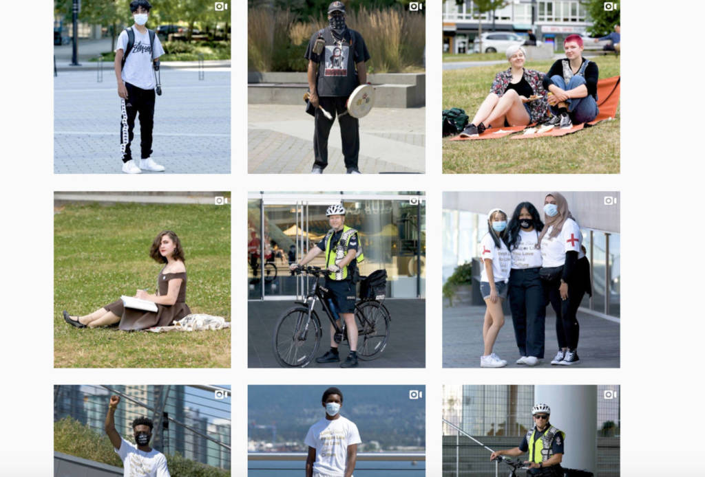
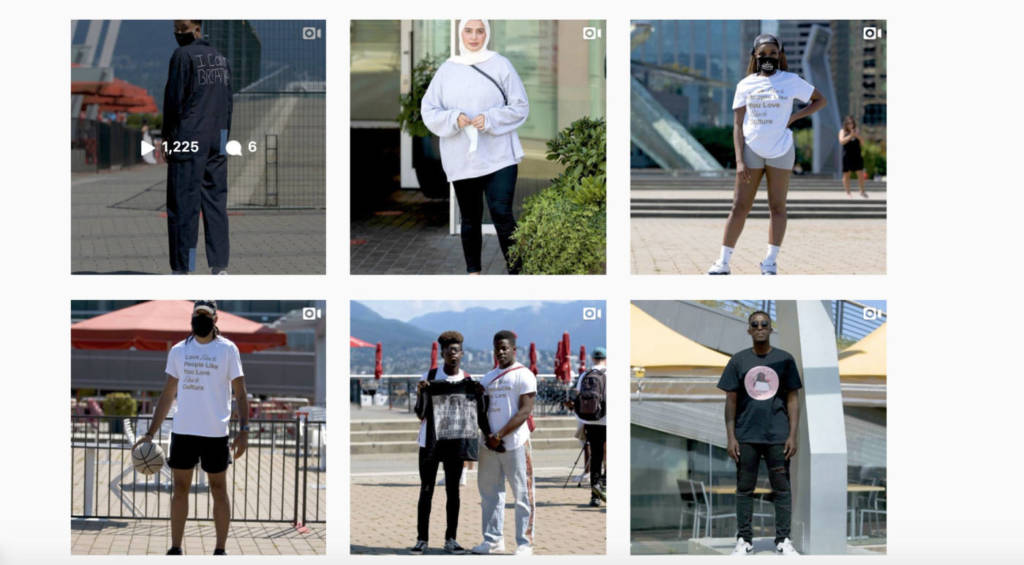
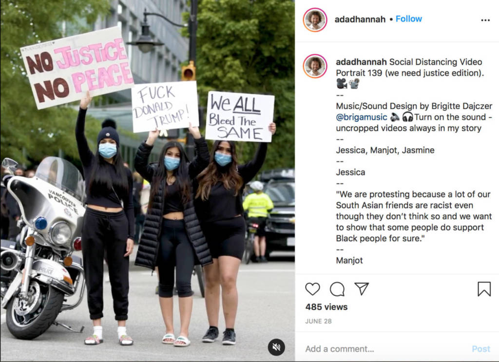
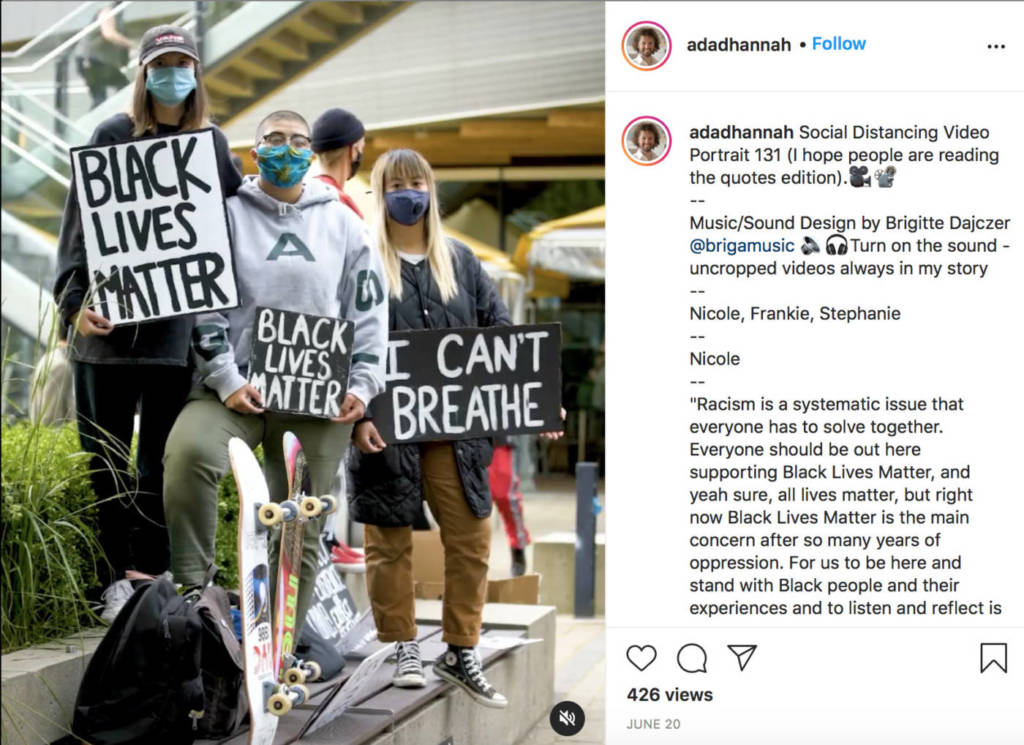
Record a video portrait in the style of Adad Hannah – choose one subject you know, and one stranger to record. Try to invite people from different walks of life, who hold different kinds of jobs, are different ages, etc. Our collective portrait should be diverse in all kinds of ways. Consider who will be an interesting subject – with an important experience to record.
Ask your subject to be still, in the middle of something they are doing in the world (outdoors), to pose for a video portrait.
Ask them to be still for a few breaths, and then answer the question: WHAT IS PENT UP FOR YOU RIGHT NOW? WHAT IS PENT UP?
Ask them to answer the question in one word, or a few sentences – and then to be still again for a few breaths afterward.
Look closely at Adad Hannah’s videos – notice the framing, the vertical proportions, the way he poses subjects inside the frame. Follow all the health restrictions and do not go too close to anyone. Use a tripod or a stabilizing device to have a clean, steady shot. Have your subject stand in the shade, or somewhere the light is not too contrasting. You may need to record your subject a few times, or ask a few people – in order to get your two short videos. Each clip should be around 20 seconds.
In class we will use your clips to practice video editing, and compile our trimmed, polished clips into a class collaboration – a VIDEO PANDEMIC PORTRAIT we are making together.
Welcome back to school everyone, I’m very happy to have a way to come together to learn about contemporary experimental art practices. During the pandemic, we will engage in weekly exercises, demos, readings and videos to learn some of the historic, theoretical, and technical aspects of working in experimental media forms.
Our virtual course will emphasize ideas, research, regular exercises and practices, as opposed to more developed and resolved artworks.
Students will perform and create studio exercises at home and in the world – within strict adherence to public health guidelines at all times – using materials and situations at hand. Together we will practice being resourceful and creative within the limits of any given situation. We will explore how to be an artist now – using aspects of performance, snapshot photography, video, audio, and artist multiples – in this unique and challenging historical moment.
Every week we will have Tuesday class meetings – and then you will do the week’s homework (things to read, write and create) posted under Weekly Assignments.
All work is due for the following Tuesday class. If you are finished your work many of you will have an opportunity to share and get feedback. You will need approximately 4-6 hours to complete your work for this course every week in addition to class meeting time.
Schedule your work and you will be able to keep up with your assignments!
All your notes, images and videos must be on the class BLOG – under your name. ONLY edit your own page – do not edit anything else on the blog. I will periodically read and evaluate your work on the BLOG and we will occasionally look at examples of works by students together in our class HUDDLE.
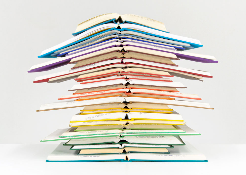
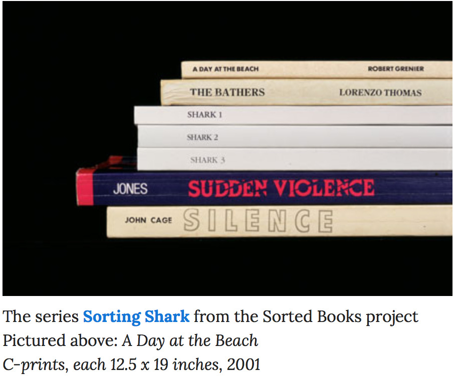
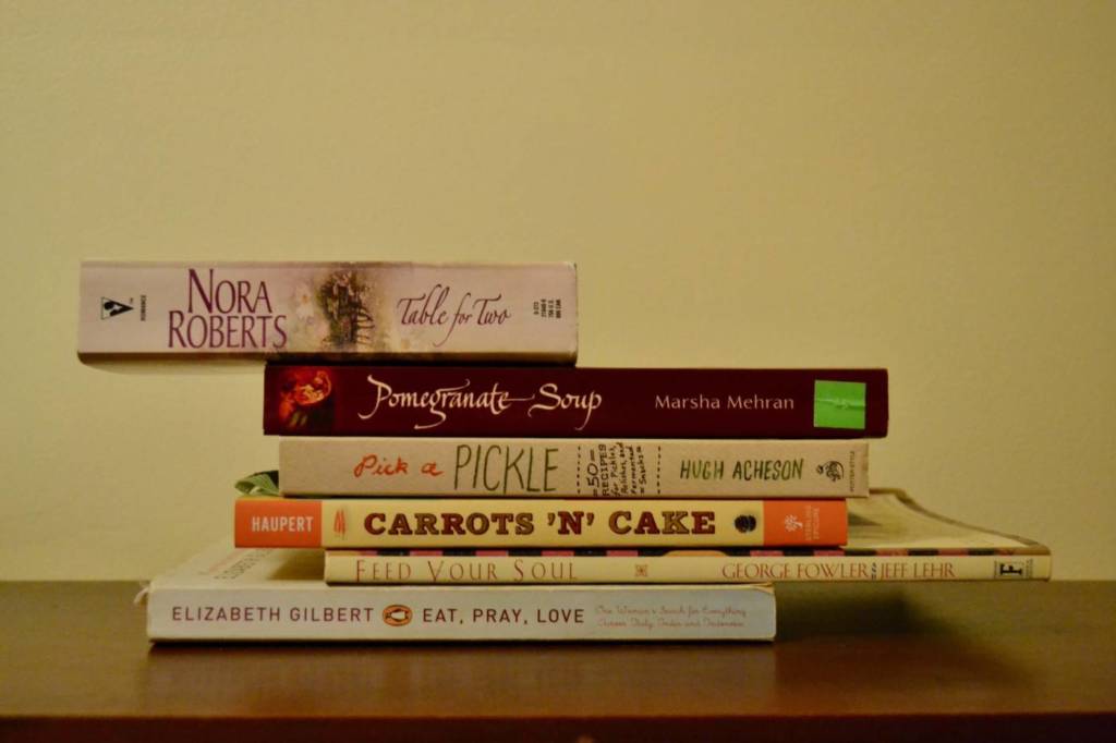
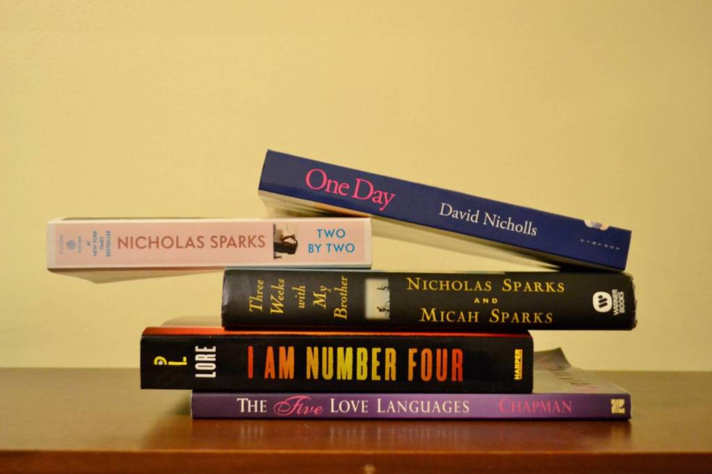
“The Sorted Books project began in 1993, and it has has taken place on many different sites over the years, ranging form private homes to specialized book collections. The process is the same in every case: I sort through a collection of books, pull particular titles, and eventually group the books into clusters so that the titles can be read in sequence. The final results are shown either as photographs of the book clusters or as the actual stacks themselves, often shown on the shelves of the library they came from. Taken as a whole, the clusters are a cross-section of that library’s holdings that reflect that particular library’s focus, idiosyncrasies, and inconsistencies. They sometimes also function as a portrait of the particular book owner. The Sorted Books project is an ongoing project which I add to almost each year, and there there are hundreds of images in the ongoing archive to date.”
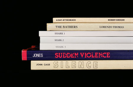
Pictured above: What is Art? C-prints, each 12.5 x 19 inches, 1996/2008The series Sorting Shark from the Sorted Books project Pictured above: A Day at the Beach C-prints, each 12.5 x 19 inches, 2001
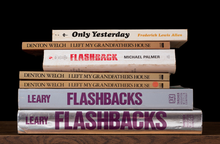
The series Kansas Cut-Up from the Sorted Books project Pictured above: Only Yesterday C-prints, each 12.5 x 19 inches, 2014
Dave Dyment:
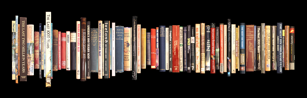
ONE BILLION YEARS [PAST AND FUTURE], 2012 A collection of books pertaining to the past and future, arranged chronologically from One Billion Years Ago to The Next Billion Years.
Ryan Park:
Ryan Park, 2009, Untitled
WATCH:
Nina Katchadourian discusses a new Sorted Books project in William S Burroughs’ library. You will also be making three stack images, using your own or someone else’s personal library, to result in any surprising new meanings.
WRITE: What are some of the strategies Katchadourin, Dyment and Park used to select and order books in their final works? What were their decisions based on, and how do the final compositions expand the meaning of each individual book, or come together to have a new and surprising meaning about the library, the family, about language and books, or about anything else? Select two pieces to discuss.
MAKE: Make 3 of your own Sorted Books stack. Choose a personal library (or some other special library) you have access to now – it could be the books you have in your bedroom, the books at your parents house, the books at work, all the books of all your roommates etc. Create a composition, with as many books you need, and photograph it. It doesn’t have to be a “portrait” of the person whose library it is – look for concise messages, play with words and concepts, experiment with different titles in relation to one another in different ways. Include the images, a short description of your library, and your process of creating the compositions on your blog page.
I hope you are all safe and well, and I am looking forward to welcoming you back to school at our first official virtual class which will be TUESDAY Sept. next week. Every week we will have synchronous – real time class HUDDLEs, on Tuesdays from 2:30 – 3:30, mark your calendars! See Course Link for links and details.
But before that – I would like to you tune in to a very special program this week Wed Sept. 9 and Thurs. Sept. 10th called Scholar Strike.
From the website:
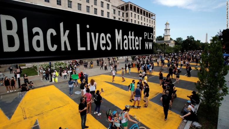
Scholar Strike is a labour action/teach-in/social justice advocacy happening. Scholar Strike originated in the U.S from a tweet by Dr. Anthea Butler who, inspired by the striking WNBA and NBA players, put out a call for a similar labour action from academics. The Canadian action is aligned with the one in the U.S., in its call for racial justice, an end to anti-Black police violence and it adds a specific focus on anti-Indigenous, colonial violence.
I strongly encourage you to tune in, to learn more about the Black Lives Matter movement, and think about ways we can personally, and collectively acknowledge and eliminate racism, inequality and injustice in our society.
Listening to activists, artists, and other racialized authours like Ibram X. Kendi – have given me a lot to think about, especially about how we all have work to do to address our own racist biases, and to challenge racist ideas, and to actively work against racist policies and inequality in all aspects of public and personal life.
From How to Be an Anti-Racist, Ibram X. Kendi
I strongly recommend you take the time to listen to this incredible podcast from CBC radio’s Out in the Open – Ibram X. Kendi’s conversation with Pia Chattopadhyay:
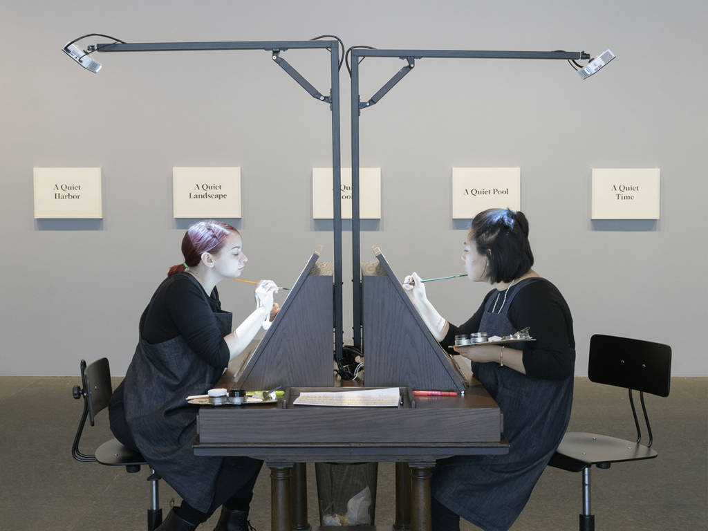
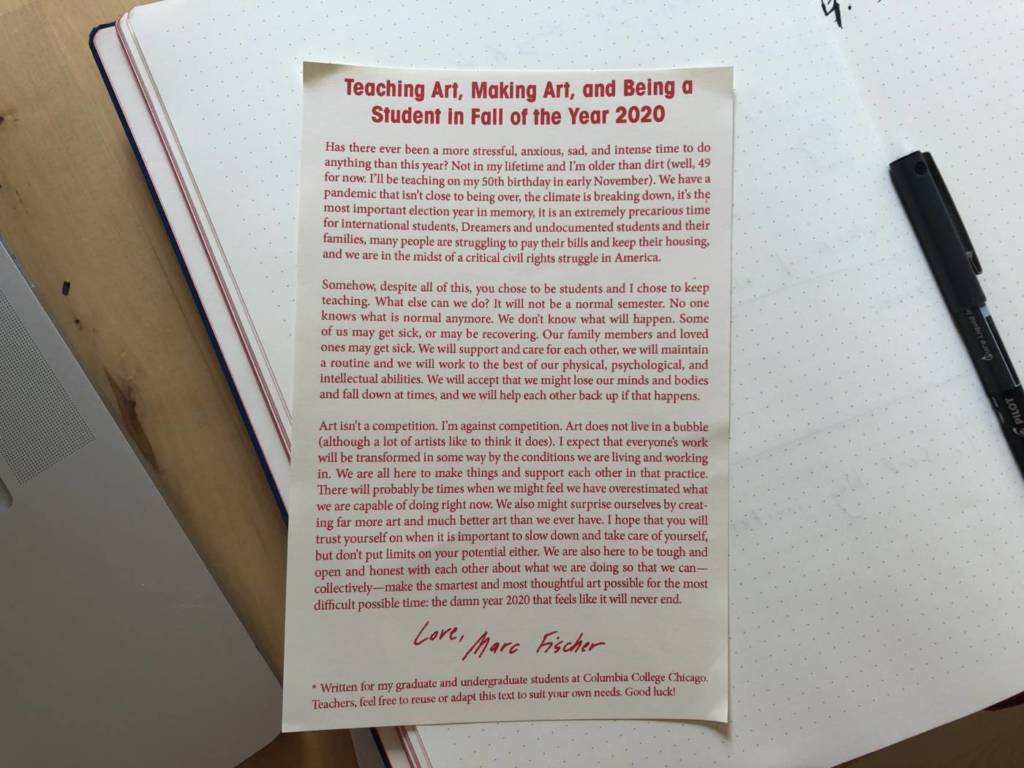
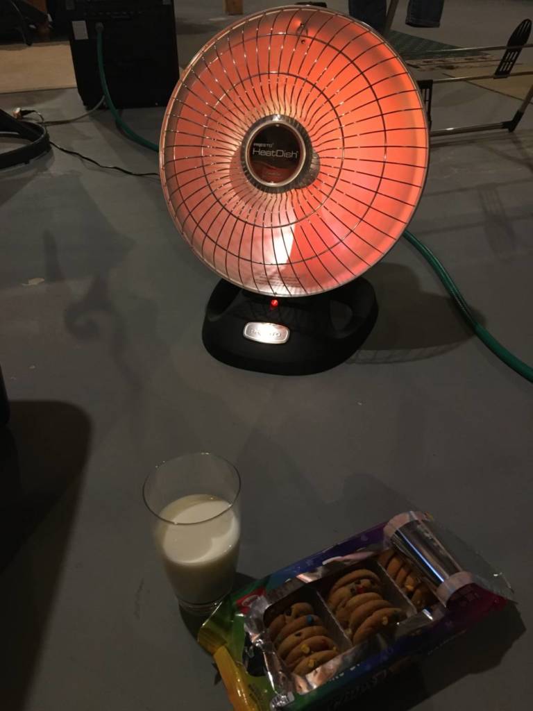
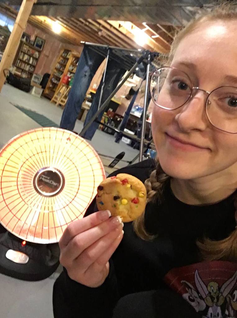
My experience during this pandemic has been far from normal or even close to convenient. From not having proper functioning wifi, to a broken computer, to having an extremely loud household, to being close to people that don’t respect public health guidelines. I have travelled far and wide from Guelph to St. Thomas ON, to Toronto, to Kitchener, all with the intention of finding a better living situation and being able to properly focus on a full school course load. Unfortunately for some projects, I have not been able to fully participate which makes me incredibly sad. From living in unfinished basements, to couch-surfing, while continuing to travel back to Guelph for work, the pandemic has definitely been one of the hardest and most frustrating times of my university life. I hope these photos express my tireless efforts but also my gratitude to such an understanding and accepting class. Thanks for everything!
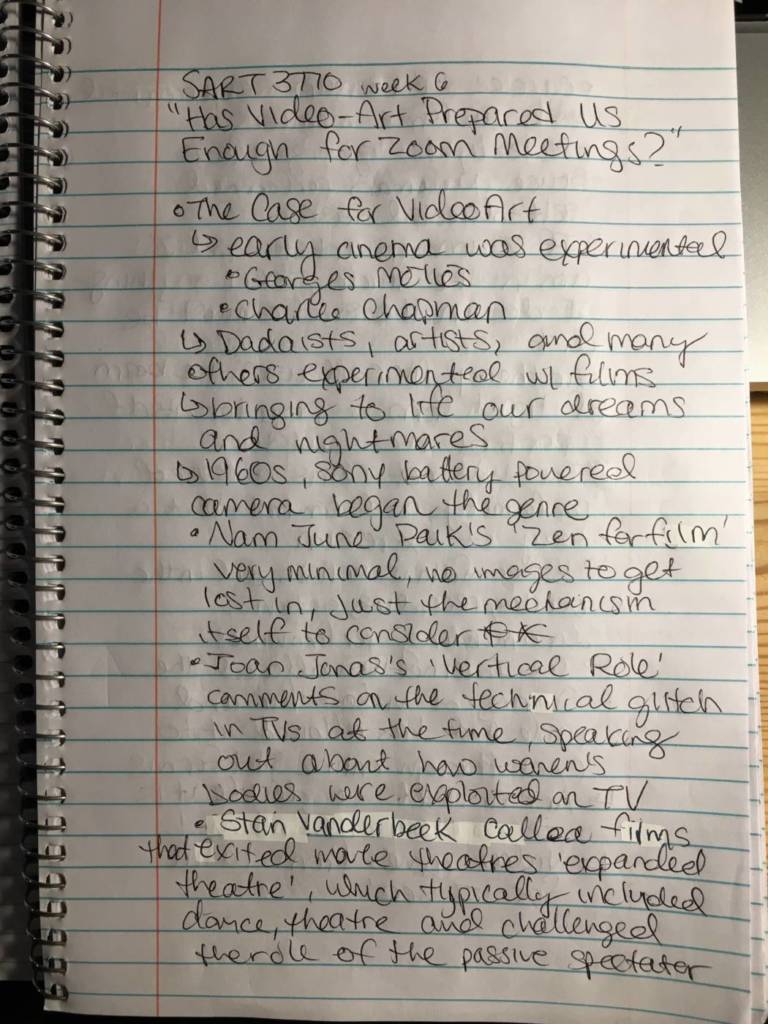
Week 6 Notes
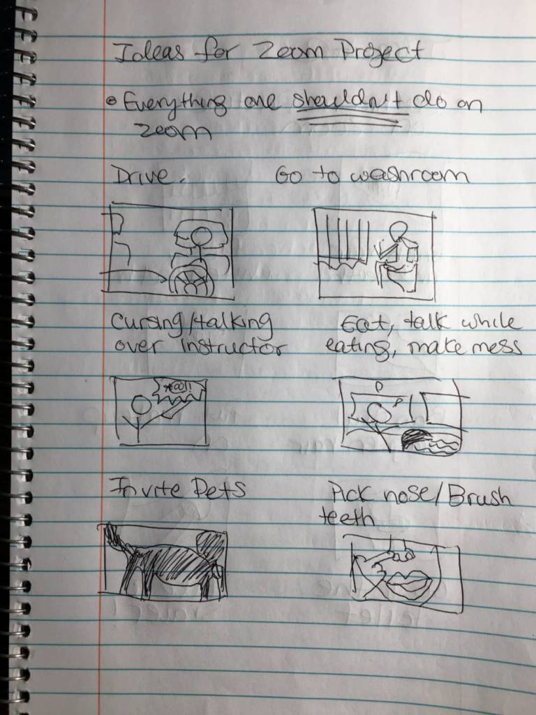
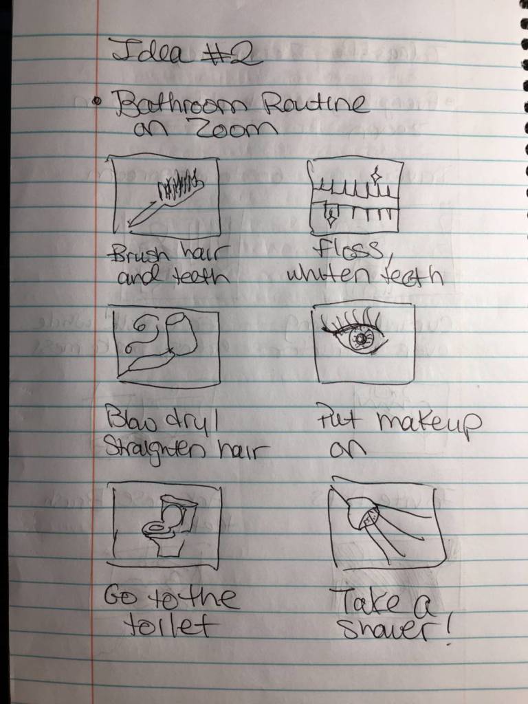
Zoom Video Project Week 7
Class Notes
What the Mirror Sees Everyday! By Sydney Rowles, with Victoria Abballe
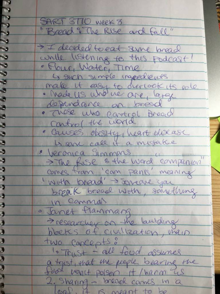
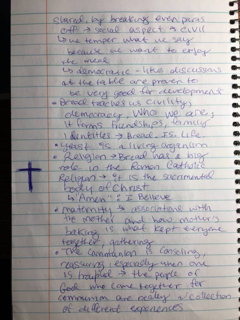
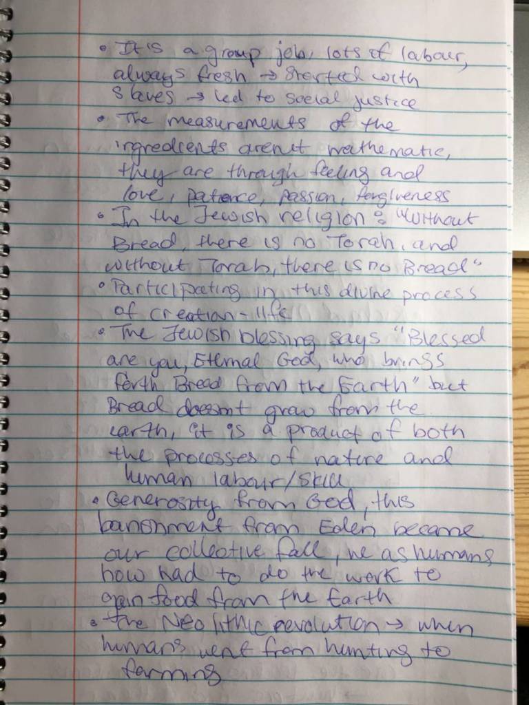
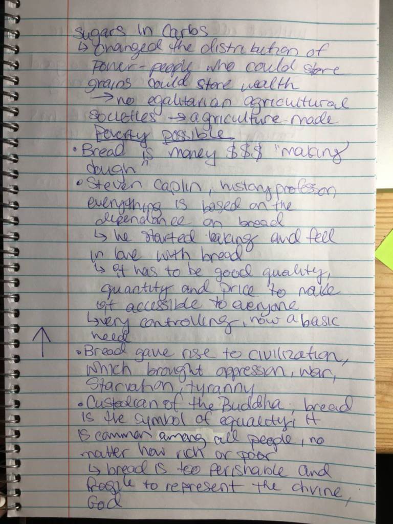
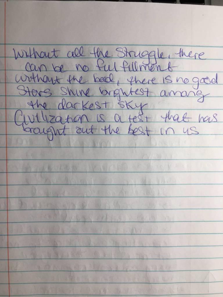
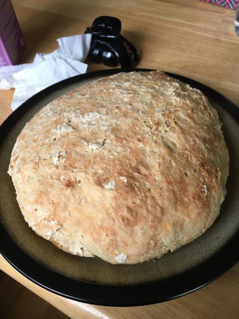
Bread Week 8
Class Notes
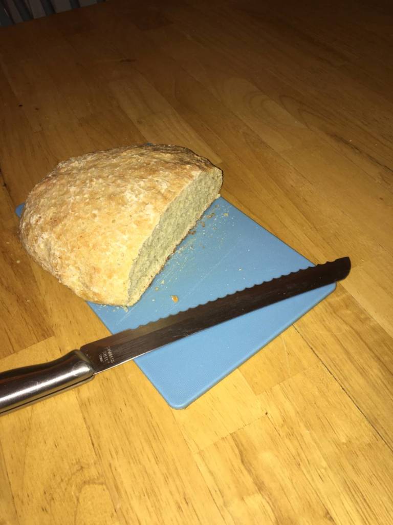
My bread!! It turned out denser than I would have liked, but I though it resembled a baguette texture, only fatter! I am not a baker at all but I found this exercise of not having to bake for anybody but myself very liberating. I was so happy and surprised with my result that I shared a few pieces with my housemates. We all had a piece with some herb and garlic cream cheese spread on it! Yum! Next time I will try incorporating different spices or maybe chocolate chips inside the dough to give it some extra flavour. Overall, I loved this week and felt so connected with everyone in class with this super simple idea of making bread all together!
Bread is Life
Week 9 Notes
Week 10/11 Video Project
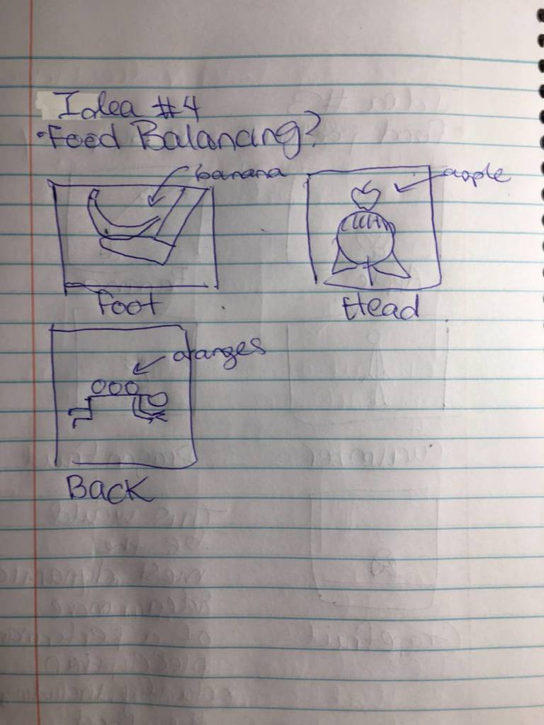
There are many different uses for fruits that everyone should take advantage of! Try them out! by Sydney Rowles, 2020
Katchadourin, Dyment and Park, the 3 artists studied in preparation for this assignment, all used interesting techniques when selecting books for their final works. One strategy I believe was commonly used was choosing books by interpreting them as sculptural objects; looking at their weight, size, mass, their wear and tear, even the font sizes since all of these factors have major impacts on the overall finished look and message of the work. Another technique that was mentioned that I, personally, tried to include in my sorted book stacks was to align all of the titles on top of one another or ‘flush left’ in order to increase legibility and have the message of the work come through quickly and easily to the viewer.
I specifically enjoy the book stack A Day at the Beach from the Sorted Books project, not only because I am drawn to the stacks that tell a story through a series of words, but the repetition of the sharks (Shark 1, Shark 2, Shark 3) is so simple yet helpfully adds to the suspense of the short story and creates an image in the mind. Above all, the Sudden Violence book is what stands out the most among the other books by not only being the climax of the story, but with the added colour and scary font. I believe the effect would not have been as great if the book were the same font and colour as the other books.
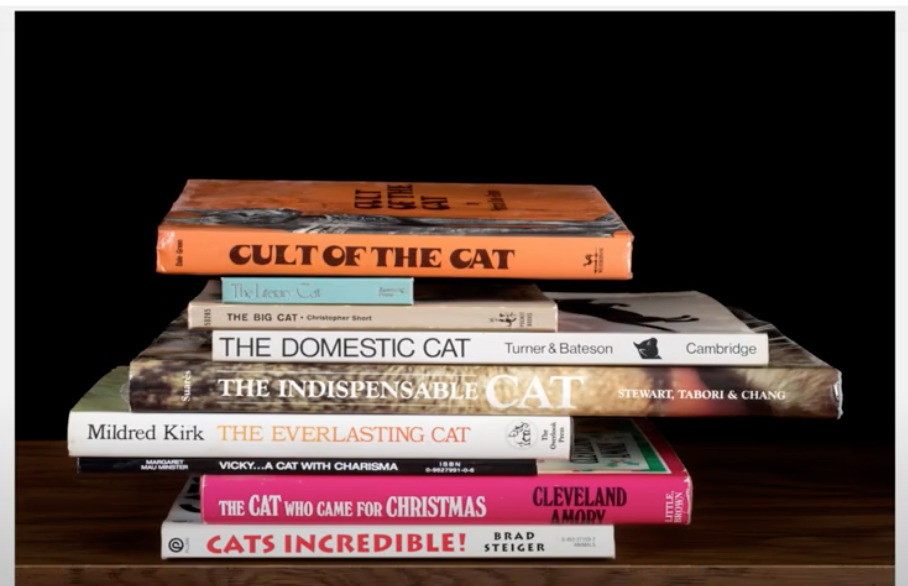
The second book stack that inspired me was (I believe it is called) Cult of the Cat, again from the Sorted Books project. Not only am I a personal lover of felines but I also loved how this funny stack was created simply by a group of books all with a similar subject. The fact that they are all different colours and fonts adds to the individuality of the cats themselves and helps create images of real cats with these names in the mind.
The three book stacks I have created are all comprised of books that came from my mother’s book collection. She is one of the biggest, widely-spread genre book readers I know and I thought it would be interesting to look through her collection for the first time. To my delight, she was happy to share her collection without any fears of judgement and by the end she became equally interested in the project and was finding and adding books to what became my final stacks!
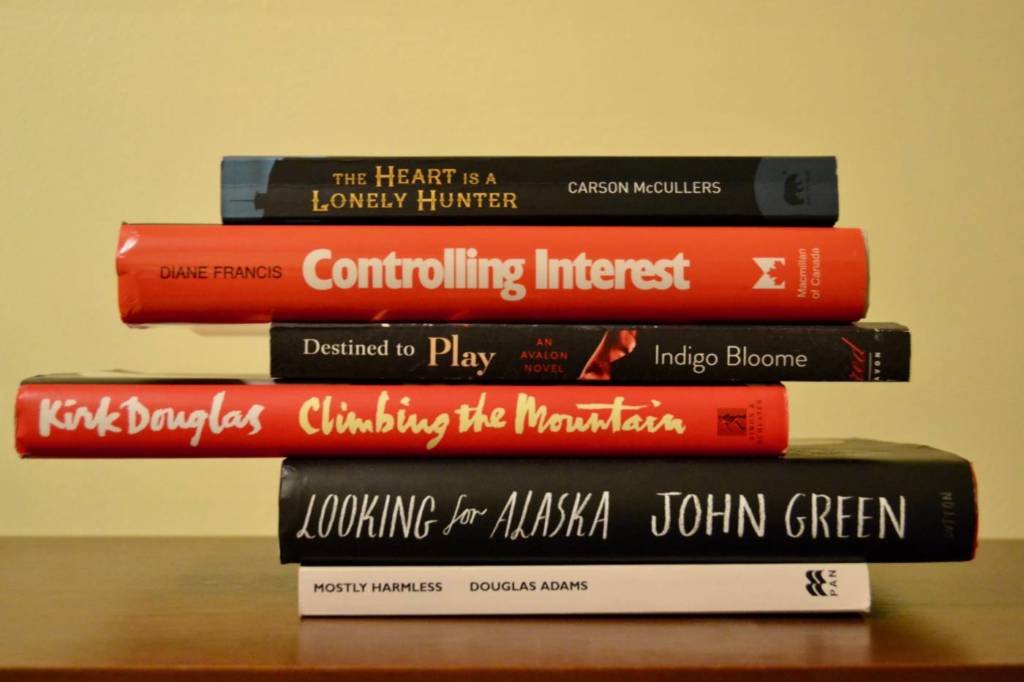
The Heart is a Lonely Hunter by Sydney Rowles, 2020
For my first sorted book stack, I first found the book The Heart is a Lonely Hunter and thought to myself “and what would it do?”, so just like the A Day at the Beach short story stack, I created a story about the heart. My favourite part has to be the irony of the small and almost missable Mostly Harmless as we all know what the heart is capable of.
Bon Appetit! by Sydney Rowles, 2020
For this sorted book stack, I looked for books in my mother’s collection that had a unifying theme of eating and food. To my surprise, the final menu cam out pretty interesting… Bon Appetit!
1, 2, 3, 4, 5 by Sydney Rowles, 2020
For my third and final sorted book stack, I randomly discovered a trend in some of my mother’s book titles that surprised the both of us! Books with numbers in their name! I wanted to continue the theme but the only other numbers I had to deal with were 7, 10, 50, and 101! Sadly the pattern had to end here but if I get the chance, I would love to add on and repost a larger and longer stack someday soon!
Text as Art Week 2
By Sydney Rowles
Nadia Myre’s Indian Act is a large group-effort piece that contains all 56 pages of the Federal Government’s Indian Act, each mounted on individual pieces of cloth and sewn over with red and white beads. The white beads stand in for each and every letter while the red beads fill the background. This was a very clever medium as not only are beads close to the same size as the documents and words they cover, but also, beads are a well-recognized material used in many First Nations art and this well represents their culture. This work is an extreme statement on opinions of colonialism and the realities of government effects on the Indigenous population. The fact that the artist gathered many people of her background who share the same story to help finish this work feels like a valuable group contribution to the Indigenous rights movement. This is a great example of how an artist belonging to a marginalized population re-appropriates a document that is used to oppress them and turn it into a powerful art statement.
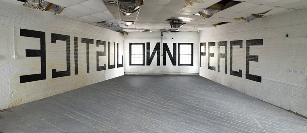
Barbara Kruger’s Belief + Doubt installation is extremely immersive, dramatic and makes many powerful statements. The artist has chosen the inside of a Museum bookstore to completely cover with her photomontages. She has covered the entire space in black, white and red vinyl, and has chosen to display her words in a confrontational high-contrast manner. The way she has chosen to display her art is extremely effective since her messages all highlight the problems of consumerism and themes of desire. It is interesting that she has chosen to place these words in a place of consumption, ie. the bookstore, in order to target the customers and make them think twice about their needs and wants. I feel like if I were in this space, I would feel extremely uncomfortable and almost smacked in the face by these statements, which I believe is the feeling the artist is aiming for in viewers.
Banner Project Week 3
Notes:
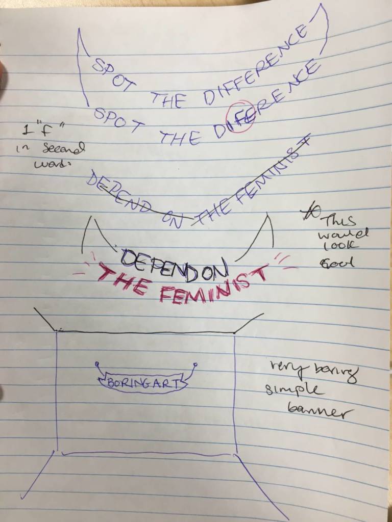
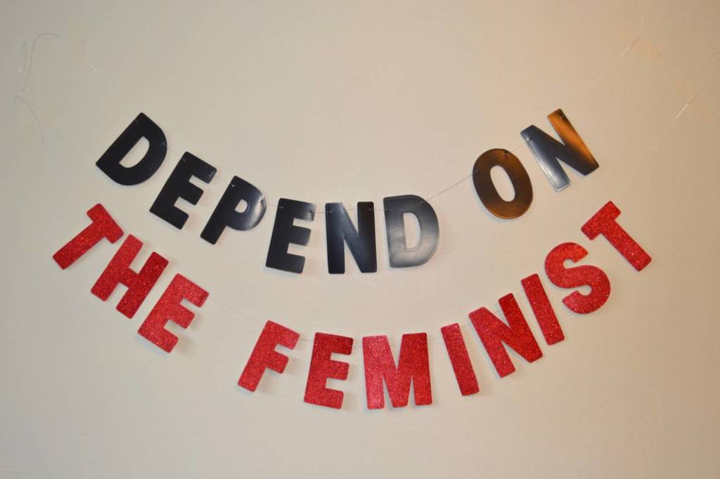
After poking through the article Dirty Words: Interesting, I discovered the powerful words “depend on the feminist” and decided to turn it into a statement piece. Currently, the feminist movement is stronger than it has ever been, its main focus on the rights of the female population and the issues of equality, domestic violence, sexual harassment, maternity leave, and many others. When creating this banner, I felt that the words “the feminist” deserved special attention and chose to have them stand out in a bright sparkly red. This setting reminds me of a banner on a wall at a party and the thought of having a feminist party after the movement becomes successful would be amazing, and I believe these exact words would fit the occasion perfectly.
Depend on the Feminist by Sydney Rowles, 2020
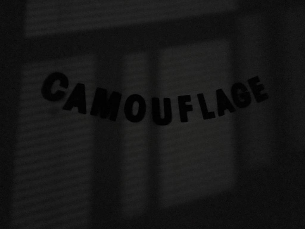
My 2nd banner I decided to create just for fun was the word “camouflage” found within the article Dirty Words: Interesting. I thought it would be intriguing to camouflage the physical word ‘camouflage’ and so I shot the image of the black letters in a very dark room with only a little light coming from a window.
Camouflage by Sydney Rowles, 2020
Social Distance Videos Week 4
Notes:
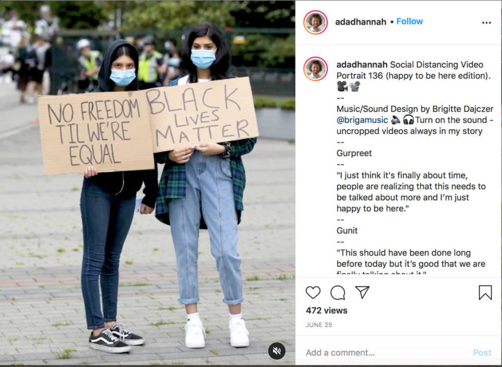
I was very inspired by Adad Hannah’s 1 minute stills of people protesting and holding the motivational signage, as I felt very moved and thought they made powerful statements. Here are some examples:
THIS IS NOT A PROTEST ABOUT ANY COMPLAINTS THAT HAVE BEEN SPOKEN DURING COVID OTHER THAN THE ONES ABOUT PEOPLE NOT WANTING TO WEAR MASKS !! As a statement contrary to the recent protests against wearing masks where people have been saying “my ears are hurting from wearing masks”, I decided to create a still video of the opinions me and my housemates share on the matter. COVID-19 is not going to disappear on it’s own and everyone needs to do their part by following public health policies and wearing their masks properly! #wereinthistogether
Our Ears Are Hurting by Sydney Rowles, 2020
Housemates: Serena, Sheyda, Anna, Shelby
Serena: “Covid has been a tough time for everyone, its so important for us to follow public health guidelines so we can hopefully end this thing sooner than later!!”
Sheyda: “Pointing fingers at anti-maskers and making this a political problem is not going to solve the issue since it is against human nature to do the right thing when they’re forcefully told to do so. Instead if we want to motivate good public health decision making, we have to appeal to people’s core values. This means connecting mask wearing to the value of caring for each other in all Canadians and how it is worth the inconvenience and discomfort to wear one.”
Anna: “Think of it this way: wouldn’t you want a stranger who could possibly have COVID who comes near one of your family members to wear a mask? I just think people need to put themselves in other people’s shoes!”
Shelby: “I think the main problem is that people don’t believe they have it since it takes up to 14 days for symptoms to show up. Thats the real danger in all of it! Protect yourselves and others!”
Where is all the Paper Towel? by Sydney Rowles, 2020
Another still video I created regarding the COVID-19 pandemic, focusing on the over-consumption of the public and how so many people are being left without their amenities or basic human needs. This obsession with the fear that the world is going to run out of paper products is so mind-boggling. Why aren’t the food isles completely sold out instead? The first wave was toilet paper. Now, WHERE IS ALL THE PAPER TOWEL?


 See the videos below on his Instagram page:
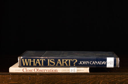


.jpg)