Carys

You’ve stumbled upon my blog! Enjoy your stay 🙂

Banner Assignment

Possible Phrases:

  • “depend on the feminist” – put on a pro-life ad, pro-life clinic, politically relevant and asks the viewers to depend on the feminist for women’s rights
  • “praise and a kiss of death”
  • “meditation on vulnerability and dissimulation”
  • “safe and exposed positions” – a commentary on sexuality and intimate parts we share about ourselves
  • “I am not bound to them” – talking about personal traumas, the location reflects that and gives the viewer an insight into my trauma. I am not bound to the individuals who have caused me trauma
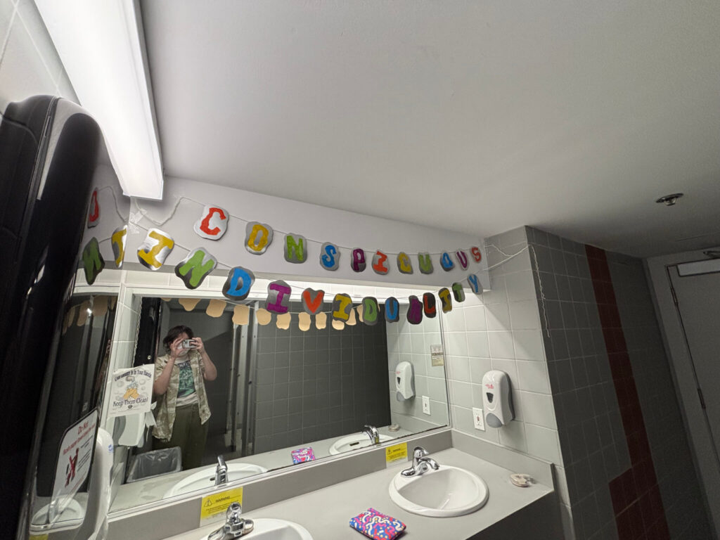
  • “conspicuous individuality” – put in front of a mirror, a comment on how we are all unique and have individualities that are recognizable to others but not to us – hence the mirror asking the individual to look at it and ponder their individualities and things that make them unique

Conspicuous Individuality, Carys Bishop, mixed media, 2025
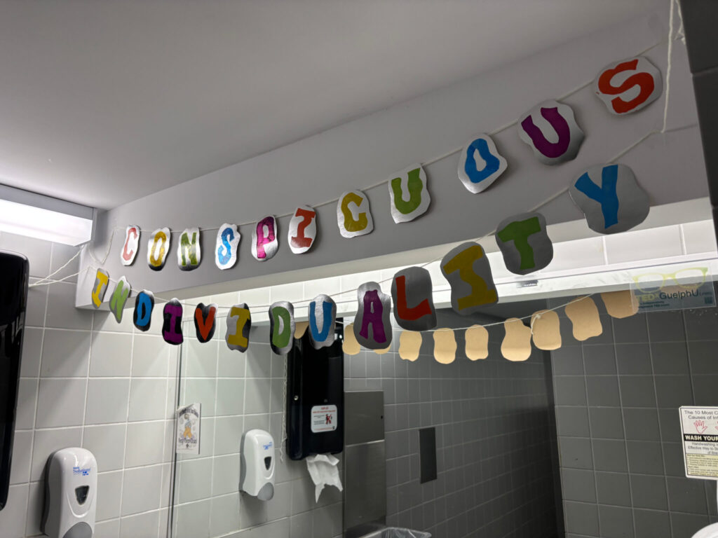
The phrase I chose from the reading Dirty Words: Tammer-El-Sheikh, from Canadian Art, was “Conspicuous Individuality.” This phrase stuck out to me because I enjoyed the sound of it, it wasn’t until I brainstormed a deeper meaning behind it that I selected it as my piece for my banner. The word conspicuous means something obvious or that stands out, so I wanted to look at features about ourselves that make us unique and individual. Nowadays I find we are so wrapped up with social media and comparing ourselves to the cookie-cutter ideal person society wants us to be. We may not notice unique features we possess that make us who we are or point them out as bad. The phrase “Conspicuous Individuality” combined with the placement of the banner, intends to get the reader to step back and think about the obvious and beautiful individualities that make them who they are. So long we spend in front of mirrors perfecting our appearance, but what if we just stood there noting all of the things that make us unique that we may not notice but others do? That’s exactly what I aim for the banner to beg of the viewer.
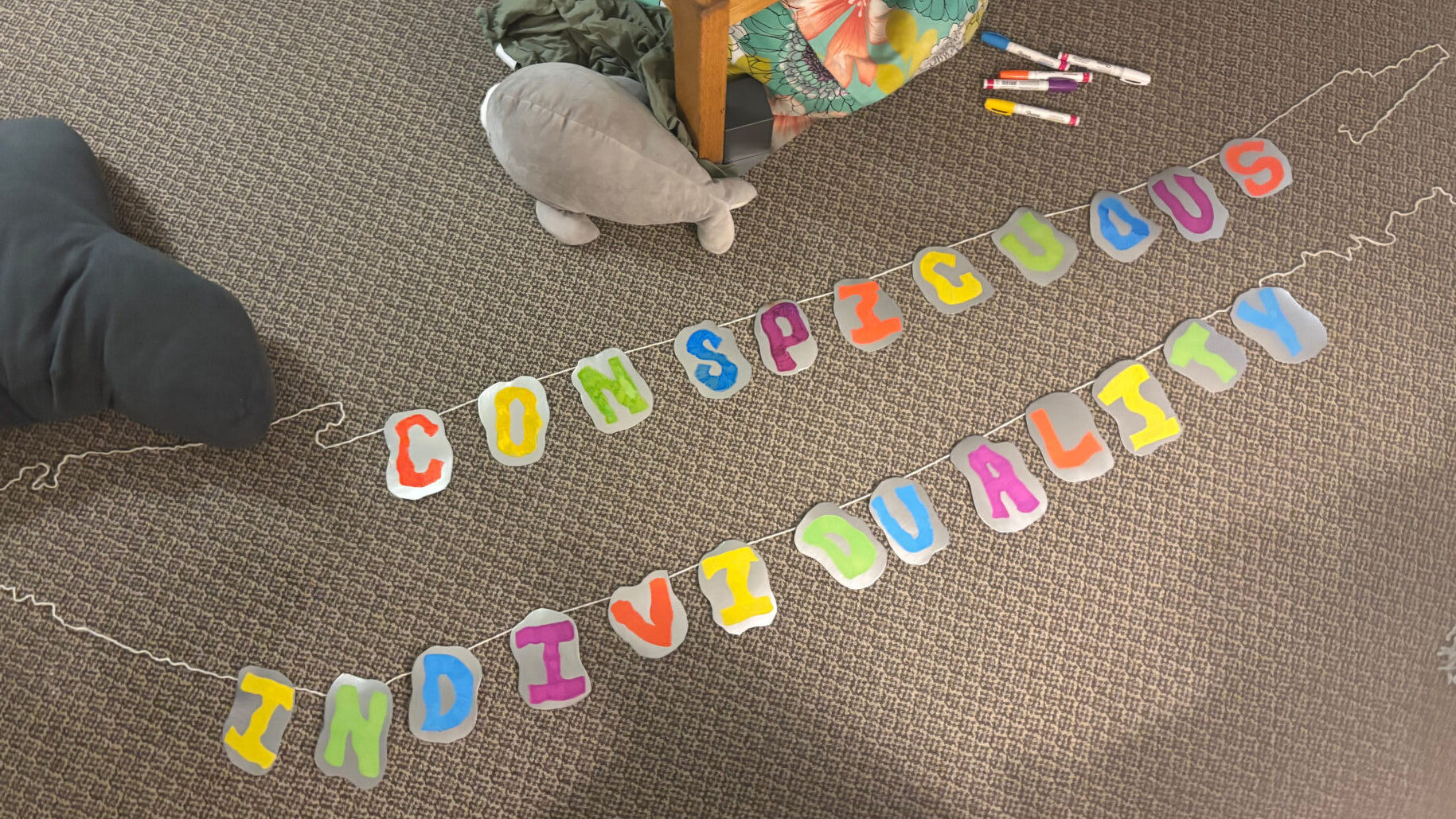
The banner right after being completed.

In making the banner, I cut unique shapes out of foil paper, ensuring each shape is different. As our individualities are unique, so are the shapes of paper. The choice of material was made to resemble a mirror, echoing the calling for looking at oneself. The warped and wavy shapes and fonts that make up the banner are intended to represent a warped sense of self, as many of us experience for numerous reasons, especially social media as I mentioned.

Neil Postman’s Amusing Ourselves to Death, 1985

Notes regarding the summarization of the material:

  • Though certain elements of the book are outdated, many of its messages about the consumption of information through media such as television, political trends due to television, and the absorption of our minds into television allowing us to neglect things in our lives
  • The world of television requires a level of complexity that previous forms of communication could not provide
  • The accessibility of television has had arguably negative effects on our society, such as decreased attention spans, fragmented information, social isolation, less exercise in children, an overreliance on the media for information
  • Language and how humans communicate are what frame our worldview
  • Media directs how we see the world 
  • Society becomes overreliant on technical innovations such as the clock and now the television 
  • Language is our media, and through media are metaphors, and through the metaphors we create our cultural content

Quotes for discussion: 

“As [Aldous Huxley] saw it, people will come to love their oppression, to adore the technologies that undo their capacities to think” (Foreword, Page xix)

  • This prediction mentioned by Postman I don’t think has ever been more relevant. In an age where most of our media consumed is mostly short-form content, we are controlled by our phones, by our constant need to consume and scroll. Children spend less time outside, people are more isolated, conspiracy theories are rampant, and we consume fragmented information, all effects stemming from what Postman warned about, which is now more relevant than ever. With the rapid and consistent consumption of media, we are rarely questioning what we consume, how it affects us and how we think. In a way, it is making the consumer dumber, not allowing us to think critically about what we consume and allowing the television to just lead us in whatever direction. People are inclined to believe whatever they are told by the person behind a screen without any facts or sources to back it. With media as accessible as it is now, anyone can have a say on anything and may or may not be taken credibly. Despite seemingly making us as consumers dumber and media being the cause of a lot of our distress, we love it, we can’t get enough. These days, we have our media right at our fingertips, ready to consume at any time, continuously; we don’t care how it affects us, we’re addicted. This prediction mentioned in the foreword is not only a great lens to look at the book through, but also our modern society.

“Whether we are experiencing the world through the lens of speech or the printed word or the television camera, our media-metaphors classify the world for us, sequence it, frame it, enlarge it, reduce it, color it, argue a case for what the world is like.” (Page 10)

  • This notion of the media we consume frames the way our world view is like is very prevalent in our modern day society. In a world of not only television but also the internet, the content we consume frames how we think about the world. Especially now, in the age of TikTok, we are seeing waves of political ideologies reach us in ways the TV never could – it all feels more personal on our handheld devices, as if they are talking to us. A good example of this phenomenon is the misogynistic right-wing content many young boys are consuming on TikTok and YouTube. It is through consuming that content that they learn how to engage with the world. It also directly affects their views on women, queer people, people of colour, and politics in general. In an age of rampant disinformation and conspiracy theories, notably on right-wing media circles on TikTok, YouTube or even TV shows like Fox News, we are seeing more than ever the creation of cult-like ideals formed from this media. This is talked about a bit in the Interview with the author’s son, Andrew, but it’s even more prevalent now amidst Trump’s second term as the US president. The right-wing governments heavily rely on the visual and digital media to shape the world view of voters, all to feed into any ideologies shared with them. 

“What is peculiar about such interpositions of media is that their role in directing what we will see or know is so rarely noticed.” (Page 11)

  • At this age, we are so used to consuming media that we rarely notice when we are directed to believe one thing or another. It is so easy to get lost in something and not notice the subtle nuances that are directing our worldview or way of thinking. One example is the use of language on a political news TV channel; a left-wing channel such as MSNBC may use negative language against right-wing ideals and politicians and positive language regarding progressive ideals. As consumers of the left channel, we may be inadvertently directed to be more tolerant of progressive ideas and less tolerant of ideas rooted in traditionalism, White nationalism or sexism. A right-wing channel such as Fox News may use negative language against left-wing ideals and politicians and positive language regarding traditionalist, sexist, White nationalist and Christian ideals. As consimers of the right channel, similar to the left channel but opposite, we may be inadvertently directed to be more tolerant of ideas under the guise of traditionalism and less tolerant of progressive ideas. This brings forth the idea of how the language used in our television shows and media consumed could be biased, thus causing the viewer to be directed to a biased side of a world view instead of thinking for themself. Television itself is meant to inform or entertain the consumer, so often we don’t think twice about the media consumed, hence, it is so easy for the show creators to skew our worldview in certain ways.

Internet Commentary Video

  • Analog horror videos – indie-made horror content in short-form videos, a huge trend on YouTube in and out of the horror community
  • Drama videos – an exposĂ© of sorts
  • Video essays – more consumable forms of information

Analog horror video

  • Inspirations: Mandela Catalogue, the Backrooms, FNAF VHS, The Walton Files, Local 58, Gemini Home Entertainment
  • Main idea: Use horror media to showcase real-time and present horrors
  • Documents the current horrors of the world in the present time – the USA is currently experiencing several historical moments
  • Showing things we are experiencing in real-time, in real life (a lot of news content with what’s happening with Human rights right now, especially in the States)
  • Often with the constant news that someone’s rights have been revoked, one becomes desensitized to it all, it’s the only way for some people to survive day-to-day.
  • I want to make viewers uncomfortable, and scared, how I feel when I think about the uncertain future of LGBTQIA+ people
  • Heavily will rely on visual and audio effects to make normal videos seem horrific
  • The analog horror genre normally relies on self-made or distorted images/videos/models to get their niche ideas across, my artistic twist is sourcing everyday things we see on the news and online

Open to the “breaking news” and announcement of crash, static overtop, distortion and black screen. distortion, footage of inside plan, flashes of black and maybe red to make it scary, “we’re going down” or something similar playing overtop. explosion. flatline sound or ringing opening into Trump’s initial mention of the plane crash.

Parental Video – A Picture of An Imperfect Family

A Picture of An Imperfect Family, Carys Bishop, Video, 2025

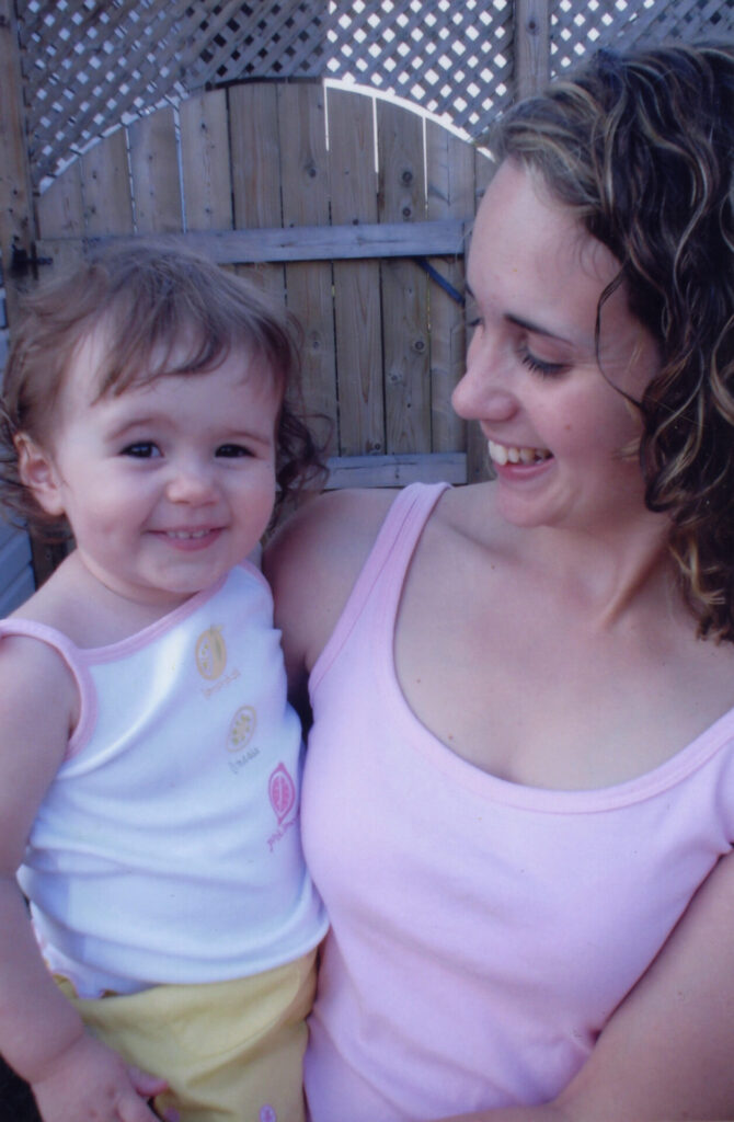
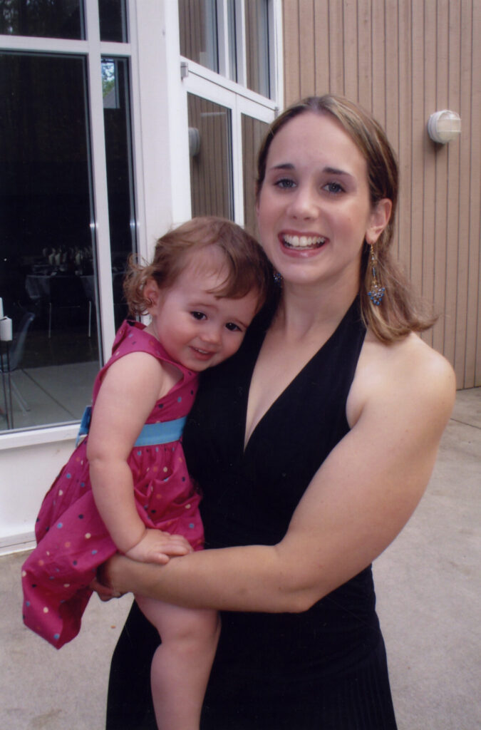
This parental video was one of the most difficult pieces in my artistic career, not because of technical difficulties but because of the pure emotion and passion that went into this assignment and dealing with its complicated subject matter. I had originally planned to do a video interview with my mom, similar to The Stories We Tell, but after conferring with Diane, I decided to go in a different direction.

I was going to use pictures from my childhood to tell the story of my imperfect family, giving the audience a picture of what my life is like. I wanted to speak to the idea of the nuclear family dynamic, especially in a time where traditional family values are promoted. Instead of showing the perfect family, I wanted to turn that on its head and showcase a family that did not fit traditional standards. I was hoping it could speak to a larger group of people whose family life doesn’t fit that perfect box, especially those with abusive or absent family dynamics.

I had my mom pick from a collection of pictures from photo albums and Facebook, photos she thought could tell the story of our family best. We mostly aimed to look at the relationship between my father and me. I chose a setting that was comfortable to her, my home; that way, it felt less manufactured and she’d be the most comfortable. Despite her wanting to do this project with me, it was going to be difficult for both of us due to reliving memories. It was an incredibly therapeutic experience for both of us, though. I got to explore our family in ways that I had never seen before, through her eyes, and our relationship grew even closer after that.

Before the video gets into the segment with my mom, I implemented a home video of my dad and I, just to show our dynamic when I was younger before my mom explains it.

I understand that there may be better formats in which to present this and the photos, I could go the route of having the photos and her side by side or making her a voice over instead, but I wanted to focus on the raw emotion brought up by these photos and am happy with the format I chose.

I am incredibly proud of what I created, and so is my mother. I’ve spoken privately with class mates as well about how it resonated with them. I achieved the goal I wanted – wanting to resonate with those who have irregular and abusive family dynamics.

Tattoo Assignment – My Body My Home

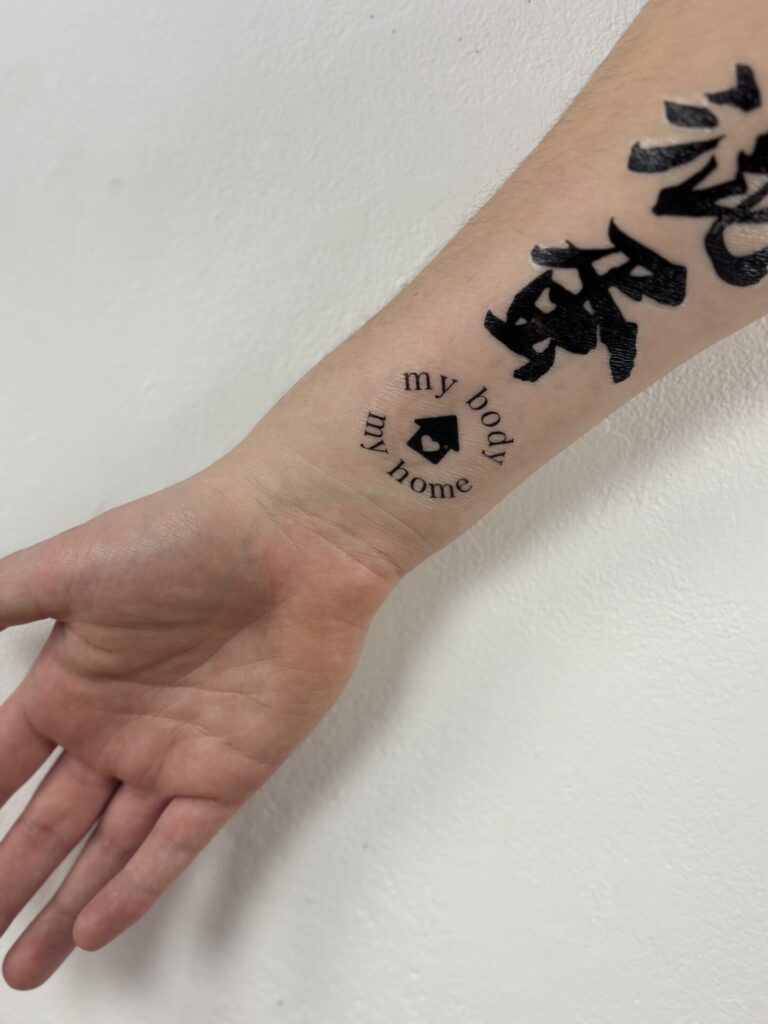
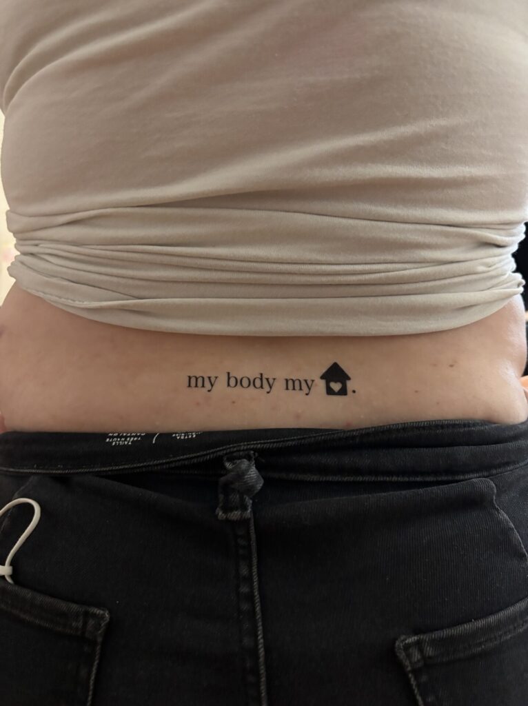
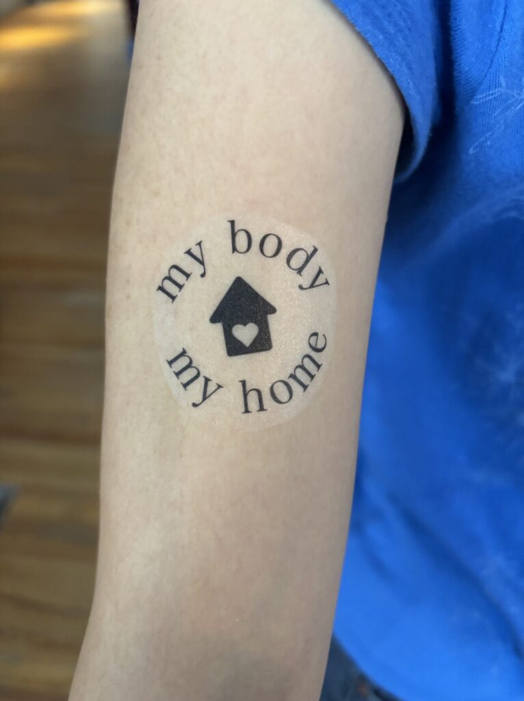
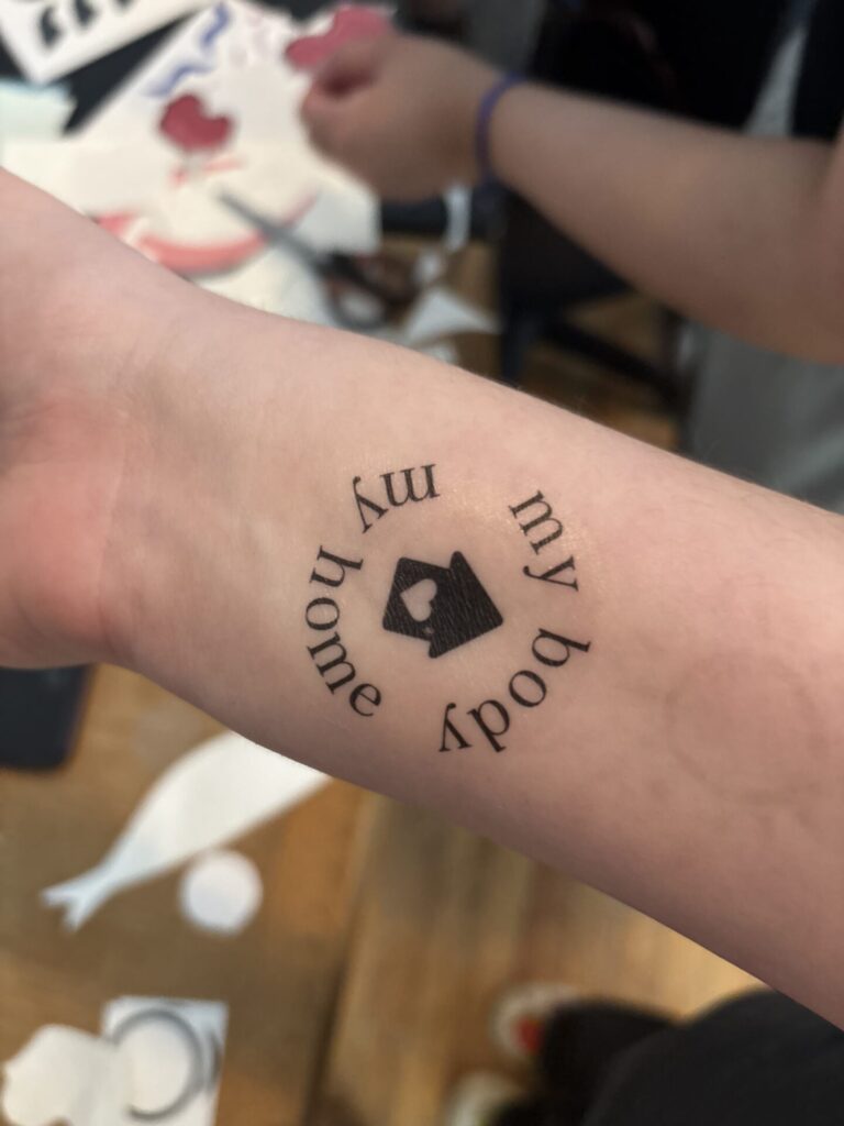
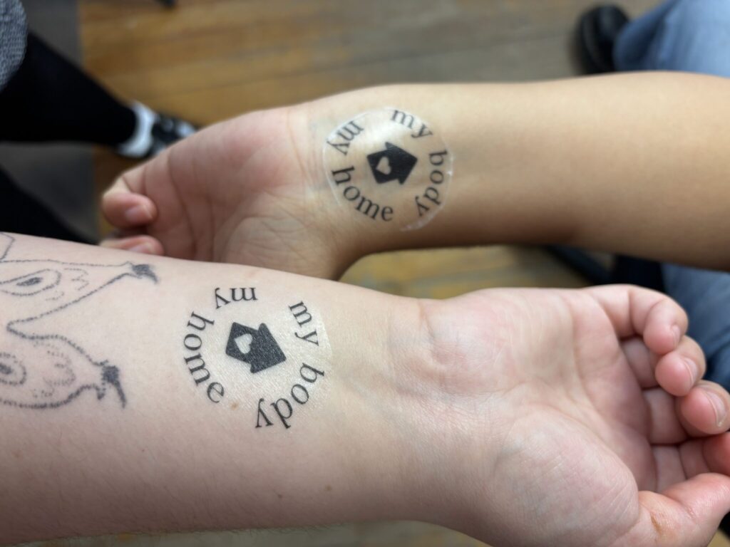
My Body My Home, Carys Bishop, Temporary Tattoo, 2025

Creating a tattoo to go on people’s bodies was an entertaining assignment, although I was initially met with idea paralysis. I had so many ideas and no idea which way to take them. I could go for something funny, or I could go for something meaningful. I ended up going with a phrase that means a lot to me and pairing it with a small graphic. The tattoo consisted of a phrase I always say to myself, especially amidst my sexual trauma healing story, “My body my home.” It is a short and simple phrase to remind myself that this is my body, and it is my home, so I should treat it with love and respect. I also liked the notion of tattooing this on people – directly signifying that the tattoo receiver is echoing the phrase.

The initial sketches consisted of my rough idea, trying to come up with a format for the house graphic and the text. Eventually, I decided on two formats and provided the two options when tattooing; that way, people can pick what fit best on their bodies.
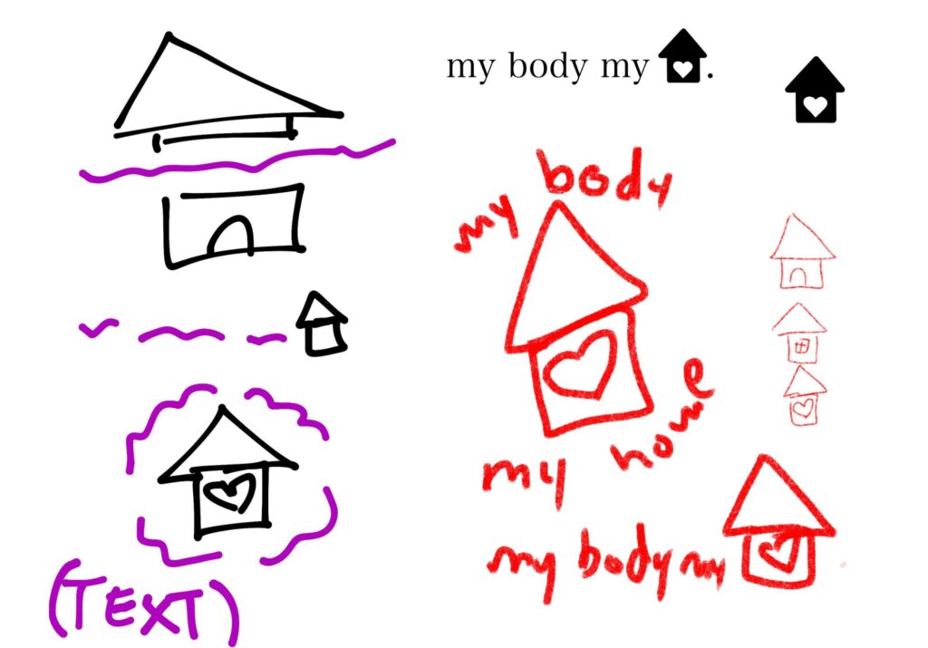
Initial sketches for tattoos.

Field Trip – The AGO

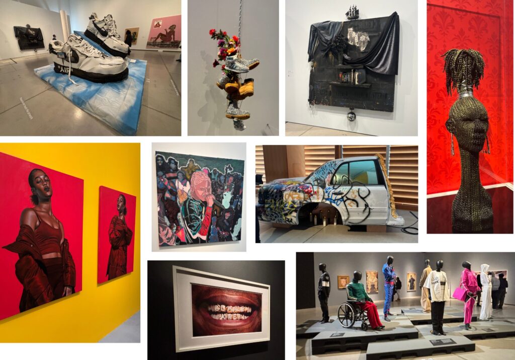
Kalmplex, Zanele Muholi, Gelatin Silver Print, 2008
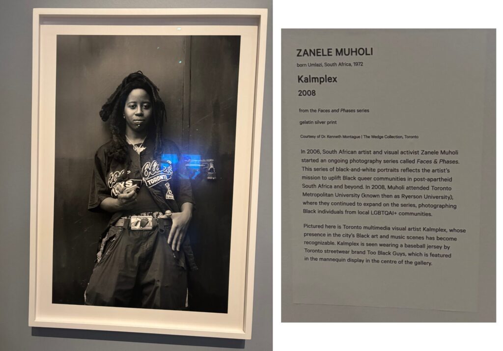
Kalmplex by Zanele Muholi was one of my favourite pieces in The Culture exhibit at the AGO. The photograph of visual artist Kalmplex is very well done. I enjoy the framing, the use of blacks and whites, and how natural it feels. Muholi did an excellent job of capturing Kalmplex in a natural position; it feels as if they’re just standing however they’re comfortable, and Muholi captured that, giving the piece a certain authenticity I wouldn’t have felt if it was posed differently. The silver print and the use of blacks and whites in this photograph increased the experience of viewing this piece for me, I could look at all of the intricate shapes and forms of Kalmplex’s outfit. I also picked out this piece due to my interest in 2SLGBTQIA+ artists and individuals, which Muholi is, and highlighting in the Faces and Phases Series. Recognizing my privilege as a White queer artist, I actively seek out Black queer artists and their works to uplift, especially since the at art world itself is so heavily whitewashed – so, finding the work of a Black queer artist depicting another queer artist at The Culture exhibit gave me serveral great artists to look at. It’s important to recognize the impact of Black individuals and artists on the queer community, after all it wouldn’t be what it is today without the help of Black transgender women. So much of queer language and phrases too, have stemmed from AAVE, mostly from Black drag queens and trans women. Overall, I enjoyed this piece and the look it gave me into Black queer culture, fashion and the importance of Black culture and how it’s interwoven with queer culture.

Don’t Talk To Me About No Significance Of Art, SHIRT, Inkjet on Canvas, 2021
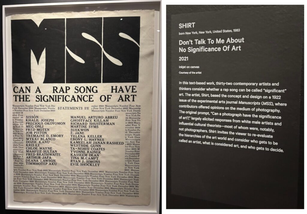
This piece first stuck out to me at first due to its use of text as art, which we learned about this semester. This piece poses a very important question, interwoven with the deep colonial ties in the art world, begging us to consider what can be considered art: “Can a rap song have the significance of art?” A rap song is indeed art, but those who do not consider it art should consider the rules of what we consider art. The notions and rules of who can be an artist and what art is are deeply rooted in racism, elitism, and colonialism, so to answer the question posed by SHIRT and the artist, we must remove any biases art has historically presented. This piece and what it represents are powerful, given just the medium of text. Seeing this piece and questioning a rap song as art also allowed me to look at some of the pieces in the exhibit in a way I had not before. I feel this piece intertwines with my artistic practice because I also enjoy challenging the notions of what art is, especially as a queer disabled artist whose communities have been often excluded from the artistic narrative. Overall, I enjoy this piece, the simplicity of the text art itself and the important question it has me consider.

Field Trip – The AGG
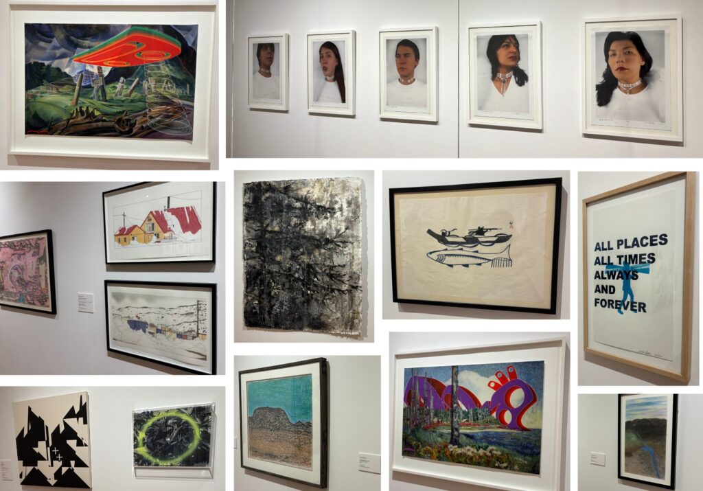
Making a b-line to HaidaBucks, Salmonberry Frap #ftw #starbucksfail #lol, Digital Intervention, 2016
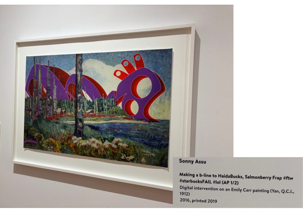
Making a b-line to HaidaBucks, Salmonberry Frap #ftw #starbucksfail #lol is a digital intervention print by Sonny Assu on a painting by Emily Carr. This piece first drew me in due to its vibrant use of colour – especially the large shape added in digitally by Assu. The shape looks out of place but it fits the painting so well. Through this series of works, Assu takes paintings by Indigenous artists or inspired by Indigenous art (Like Emily Carr’s works) and transforms them by altering them digitally, creating a blend of science fiction and traditional art, a perfect cultural hybrid. Through this, Assu injects his narratives into the piece, challenging how the viewer thinks of traditional landscape paintings. I really enjoy artworks that add things on top of preexisting artworks and have even explored that idea in my artistic practices, hence why I was so drawn to this painting. This makes me want to go even further in playing with the idea of adding or removing from already existing artworks to add my meaning to them.

https://www.artistrunwebsite.com/inspiration/1743/Cultural+Hybrids%3A+Art+by+Sonny+Assu

Cyborg Hybrids, a series by KC Adams, Digital Print, 2005
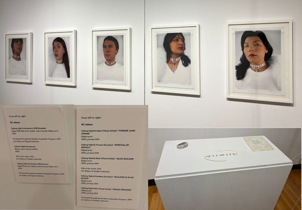
Cyborg Hybrids is a series of photos by Indigenous artist KC Adams. Adams herself explores technology in relation to her Indigenous identity, which is exactly what this series aims to do. The AGG exhibition of the series not only had the photos but also the accessories worn by the models in the photos. Adams wanted to create a mixing of two cultures, including Euro-Indigenous artists as her models. Each of the models dons a shirt with a humorous phrase on it, like “FORMER LAND OWNER” or “INDIAN PRINCESS,” all of which add a commentary to certain aspects of Indigenous culture, stereotypes, and humour. They each post stoically, framed in a way that mocks the photography of Indigenous individuals in the 19th and 20th centuries. She also digitally altered them to make the figures appear like they are in a fancy magazine. Per Donna Harroway’s Cyborg Manifesto, Adams views a cyborg as “a creature in a technological, post-gender world free of traditional western stereotypes towards race and gender” (KC Adams) and implores the artist to view this work through that lens. I was first drawn to this series for the striking way the photos are framed and how I felt as if I was being watched by each of the models with their stoic gazes. As I looked into the piece further through Adams’ artist statement, I found myself falling in love with the notion of the Cyborg. Our world nowadays is so binary and has Western stereotypes heavily embedded in every fabric of our society. This series allows me to think of a world beyond all of that, a marriage of culture and technology, transcending all Western stereotypes. As a nonbinary person, I like to explore the notions of breaking free of stereotypes towards gender in my art, hence my love for this completely different perspective of a practice I already engage in. I wish to explore more of her works because I find the concept of technology and its relation to cultural identity fascinating as we move to a more technically advanced world!

https://www.kcadams.net/art/photography/Hybrids/hybridmain.html

MFA Open Studios
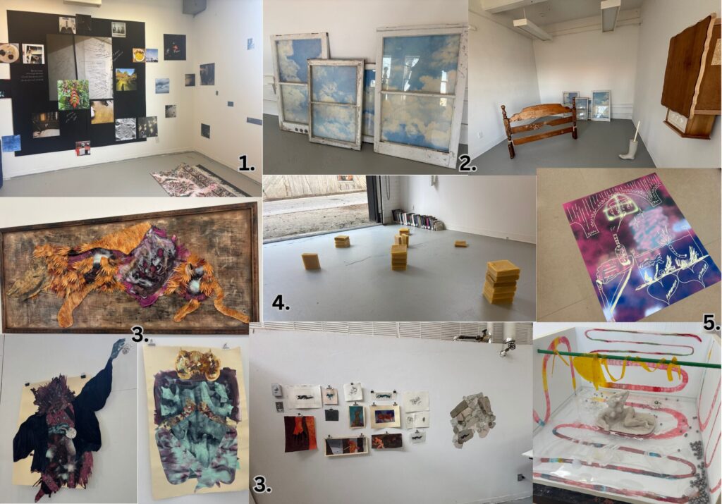
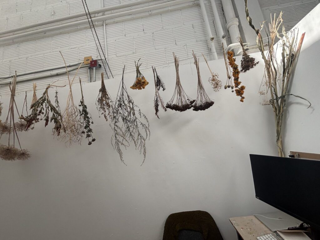
1. Bahar Enshaeian, 2. Hal Fortin, 3. LagoMorphhh, 4. Hillary Matt, 5. Aubin Soonhwan K

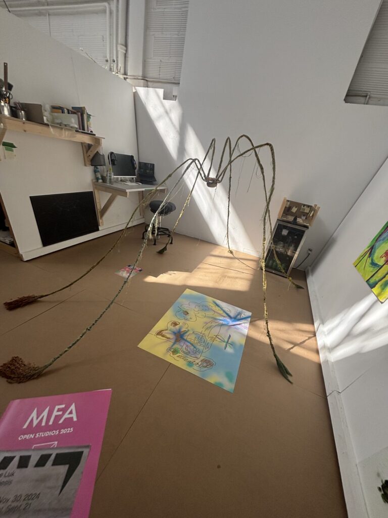
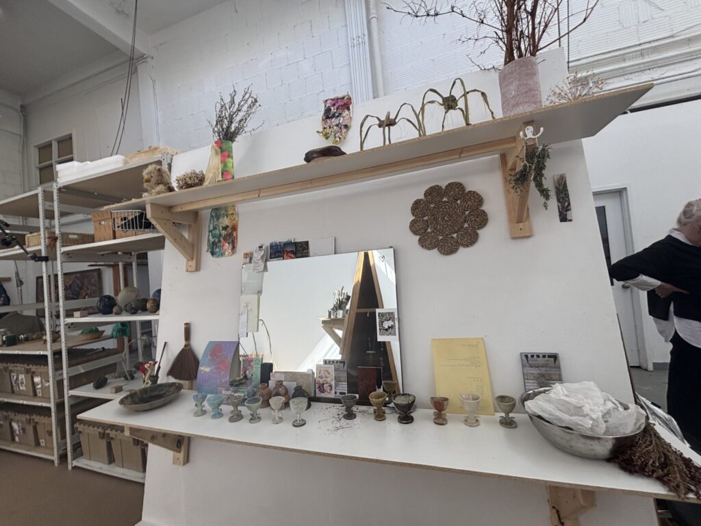
Visiting the MFA studios was very enjoyable for me, it opened up new possibilities for me that I had never quite experienced before. Going to university for art and building my artistic career, it’s easy to feel lost amongst it all. I’m in my third year and I feel like I still haven’t found my artistic niche, something I specialize in. It gives me a sense of imposter syndrome, like I don’t belong here with all of the other amazing artists. Seeing all of the different artistic practices in the open studios allowed me to realize just how broad the field of art is. There are so many ways to interpret and create art, I shouldn’t try to confine myself to a box. I enjoyed every studio I visited but I’ve detailed some of my favourites below.

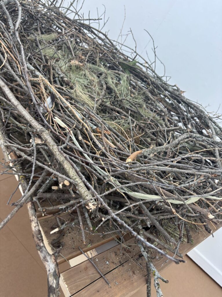
Visiting Eunice Luk’s studio space, I was immediately enamoured by her works, especially the large bird’s nest and the spider sculptures. The use of natural and found materials was really beautiful and added a comfort to the space I didn’t expect. Upon entering the space and removing my shoes, Eunice immediately asked me to add a stick to her large bird’s nest sculpture. It’s shocking to think that every branch or twig was carefully selected by individuals like myself to create this labour of love.

I remember visiting Clea Christakos-Gee’s studio so vividly, the sun was shining so beautifully through the windows of Blackwood Hall, creating the most beautiful shapes as it refracted through all of Clea’s stained glass pieces. Clea and I spoke for a while, I looked through all of her collage materials. I have been enjoying collages in my practice, so seeing just how far you could take it widened my horizons. I especially liked going through her daily collage journals where she’d force herself to create one collage piece a day, It’s such a cool concept and what a way to not let artist block get the best of you! I don’t have any pictures because I was enjoying my conversation and exploration of Clea’s works too much!

Bridget Moser, My Crops are Dying but my Body Persists

Charlene Lau’s Review: https://www.artforum.com/events/bridget-moser-247483

Watching Moser’s My Crops are Dying but my Body Persists through the lens of Charlene Lau’s review, instead of my initial confusion and discomfort, I was able to more closely examine the themes Moser had intentionally left in the video. Moser makes us uncomfortable, both with her body language, prop humour and use of erotic imagery. All of the actions are rather absurd, yet Moser has her reasons.

The pairing of certain objects and scenes feels almost like a “GRWM (get ready with me)” video, a common trend on YouTube and TikTok1. She dons silk pyjamas, shows off a set of in Lau’s words, “consumerist, bourgeois junk—such as a rose-gold makeup mirror, white and gilt decorative ceramic objects, and a bottle of pink Himalayan salt—parodies displays of “haute” consumerist taste,” (ArtForum, Lau) the high-end face cream, the pasta hair braiding, and the emphasis on nails. I find both of these items very reminiscent of the influencer culture on YouTube and TikTok. It feels almost as if she is parodying the women, so obsessed with consumerism and how they look that they create these fake GRWM videos to idealize their life to their viewers. Like these videos, there’s an inherent loneliness in them, and I think Moser highlights that quite well. She craves intimacy, she craves touch, and she showcases that through her erotic movements or use of props. Another theme Moser highlights is that of white supremacy, white fragility, and white privilege. Historically and currently, in the Western world, whiteness is treated as an ideal, especially by white supremacists; they think everyone should want to be white. She shows herself embodying the white supremacy in a very unexpected and uncomfortable way, buttering a piece of white bread with an expensive moisturizer and sinking her teeth into it. It is through her dialogue that we gain the insight into her intentions to sink into white supremacy in the video, “This is where I come from, or anyways I think you can see the resemblance. We’re all a bit soft and not always digestible. We’re just used to certain comforts.” (ArtForum, Lau) She slowly becomes complacent to these thoughts, submitting to the notions and becoming complacent. As Lau puts it, “As if slowly awakening to white supremacy, the narrator begins to process it as a disease. Moser’s sardonic tone—with a hint of creepy innocence—exteriorizes these innermost thoughts, which turn into an earnest declaration of complicity.” (ArtForum, Lau) I think notions of white supremacy, fragility and privilege are very prevalent in influencer culture as well. These individuals, mostly white women, are very privileged for their place and following, most of them directly reaping the benefits of complicity in white supremacy – like Moser did in the performance. On the internet nowadays, we see so many women get famous simply because they’re pretty and white, yet when women of colour do the same thing, they don’t always get the same amount of views. There’s an inherent power white influencers have on platforms, and that’s highlighted in our society and Moser’s video.

Furthering my point of influencer culture, I also believe in influencer culture, there’s this need to have everything you do be constantly “aesthetically pleasing.” There are hundreds of “aesthetic” GRWM compilations all across the internet. People put on this perfect facade to present the perfect life to viewers. I believe Moser put in a lot of effort to make her sets aesthetically pleasing and clean, much like these influencer sets and rooms, directly parodying them. The influencer culture is so bad that there are even children as young as 4 trying to emulate this successful and ideal life. I will not include video references of the children to retain their privacy, but the number of impressed young girls wanting this idealized life supported by white supremacy is scary. I’ve found a video, however, from a creator I enjoy that delves into the topic of these young girls trying to copy these older, successful, white women influencers. 2

Examining her colour choices when going through this lens of white privilege and influencer culture, the colours chosen by Moser feel dainty and feminine – which is exactly how these influencers want to appear. In the video I’ve linked below 3 of a GRWM Tiktok compilation, almost every influencer dons white, pink, and dainty colours as worn by Moser.

In the final part of the video, Moser fully embraces all aspects of her white privilege, rubbing it in the viewers’ faces in a way. Like these influencers, her success and triumph are “built at the expense of others,” (ArtForum, Lau) as Lau puts it, and Moser is completely oblivious to it, much like these influencer figures. The video ends by telling those who have white privilege not to benefit from it completely obliviously but to actively take action against it, something many of these prominent white celebrities and influencers need to understand.

1:

2:

3:

Notes from watching before reading review:
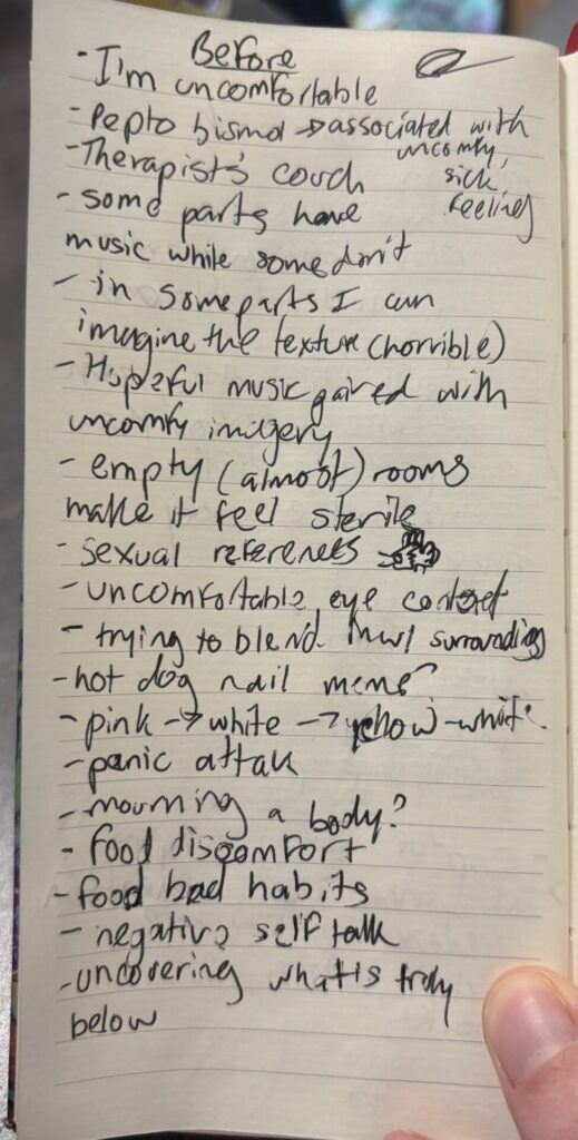
Notes from reading and watching after:

Watch the video again – in light of the commentary by Charlene Lau –

and comment on the ways Moser appropriates internet tropes, youtubers, pop culture references, and/or memes in this work.

  • Enyaesque music, almost hopeful, feels very out of place with the uncomfortable imagery
  • A parody of consumerist clutter with her choices of props
  • A mix of oddly relaxing content and ASMR and erotic comedy
  • notions of white supremacy and fragility with the bread that carries further into the video’s climax
  • hot dog fingers meme

What are some of the things her colour choices, and/or her props and costumes remind you of? How do you experience the video physically?

  • The colour choices almost remind me of a hospital, like in a hospital, pale colours are meant to bring calming energy, but to me it feels uncomfortable and sterile – this could connect to her themeing of the virus and COVID-19

What are some of the ideas Moser is playing with, including questions she is raising? What is the role of absurdity in her work? In your discussion of Moser’s work, you should quote the art forum review twice.

  • Moser is playing with themes of intimacy, of discomfort and white privilage
Carys

** Please contact Carys if there are any issues loading photos on the blog. **

Book Stacks – Assignment #1

The Midnight Murder – Book Stack 1

Titles from top to bottom: The Midnight Murder, The Dark Night, Alone, The Twist of a Knife, Death, The Witnesses, Suspect, Found, Justice.

This book stack sculpture is modelled after a classic “whodunnit” book. As an avid enjoyer of murder mystery books, I wanted to have fun with this first book stack. The books are carefully arranged so the titles can tell a story, in this case, a very simple “whodunnit” story. The first book ‘The Midnight Murder’ is the piece’s title and gives the viewer a sense of the story. The books vaguely outline someone alone (‘Alone’) at night (‘The Dark Night’) who then gets murdered (‘The Twist of a Knife’ and ‘Death’). From there we learn there were witnesses to this crime (‘The Witnesses’) which leads to the murderer being found and eventually prosecuted (‘Suspect’ and ‘Found’), leading to justice (‘Justice’) once the case is solved. Collecting these books was a difficult process, only one of them was from home while I scoured the library for all of the other ones. I had a general idea and used books to fill in the spaces for the final narrative. I found the best way of arranging the books in the case of all three of my pieces was to stack them directly on top of one another.

Absent Fathers? – Book Stack 2

**Trigger Warning** This next piece and the artist’s statement include themes/mentions of familial violence and abuse. Viewer discretion is advised.

Titles from top to bottom: Hard Truths, Doubt, The Other Woman, Coping with Family Violence, Divorce and Disengagement, Divorced Father, Family Breakup, Fathers & Daughters, Daddy, We Need You Now!, Learning to Say Goodbye, On New Shores, Lone Parenthood, Making Ends Meet, and Learning to Live.

The title of this book stack sculpture is ‘Absent Father?’ as shown with the book at the very top of the stack. Through this sculpture, viewers can look at the titles of the books from top to bottom, to gauge a general idea of the story or history presented. The themes of this sculpture are significantly more personal to me compared to the last one, it gives the viewer a look into life before, during and after my parent’s divorce. It is important to note that my parents divorced when I was only a child, so the perspective of this history/narrative comes from me as an adult with a more complex understanding of everything. As mentioned the narrative is split into three pieces, first, it’s life before the divorce, which includes ‘Hard Truths’ to ‘Coping with Family Violence.’ The before section touches on what I was going through leading up to my parent’s divorce. Although my memory is mostly blacked out from this time, I remember the struggle I had absorbing that my father wasn’t a good man, or even in some cases, a good father. From the violence I remember encountering to his allegedly cheating before my parents got divorced was hard for me as a child. The second piece of the narrative is during the divorce, which is from ‘Divorce and Disengagement’ to ‘Fathers and Daughters’. This touches on the breakup of our family and the evolving father/daughter relationship between my dad and me as I was forced to examine him in a new light. The third section is after the divorce, which is from ‘Daddy, We Need You Now!’ to ‘Learning to Live.’ This section details how my father slowly became more absent in my life, learning to come to terms with this, eventually working through those emotions, living life with my single mother and struggling, and eventually learning to live with my complicated relationship with my father, accepting that as a piece of me. I went about collecting the books the same way as the last stack, this time though, they were all from the library.

Survivor – Book Stack 3

**Trigger Warning** This next piece and the artist’s statement include themes/mentions of sexual violence and abuse. Viewer discretion is advised.

Titles from top to bottom: Alcohol, The Art of Wooing, Love Tactics, Seduction Lines, Sex Signals, Willing, Wanting, Waiting, Personal Decisions, Sexual Choice, Yes, Human Fulfillment, The Stories We Tell Ourselves, Is it Love or is it Addiction?, Sex & Isolation, Understanding Reality, Wounded Images, Evil, Violence in Dating Relationships, Dating Violence.

The title of this book stack sculpture is simply, Survivor, unlike the first two, the book at the top is not the title, instead, it’s the beginning of the story. This book stack goes through the story of my sexual assault and the aftermath of it. It’s a tragic tale, me going through the actual assault and then convincing myself it never happened or that it wasn’t valid. ‘The Stories We Tell Ourselves’ until ‘Sex & Isolation’ is me not yet coming to terms with what had happened. In reality, it took months for me even to register what happened as sexual assault, it took my friends telling me constantly. The final books from ‘Understanding Reality’ and down is me detailing the process of my reality shattering. The rose-coloured glasses came off, and I finally was able to see the terrible person my assaulter was and that what had happened was sexual violence. Creating this narrative was very important to me, I wanted to frame what had occurred in a very accessible and easy-to-read format. I hunted down books from all library floors, ensuring I used a variety of sources and not just books from a single section. This portion of the assignment allowed me to look back at the event, and examine it as a whole, finding books that fit the narrative. Even though it was a fairly dark topic, I still found it enjoyable.

Environmental Video Assignment – Overtaken

The title of this video is ‘Overtaken,’ it is an environmental video filmed in the Arboretum. The video follows two figures depicted in different natural scenes, staying as still as possible to give the illusion of these being statuesque. Throughout the videos, the two figures are pictured in locations that are slowly more and more overtaken by nature. The settings were very carefully chosen to fit the narrative. The first was a bench just barely surrounded by the leaves of the nearby tree, not quite overtaken by nature yet. The second is a fence, broken and covered in moss, losing its original design to nature. The third is a wall and a bench, surrounded by branches and leaves, giving a sort of canopy effect around the figure. The fourth is a wall completely buried in leaves, the figure nestled within it. The fifth is a location meant to encase the figure in nature, as the leaves are all around, encircling them. The sixth is a path covered in fallen leaves, concealing parts of the figure. The final setting is the view from an old bridge, the contents below heavily overgrown, the figures amongst the overgrowth. For this project, we wanted to look at manmade items and spaces as nature has slowly overtaken them. So, Aleida and I found various spaces that were covered in nature or would cover us in nature, what better place to do this than the Arboretum? Though mainly thought of as a natural place itself, the Arboretum is manufactured by humans to have a specific look. An example would be the tree-lined main pathway at the entrance of the Arboretum and how it was specifically manufactured by man to give an archway effect. Another example would be the various structures throughout it such as statues, benches, or buildings.

In terms of costumes, the two figures, Aleida and myself, are dressed in all grey to give the appearance of statues. Throughout the video we have vines slowly wrapping around us, climbing up our bodies, eventually covering the entirety of us. In the very first clip in the video, there are no vines present on the figure, but as we get to the end, both figures are wrapped in vines. Each scene sees the figure slowly wrapped in more vines. With the combination of the statuesque colours and the vines, we wanted to further portray the idea of manmade things overtaken by nature. It was almost as if we were statues in a graveyard, or in an old historical site, slowly lost to time and overgrowth.

The meaning portrayed in the video examines a theme found throughout art history. It examines a theme specifically with the Myceaneans, in their art and architecture there have always been these ideas of man dominating nature, so Aleida and I wanted to take that trope and flip it to nature dominating man – taking back its space rightfully. The nature dominating/overtaking men can be seen in both our costumes with the climbing vines and the settings we chose, as mentioned.

Overall, I had a lot of fun with this project and examining different spaces. It was interesting to look at the Arboretum in a different light than what I traditionally had. I enjoyed the filming process and playing around with the camera angles to perfect the shots we were going for.

Part of the planning process with pictures taken by Aleida: https://docs.google.com/document/d/10fSdwaqv9TyzpNltssrQXV3AbtavIVnDbE8LrDaEf64/edit

*Note, a significantly larger amount than needed was written as I was unable to attend the critique due to strep throat.

Maria Kalman – O Being Podcast

Maria Kalman, beloved dog, book spread, 2015.

Listening to the O Being Podcast was so interesting, Maria Kalman has such a unique way of thinking, so it was a pleasure to get to see a little into her world.

The first thing I noted from Kalman was “a human being can encompass very contradictory ideas and feelings at the exact same time. They’re not separate; they don’t even follow each other so much. They just live in you.” (O Being Podcast). This quote attributes to the importance of the balance between whimsy and angst, how Kaulman keeps serious subjects in her work but is also incredibly playful at times. I think this stuck out to me as I often forget the importance of not being serious or playful exclusively, but rather balancing the two and allowing them to live in harmony within me. Pertaining to art, this concept reminds us as artists that serious, deep themes can exist beside and within playful and whimsy works. How these topics aren’t separate in not only Kaulman’s artistic practices but all of our artistic practices.

The second thing I noted from Kalman was something Tibbet had quoted back to her, “They are constant reminders that life reveals the best of itself when we live fully in the moment and extend our unconditional love. And it is very true that the most tender, uncomplicated, most generous part of our being blossoms without any effort when it comes to the love of a dog.” O Being Podcast). On the surface, it would seem like a woman expressing love to her dog, and it did stick out to me at first because of my love for my dog, but it is so much deeper than that. Kalman is reminding us of the importance of living life in the moment and with love. Nowadays, people don’t do that anymore, I am guilty of this. We all get caught up in life’s whirlwind of emotions, so Kalman tells us that instead of living in the anxieties and within our pasts, we should truly live each moment of our life to its fullest. This also reflects into art, if we allow ourselves both as artists and as viewers of art to just enjoy the practice and embed it with love, we could create a revolution of art that is just pure love and beauty – much like Kalman’s work.

Maria Kaulman, Girl holding a doll and book from women holding things, 2023.

The image I chose by Kalman is Girl holding a doll and book from her series Women Holding Things. I chose this piece because I believe it represents youth in art. To elaborate, something Kalman touches on in the podcast is how she looks at the world with wonder, similar to how a child does, looking for joy in the world each day. Youth in art simply represents that childlike wonder. Kalman’s art style is so bright and colourful, to me that’s something that represents childhood. Sometimes art is taken too seriously, causing our creative practices to struggle – the same can be said about life in general as well – so, this playful depiction of a child holding her items near fosters that idea that we shouldn’t take life or art so seriously all the time.
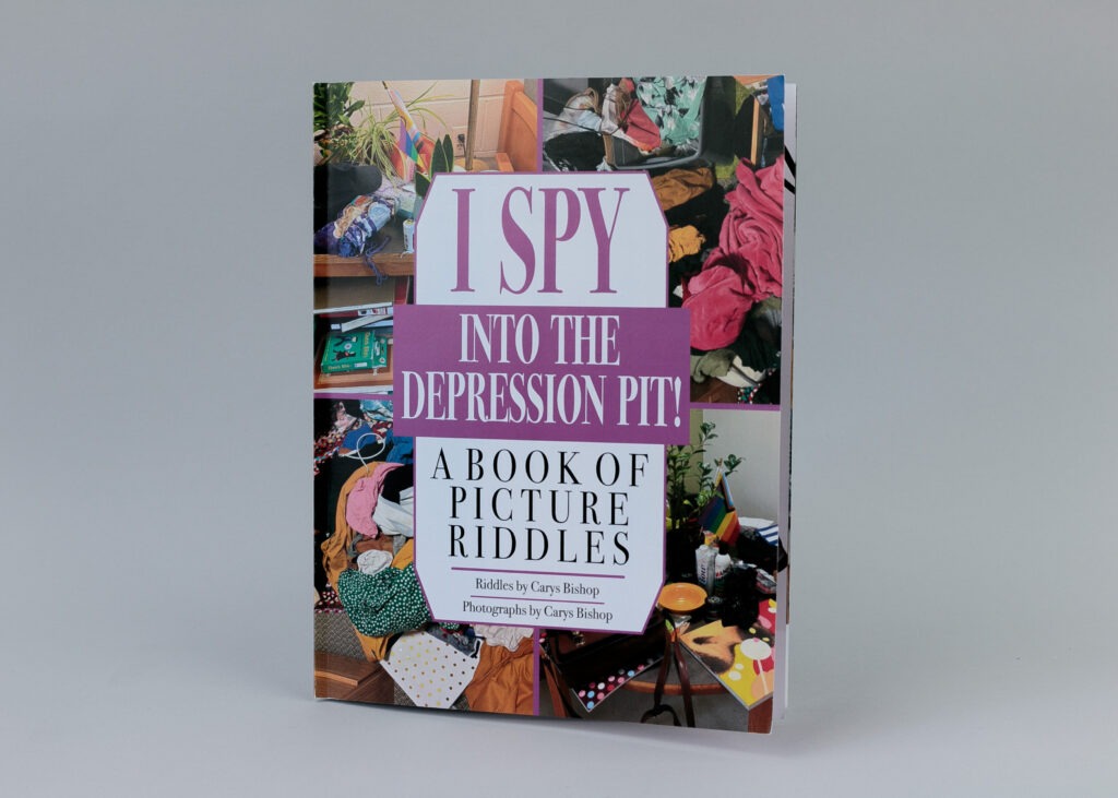
Artist Book – I SPY: Into the Depression Pit!

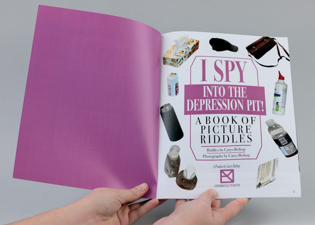
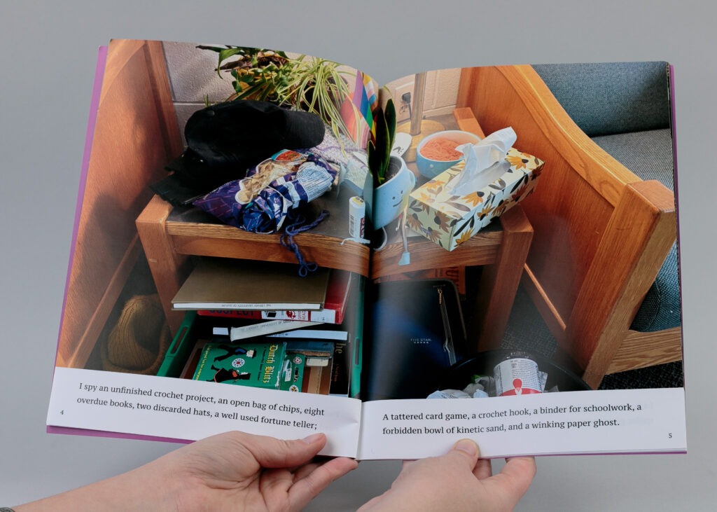
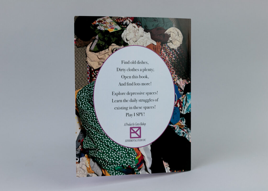
This humorously titled “I SPY: Into the Depression Pit!” is modelled after an I-Spy book. The content is very intimate and personal, showcasing the messy spaces that plague my life due to my depression. I wanted to give an in-depth, personal look at my depressive spaces with a humorous twist. Pictured are the front and back, along with two-page spreads.
The process of designing this book was very complicated but I had a lot of fun. Not only did I work in Affinity Publisher as required, but Nathan also helped me with Affinity Designer and Photo. With Designer, I was able to create the elements that I wanted to really give the book an I-Spy feel. I crafted each page carefully to give the illusion of an actual I-Spy book. I even made a makeshift logo with my artist’s signature to provide the book with some feeling of authenticity. I wanted the book to feel like an authentic I-Spy book because I enjoyed the humour of having incredibly messy spaces instead of the perfectly organized and curated scenes of an I-Spy book. Each scene is a picture from my house after a depressive episode (times when I am incredibly depressed and unable to care for myself or my spaces). Beneath each photo, I have the riddle written, which I took the time to write myself. I chose a select few items that the reader can look for if they’d like.
Overall, this assignment was a huge exercise for me; I would never normally showcase these spaces like this, but doing it for art, in a fun way made me feel comfortable enough to. I hope also to raise some awareness about the severity of some depression disorders like my own.

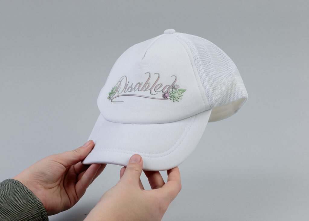
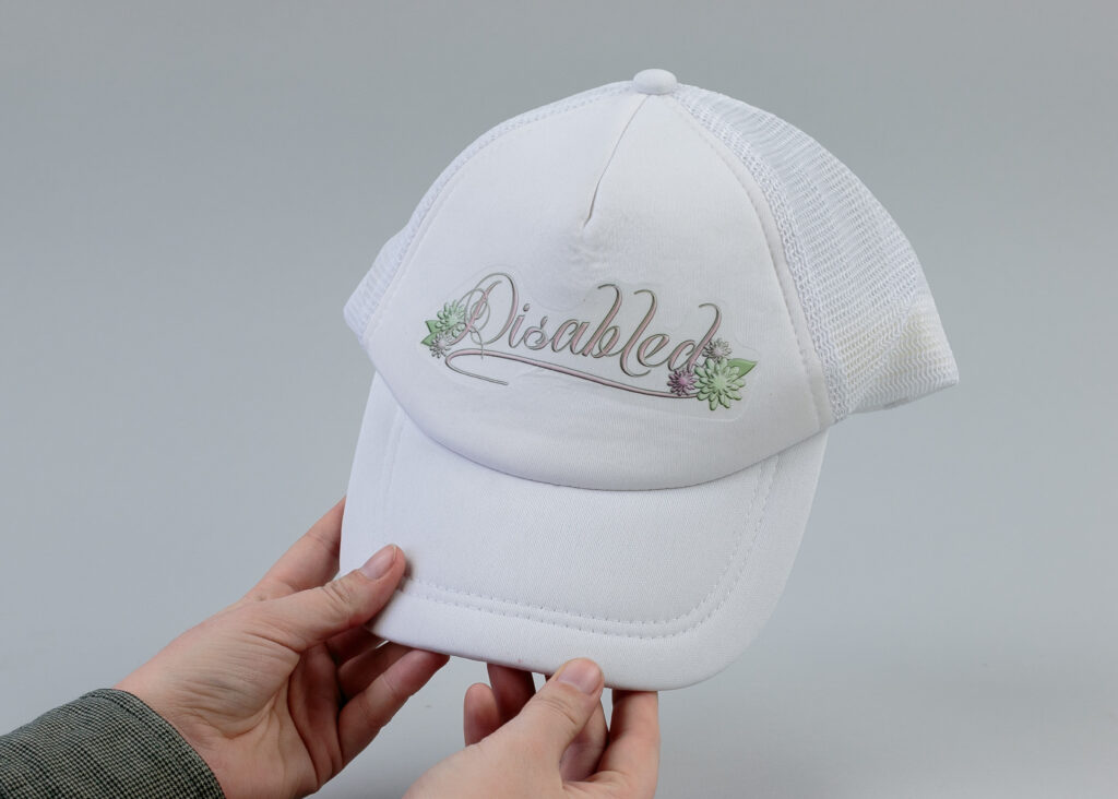
Artist Multiples – Disabled

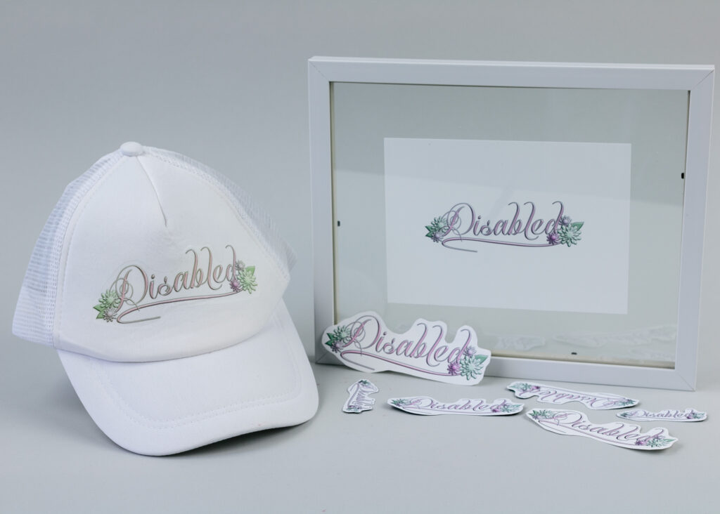
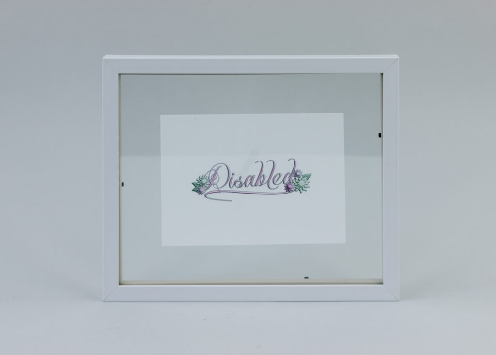
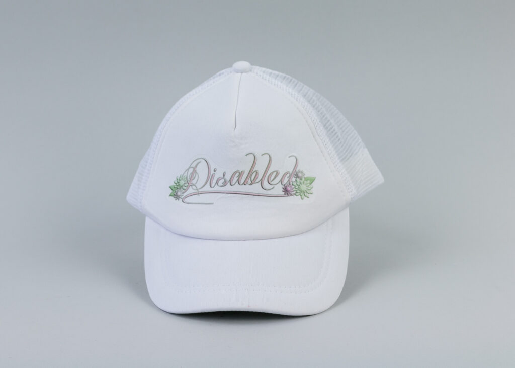
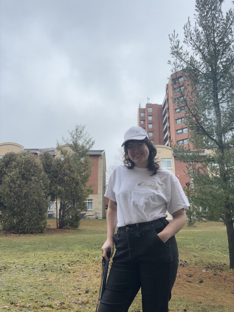
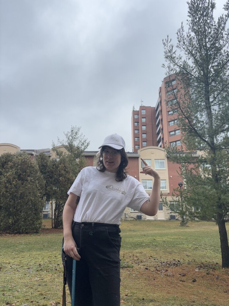
This artist multiples project is something I hold very dear to my heart, it is called Disabled. I am a disabled person and I have been since 2020, and since developing my disability, I have been struggling with my identity as a disabled person. Many disabled people have their own opinions on what labels are comfortable for them, and for me, I love to label myself as disabled. The word “disabled,” though beautiful to me and several others can be misconstrued as something bad. In a way, it labels my body as not working as well as a predisabled person. People have come up with many euphemisms for disability and disabled, inferring that the words are dirty in some way. Labelling myself as disabled is my way of reclaiming that identity. Secondly, I am able to dismantle the preconceived notions about disability through “disabling” things. This multiple has a sort of humour to it as well. Disability can be so serious at times, so I wanted to play around with the idea of sticking my design to people or objects that would “disable” them.

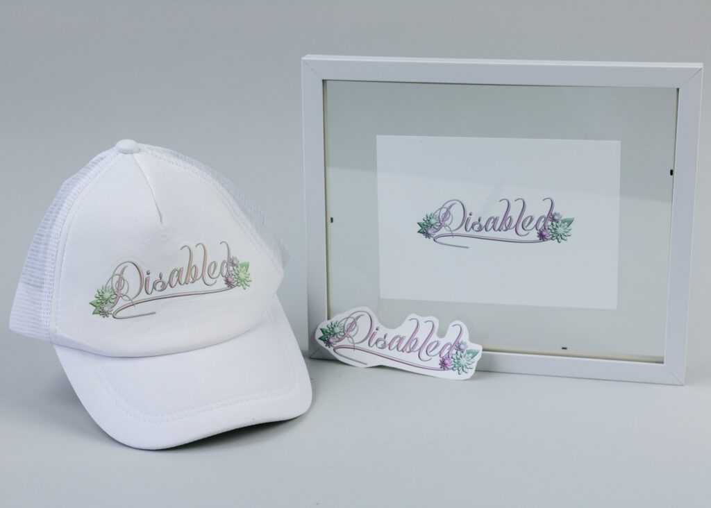
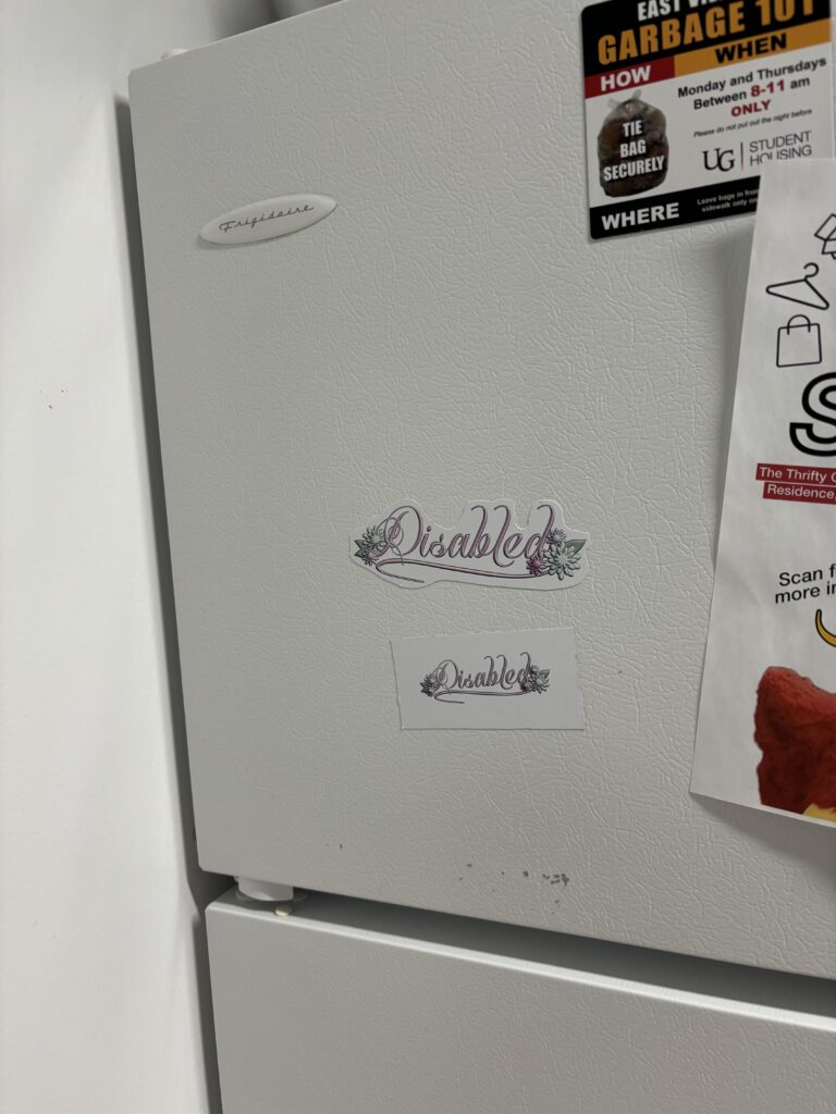
The idea for this piece was to make art out of the word “disabled.” What some label a dirty or bad word I made opulent, intricate, and beautiful. I picked the most opulent font out of a group I tested, while still ensuring it was readable. I added flowers too, adding to the beauty of it all. The colour choice was meant to be feminine and beautiful, touching on my own experience with a disability that mainly affects those born as women. The colour choices also factor into the idea that disability is something that should be viewed as serious or a harsh reality, so by choosing these nonserious and playful colours I am able to combat this notion. I designed the piece in Affinity Designer. When importing I edited the text and shape curves where I see fit and to make it to my vision. The flowers I made in Designer as well, utilizing the shape tools and playing around with manipulating edges.

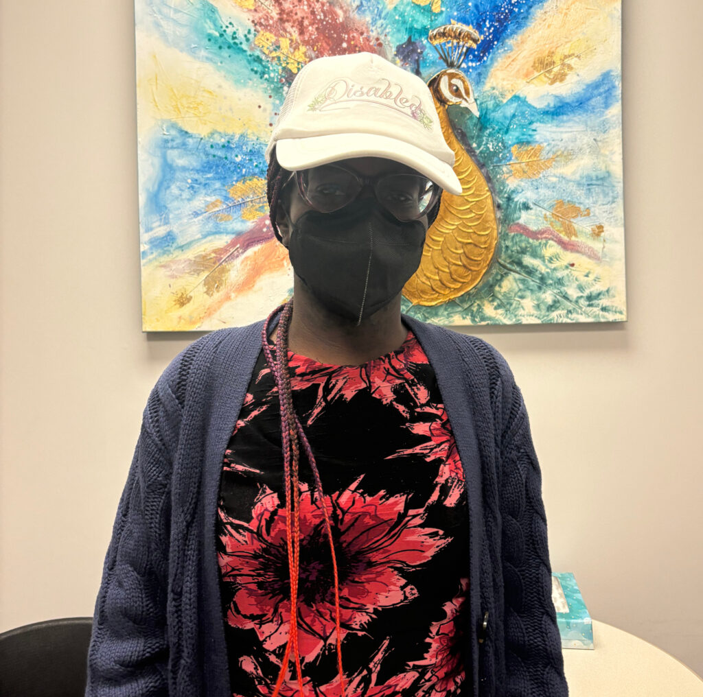
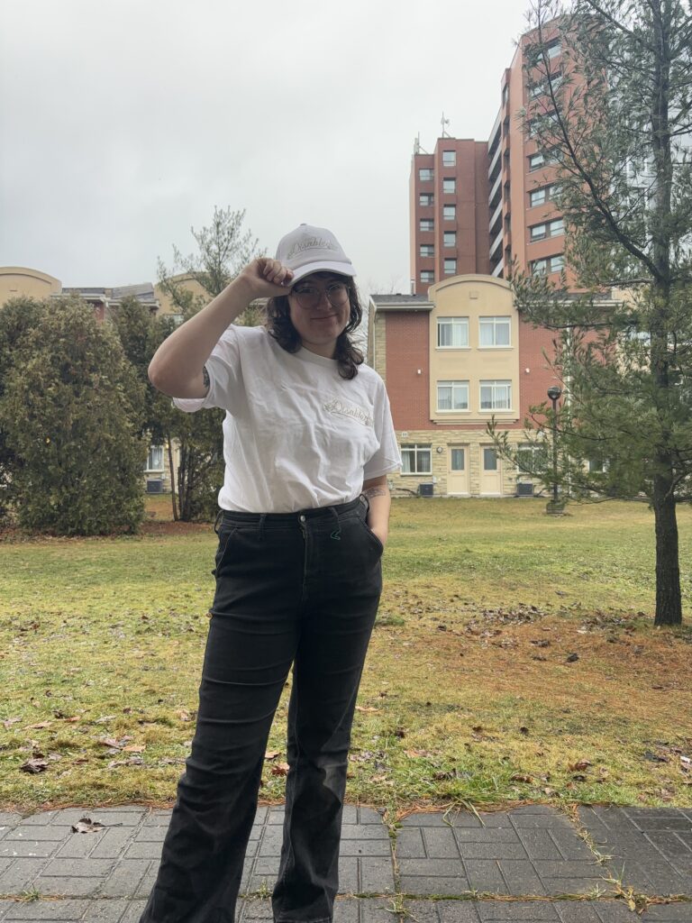
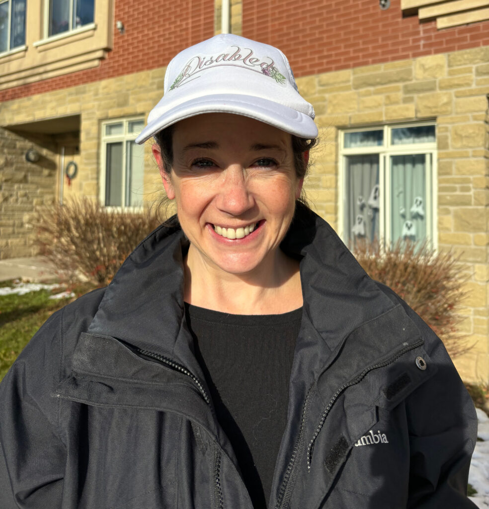
When choosing how to document this piece and present the multiples, I opted for prints, a shirt, magnets, stickers, and a hat. For the print (pictured above), I liked the idea of having the word disabled, a bad word to some, framed and displayed as if it were art (which it is now!). For the stickers, shirt, hat, and magnets, the idea was that I could stick them on objects or people, along with distributing them to other disabled folks in my life who take pride in their identity. Above is the hat I made showcased on three different figures, myself, my accessibility advisor, and my mother. In the future, I’d like to document even more people in the hat, which I was unable to do because of issues that came up with my disability (ironic!). Also pictured below are my multiples in various locations, my mobility scooter is the placement I enjoy the most. I also have some pictures of me in my disability swag, proudly labelling myself as disabled. Overall, I really enjoyed this project and will continue distributing these multiples amongst disabled people in my life.

A Visit to the AGG

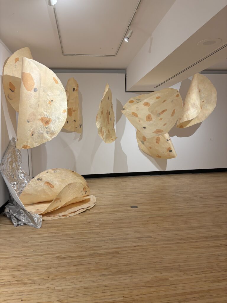
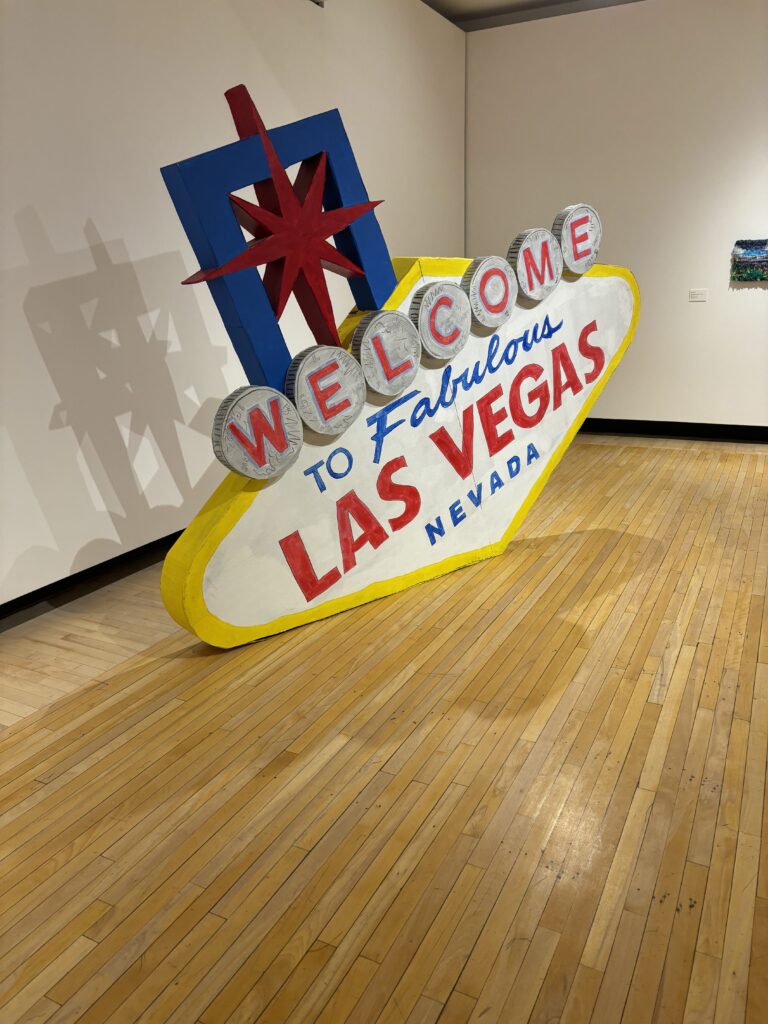
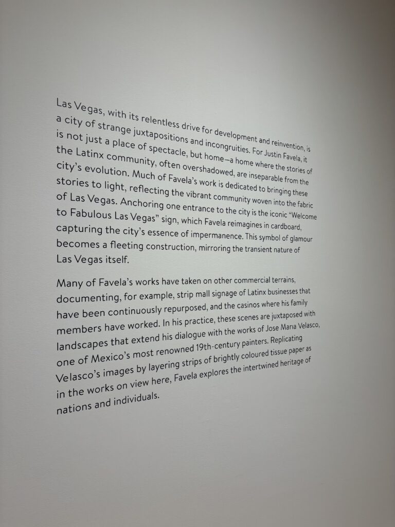
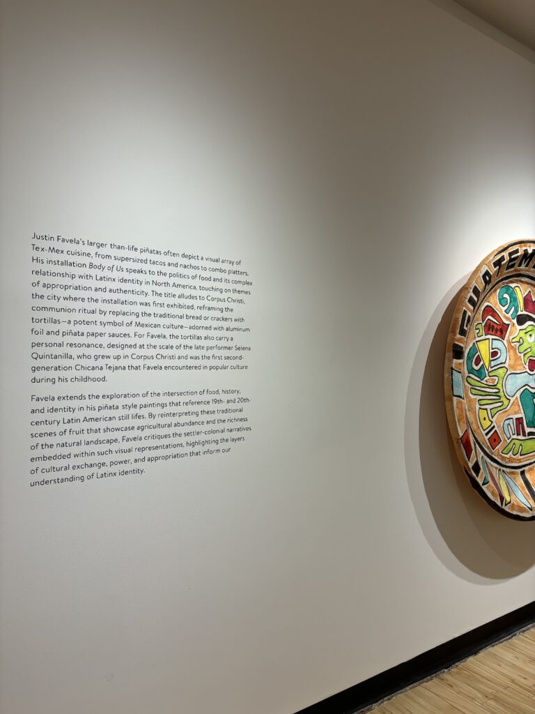
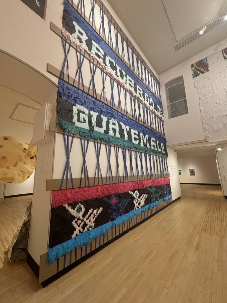
I visited the Art Gallery of Guelph on November 18th with our Experimental 2 group. There were three main exhibits on during our visit, all being somewhat experimental in their approaches. The exhibits were Entrelazados: Justin Favela, Do You Remember Love, and Some kind of we. Of the three exhibits, my favourite was Some kind of we, as I was able to make more of a personal connection with the content and art.

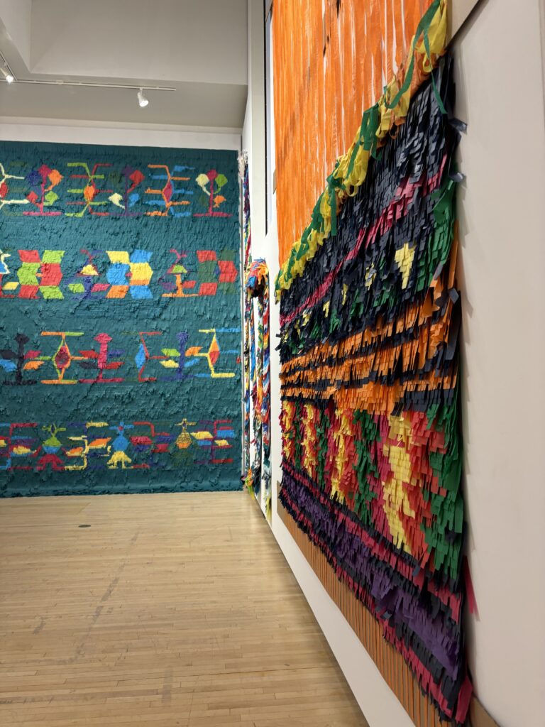
Pictured here are some of my favourite pieces from Entrelazados by Justin Favela, along with the artwork labels and explanations of Favela’s works. Favela intricately weaves his culture, Latinx identity, experiences, and places of importance into his art through sculpture and mixed media. I enjoyed how colourful his works are and the beautiful representation of Favela’s life.

The next exhibit is Do You Remember Love, which is a combination of a video by Susan Mogul from 1997 and a collection of quillboxes.

Do You Remember Love was a brilliant exhibition to witness. First off the film by Susan Mogul was projected on the wall, across from a bench for viewers to watch. The video was very intimate, it follows the experiences of a family, with interviews, voiceover segments and different cinematic shots. Watching the video, it felt like I was a part of the family, experiencing their lives with a special intimacy a regular video wouldn’t provide. The combination of scenes with interviews or talking and then the framed cinematic experiences adds such an element of complexity. One of the cinematic experiences I enjoyed the most was the artist Susan discussing a dream she had about love and her fears of losing it to another feminine figure. This part consisted of Susan’s voiceover with the explanation of her dream and then scenes of water that seemed like a part of a dream sequence, pulling you down to the depths of imagination.

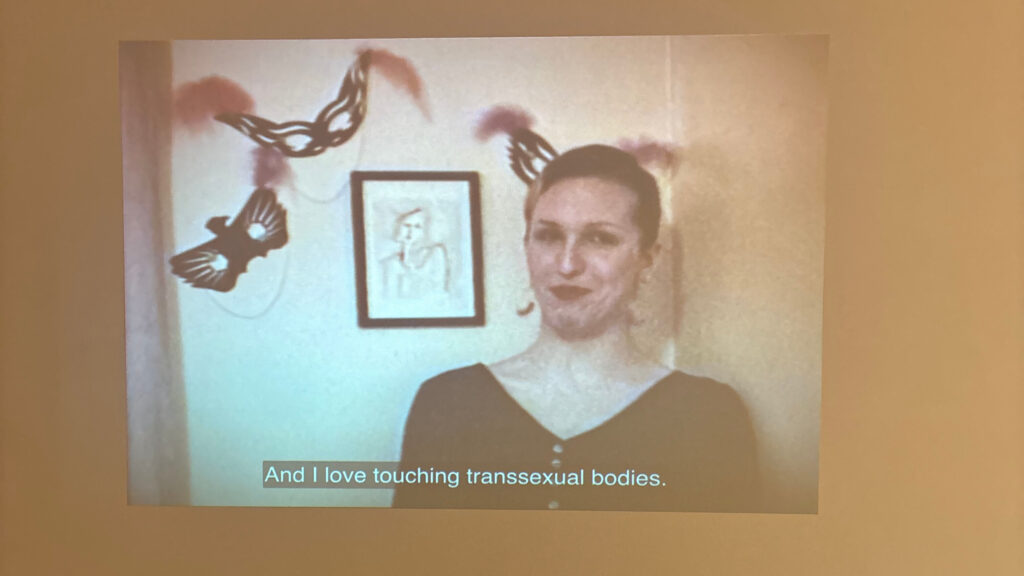
The final exhibit and the one I enjoyed the most was Some Kind of we which includes a combination of works that look at historical and modern t4t love (transgender for transgender, meaning being in a relationship as a trans person with a trans person). Some kind of we showcases the beauty of t4t relationships and intimacy. There are several videos, three on TV screens and one projected, and some multiples for individuals to take (pictured above). I am going to discuss the two pieces that stuck out to me the most as a transgender person.

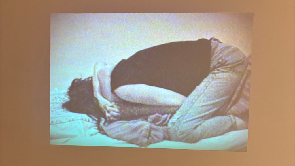
In polished (2016), by B.G-Osborne and Benjamin Da Silva, the two sit in a bathtub together on the left screen, and on the right screen the two are shaving. Osborne and Da Silva discuss topics of mental health, transgender and nonbinary identity, transition, and substance use. The conversations they have show the complexity of trans and nonbinary identity, far beyond what is presented in the media. These are two figures, talking about their real, personal, and heavy experiences, not some idealized or demonized version of a transgender person. The discussions of mental health interact so heavily with transgender identity, which is not something a lot of people think about which this highlights. It impacts one’s gender and self-love journey, especially one’s transition. The two talk about how one’s transition expectations and obsessions can impact mental health and this resonates with me deeply. When I first came out as a nonbinary person, I had an idealized idea of what I wanted to look like if I transitioned. More than anything, I thought I wanted top surgery, it became an obsession. My gender dysphoria and issues with my chest plagued me constantly, the idea of what society viewed as a perfect nonbinary person with a flat chest and androgynous haircut was all I wanted to be. Having that obsession and that ideal nonbinary figure pushed on me made it very hard to love myself, which is a common experience that a lot of trans individuals face and that Osborne and Da Silva go into. Society has no clue about the complexity of nonbinary identity and the two touch on this in the video. There are so many ways to be nonbinary or transgender outside of the gender binary, which people can’t grasp, exactly like how the two explained in frustration. This piece made me feel so many emotions, and I felt like I could just sit there watching them in that bathtub and shaving for hours.

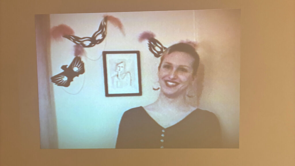
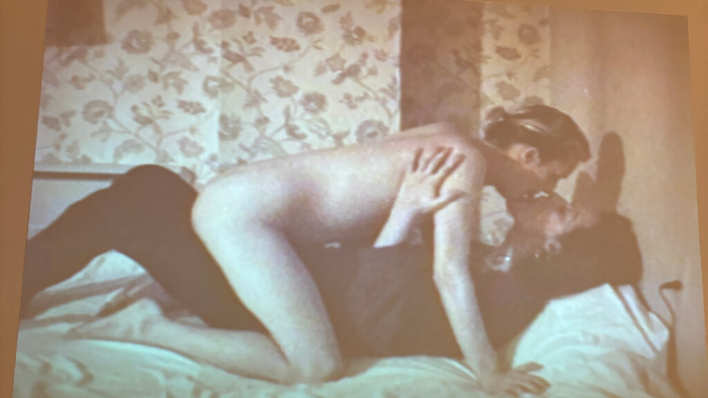
Within Some kind of we, Gendertroublemakers (1993) is projected on the wall adjacent to polished. Gendertroublemakers is a home video with Mirha-Soleil Ross and Xanthra Phillippa MacKay, two transgender women, discussing their past experiences with cisgender gay men and their love/attraction to other transsexual women. The video is composed of shots of the two women speaking in an interview style to the camera, and then shots of them kissing or being sexual with one another. The video itself feels so intimate, the home video style allows for a more authentic experience, it feels as if this isn’t even a video, rather we as the audience are sitting there with Ross and MacKay. The video along with showcasing the two women’s experiences and issues with transgender identity not being taken seriously also touches on the beauty of t4t relationships. These two women are proudly and openly reclaiming sexual identity and sexuality in a transphobic world – I think this is so incredibly beautiful. A quote that sticks out the most to me from the video is when one of them is talking about their experiences with a transphobic cis gay man “How dare you tell me what you can call me.” This stuck out to me not only because of the raw power and frustration in her voice as she recalled this, but because it entwines with my personal experience. As a nonbinary person who is often viewed as a woman by those in society, I am so sick of people telling me how I should be identified or misgendering me with feminine pronouns; so I share the frustration of the woman.

Overall, this exhibit meant a lot to me. I got to look at different views of t4t relationships and recognize the beauty of them. Highlighting the beauty of transgender love is so important at a time filled with such rampant hatred for us. Within the exhibit, as someone in a t4t relationship, I felt at home with my community and seen, truly.

Carmen Papalia

Carmen Papalia, Long Cane, 2013, Performance piece, duration varies photos by Kristin Rochelle Lantz

Carmen Papalia is a non-visual artist and disability activist from Vancouver who focuses on experimental and conceptual artwork relating to social practice. He confronts notions of disability and one’s access to the world without vision. 

When figuring out how to identify himself, he did not find comfort in the label “blind” due to its social and cultural baggage or in the label “visually impaired” as it implies his eyes don’t work as other body parts do. With his rejection of labels, he aims to examine his relationship and his connections to institutions, especially the disability support institution. Instead, he aims to embody a nonvisual learning style, highlighting his ability to access knowledge without the use of vision and as his other senses allow. Papalia looks past the limitations placed on him by society due to his condition and frames his learning style as something liberating for himself and others. 

Carmen Papalia, Provisional Structure 2, 2022, mixed media installation, Courtesy of the Artist

At the beginning of his conceptual art career, he looked at the limitations of the world and his understanding of himself through the lens of his disability; this is reflected in his artwork (i.e. one of his most famous works Blind Field Shuttle, 2010-present). Presently, his work is framed on his experience and access to visual culture, public spaces and art institutions as a nonvisual learner (i.e.  Provisional Structure 2, 2022). Papalia finds his artwork has allowed people to start adopting this “non-visual learner” language, it is through his artistic practice and repeated use of the term non-visual that he hopes to create not only a more accessible art practice or learning practice but also a more accessible world in general. 

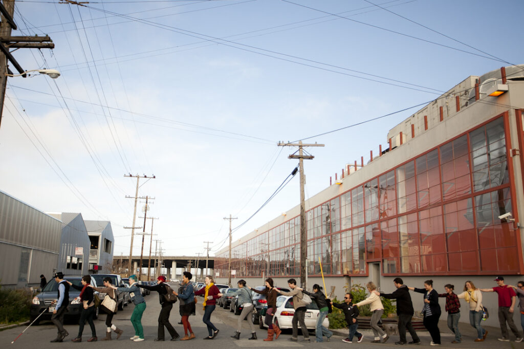
Carmen Papalia, Blind Field Shuttle, 2012, Photos by Jordan Reznick

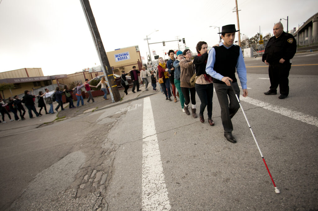
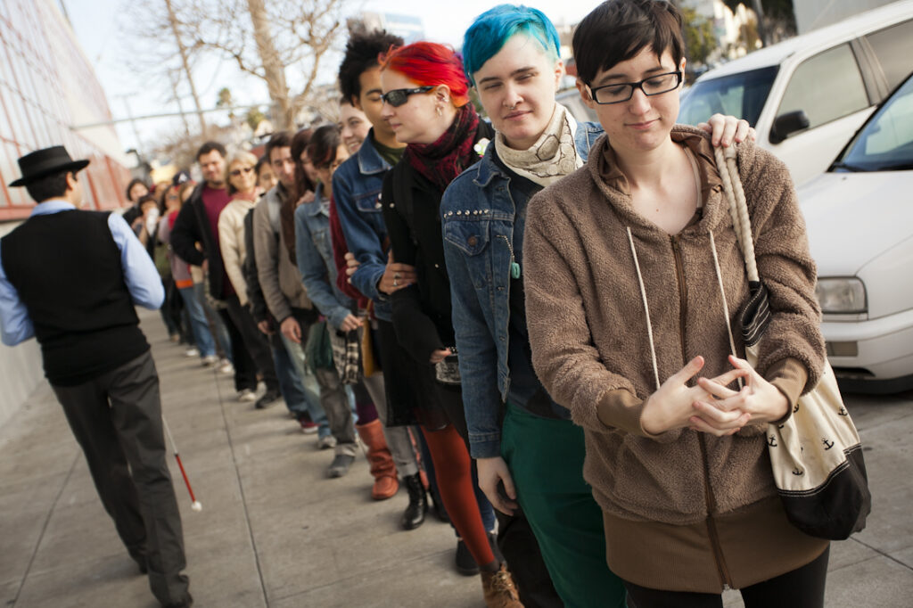
One of Papalia’s most famous works is Blind Field Shuttle where he takes a large group of people on a walking tour through different spaces while closing their eyes. Participants each place their hands on each other’s shoulders and follow in a long line, as pictured above. They direct their senses to explore the world around them, being forced to access the world through non-visual means like Papalia. Through exploring the world and chosen spaces through the other senses, participants are able to realize elements about these spaces they didn’t notice before, forcing them to reexamine how these newly noticed things affect our perceptions of the world around us. 

Carmen Papalia, Blind Field Shuttle at McColl Center for Art + Innovation, 2017, McColl Center

Through my own experience as a disabled artist working in the conceptual field, I can understand certain aspects of Papalia’s work through my own lived experience, but I am also experiencing a whole new realm of disability through his nonvisual practices. I enjoy his notions of challenging language society places on us and the words we as disabled people choose to identify with being very personal to our journeys. An example of me exploring the notion of disability language through conceptual artwork would be my Artist Multiples project where I took the word “Disabled” and chose to make art of it, challenging the idea that the word “disabled” is a bad word. Papalia’s works inspire me to go further with my disability activism in conceptual art. I’d like to create pieces that are very disruptive much like Mobility Device, forcing others to view my experience with my disability. My favourite piece of his that I’ve seen is Mobility Device, just mentioned previously. In Mobility Device, instead of relying on his traditional mobility device of the white cane, Papalia opts for a marching band to follow him around on a walk to act as his guiding device. Different obstacles and things Papalia encounters on his walk are represented through different sounds. Each time Papalia performs this work, it takes an incredible amount of trust in the marching band, as he relies on them to know where he is going. As mentioned, there is also a disruptive element to it – he is directly combating the idea of a silent man using his white cane, to a loud and in-your-face depiction of disability. 

Carmen Papalia, Mobility Device, 2014, Grand Central Art Center CSUF

Overall, I greatly enjoy Papalia’s works, he approaches conceptual art in a way that allows people to step into his shoes and examine the world through a non-visual perspective. 

A list of sources can be found here.

Christine Sun Kim

Christine Sun Kim, Time Owes Me Rest Again, 2022, Photo by Hai Zhang.

Christine Sun Kim is a deaf artist, activist, and performer who focuses on conceptual and communications art. She creates in various mediums such as performance, video, murals, billboards, audio installations, and works on paper. Using these mediums, she outlines the multi-layered sensory experience of sound and her place in it as a deaf individual. She uses her work to highlight Deaf culture, the connection to language and sound,  and the societal implications of communication within that community. She was also a co-creator of the symbol <0/ which means “Deaf Power” – this symbol is something shared widely by Sun Kim herself and open source on the web. 

A common theme shown throughout Sun Kim’s work is echoes or repetition. She mentions in the Friends & Strangers episode in the eleventh season of the Art in the Twenty-First Century series, that echos and repetition are common throughout American Sign Language (ASL), which Sun Kim uses to communicate. As she explores communication, Sun Kim notes the importance of repetition and echos, the simple act of repeating a gesture in ASL could completely change the meaning of what one is saying, or how Sun Kim’s interpreter echos everything she says vocally. In the same video, she gives us a tweet and wants us to view it as a lens to view who she is and her art (pictured below). 

A tweet by Sara Nović referenced by Sun Kim in her TED talk.
Christine Sun Kim, Stairway For A Composer To Work In from the series Available Spaces for Composers, 2016, Charcoal on Paper, Photo by Chris Streek.

Sun Kim explores musical notation and musical scores often in her works, which correlates specifically to her exploration of sound. In some of these musical notation pieces, Sun Kim investigates the emptiness of the music staff and the absence of notes, and how that makes the piece more about the underlying foundation rather than the music itself (Stairway For A Composer To Work In from the series Available Spaces for Composers, 2016). Sun Kim has a series of these works, Scores and Transcripts, showcasing a variety of musical notation, traces of ASL, body language, and  English vernacular. In this series, she dives into her perception of communication and how these different portions shape her view of communication itself. In all of these pieces, she takes out all aspects of music that Western society is used to and turns it on its head, forcing us to view and experience music through means other than sound. Her musical scores aim to encapsulate her intersectional experience as a deaf woman of colour, showing us, the audience, her perspective and how she views the world. 

Christine Sun Kim, Pianoiss … issmo (Worse Finish) from the Scores and TRanscripts Series, 2012, Transcript, pastel and pencil on paper. Courtesy of the artist, Photo by Erica Leone.

A musical notation piece I enjoy a lot by Sun Kim is Ghost(ed) Notes, a mural exhibited at the Henry Art Gallery, University of Washington, Seattle. This piece combines musical notation with ASL and graphics, furthering her delve into the political context of sound and communication. This piece, like many of her others, highlights her experience as a deaf individual in a world catered to hearing individuals and how sound has an influence on society. Sun Kim’s design of the musical notation used in this mural is very deliberate – particularly in her use of “ghost notes” which indicate a small sound with no pitch. Ghost notes also play into the theme of “ghosting,” which entails a sudden cutoff of communication with no explanation. The score is also intentionally designed to be not the standard 5 lines, rather opting for the 4 lines. The meaning of the 4 lines aims to tackle the aforementioned political notions in a hearing-centric society and emphasize the large accessibility gaps Kim faces. The mural itself is meant to make the viewer reexamine their societal views and challenge ableist notions rooted in our societal foundation.

Christine Sun Kim, Ghost(ed) Notes [Installation view, Henry Art Gallery, University of Washington, Seattle. 2024], Photo by Jueqian Fang.

[Closer Captions], 2020, is another work by Kim that criticizes the inaccessibility of her and the Deaf community. It is a video where Kim captions the original video herself, showing us what closed captions would look like if they were written by a deaf person and actually helpful to deaf individuals. The video she captioned is a beautiful story, the captions are so vivid and allow you to fully experience the story without the use of sound. It also focuses on little details that regular closed captions wouldn’t note or even a hearing person wouldn’t hear such as the opening of eyelids or the electricity finding its output. The video in the background itself is so simple, but arguably Sun Kim’s captions just add so much more depth to the video than sound could. In part of the video, we do experience sound, but it is entirely through the view of Kim and how she views the music notes shown in closed captions. 

Exploring Sun Kim’s works was such a surreal experience, through the lens of her art I was able to understand more about her life as a deaf woman. Through research, I learned so much about Deaf culture and the community among those who are deaf. Though I am a disabled artist, I tend not to explore art beyond the scope of my mobility-inhibiting disability, so it was fascinating to learn more about another disabled person’s experience through art. I am still in awe of the beauty of her piece [Closed Captions]. I had previously thought about how bad closed captions are, but never to the extent Kim detailed. Aside from the beauty of her works, I also greatly enjoy the political and social commentary that comes with each of her pieces. Disabled artists have this unique factor to them where they are able to use their art to show their world-view and experiences, and I think that is such an engaging practice I want to take part in. One piece by Kim that I relate to my experience is Shit Hearing People Say To Me, 2019. In this artwork, she creates an easily accessible and understood infographic that Kim hears in her day-to-day life. The portions are all equally sized to highlight the vast amount of things hearing people say to her. This makes me think of my own experience with my physical disability, I have so many phrases I hear daily that I am so sick of hearing. Disabled people just want to live their lives and shouldn’t have to deal with constant commentary from pre-disabled individuals! Sun Kim’s work shares my frustration with this experience, and that is something I find great kinship with as a fellow disabled artist. 

Christine Sun Kim, Shit Hearing People Say To Me, 2019. Courtesy of the artist and François Ghebaly Gallery, Los Angeles and New York City. Photo by Peter Harris Studio.

Overall, I loved looking at Sun Kim’s perceptions of the world and sound. I never had thought about how sound impacts our society, but her artistic practice along with her artworks allowed me to gain so much more knowledge than I started out with. 

A list of sources can be found here.