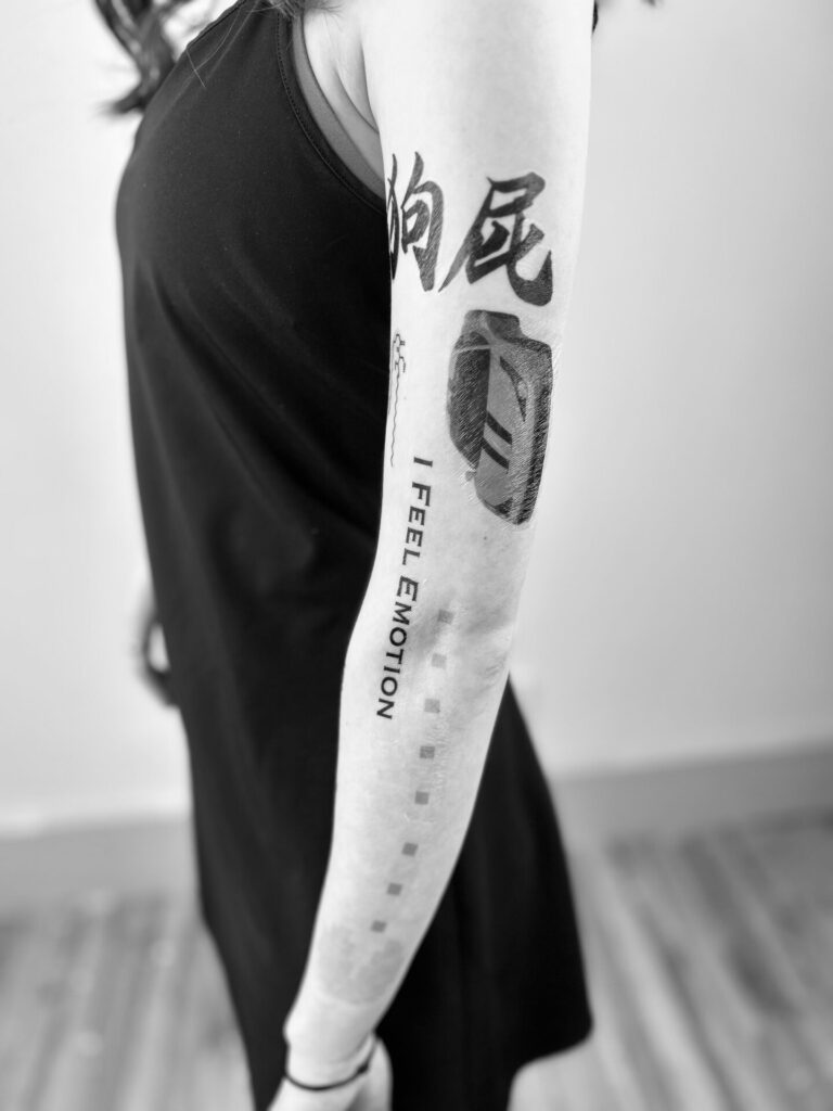
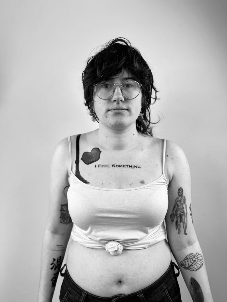
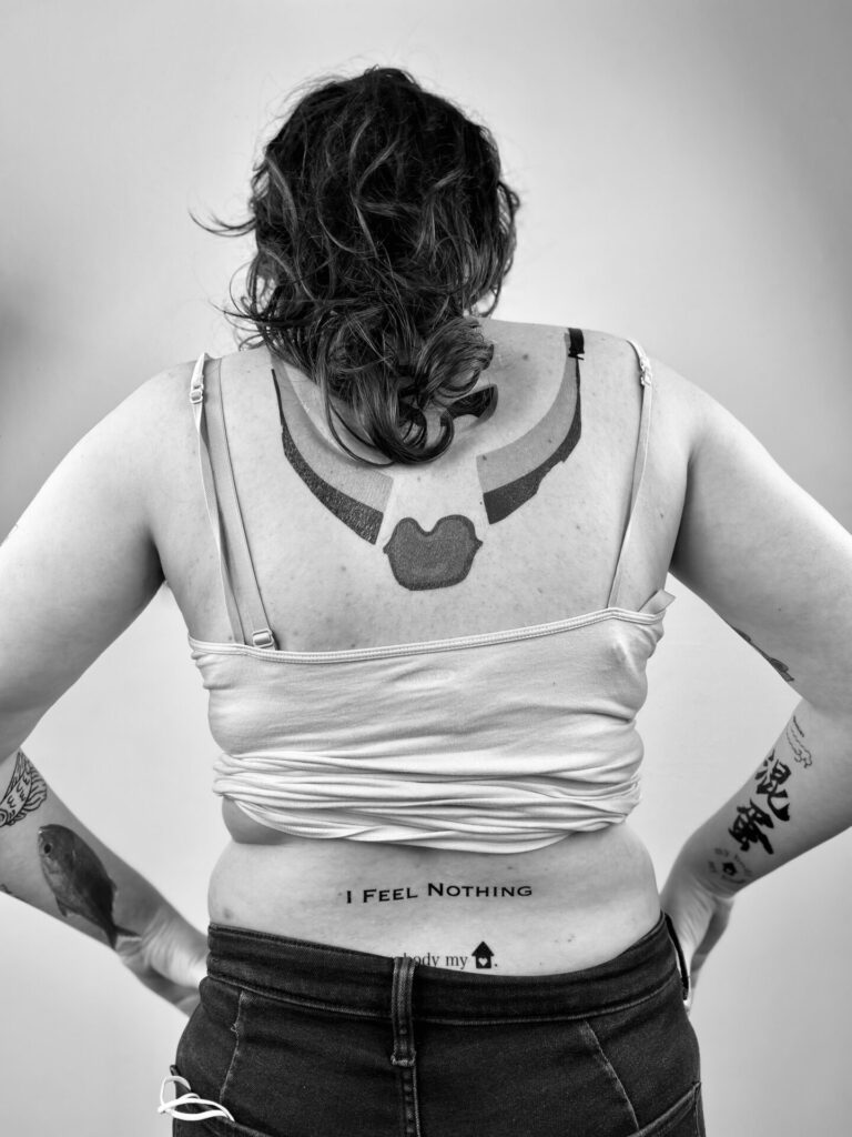
Aleida

Statment

Title: Mother Daughter Bonding

To start off I have a step dad, my bio dad was a complete and utter asshole, I’m surprised he isn’t behind bars. My step dad is lovely, I consider him my real father, however one person has been with me since day one and that would be my mom. This assignment revolved around her and myself and our bond with each other, she is my person, she has supported my decision with everything since day 1, that includes this profession. Love you mom.

I thought it would be fun to take her to a rage room, reasons being if you’ve ever seen her mad and or just driving. we have comments back and forth about wanting to hit something or someone just because how stupid people can be, some comments also refer to the water in our area like “what is in the water, did everyone drink it today and become incompetent!?”. On top of that the topic of a rage room has come up many times. when getting this assignment I called her and asked “wanna go to a rage room? great? we have a reason to go now!” when I got home to do this assignment I found out that half my family and my moms childhood friend would be joining us. This made it difficult until I found out that there was 2 rooms in a technical sense, my brother and step dad were in room 1 and myself, my mom and her friend were in room 2. We each got a crate of breakable items but for the video I bought an extra item, being an electronic for my mom and myself. My mom and myself are in many ways similar, sometimes in a scary way, this was just another interest of ours that we got to do and an experience that we got to share together.

This was extremely therapeutic and my mom says so in the video. We had to much fun and honestly wished we had more crates so then we didn’t have to leave right away. In the end I got a small clip of everyone walking across the screen, they were supposed to stay in frame but that’s a small conversation that can also be heard. When getting in the car I made the comment about us needing to make this a family tradition, maybe sometime around Thanksgiving or Christmas, my mom loved that idea and I can’t wait to go back.

Side note: we wen’t to a bar after and got drinks, not my bother, he was left at home.

people involved: My mother, Aaron | My step dad, Jay | My moms friend, Sabrina | My brother, Jaxon | Myself.

music in the background consisted of Grandson, Joost Klein and ______

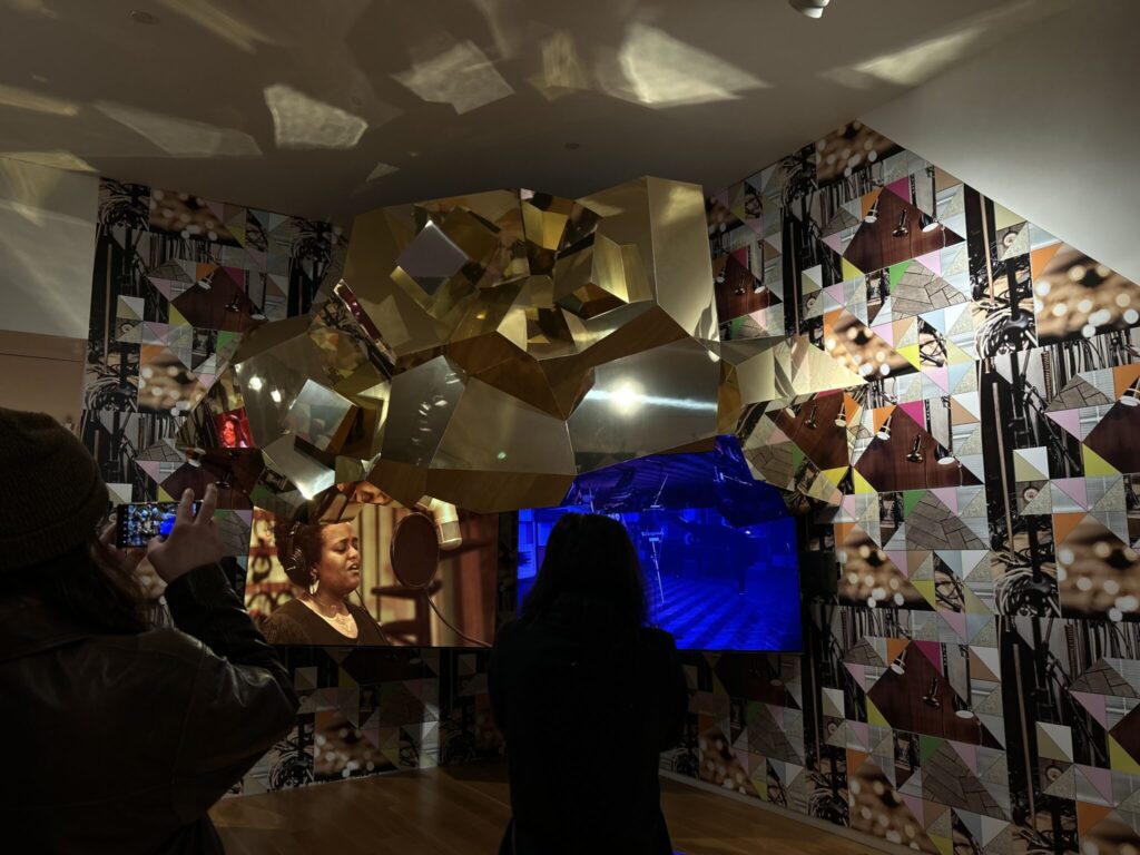
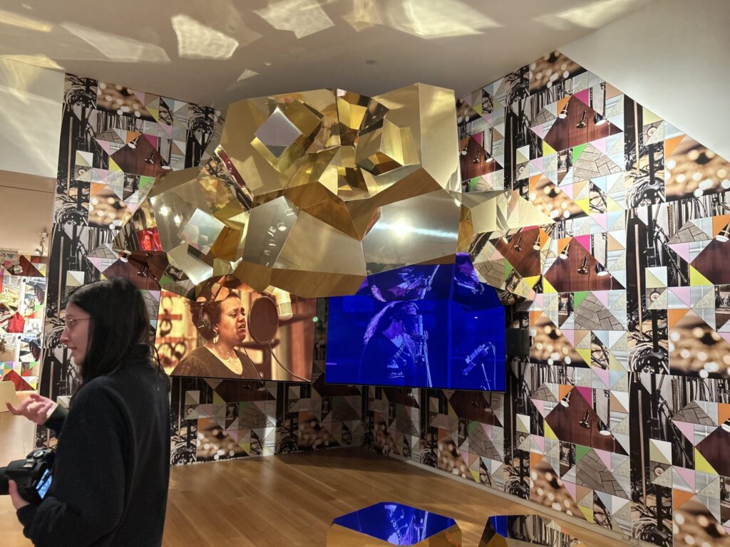
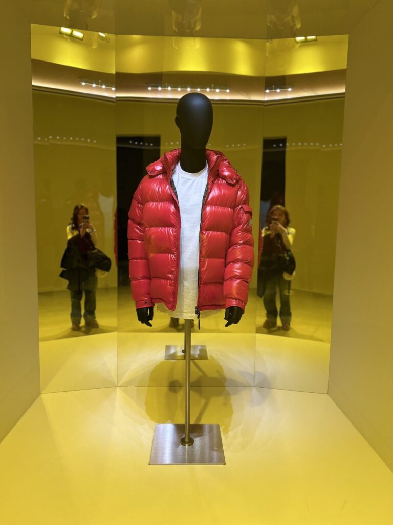
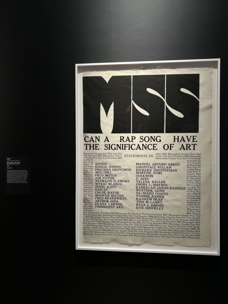
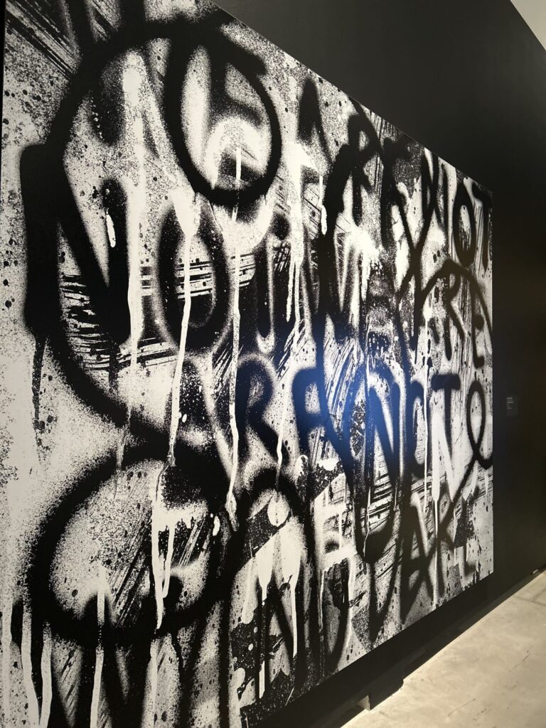
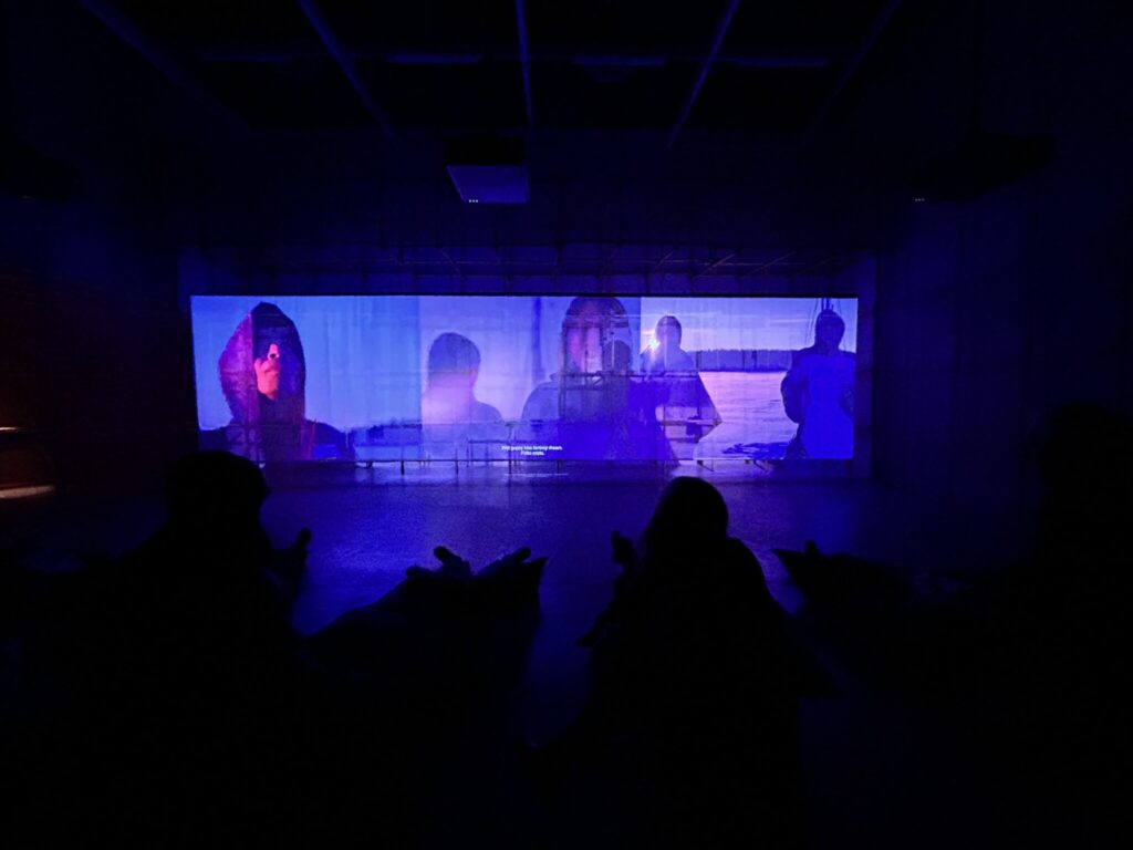
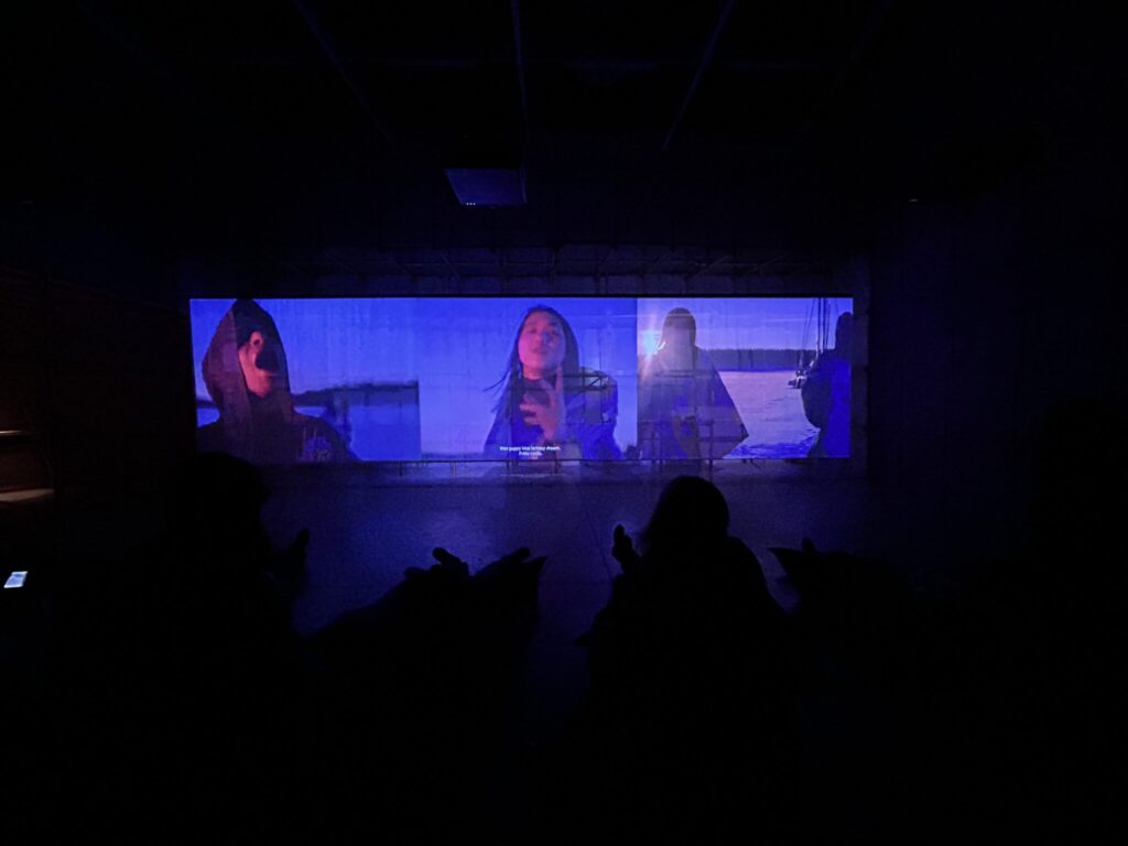
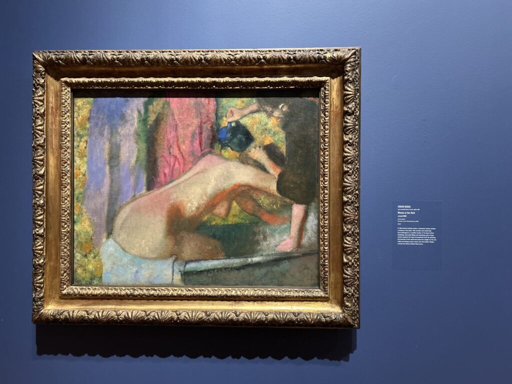
In the first part at the A.G.O I looked into (enter gallery name here) I loved the visual elements that it gave and in was very immersive. The only thing I found hard was the audio, I know it’s a part of the installation itself, however, personally I couldn’t take the audio. Not that I didn’t like it, it was interesting.
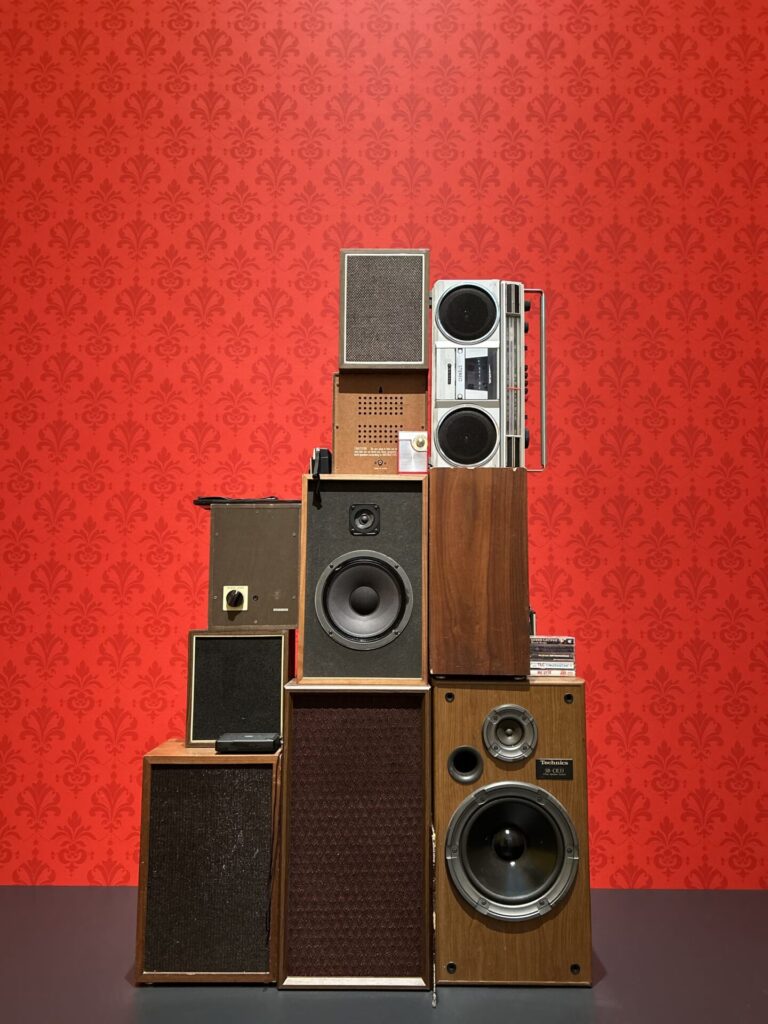
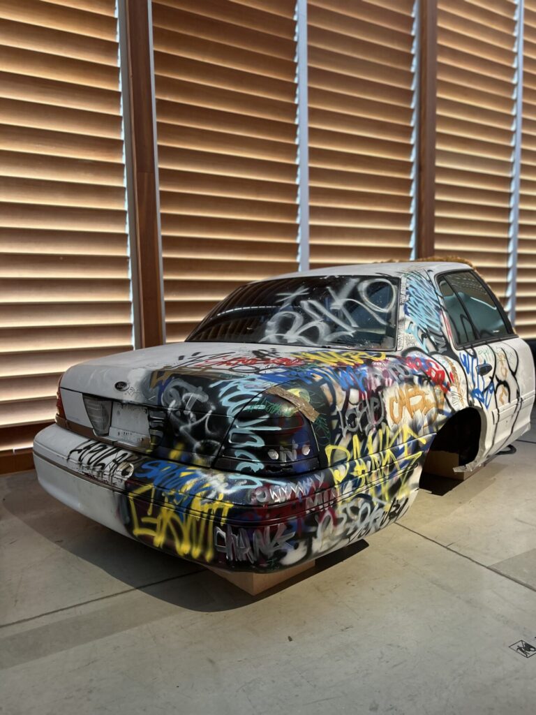
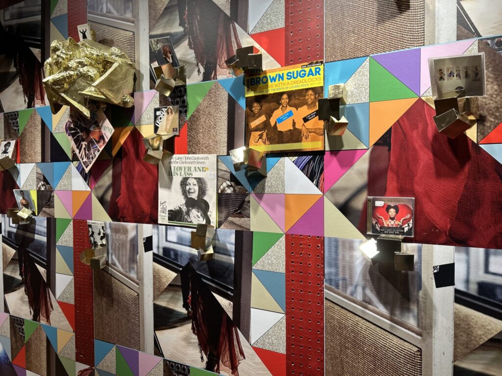
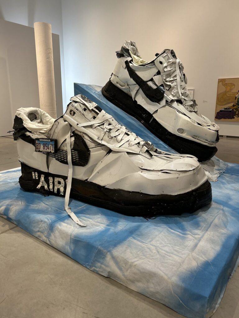
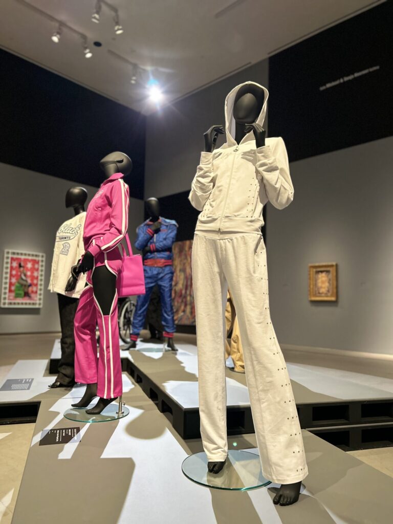
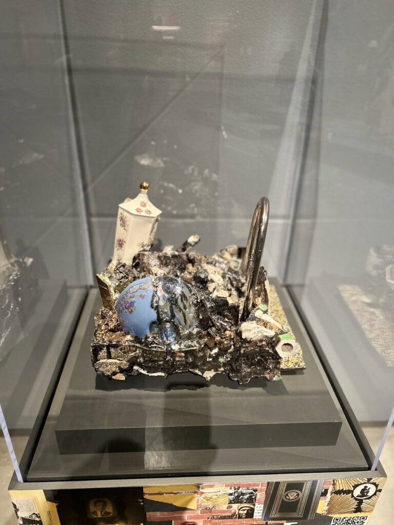
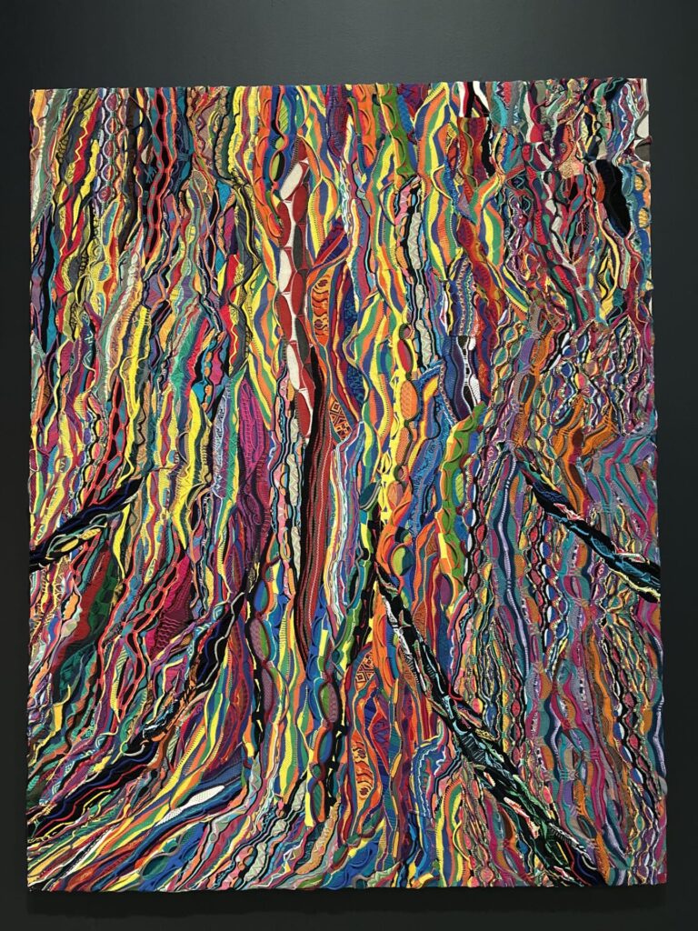
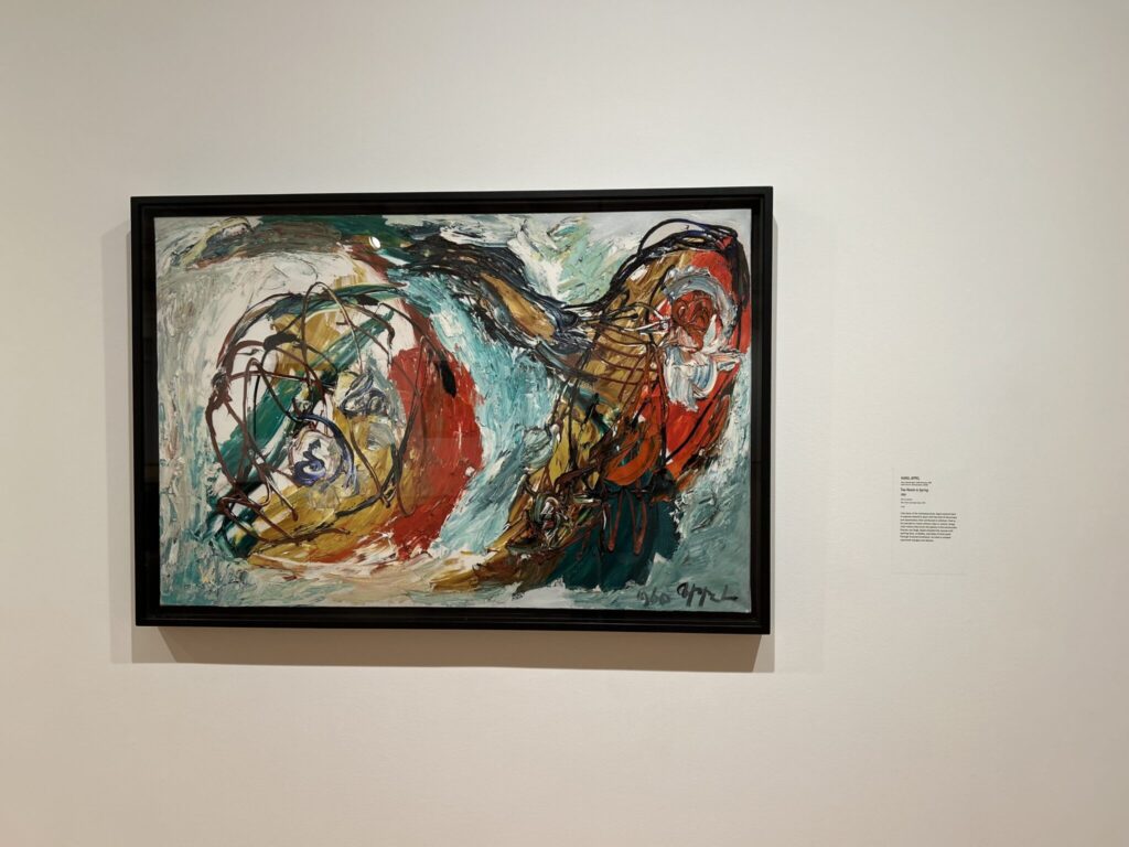
The second part of the A.G.O was more favourited than the first part, I loved the colour, all the visuals, with texture, the sculptural elements, mixed media, the audio rooms, ext.

(put more info here please)
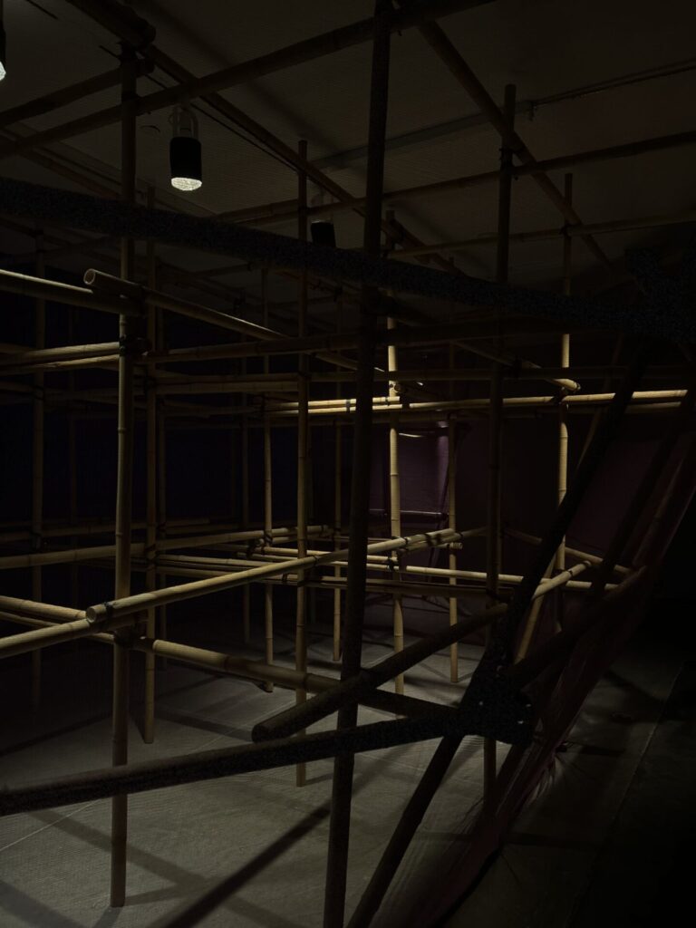
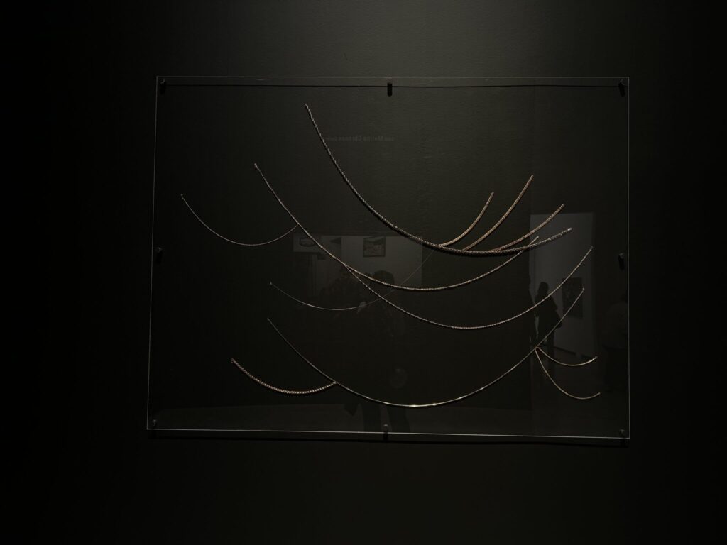
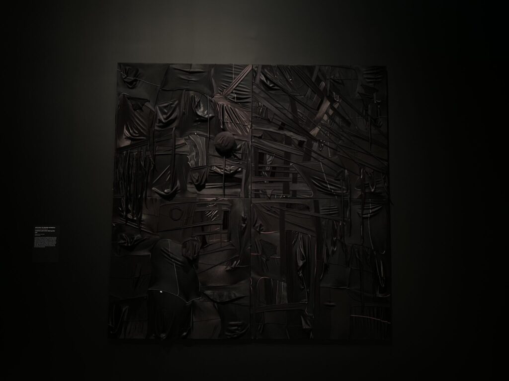
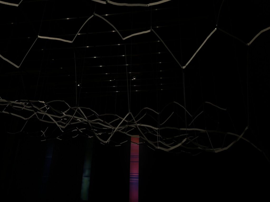
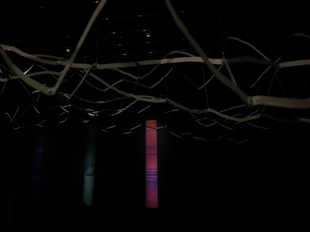
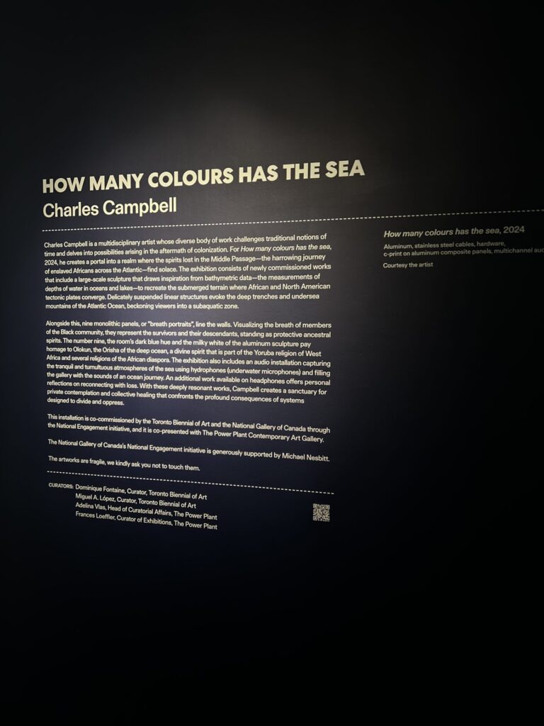
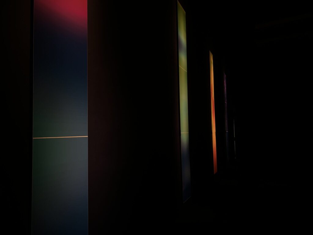
when arriving at the Power Plant, I wasn’t expecting the immersive installations with colour and sound that I was about to walk into. The first one I visited was (name here) and that was my favourite out of the 2, the dark ambiance with the accents of multiple colours and shapes… continue
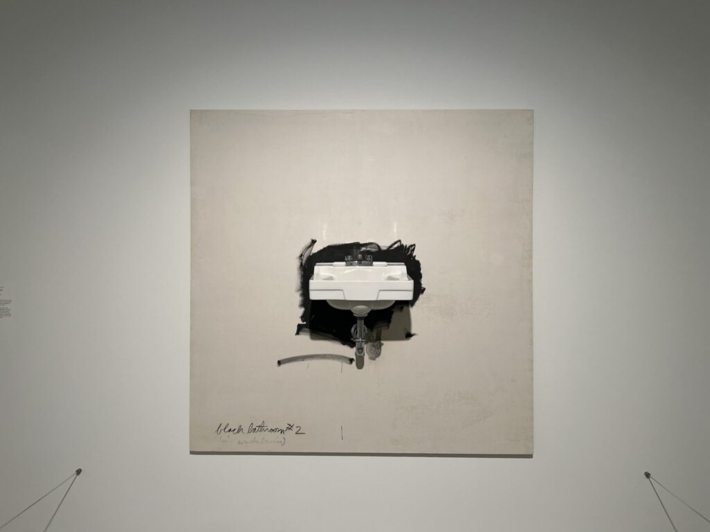
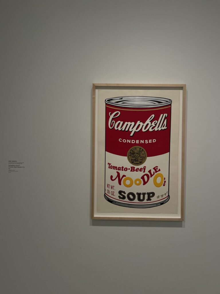
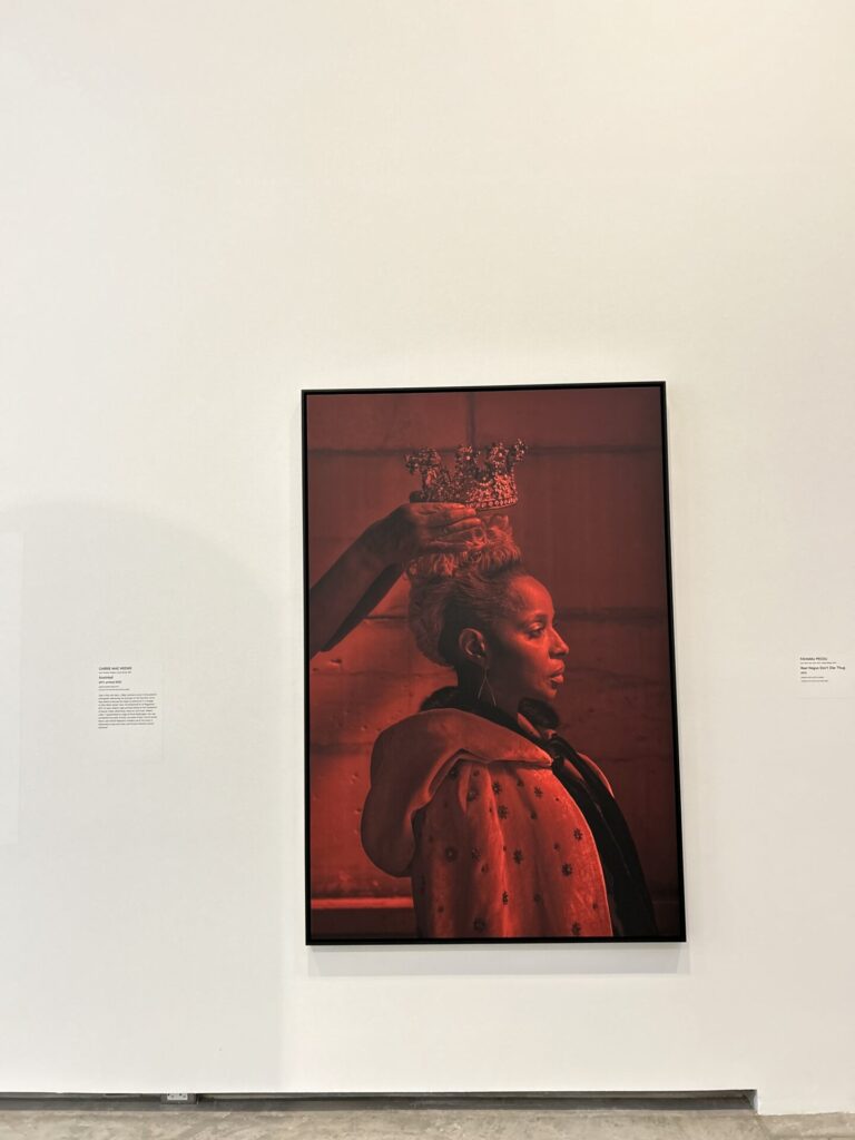
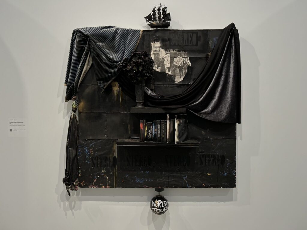
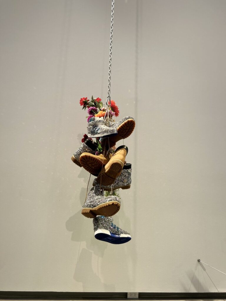
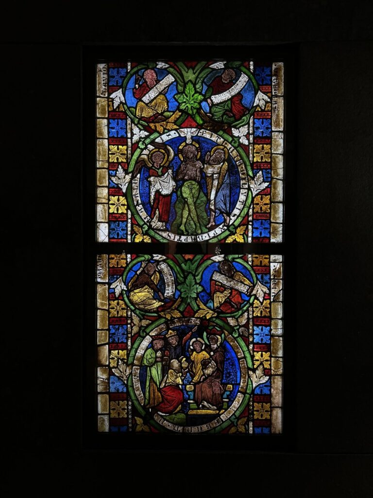
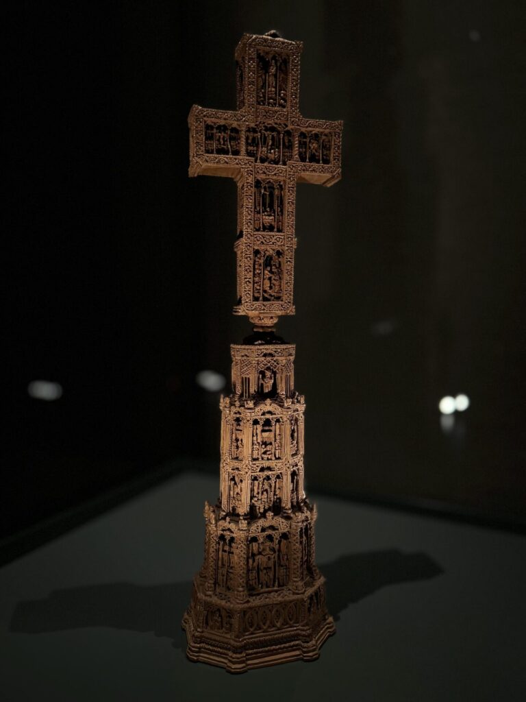
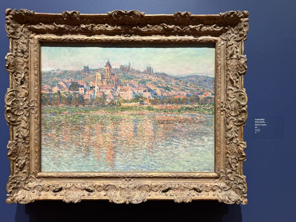
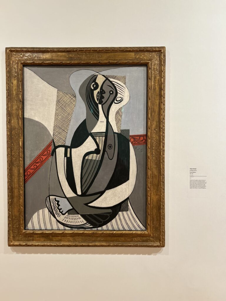
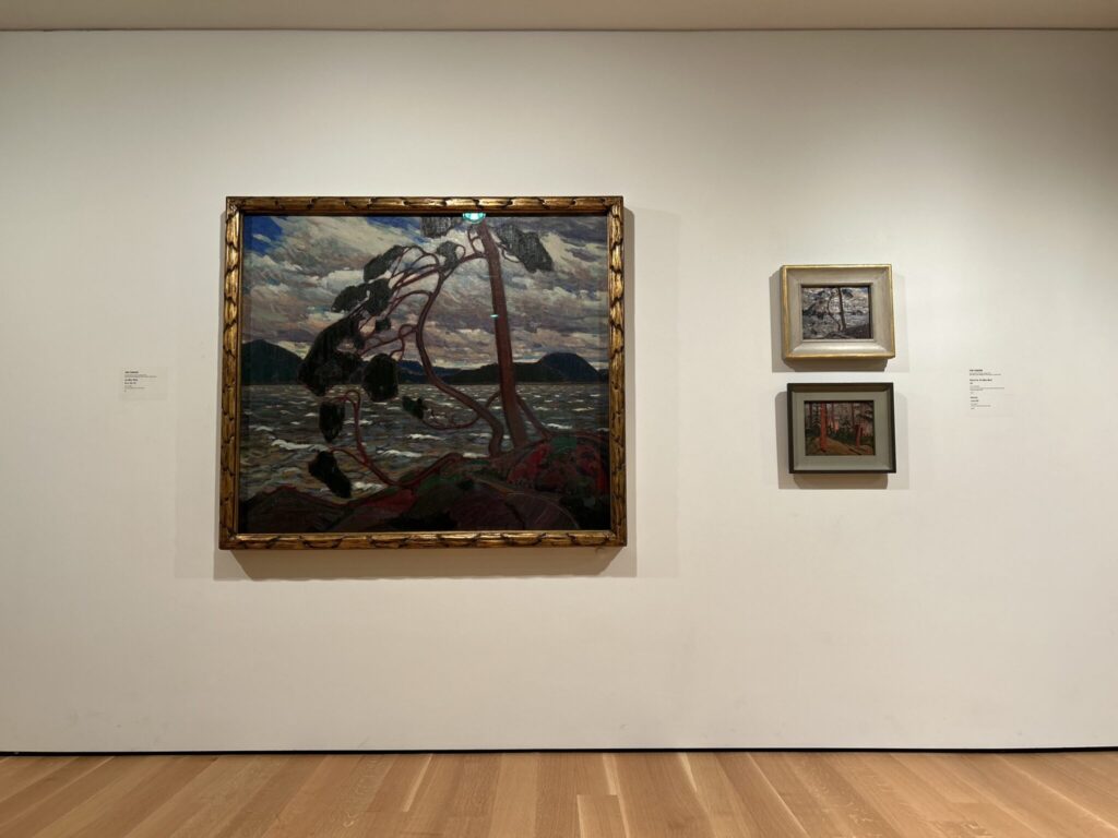
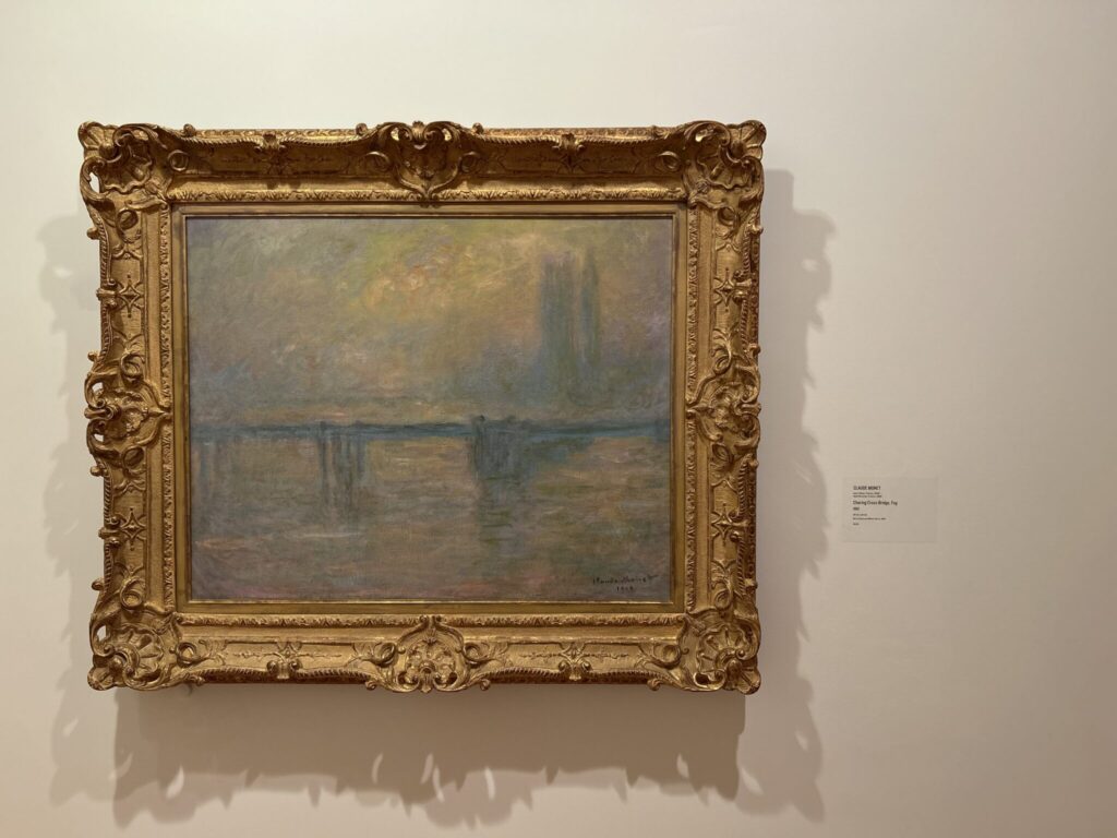
lastly my upmost favorite part of the trip: As much as I loved seeing everything at the AGO, seeing as it being my first time there. I found these piece’s and other’s like them to be my favorite part of the trip and out of all the art work we got to see. I felt at home in these areas, calm, and really happy. I didn’t go to picture crazy because there are so many of these on the internet, but I wanted to commemorate the firsts, the first Rembrandt, Monet, Picasso, etc. I was so close to tears.

Title: Internal

Edit: I took the advise from crit and took out the audio and replaced it with subtitles, I don’t know why it isn’t popping up.

This is my stolen video art.

For my video I went with a “day in the life” video genre, however its just a few minutes in the mind of someone that has ADHD. I wanted something to show to people what can really be happening in ones mind and that ADHD isn’t all on the outside, it never is. This video is meant to reach people who don’t have ADHD, but it doesn’t mean it’s targeted for them to be the ones to understand what is happening. The people targeted for understanding is other people with ADHD/someone that might know another. This may not pertain to everyone with ADHD, but it will reach a good amount.

The idea for this came about when I didn’t fully understand what the project was supposed to be and when talking with Diane, she said something that made my mind jump to “All videos are like a representation of our own minds” however I have ADHD, I thought it be funny to make the video and the intention was to have it be lighthearted. In the middle of editing I opted on doing a voice over and make it a 50/50 in laughter and sadness. I also wanted the voice over audio to be a bit worn and not top notch for it to represent it coming from my mind, it is not clear and shouldn’t be as such. I enjoy the end result of the voice and think of it as myself stuck in my head, maybe in a glass bubble or metal box just trying to pick a fight.

This would be my very first exceptionally personal Art-Piece. Growing up not knowing I had ADHD didn’t help with school and other things in my life. At some point I genuinely thought that I was lazy and was going to have nothing in life, many situations left people in the same thought process. I want people to see what might be going on in the mind. Someone might look like they don’t care or want to do the task, but they might just be fighting with themselves internally to do the most simple thing, standing.

NOTE: The video is not coherent, it is supposed to be a mess.

These 3 videos would be my inspiration for my ADHD video.

Artist statement:

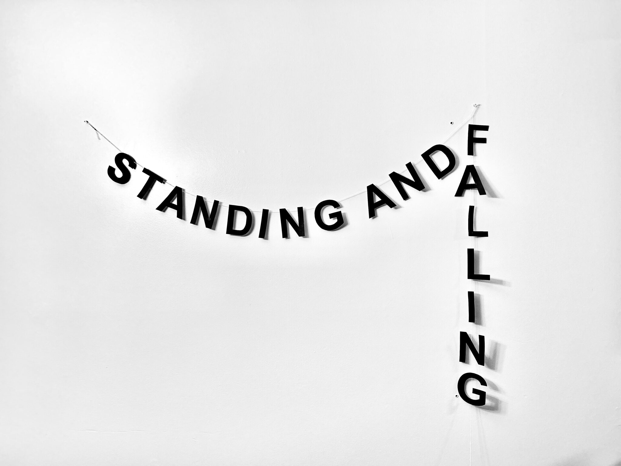
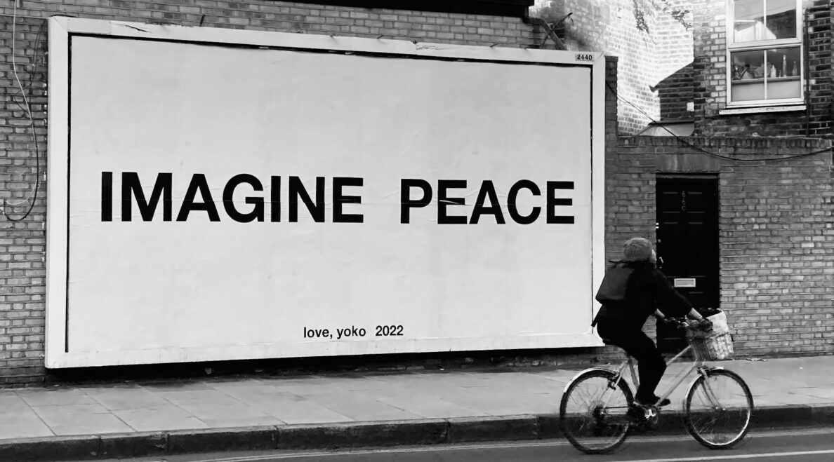
When reading through the article, I found multiple words/small sentences that I could have used. However for some reason this one called out to me more. I constantly feel myself put together but in reality I find myself falling apart, when reading the words “standing and falling” I knew that this was the banner I would make, its just to relatable.
Aleida

Title: In The End.

base: Dark humoured advertisements.

Intro: “Are you someone who has a hard time thinking about the after life? Have people have asked you/ have had the thought about death in the back of your mind on what to do after the event comes?. Well look no further for I have some advertising posters/stickers (I’m making them, not done yet) that has a sense of dark humour to take away from the serious topic on which is being advertised! Now you can relax a bit and think of these instead!”

Statement: I Had the idea to do posters to begin with, just because of my time and how I thought these would be easier and yet still get my point across. I am happy to say that it worked out beautifully, and if I had to do this over again I don’t think I would change the advertising medium. I would however add more posters that have more options, this was a very fun project.

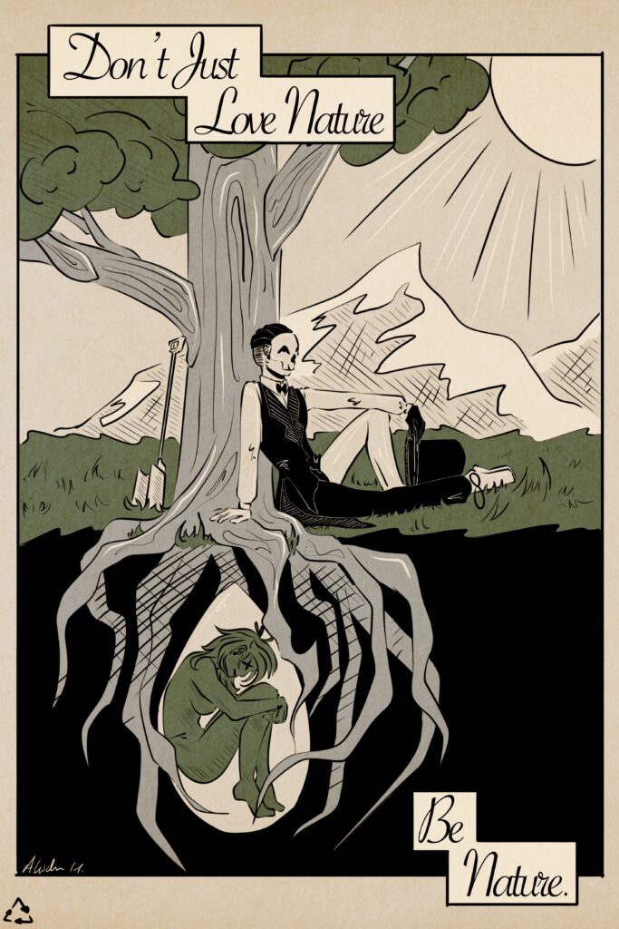
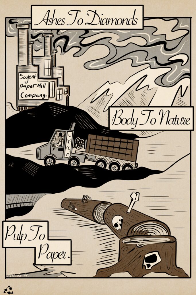
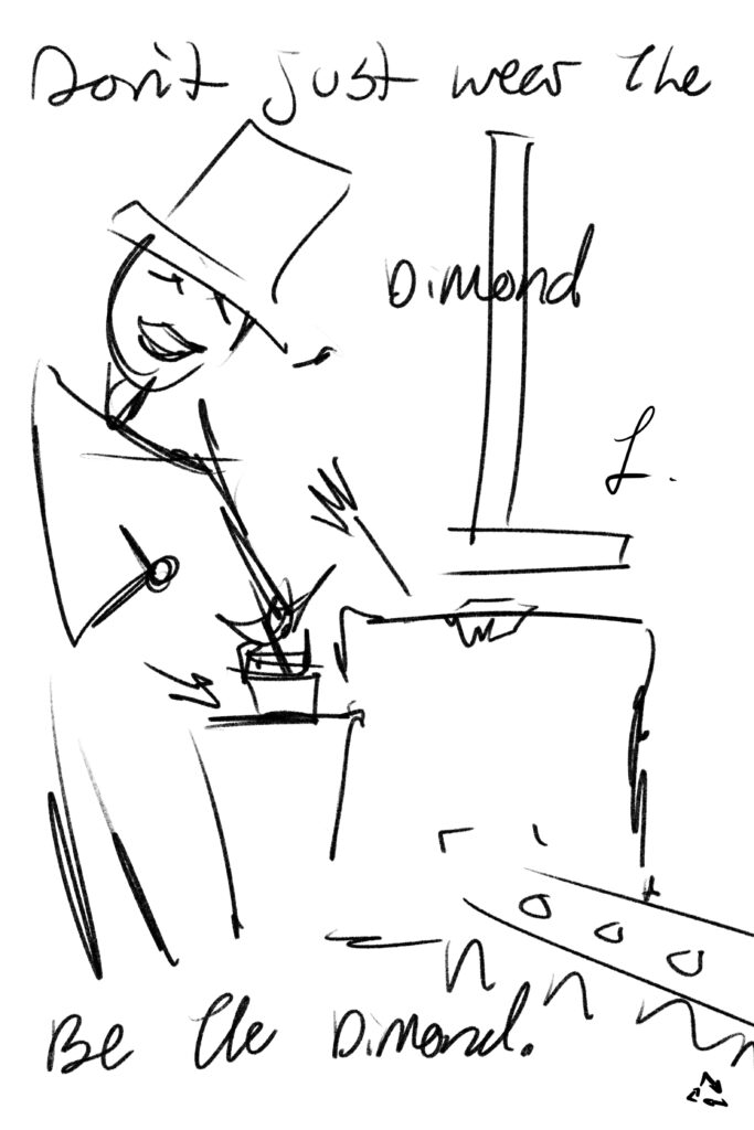
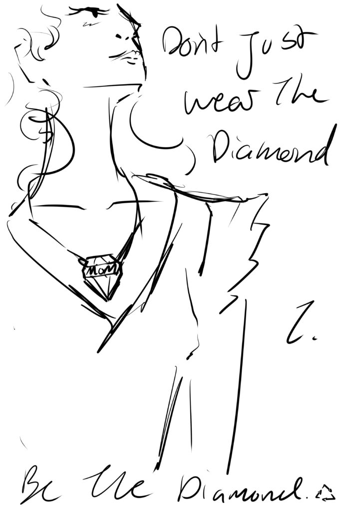
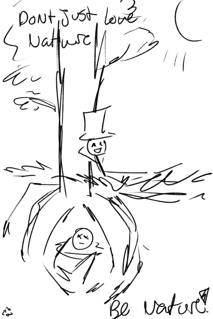
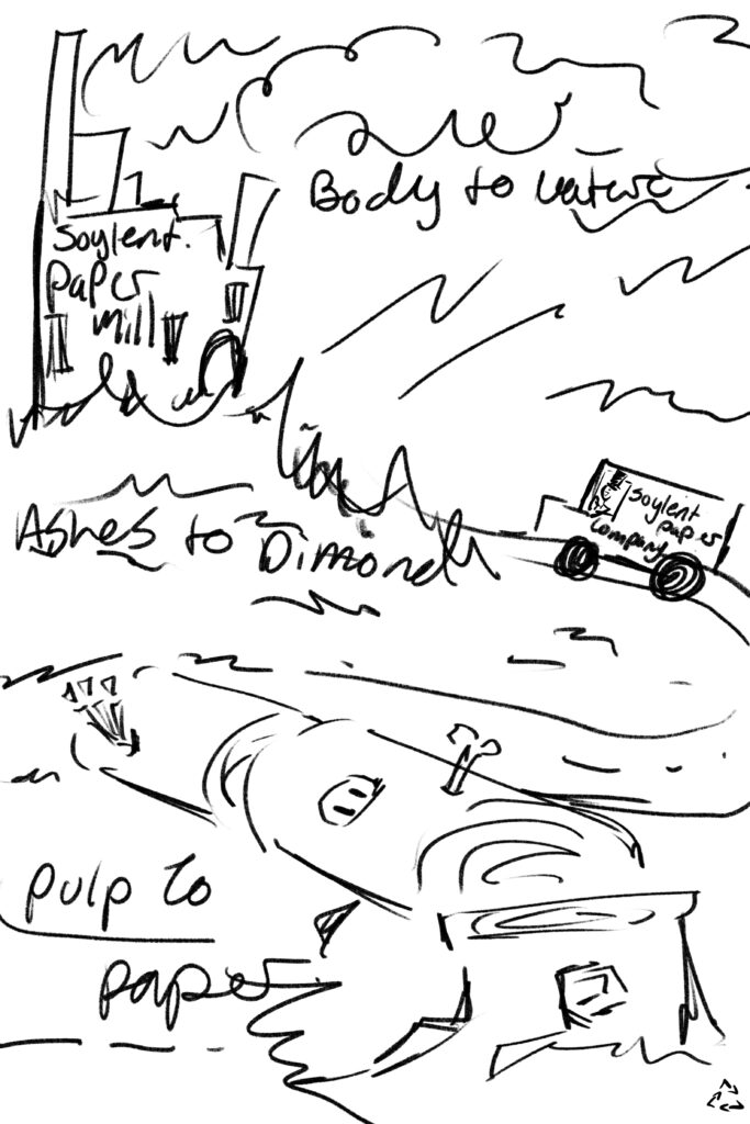
Why choose this specific way of showing my thoughts? I thought it would be funny to make posters that showed/informed people in a simple way about their other options for once they have passed. Showing them that you don’t just have to pick being buried at a graveyard, being cremated and or sending your body off to science. For the designs I didn’t want them to be so realistic eg. images photoshopped together to make a professional advertisement, the whole point was to inform people through a humorous way to prevent any upsetting thoughts. In the bottom left corner there is a recycling symbol to indicate that we recycle and how we could also be recycling ourselves. I also made it intentional that Death has a fun and mischievous, persona within the posters to give a sense of fun, peace and consistency. I, myself, have a hard time thinking about the after and what happens, and to prevent me from spiralling in this moment I won’t go into too much detail. However I love watching movies/shows that portray this topic, especially anything Tim Burton and his mind to the weird and concerning, in the end he was one of my inspirations when drawing these out. To cope with these thoughts I have, I find dark humour eases my mind, and wondered if that could be used to inform people about their options that have the same issue, or to just have a fun conversation.

Where would these go? Placing these posters outside was my main thought, they could be plastered up unto walls that have other advertisements, they could be stickers stuck onto poles that line the streets, they could also be made into postcards. If we’re looking for a very specific location/for a profit, all of these could be sold/shown at a crematorium or they could go in cafe’s with other posters on a cork board.

Overall, I like my final product.

NOTE: I am hoping that over the winter break I am able to get images of my posters and stickers out in the real world for the blog.

UPDATE: I forgot my posters in guelph. The post for the posters might be much later then what I intended…

Time Lapsed video of my process to making the posters:

  • app, Procreate
  • Total time, 10 Hours

My idea is to create dark humoured posters informing people about the many different options they have for after they are gone. I’ll be executing this through posters and having short but sweet text to go with the simple and cute drawn characters and scenery.

Title: Right To Left

For this assignment I didn’t know what to do at first, I was never a great reader and would rarely pick up a novel. However manga was something I got into and became obsessed with, it was my way of reading without my brain’s constant interruption which made reading a novel very infuriating. With that I made my artist book about my reading problems throughout my childhood to now. In my book you will see at least half of my collection using the first volume on each page along side that you can see my personal stats/notes for each manga. On every other page I put a few sentences stringing together my childhood reading.

Another thing to add is my choice for the books structure and how it reads right to left. In a manga reading right to left is usually how you would read one so I thought to make my artist book translate a similar structure for mine. The barcode being on the front cover however was not planned but I couldn’t do anything to change it. The trade book layout was the most similar to a manga so I wanted to keep to that and not change to a photo book which wouldn’t have had the barcode at all. My design for the cover was to show myself from when I was 11 to now picking out another book. In the middle of the book I had the idea to line up my books to look as if they were on a shelf, another thing to point out for the shelved books is that I lined them in the same order I set for within my book.

Lastly the way I photographed my book was intentional, I wanted the quality to be ok and not top notch due to the time I started collecting manga. I was 11 and at that time I would take not great quality photos, plus I would have been taking photos with my phone and not a camera. I tried my best to get the best of both worlds but this is what I was left with. Now if I had my book display holder still, I would have used that to hold my book to take the photos with, in many of my old photographs of manga they would often be sitting in that display holder on my not so great shelf.

To sum up my artist statement, I made my book about my reading problems from when I was younger that turned to be undiagnosed ADHD. Reading manga was easier than a novel because of the images and the broken up text, plus I loved the art within the manga I collected. I soon started collecting more and more and with each punches my taste in stories change, you can see the timeline within my book with each page reading right to left and having a manga at every turn along with my own stats. Finally the way I photographed my book was intentional because of the time I started to collect manga. I enjoyed this assignment, it was fun going through my old manga and at one point I ended up reading some within my free time.

Also, shoutout to my younger brother for holding my book while I took photos.

Title: Overtaken

When coming up with ideas for the assignment, we thought about growth and how within the arboretum you can find areas where nature has taken back what was once theirs. Bridging off that thought, we discussed about Italian statues and or historical garden decor, leading us to talk about dressing in grey as if we were statues and staying as still as we possibly could in different locations. When starting the filming process we thought about switching throughout each location until the end when we would both be in frame “under” one of the bridges with the camera shooting on the other side of the fence, representing that nature has been chosen by humanity as to where it can be and where it can’t be. With each new scene you can see the vines slowly growing more and more, on myself and Carys. This is to show how nature is slowly covering what has been built/placed in the area. Out in the world you can find small complexes that has vines growing up the side, abandoned houses that have begun to fall apart accompanied by the overgrown lawn and other plants/weeds etc…

Personally I love historical statues and garden decor, especially Italian. I don’t completely understand why but I just have a fixation on it. I find them beautiful and so highly detailed to the point where they really do look like someone that has just been painted. To add to that with the overgrowth of nature just brings a whole new perspective. One can look at it as someone that hasn’t taken care on their property. However, someone else can view this as a figure becoming one with its surroundings, becoming one with nature.

When it comes down to it, our video assignment is about nature and overgrowth on man made structures and how it can be beautiful and or a lesson. Showing different areas is intentional, it is to help broaden the idea in locations and how it is not just within your garden. Showing a person (us) being wrapped in vines was to indicate the statues/man made building’s/structures being taken by nature. Having us sit behind the fence in a ditch below a bridge was to show the most growth that we found and that the fence could act as a cage.

Final note (personally): I find that people should start to incorporate nature into the building process when under construction in the future to help with the all the damage humanity has done to this planet and to its other living creatures. We are not the only living beings here, and I find that many people in many life changing industries don’t remember that. It’s like being in the Barbie: Thumbelina 2009 movie that I watched way too many times as a kid. People need to start listening and actually hearing what the planet itself is trying to tell us, we are already on the edge. (Sorry for the rant)

https://docs.google.com/document/d/10fSdwaqv9TyzpNltssrQXV3AbtavIVnDbE8LrDaEf64/edit

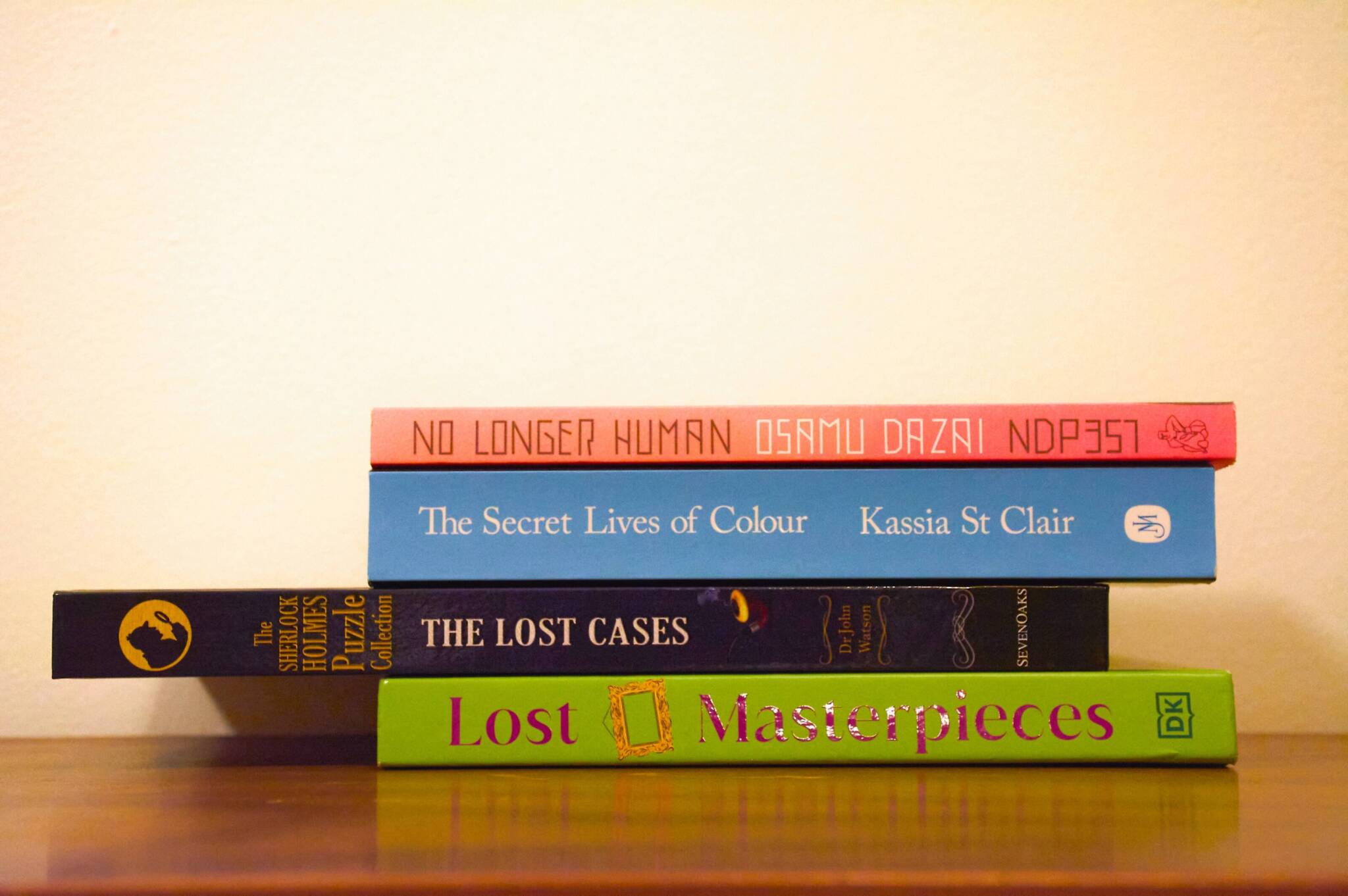
Stack #1: Missing Art work

When trying to think up the first stack, I knew I wanted it to have something involving mystery and relations to detective casefiles. I very much enjoy watching mystery themed content and thought it would be fun to start the assignment there. With this, I interpret this bookstack as:
We are looking at art pieces and the colour’s, the beauty and emotions they contain. The piece then becomes lost and the trail runs cold, there is nothing anyone can do but close the file for now and list the art piece as a lost masterpiece. However you can also interpret this as an art piece being destroyed and no one can figure out who would do such a thing, what happened? This then lead me to edit the photo to give a basic colour tint and nothing to sever.

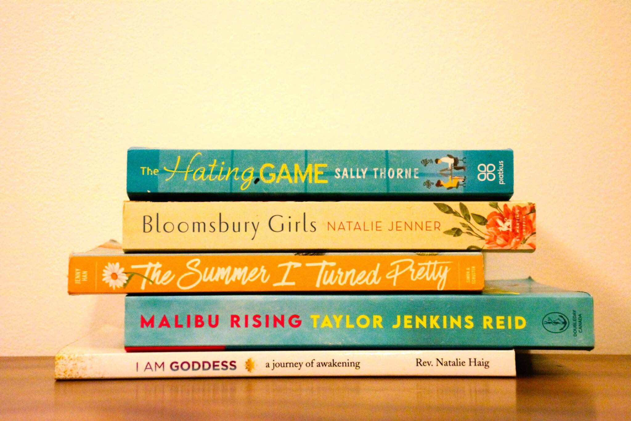
Stack #2: To find yourself/ accepting who you are

With the second stack I had to dive mainly into my roommates/close friends books, so I took a different approach to the theme and thought to base it off of her. This stack is trying to show someone on the path to find who they are and that they can accept themselves for what they look like and what their personality is to begin with. Taking someone that comes from a dark place and finally being able to put all the pieces in the right spot so they don’t have to second guess every last decision, that they are now in the light and can hold their head up high without worry. They are a Goddess. When editing the image I wanted a very warm feeling coming from it, so I added a warm layer over the other modifications.

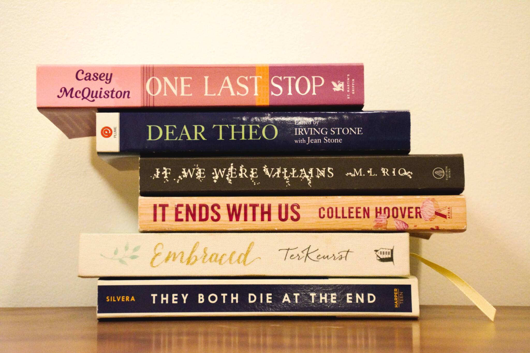
Stack #3: The story of their end

When completing the last 2 bookstacks I knew I wanted this last one to be the classic “with you until the end” I thought to start this story as if it was a person reading a letter that they have just been handed after opening the door. As they have read through the letter and realize whatever point the other person/lover/friend, ect. They went to meet up and have one last day together before ending their story before anyone else could get hurt seeing as the letter was implying that they were something the world would be better without. This bookstack would have to be my favorite, however I’m not completely sure as to why. I wanted the image to give off a dull get still life like feeling, as if it came from a movie with the plot being some non realistic documentary. So instead of giving a sad vibe and putting a cool tone over the image, I set out to try and keep the colour, but just have it muted in some way.