Carys

** Please contact Carys if there are any issues loading photos on the blog. **

Book Stacks – Assignment #1

The Midnight Murder – Book Stack 1

Titles from top to bottom: The Midnight Murder, The Dark Night, Alone, The Twist of a Knife, Death, The Witnesses, Suspect, Found, Justice.

This book stack sculpture is modelled after a classic “whodunnit” book. As an avid enjoyer of murder mystery books, I wanted to have fun with this first book stack. The books are carefully arranged so the titles can tell a story, in this case, a very simple “whodunnit” story. The first book ‘The Midnight Murder’ is the piece’s title and gives the viewer a sense of the story. The books vaguely outline someone alone (‘Alone’) at night (‘The Dark Night’) who then gets murdered (‘The Twist of a Knife’ and ‘Death’). From there we learn there were witnesses to this crime (‘The Witnesses’) which leads to the murderer being found and eventually prosecuted (‘Suspect’ and ‘Found’), leading to justice (‘Justice’) once the case is solved. Collecting these books was a difficult process, only one of them was from home while I scoured the library for all of the other ones. I had a general idea and used books to fill in the spaces for the final narrative. I found the best way of arranging the books in the case of all three of my pieces was to stack them directly on top of one another.

Absent Fathers? – Book Stack 2

**Trigger Warning** This next piece and the artist’s statement include themes/mentions of familial violence and abuse. Viewer discretion is advised.

Titles from top to bottom: Hard Truths, Doubt, The Other Woman, Coping with Family Violence, Divorce and Disengagement, Divorced Father, Family Breakup, Fathers & Daughters, Daddy, We Need You Now!, Learning to Say Goodbye, On New Shores, Lone Parenthood, Making Ends Meet, and Learning to Live.

The title of this book stack sculpture is ‘Absent Father?’ as shown with the book at the very top of the stack. Through this sculpture, viewers can look at the titles of the books from top to bottom, to gauge a general idea of the story or history presented. The themes of this sculpture are significantly more personal to me compared to the last one, it gives the viewer a look into life before, during and after my parent’s divorce. It is important to note that my parents divorced when I was only a child, so the perspective of this history/narrative comes from me as an adult with a more complex understanding of everything. As mentioned the narrative is split into three pieces, first, it’s life before the divorce, which includes ‘Hard Truths’ to ‘Coping with Family Violence.’ The before section touches on what I was going through leading up to my parent’s divorce. Although my memory is mostly blacked out from this time, I remember the struggle I had absorbing that my father wasn’t a good man, or even in some cases, a good father. From the violence I remember encountering to his allegedly cheating before my parents got divorced was hard for me as a child. The second piece of the narrative is during the divorce, which is from ‘Divorce and Disengagement’ to ‘Fathers and Daughters’. This touches on the breakup of our family and the evolving father/daughter relationship between my dad and me as I was forced to examine him in a new light. The third section is after the divorce, which is from ‘Daddy, We Need You Now!’ to ‘Learning to Live.’ This section details how my father slowly became more absent in my life, learning to come to terms with this, eventually working through those emotions, living life with my single mother and struggling, and eventually learning to live with my complicated relationship with my father, accepting that as a piece of me. I went about collecting the books the same way as the last stack, this time though, they were all from the library.

Survivor – Book Stack 3

**Trigger Warning** This next piece and the artist’s statement include themes/mentions of sexual violence and abuse. Viewer discretion is advised.

Titles from top to bottom: Alcohol, The Art of Wooing, Love Tactics, Seduction Lines, Sex Signals, Willing, Wanting, Waiting, Personal Decisions, Sexual Choice, Yes, Human Fulfillment, The Stories We Tell Ourselves, Is it Love or is it Addiction?, Sex & Isolation, Understanding Reality, Wounded Images, Evil, Violence in Dating Relationships, Dating Violence.

The title of this book stack sculpture is simply, Survivor, unlike the first two, the book at the top is not the title, instead, it’s the beginning of the story. This book stack goes through the story of my sexual assault and the aftermath of it. It’s a tragic tale, me going through the actual assault and then convincing myself it never happened or that it wasn’t valid. ‘The Stories We Tell Ourselves’ until ‘Sex & Isolation’ is me not yet coming to terms with what had happened. In reality, it took months for me even to register what happened as sexual assault, it took my friends telling me constantly. The final books from ‘Understanding Reality’ and down is me detailing the process of my reality shattering. The rose-coloured glasses came off, and I finally was able to see the terrible person my assaulter was and that what had happened was sexual violence. Creating this narrative was very important to me, I wanted to frame what had occurred in a very accessible and easy-to-read format. I hunted down books from all library floors, ensuring I used a variety of sources and not just books from a single section. This portion of the assignment allowed me to look back at the event, and examine it as a whole, finding books that fit the narrative. Even though it was a fairly dark topic, I still found it enjoyable.

Environmental Video Assignment – Overtaken

The title of this video is ‘Overtaken,’ it is an environmental video filmed in the Arboretum. The video follows two figures depicted in different natural scenes, staying as still as possible to give the illusion of these being statuesque. Throughout the videos, the two figures are pictured in locations that are slowly more and more overtaken by nature. The settings were very carefully chosen to fit the narrative. The first was a bench just barely surrounded by the leaves of the nearby tree, not quite overtaken by nature yet. The second is a fence, broken and covered in moss, losing its original design to nature. The third is a wall and a bench, surrounded by branches and leaves, giving a sort of canopy effect around the figure. The fourth is a wall completely buried in leaves, the figure nestled within it. The fifth is a location meant to encase the figure in nature, as the leaves are all around, encircling them. The sixth is a path covered in fallen leaves, concealing parts of the figure. The final setting is the view from an old bridge, the contents below heavily overgrown, the figures amongst the overgrowth. For this project, we wanted to look at manmade items and spaces as nature has slowly overtaken them. So, Aleida and I found various spaces that were covered in nature or would cover us in nature, what better place to do this than the Arboretum? Though mainly thought of as a natural place itself, the Arboretum is manufactured by humans to have a specific look. An example would be the tree-lined main pathway at the entrance of the Arboretum and how it was specifically manufactured by man to give an archway effect. Another example would be the various structures throughout it such as statues, benches, or buildings.

In terms of costumes, the two figures, Aleida and myself, are dressed in all grey to give the appearance of statues. Throughout the video we have vines slowly wrapping around us, climbing up our bodies, eventually covering the entirety of us. In the very first clip in the video, there are no vines present on the figure, but as we get to the end, both figures are wrapped in vines. Each scene sees the figure slowly wrapped in more vines. With the combination of the statuesque colours and the vines, we wanted to further portray the idea of manmade things overtaken by nature. It was almost as if we were statues in a graveyard, or in an old historical site, slowly lost to time and overgrowth.

The meaning portrayed in the video examines a theme found throughout art history. It examines a theme specifically with the Myceaneans, in their art and architecture there have always been these ideas of man dominating nature, so Aleida and I wanted to take that trope and flip it to nature dominating man – taking back its space rightfully. The nature dominating/overtaking men can be seen in both our costumes with the climbing vines and the settings we chose, as mentioned.

Overall, I had a lot of fun with this project and examining different spaces. It was interesting to look at the Arboretum in a different light than what I traditionally had. I enjoyed the filming process and playing around with the camera angles to perfect the shots we were going for.

Part of the planning process with pictures taken by Aleida: https://docs.google.com/document/d/10fSdwaqv9TyzpNltssrQXV3AbtavIVnDbE8LrDaEf64/edit

*Note, a significantly larger amount than needed was written as I was unable to attend the critique due to strep throat.

Maria Kalman – O Being Podcast

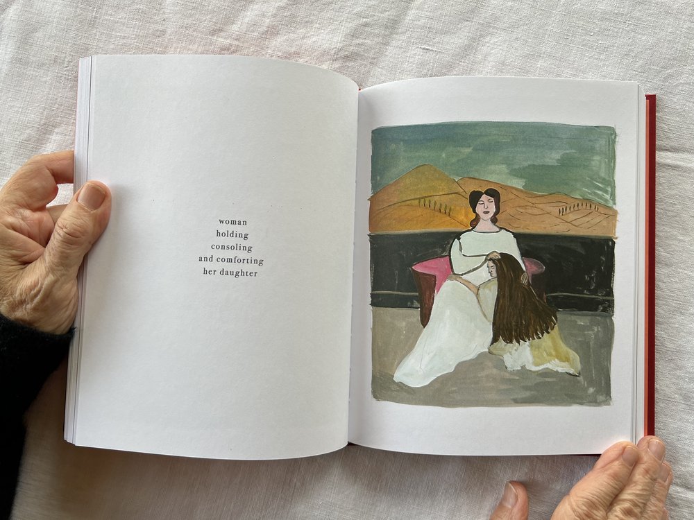
Maria Kalman, beloved dog, book spread, 2015.

Listening to the O Being Podcast was so interesting, Maria Kalman has such a unique way of thinking, so it was a pleasure to get to see a little into her world.

The first thing I noted from Kalman was “a human being can encompass very contradictory ideas and feelings at the exact same time. They’re not separate; they don’t even follow each other so much. They just live in you.” (O Being Podcast). This quote attributes to the importance of the balance between whimsy and angst, how Kaulman keeps serious subjects in her work but is also incredibly playful at times. I think this stuck out to me as I often forget the importance of not being serious or playful exclusively, but rather balancing the two and allowing them to live in harmony within me. Pertaining to art, this concept reminds us as artists that serious, deep themes can exist beside and within playful and whimsy works. How these topics aren’t separate in not only Kaulman’s artistic practices but all of our artistic practices.

The second thing I noted from Kalman was something Tibbet had quoted back to her, “They are constant reminders that life reveals the best of itself when we live fully in the moment and extend our unconditional love. And it is very true that the most tender, uncomplicated, most generous part of our being blossoms without any effort when it comes to the love of a dog.” O Being Podcast). On the surface, it would seem like a woman expressing love to her dog, and it did stick out to me at first because of my love for my dog, but it is so much deeper than that. Kalman is reminding us of the importance of living life in the moment and with love. Nowadays, people don’t do that anymore, I am guilty of this. We all get caught up in life’s whirlwind of emotions, so Kalman tells us that instead of living in the anxieties and within our pasts, we should truly live each moment of our life to its fullest. This also reflects into art, if we allow ourselves both as artists and as viewers of art to just enjoy the practice and embed it with love, we could create a revolution of art that is just pure love and beauty – much like Kalman’s work.

Maria Kaulman, Girl holding a doll and book from women holding things, 2023.

The image I chose by Kalman is Girl holding a doll and book from her series Women Holding Things. I chose this piece because I believe it represents youth in art. To elaborate, something Kalman touches on in the podcast is how she looks at the world with wonder, similar to how a child does, looking for joy in the world each day. Youth in art simply represents that childlike wonder. Kalman’s art style is so bright and colourful, to me that’s something that represents childhood. Sometimes art is taken too seriously, causing our creative practices to struggle – the same can be said about life in general as well – so, this playful depiction of a child holding her items near fosters that idea that we shouldn’t take life or art so seriously all the time.

Artist Book – I SPY: Into the Depression Pit!

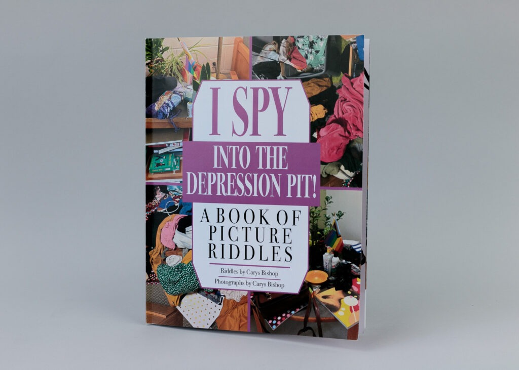
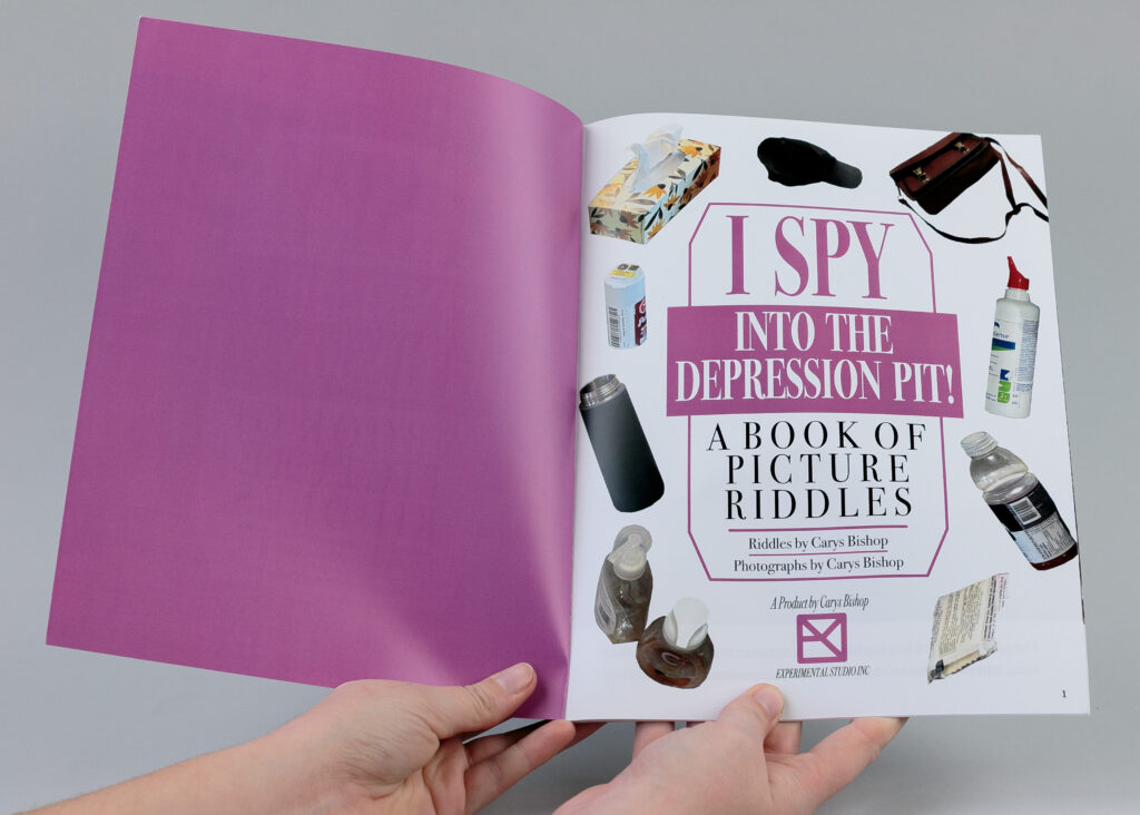
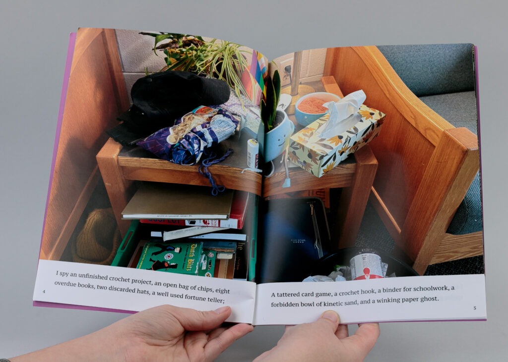
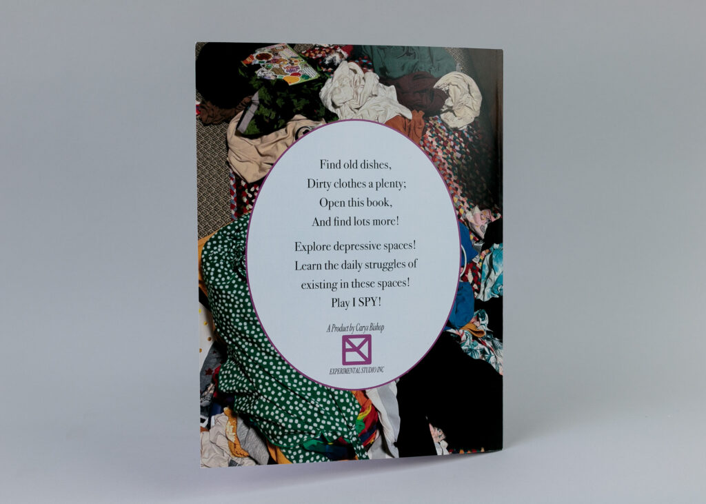
This humorously titled “I SPY: Into the Depression Pit!” is modelled after an I-Spy book. The content is very intimate and personal, showcasing the messy spaces that plague my life due to my depression. I wanted to give an in-depth, personal look at my depressive spaces with a humorous twist. Pictured are the front and back, along with two-page spreads.

The process of designing this book was very complicated but I had a lot of fun. Not only did I work in Affinity Publisher as required, but Nathan also helped me with Affinity Designer and Photo. With Designer, I was able to create the elements that I wanted to really give the book an I-Spy feel. I crafted each page carefully to give the illusion of an actual I-Spy book. I even made a makeshift logo with my artist’s signature to provide the book with some feeling of authenticity. I wanted the book to feel like an authentic I-Spy book because I enjoyed the humour of having incredibly messy spaces instead of the perfectly organized and curated scenes of an I-Spy book. Each scene is a picture from my house after a depressive episode (times when I am incredibly depressed and unable to care for myself or my spaces). Beneath each photo, I have the riddle written, which I took the time to write myself. I chose a select few items that the reader can look for if they’d like.

Overall, this assignment was a huge exercise for me; I would never normally showcase these spaces like this, but doing it for art, in a fun way made me feel comfortable enough to. I hope also to raise some awareness about the severity of some depression disorders like my own.

Artist Multiples – Disabled

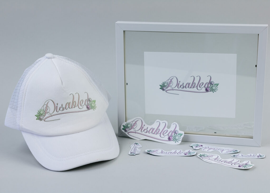
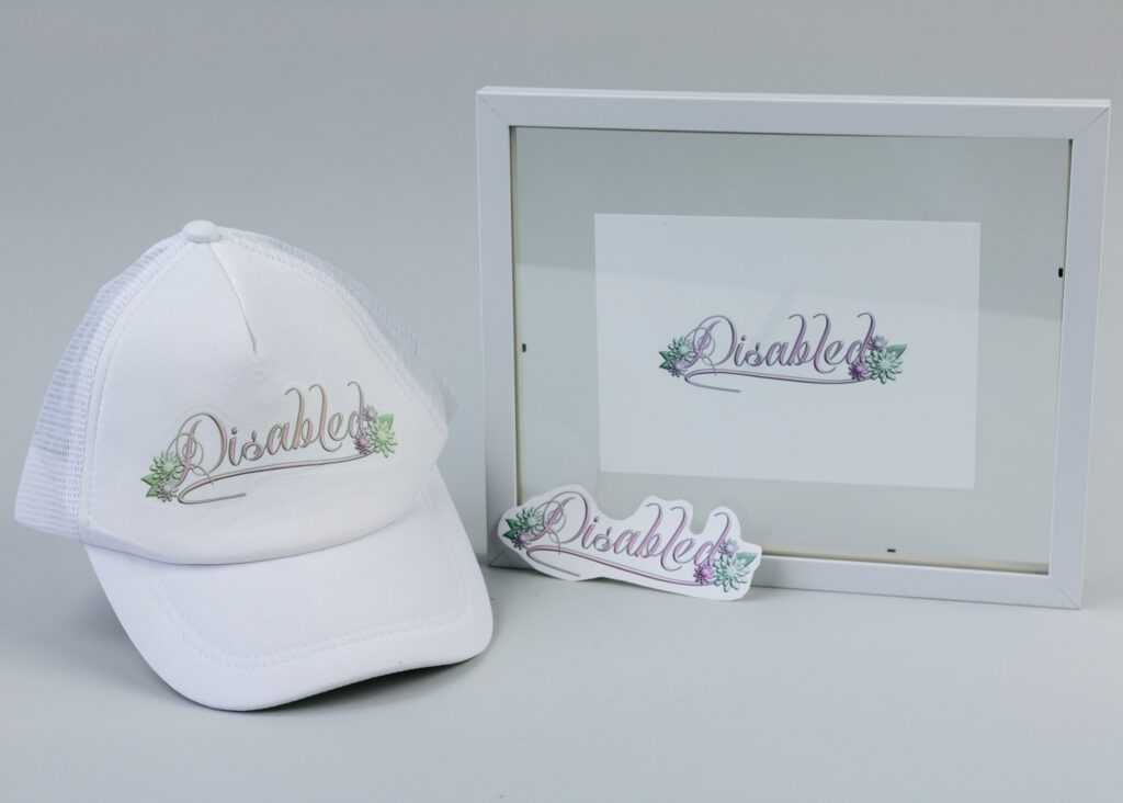
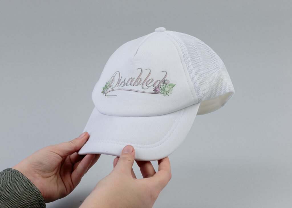
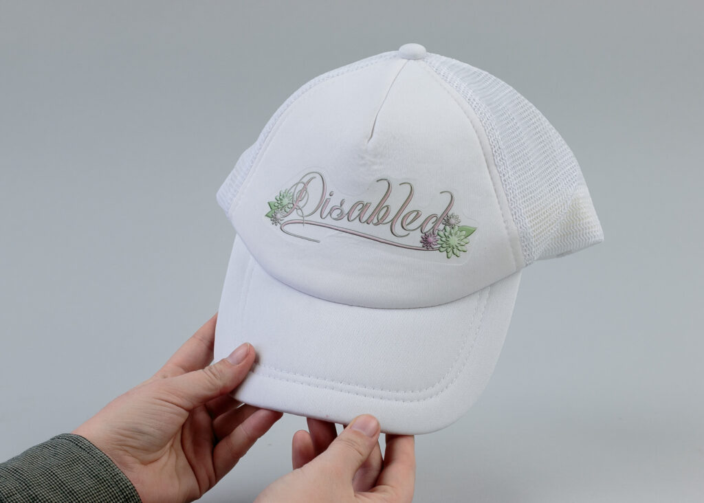
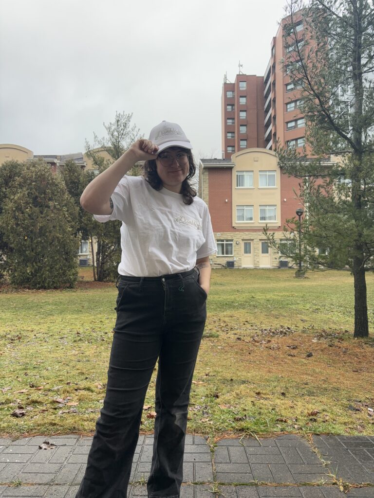
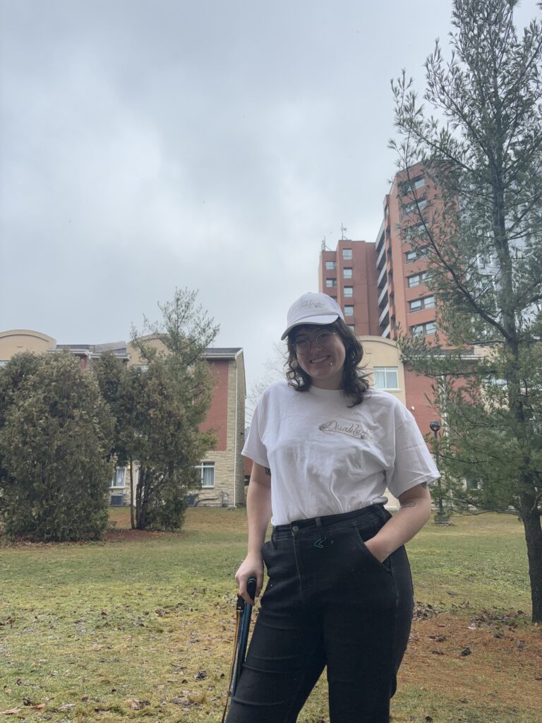
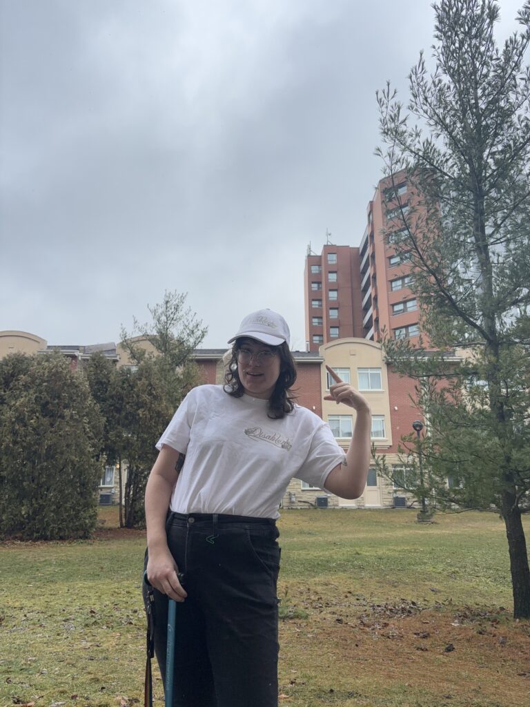
This artist multiples project is something I hold very dear to my heart, it is called Disabled. I am a disabled person and I have been since 2020, and since developing my disability, I have been struggling with my identity as a disabled person. Many disabled people have their own opinions on what labels are comfortable for them, and for me, I love to label myself as disabled. The word “disabled,” though beautiful to me and several others can be misconstrued as something bad. In a way, it labels my body as not working as well as a predisabled person. People have come up with many euphemisms for disability and disabled, inferring that the words are dirty in some way. Labelling myself as disabled is my way of reclaiming that identity. Secondly, I am able to dismantle the preconceived notions about disability through “disabling” things. This multiple has a sort of humour to it as well. Disability can be so serious at times, so I wanted to play around with the idea of sticking my design to people or objects that would “disable” them.

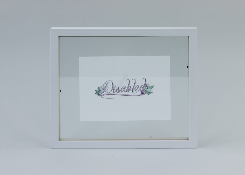
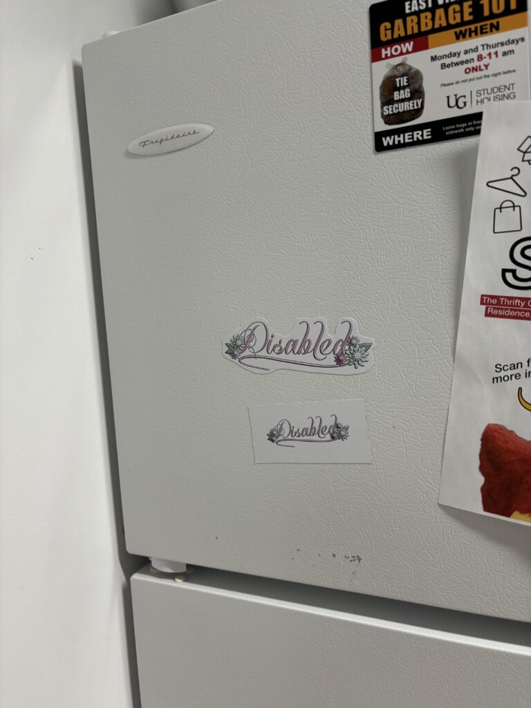
The idea for this piece was to make art out of the word “disabled.” What some label a dirty or bad word I made opulent, intricate, and beautiful. I picked the most opulent font out of a group I tested, while still ensuring it was readable. I added flowers too, adding to the beauty of it all. The colour choice was meant to be feminine and beautiful, touching on my own experience with a disability that mainly affects those born as women. The colour choices also factor into the idea that disability is something that should be viewed as serious or a harsh reality, so by choosing these nonserious and playful colours I am able to combat this notion. I designed the piece in Affinity Designer. When importing I edited the text and shape curves where I see fit and to make it to my vision. The flowers I made in Designer as well, utilizing the shape tools and playing around with manipulating edges.

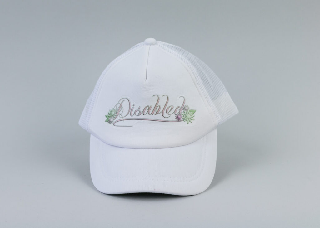
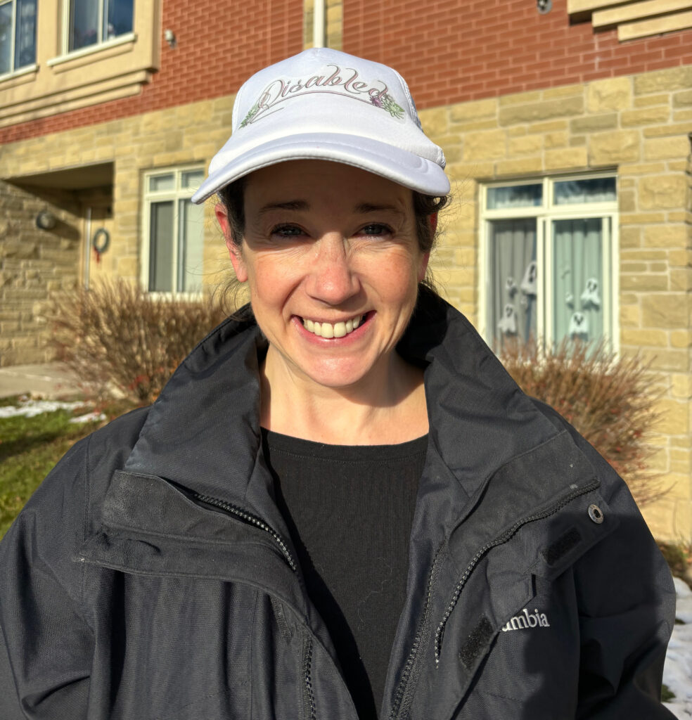
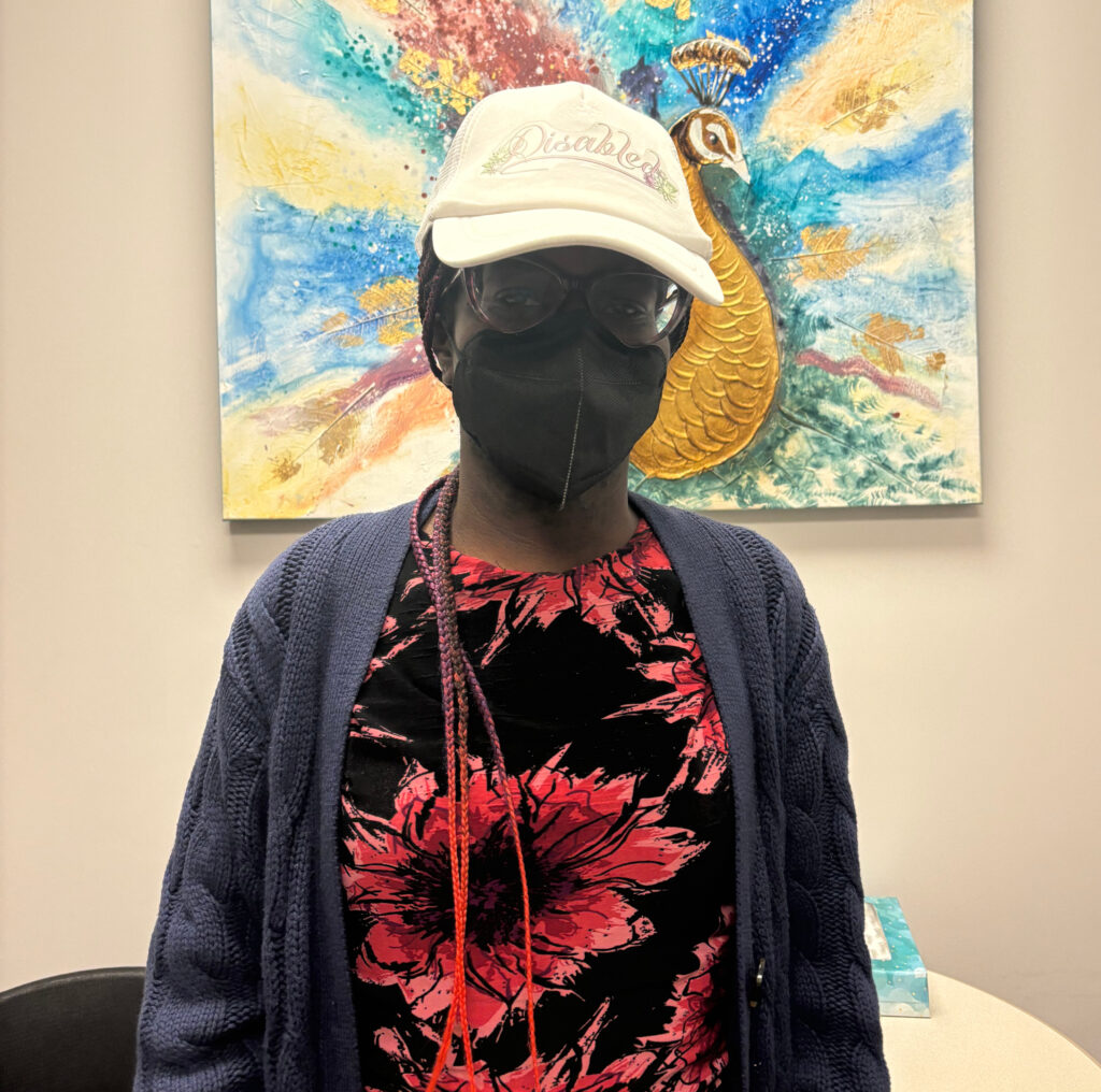
When choosing how to document this piece and present the multiples, I opted for prints, a shirt, magnets, stickers, and a hat. For the print (pictured above), I liked the idea of having the word disabled, a bad word to some, framed and displayed as if it were art (which it is now!). For the stickers, shirt, hat, and magnets, the idea was that I could stick them on objects or people, along with distributing them to other disabled folks in my life who take pride in their identity. Above is the hat I made showcased on three different figures, myself, my accessibility advisor, and my mother. In the future, I’d like to document even more people in the hat, which I was unable to do because of issues that came up with my disability (ironic!). Also pictured below are my multiples in various locations, my mobility scooter is the placement I enjoy the most. I also have some pictures of me in my disability swag, proudly labelling myself as disabled. Overall, I really enjoyed this project and will continue distributing these multiples amongst disabled people in my life.

A Visit to the AGG

I visited the Art Gallery of Guelph on November 18th with our Experimental 2 group. There were three main exhibits on during our visit, all being somewhat experimental in their approaches. The exhibits were Entrelazados: Justin Favela, Do You Remember Love, and Some kind of we. Of the three exhibits, my favourite was Some kind of we, as I was able to make more of a personal connection with the content and art.

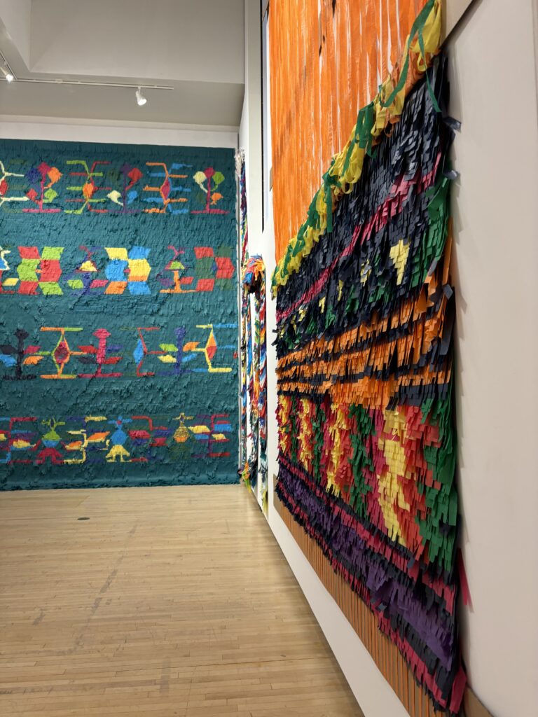
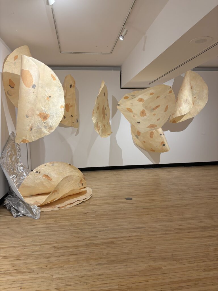
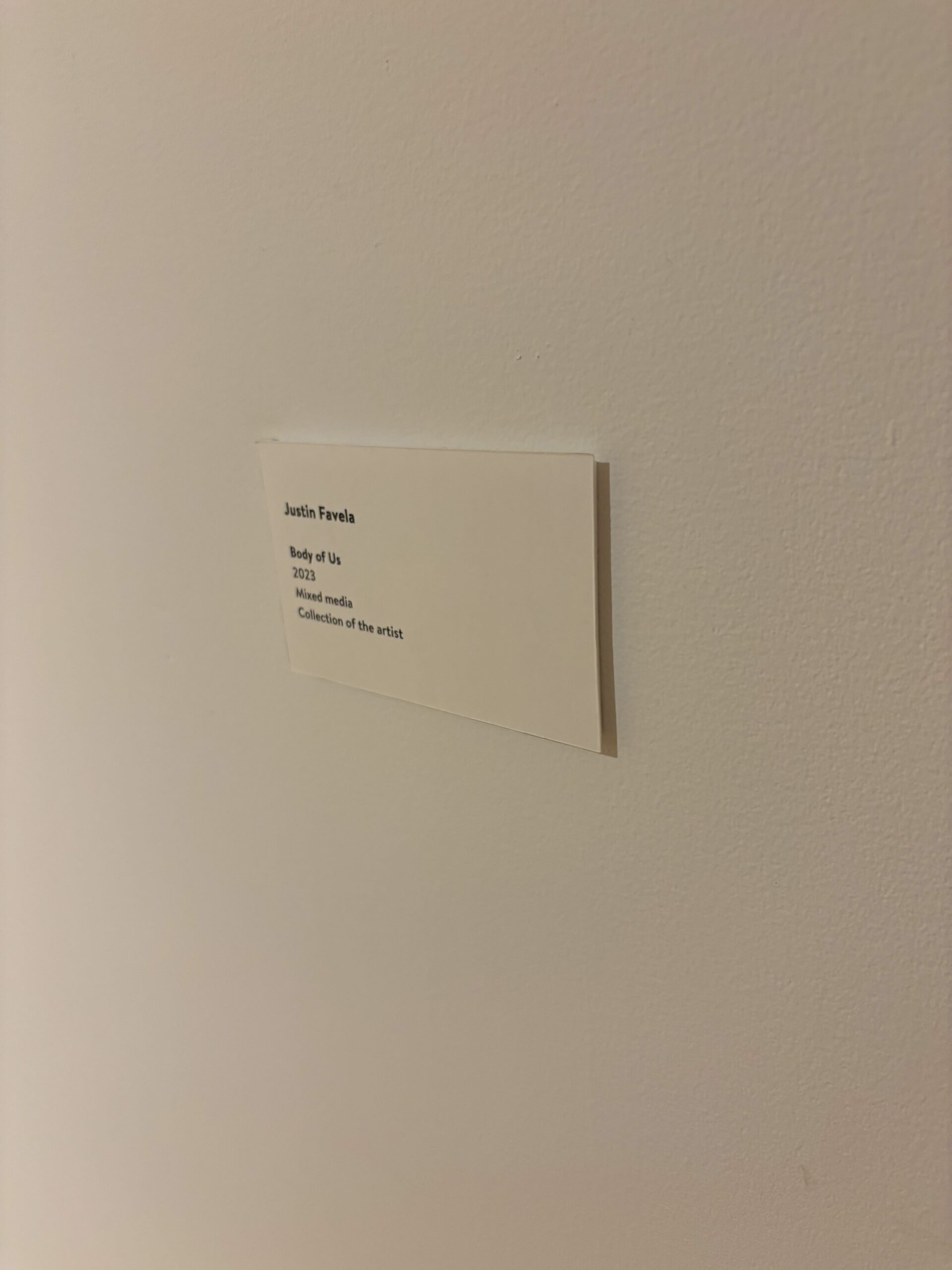
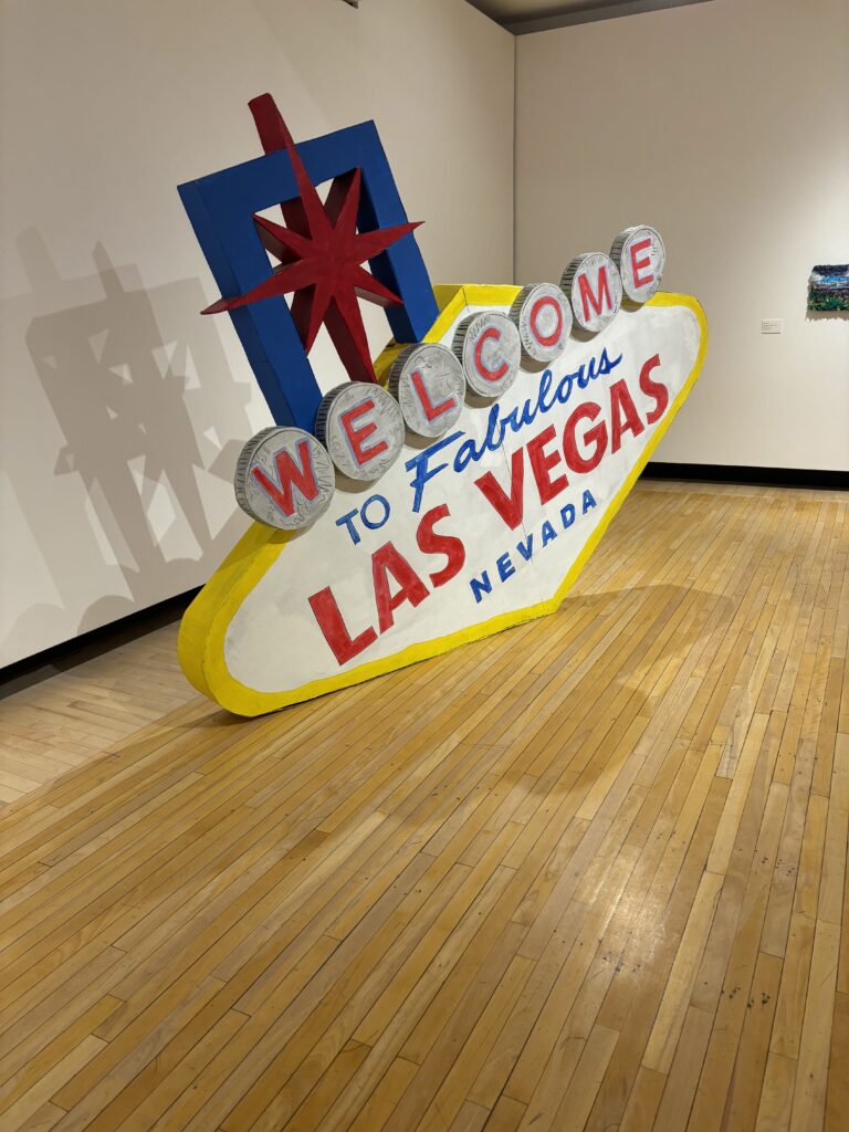
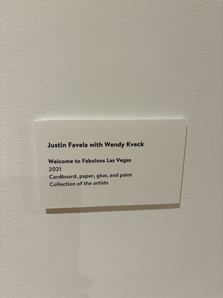
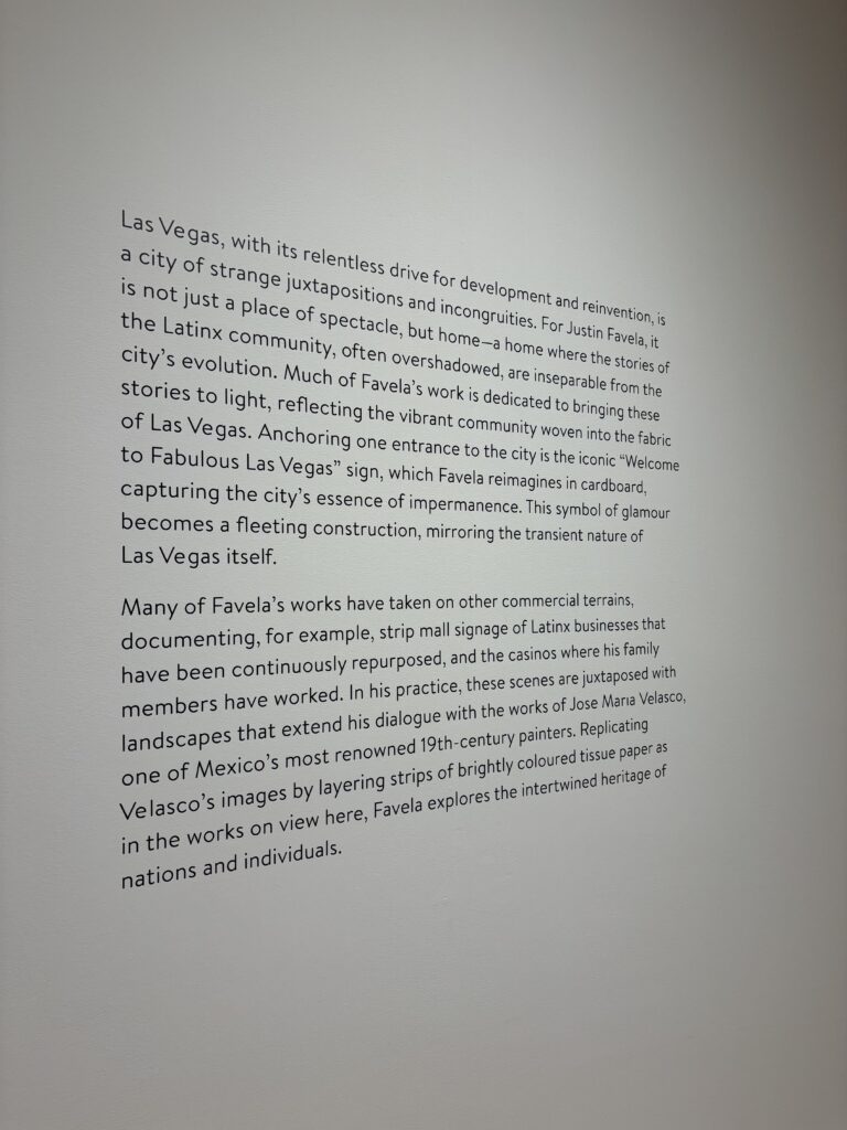
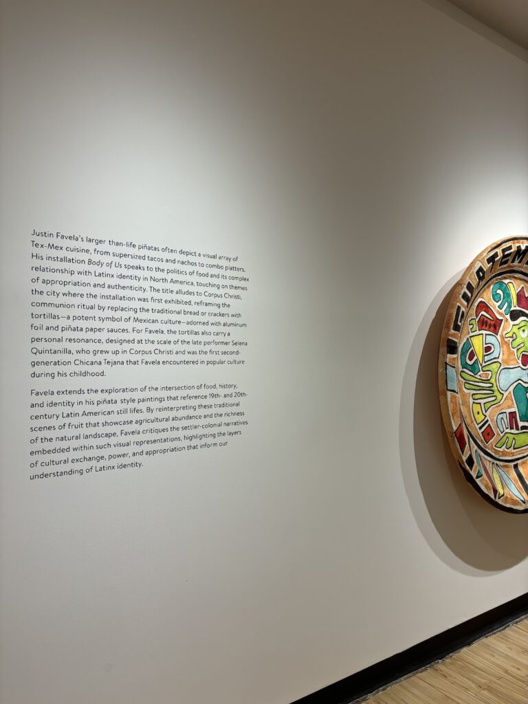
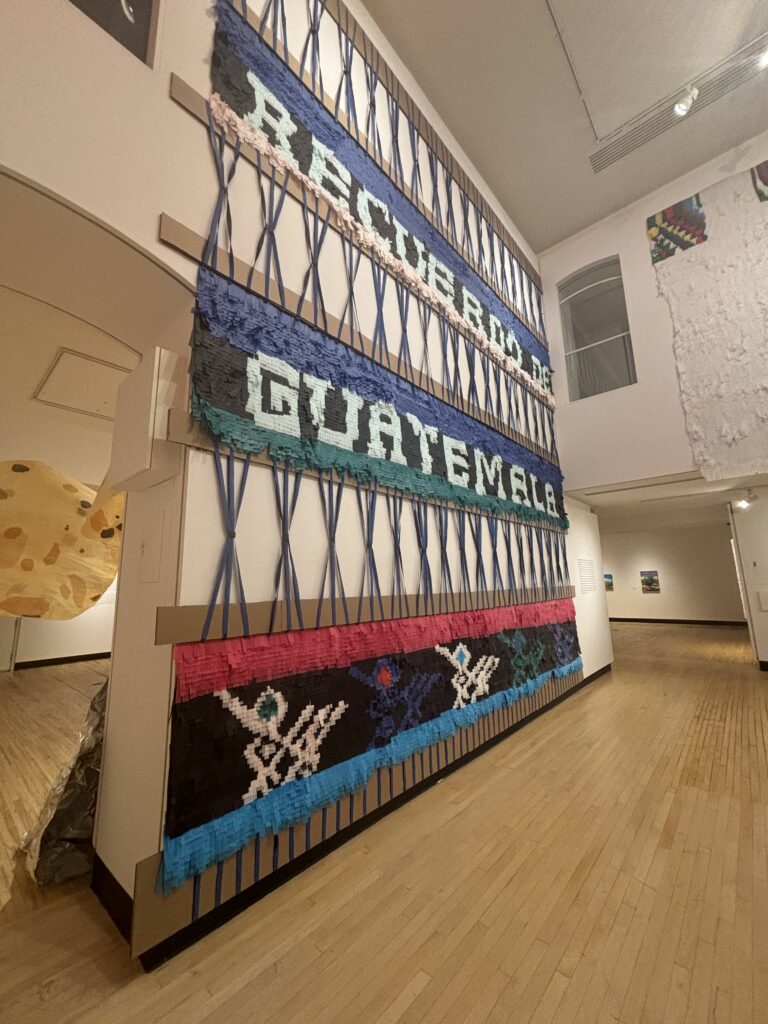
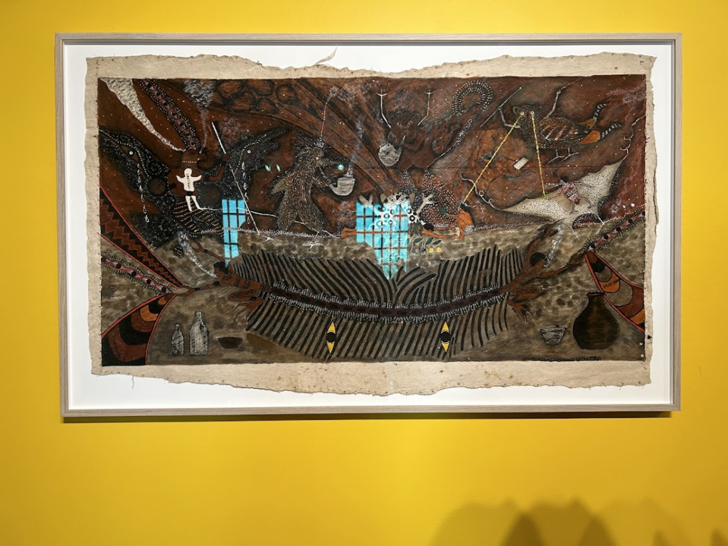
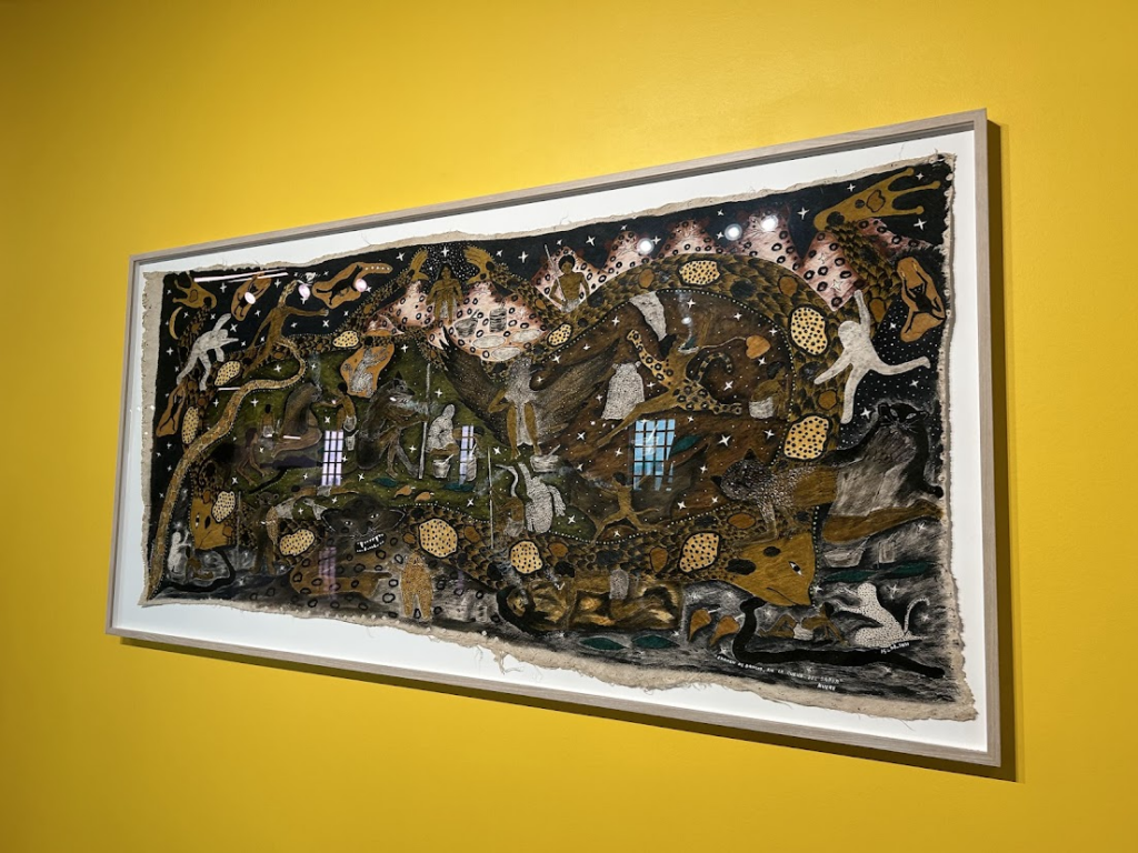
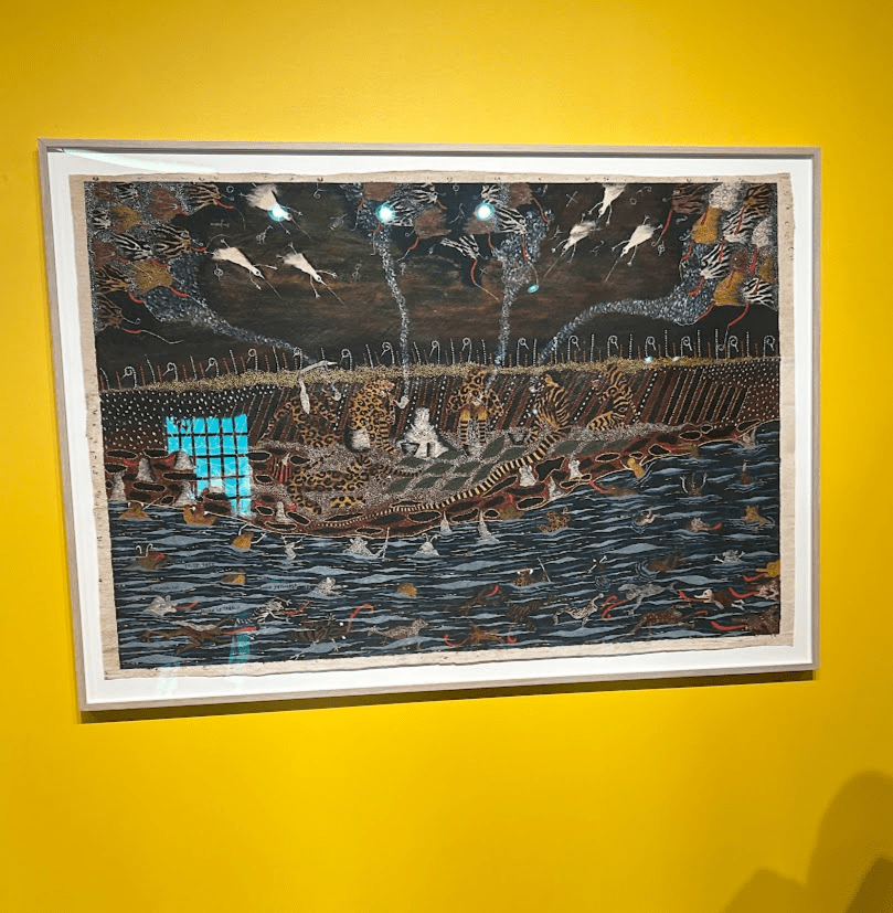
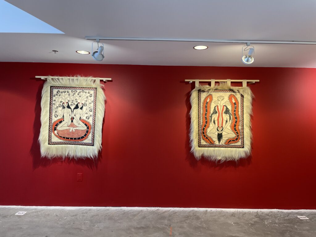
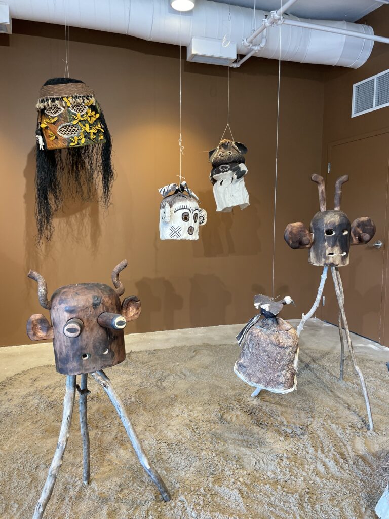
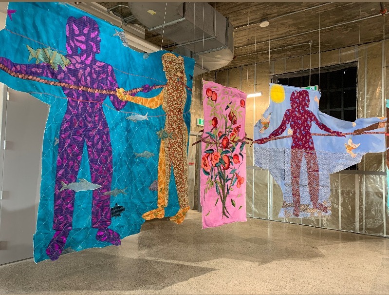
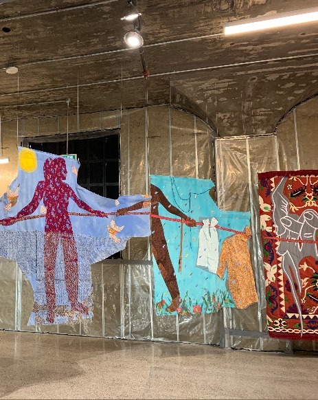
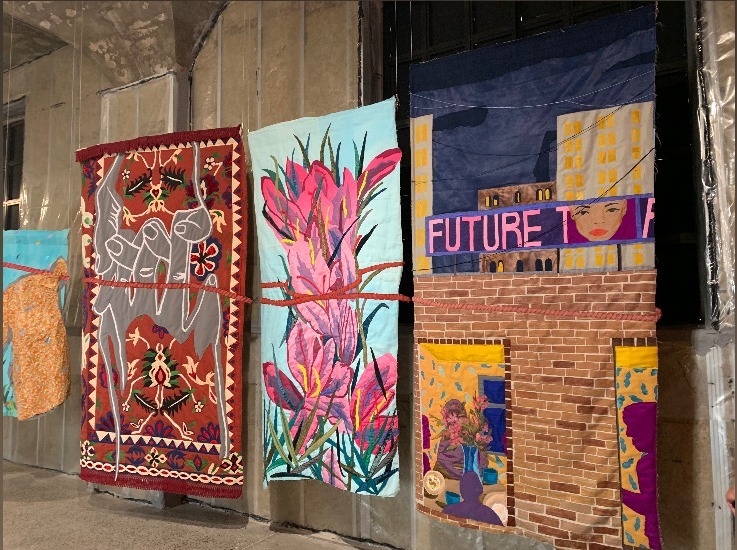
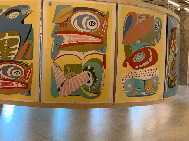
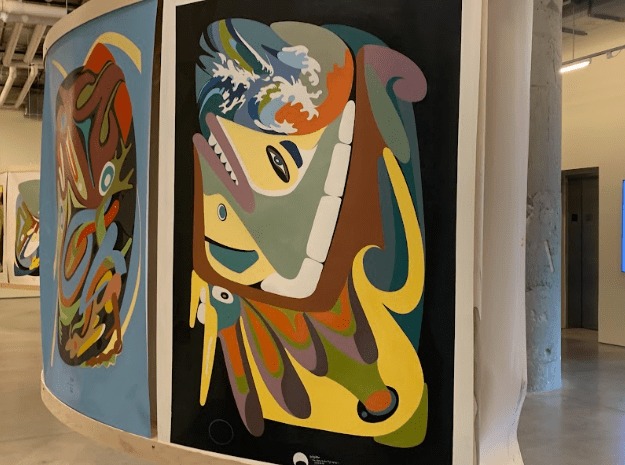
Pictured here are some of my favourite pieces from Entrelazados by Justin Favela, along with the artwork labels and explanations of Favela’s works. Favela intricately weaves his culture, Latinx identity, experiences, and places of importance into his art through sculpture and mixed media. I enjoyed how colourful his works are and the beautiful representation of Favela’s life.

The next exhibit is Do You Remember Love, which is a combination of a video by Susan Mogul from 1997 and a collection of quillboxes.

Do You Remember Love was a brilliant exhibition to witness. First off the film by Susan Mogul was projected on the wall, across from a bench for viewers to watch. The video was very intimate, it follows the experiences of a family, with interviews, voiceover segments and different cinematic shots. Watching the video, it felt like I was a part of the family, experiencing their lives with a special intimacy a regular video wouldn’t provide. The combination of scenes with interviews or talking and then the framed cinematic experiences adds such an element of complexity. One of the cinematic experiences I enjoyed the most was the artist Susan discussing a dream she had about love and her fears of losing it to another feminine figure. This part consisted of Susan’s voiceover with the explanation of her dream and then scenes of water that seemed like a part of a dream sequence, pulling you down to the depths of imagination.

The final exhibit and the one I enjoyed the most was Some Kind of we which includes a combination of works that look at historical and modern t4t love (transgender for transgender, meaning being in a relationship as a trans person with a trans person). Some kind of we showcases the beauty of t4t relationships and intimacy. There are several videos, three on TV screens and one projected, and some multiples for individuals to take (pictured above). I am going to discuss the two pieces that stuck out to me the most as a transgender person.

In polished (2016), by B.G-Osborne and Benjamin Da Silva, the two sit in a bathtub together on the left screen, and on the right screen the two are shaving. Osborne and Da Silva discuss topics of mental health, transgender and nonbinary identity, transition, and substance use. The conversations they have show the complexity of trans and nonbinary identity, far beyond what is presented in the media. These are two figures, talking about their real, personal, and heavy experiences, not some idealized or demonized version of a transgender person. The discussions of mental health interact so heavily with transgender identity, which is not something a lot of people think about which this highlights. It impacts one’s gender and self-love journey, especially one’s transition. The two talk about how one’s transition expectations and obsessions can impact mental health and this resonates with me deeply. When I first came out as a nonbinary person, I had an idealized idea of what I wanted to look like if I transitioned. More than anything, I thought I wanted top surgery, it became an obsession. My gender dysphoria and issues with my chest plagued me constantly, the idea of what society viewed as a perfect nonbinary person with a flat chest and androgynous haircut was all I wanted to be. Having that obsession and that ideal nonbinary figure pushed on me made it very hard to love myself, which is a common experience that a lot of trans individuals face and that Osborne and Da Silva go into. Society has no clue about the complexity of nonbinary identity and the two touch on this in the video. There are so many ways to be nonbinary or transgender outside of the gender binary, which people can’t grasp, exactly like how the two explained in frustration. This piece made me feel so many emotions, and I felt like I could just sit there watching them in that bathtub and shaving for hours.

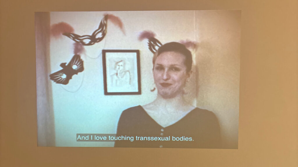
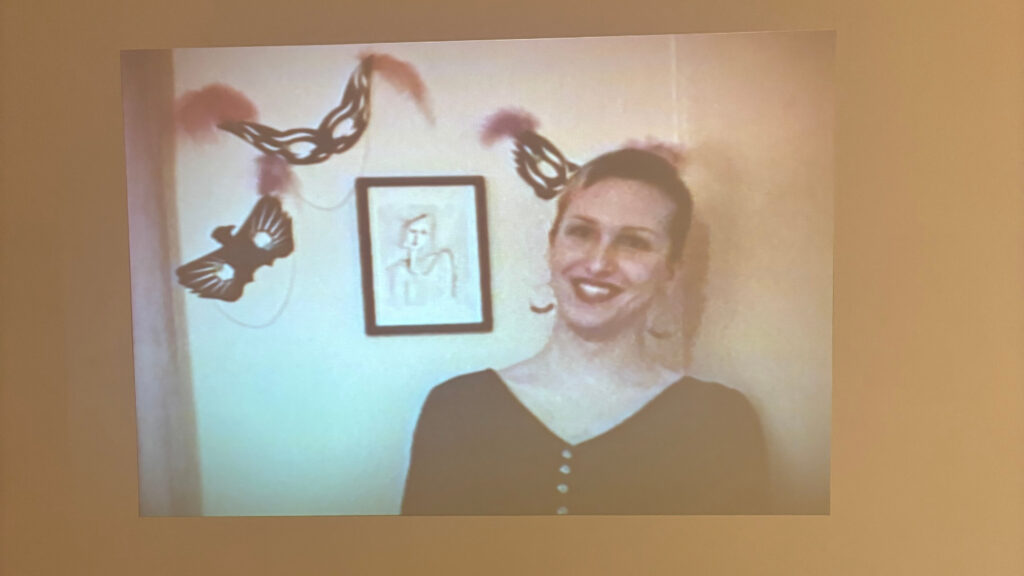
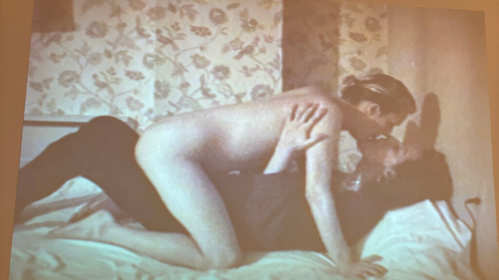
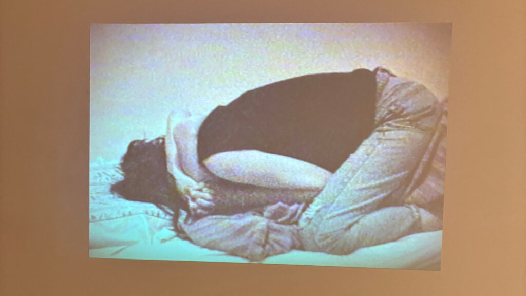
Within Some kind of we, Gendertroublemakers (1993) is projected on the wall adjacent to polished. Gendertroublemakers is a home video with Mirha-Soleil Ross and Xanthra Phillippa MacKay, two transgender women, discussing their past experiences with cisgender gay men and their love/attraction to other transsexual women. The video is composed of shots of the two women speaking in an interview style to the camera, and then shots of them kissing or being sexual with one another. The video itself feels so intimate, the home video style allows for a more authentic experience, it feels as if this isn’t even a video, rather we as the audience are sitting there with Ross and MacKay. The video along with showcasing the two women’s experiences and issues with transgender identity not being taken seriously also touches on the beauty of t4t relationships. These two women are proudly and openly reclaiming sexual identity and sexuality in a transphobic world – I think this is so incredibly beautiful. A quote that sticks out the most to me from the video is when one of them is talking about their experiences with a transphobic cis gay man “How dare you tell me what you can call me.” This stuck out to me not only because of the raw power and frustration in her voice as she recalled this, but because it entwines with my personal experience. As a nonbinary person who is often viewed as a woman by those in society, I am so sick of people telling me how I should be identified or misgendering me with feminine pronouns; so I share the frustration of the woman.

Overall, this exhibit meant a lot to me. I got to look at different views of t4t relationships and recognize the beauty of them. Highlighting the beauty of transgender love is so important at a time filled with such rampant hatred for us. Within the exhibit, as someone in a t4t relationship, I felt at home with my community and seen, truly.

Carmen Papalia

Carmen Papalia, Long Cane, 2013, Performance piece, duration varies photos by Kristin Rochelle Lantz

Carmen Papalia is a non-visual artist and disability activist from Vancouver who focuses on experimental and conceptual artwork relating to social practice. He confronts notions of disability and one’s access to the world without vision. 

When figuring out how to identify himself, he did not find comfort in the label “blind” due to its social and cultural baggage or in the label “visually impaired” as it implies his eyes don’t work as other body parts do. With his rejection of labels, he aims to examine his relationship and his connections to institutions, especially the disability support institution. Instead, he aims to embody a nonvisual learning style, highlighting his ability to access knowledge without the use of vision and as his other senses allow. Papalia looks past the limitations placed on him by society due to his condition and frames his learning style as something liberating for himself and others. 

Carmen Papalia, Provisional Structure 2, 2022, mixed media installation, Courtesy of the Artist

At the beginning of his conceptual art career, he looked at the limitations of the world and his understanding of himself through the lens of his disability; this is reflected in his artwork (i.e. one of his most famous works Blind Field Shuttle, 2010-present). Presently, his work is framed on his experience and access to visual culture, public spaces and art institutions as a nonvisual learner (i.e.  Provisional Structure 2, 2022). Papalia finds his artwork has allowed people to start adopting this “non-visual learner” language, it is through his artistic practice and repeated use of the term non-visual that he hopes to create not only a more accessible art practice or learning practice but also a more accessible world in general. 

Carmen Papalia, Blind Field Shuttle, 2012, Photos by Jordan Reznick

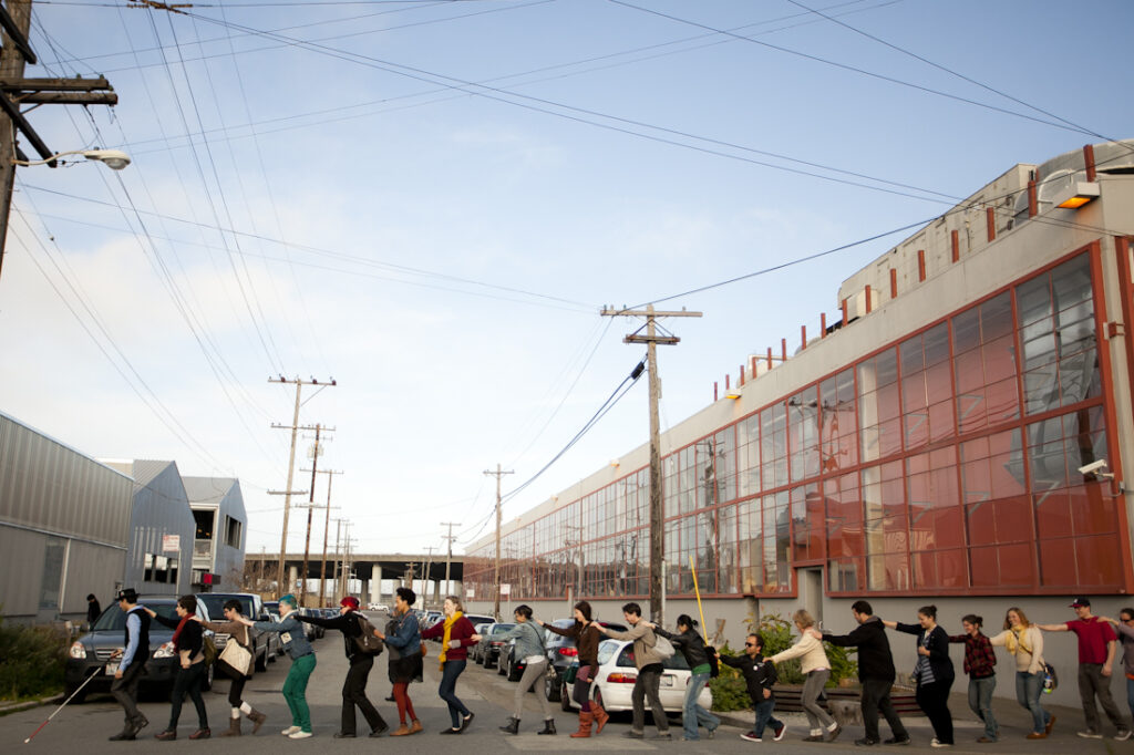
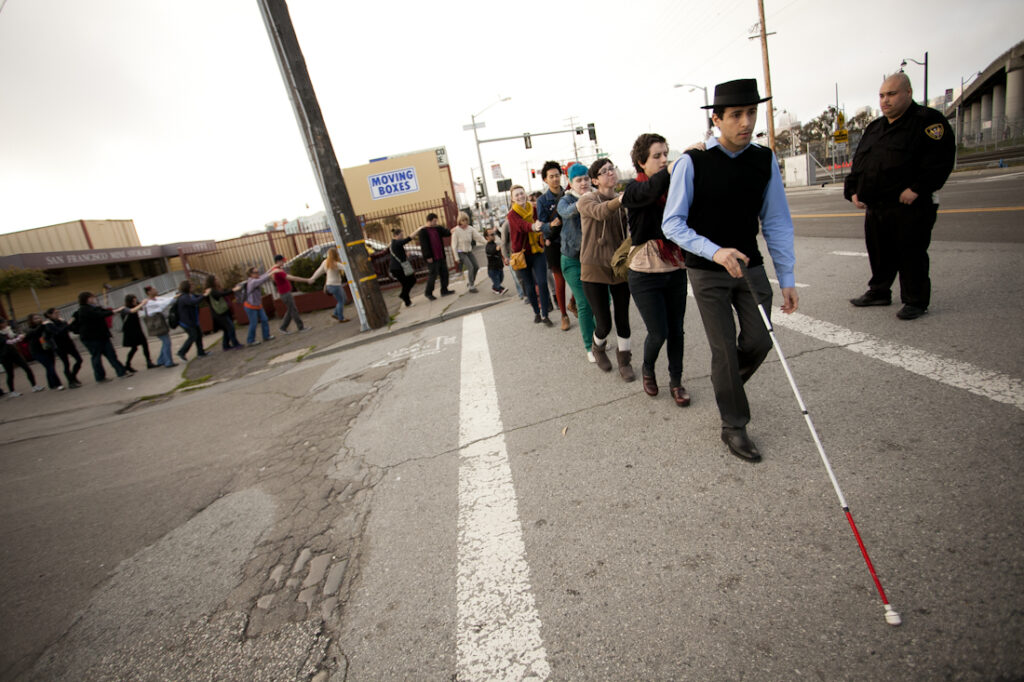
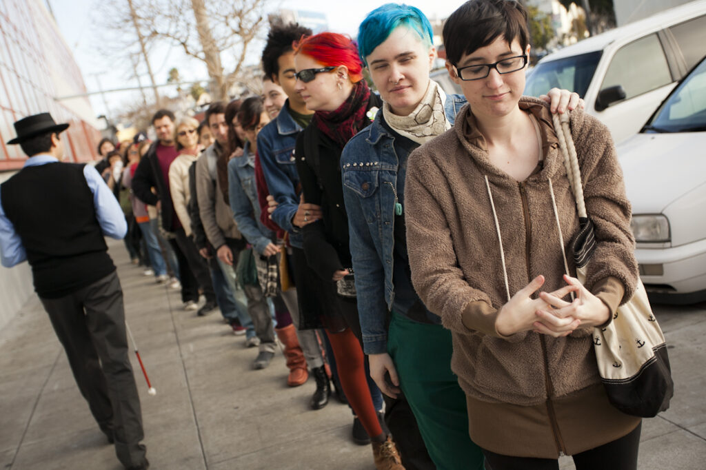
One of Papalia’s most famous works is Blind Field Shuttle where he takes a large group of people on a walking tour through different spaces while closing their eyes. Participants each place their hands on each other’s shoulders and follow in a long line, as pictured above. They direct their senses to explore the world around them, being forced to access the world through non-visual means like Papalia. Through exploring the world and chosen spaces through the other senses, participants are able to realize elements about these spaces they didn’t notice before, forcing them to reexamine how these newly noticed things affect our perceptions of the world around us. 

Carmen Papalia, Blind Field Shuttle at McColl Center for Art + Innovation, 2017, McColl Center

Through my own experience as a disabled artist working in the conceptual field, I can understand certain aspects of Papalia’s work through my own lived experience, but I am also experiencing a whole new realm of disability through his nonvisual practices. I enjoy his notions of challenging language society places on us and the words we as disabled people choose to identify with being very personal to our journeys. An example of me exploring the notion of disability language through conceptual artwork would be my Artist Multiples project where I took the word “Disabled” and chose to make art of it, challenging the idea that the word “disabled” is a bad word. Papalia’s works inspire me to go further with my disability activism in conceptual art. I’d like to create pieces that are very disruptive much like Mobility Device, forcing others to view my experience with my disability. My favourite piece of his that I’ve seen is Mobility Device, just mentioned previously. In Mobility Device, instead of relying on his traditional mobility device of the white cane, Papalia opts for a marching band to follow him around on a walk to act as his guiding device. Different obstacles and things Papalia encounters on his walk are represented through different sounds. Each time Papalia performs this work, it takes an incredible amount of trust in the marching band, as he relies on them to know where he is going. As mentioned, there is also a disruptive element to it – he is directly combating the idea of a silent man using his white cane, to a loud and in-your-face depiction of disability. 

Carmen Papalia, Mobility Device, 2014, Grand Central Art Center CSUF

Overall, I greatly enjoy Papalia’s works, he approaches conceptual art in a way that allows people to step into his shoes and examine the world through a non-visual perspective. 

A list of sources can be found here.

Christine Sun Kim

Christine Sun Kim, Time Owes Me Rest Again, 2022, Photo by Hai Zhang.

Christine Sun Kim is a deaf artist, activist, and performer who focuses on conceptual and communications art. She creates in various mediums such as performance, video, murals, billboards, audio installations, and works on paper. Using these mediums, she outlines the multi-layered sensory experience of sound and her place in it as a deaf individual. She uses her work to highlight Deaf culture, the connection to language and sound,  and the societal implications of communication within that community. She was also a co-creator of the symbol <0/ which means “Deaf Power” – this symbol is something shared widely by Sun Kim herself and open source on the web. 

A common theme shown throughout Sun Kim’s work is echoes or repetition. She mentions in the Friends & Strangers episode in the eleventh season of the Art in the Twenty-First Century series, that echos and repetition are common throughout American Sign Language (ASL), which Sun Kim uses to communicate. As she explores communication, Sun Kim notes the importance of repetition and echos, the simple act of repeating a gesture in ASL could completely change the meaning of what one is saying, or how Sun Kim’s interpreter echos everything she says vocally. In the same video, she gives us a tweet and wants us to view it as a lens to view who she is and her art (pictured below). 

A tweet by Sara Nović referenced by Sun Kim in her TED talk.
Christine Sun Kim, Stairway For A Composer To Work In from the series Available Spaces for Composers, 2016, Charcoal on Paper, Photo by Chris Streek.

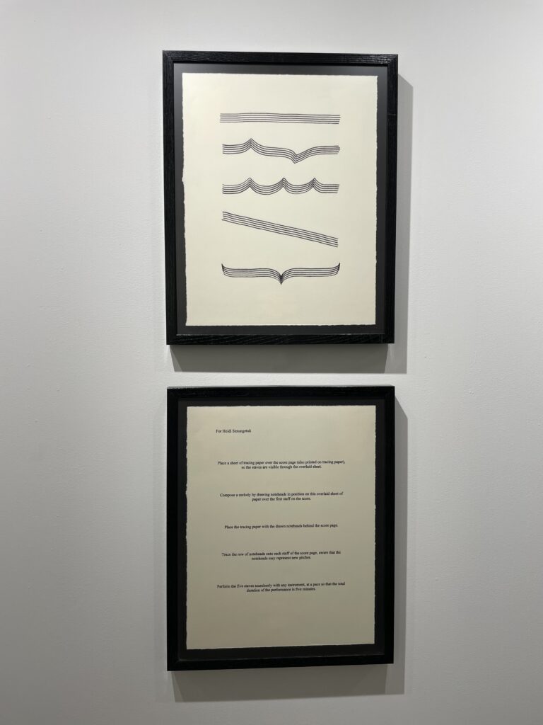
Sun Kim explores musical notation and musical scores often in her works, which correlates specifically to her exploration of sound. In some of these musical notation pieces, Sun Kim investigates the emptiness of the music staff and the absence of notes, and how that makes the piece more about the underlying foundation rather than the music itself (Stairway For A Composer To Work In from the series Available Spaces for Composers, 2016). Sun Kim has a series of these works, Scores and Transcripts, showcasing a variety of musical notation, traces of ASL, body language, and  English vernacular. In this series, she dives into her perception of communication and how these different portions shape her view of communication itself. In all of these pieces, she takes out all aspects of music that Western society is used to and turns it on its head, forcing us to view and experience music through means other than sound. Her musical scores aim to encapsulate her intersectional experience as a deaf woman of colour, showing us, the audience, her perspective and how she views the world. 

Christine Sun Kim, Pianoiss … issmo (Worse Finish) from the Scores and TRanscripts Series, 2012, Transcript, pastel and pencil on paper. Courtesy of the artist, Photo by Erica Leone.

A musical notation piece I enjoy a lot by Sun Kim is Ghost(ed) Notes, a mural exhibited at the Henry Art Gallery, University of Washington, Seattle. This piece combines musical notation with ASL and graphics, furthering her delve into the political context of sound and communication. This piece, like many of her others, highlights her experience as a deaf individual in a world catered to hearing individuals and how sound has an influence on society. Sun Kim’s design of the musical notation used in this mural is very deliberate – particularly in her use of “ghost notes” which indicate a small sound with no pitch. Ghost notes also play into the theme of “ghosting,” which entails a sudden cutoff of communication with no explanation. The score is also intentionally designed to be not the standard 5 lines, rather opting for the 4 lines. The meaning of the 4 lines aims to tackle the aforementioned political notions in a hearing-centric society and emphasize the large accessibility gaps Kim faces. The mural itself is meant to make the viewer reexamine their societal views and challenge ableist notions rooted in our societal foundation.

Christine Sun Kim, Ghost(ed) Notes [Installation view, Henry Art Gallery, University of Washington, Seattle. 2024], Photo by Jueqian Fang.

[Closer Captions], 2020, is another work by Kim that criticizes the inaccessibility of her and the Deaf community. It is a video where Kim captions the original video herself, showing us what closed captions would look like if they were written by a deaf person and actually helpful to deaf individuals. The video she captioned is a beautiful story, the captions are so vivid and allow you to fully experience the story without the use of sound. It also focuses on little details that regular closed captions wouldn’t note or even a hearing person wouldn’t hear such as the opening of eyelids or the electricity finding its output. The video in the background itself is so simple, but arguably Sun Kim’s captions just add so much more depth to the video than sound could. In part of the video, we do experience sound, but it is entirely through the view of Kim and how she views the music notes shown in closed captions. 

Exploring Sun Kim’s works was such a surreal experience, through the lens of her art I was able to understand more about her life as a deaf woman. Through research, I learned so much about Deaf culture and the community among those who are deaf. Though I am a disabled artist, I tend not to explore art beyond the scope of my mobility-inhibiting disability, so it was fascinating to learn more about another disabled person’s experience through art. I am still in awe of the beauty of her piece [Closed Captions]. I had previously thought about how bad closed captions are, but never to the extent Kim detailed. Aside from the beauty of her works, I also greatly enjoy the political and social commentary that comes with each of her pieces. Disabled artists have this unique factor to them where they are able to use their art to show their world-view and experiences, and I think that is such an engaging practice I want to take part in. One piece by Kim that I relate to my experience is Shit Hearing People Say To Me, 2019. In this artwork, she creates an easily accessible and understood infographic that Kim hears in her day-to-day life. The portions are all equally sized to highlight the vast amount of things hearing people say to her. This makes me think of my own experience with my physical disability, I have so many phrases I hear daily that I am so sick of hearing. Disabled people just want to live their lives and shouldn’t have to deal with constant commentary from pre-disabled individuals! Sun Kim’s work shares my frustration with this experience, and that is something I find great kinship with as a fellow disabled artist. 

Christine Sun Kim, Shit Hearing People Say To Me, 2019. Courtesy of the artist and François Ghebaly Gallery, Los Angeles and New York City. Photo by Peter Harris Studio.

Overall, I loved looking at Sun Kim’s perceptions of the world and sound. I never had thought about how sound impacts our society, but her artistic practice along with her artworks allowed me to gain so much more knowledge than I started out with. 

A list of sources can be found here.
Vanni

Week 1

Book Stacks inspired by Nina Katchadourian’s Book Stacks

To create my Book Stacks, I used books from my sister’s and my shared library. From our library, I was able to create some interesting book stacks, which held personal meaning to me and I hope others will be able to connect with them as well. While browsing for these stacks I knew right away what I wanted to create and that I wanted to capture them where we read most of them, i.e. my bedroom.

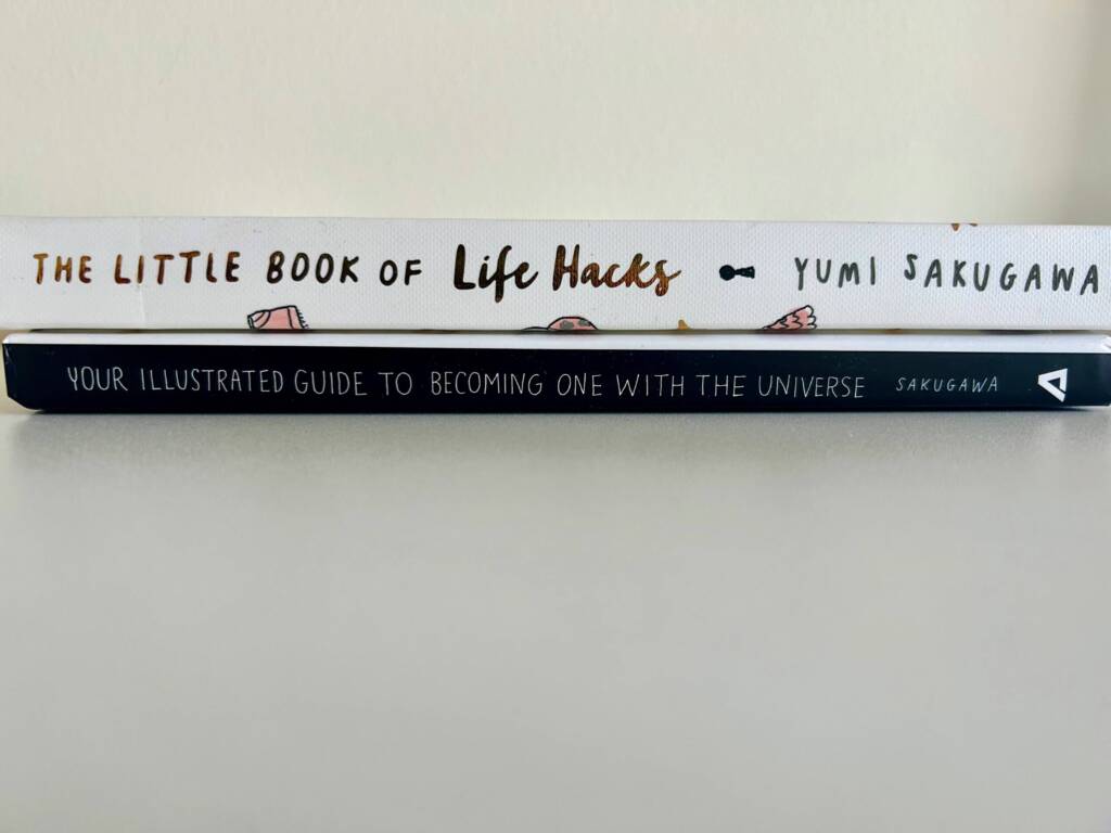
Stack 1: Sakugawa and her Stacked Universe

For my first stack, I knew I had to use one of my – as I call them – ‘Meditation books’. The preseason behind this stack was not only the books being by the same author, I thought the titles flowed well together and was a clever way of using something spiritual with something most of us do have a personal list of our life hacks as well.

Stack 2: Your Element

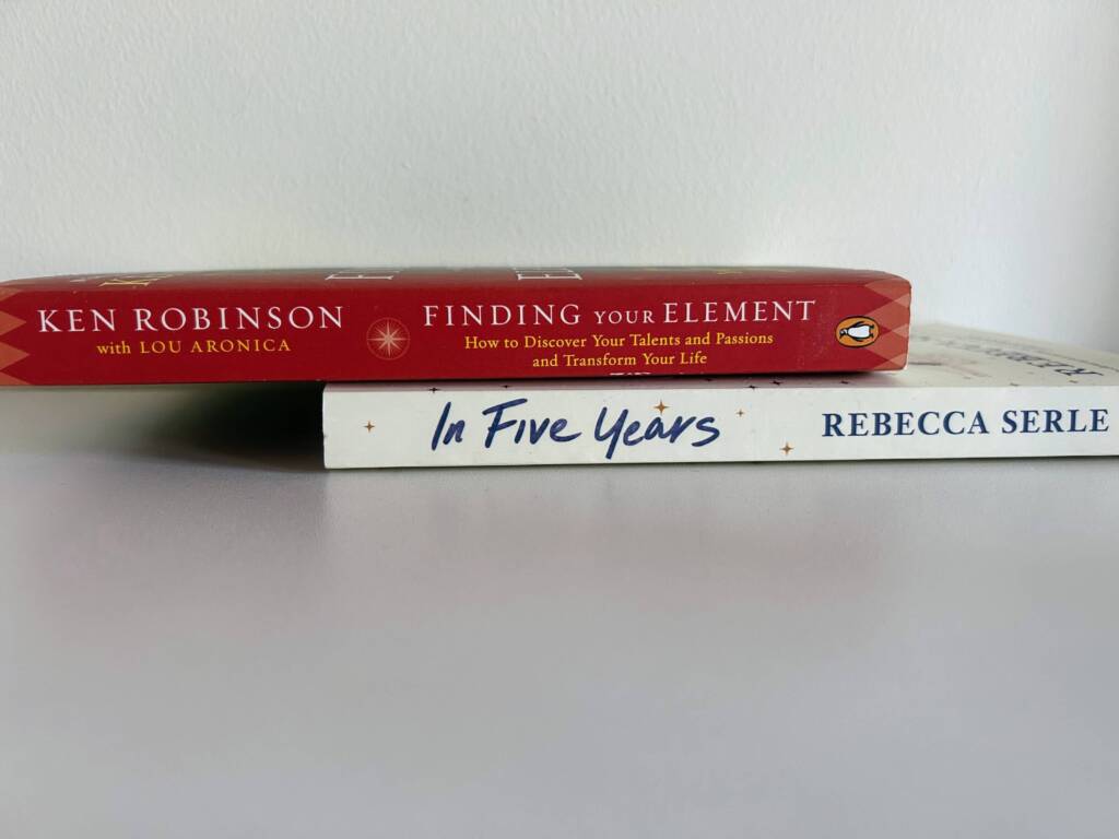
For my second stack, I knew I wanted to add one of my Ken Robinson ‘Element’ books to my second stack. Even if I haven’t read them yet, I still find them to be quite inspirational.

Stack 3: A Stack for Life

This stack came together because of the aesthetic of both the books and the puns. The initial perception one would get from these books is quite similar.

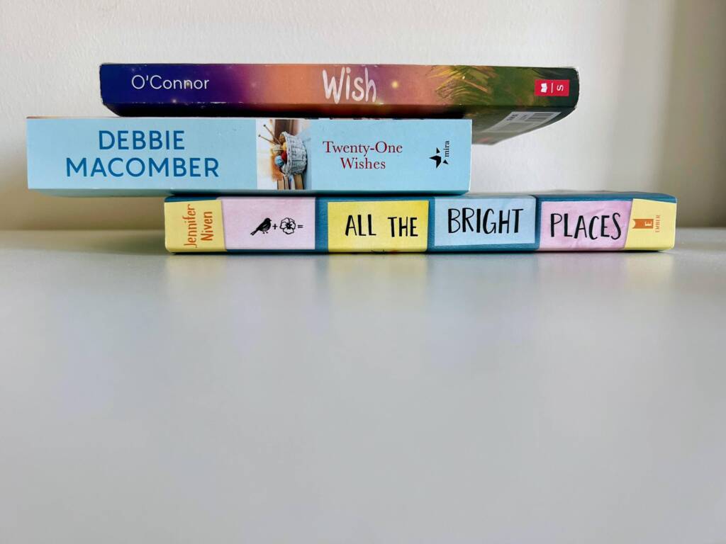
Stack 4: Wishful Wishes

For this last stack, I wanted to use book titles that used the same words, for this instance, the word ‘wish’ is used in two out of the three books and it just came to be that I could relate to it as well, cause who wouldn’t wish for “All the Bright Places


Week 2

Ideas for Environmental Video – Yasmin & Vanni

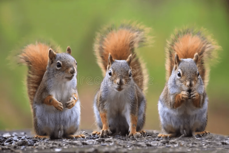
1 – Conversations with Squirrels

2 – Dressing as a tree and then hugging another tree –> different shots of each of us hugging different trees

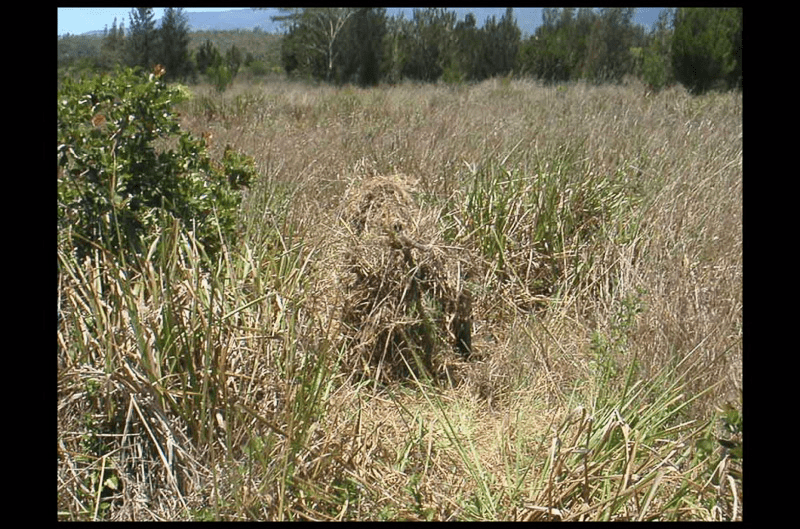
3 – Dressing up as a tree/ bush and rolling down a hill or camouflaging – not the smartest or safest

4 – Use the weeping willow tree and emerge out of it dressed as an animal or another tree


Week 3

Field Trip to the Toronto Biennial of Art and the Museum of Contemporary Arts

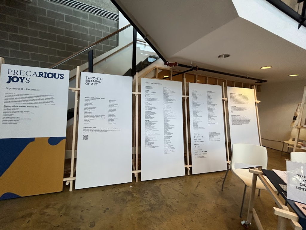
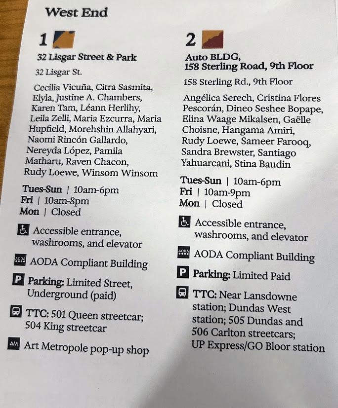
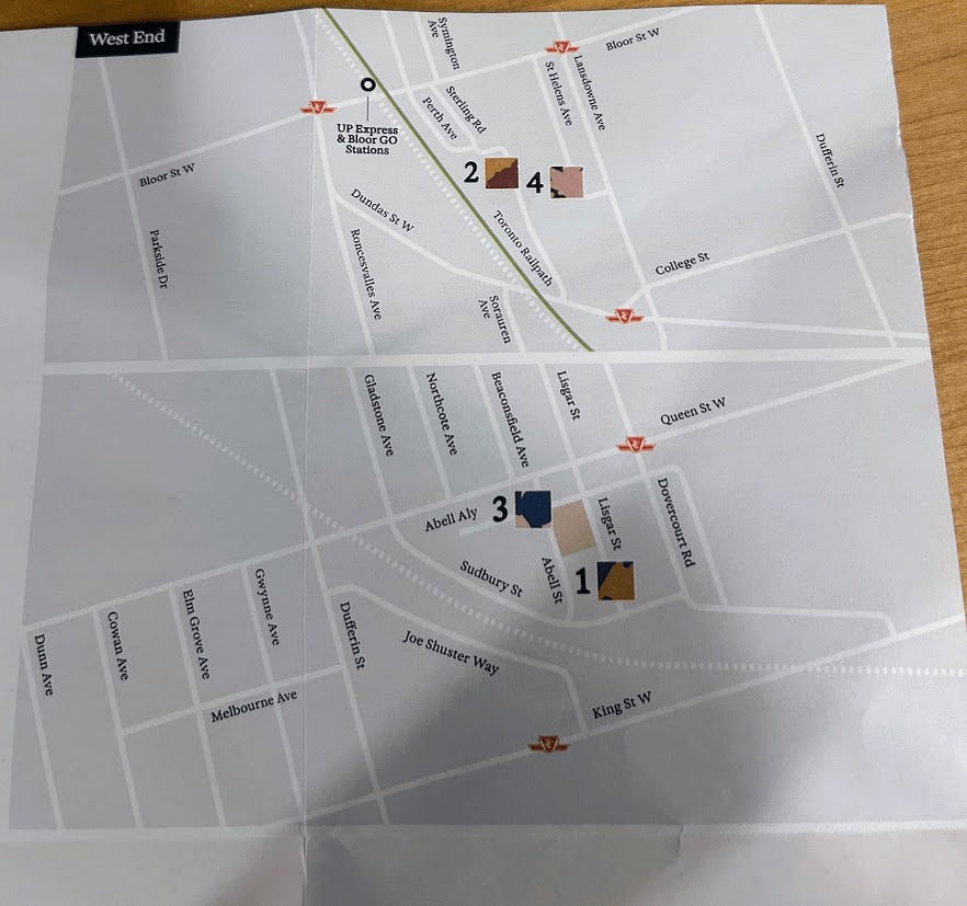
The Toronto Biennial Of Art at 32 Lisgar St

Precarious Joys 2024

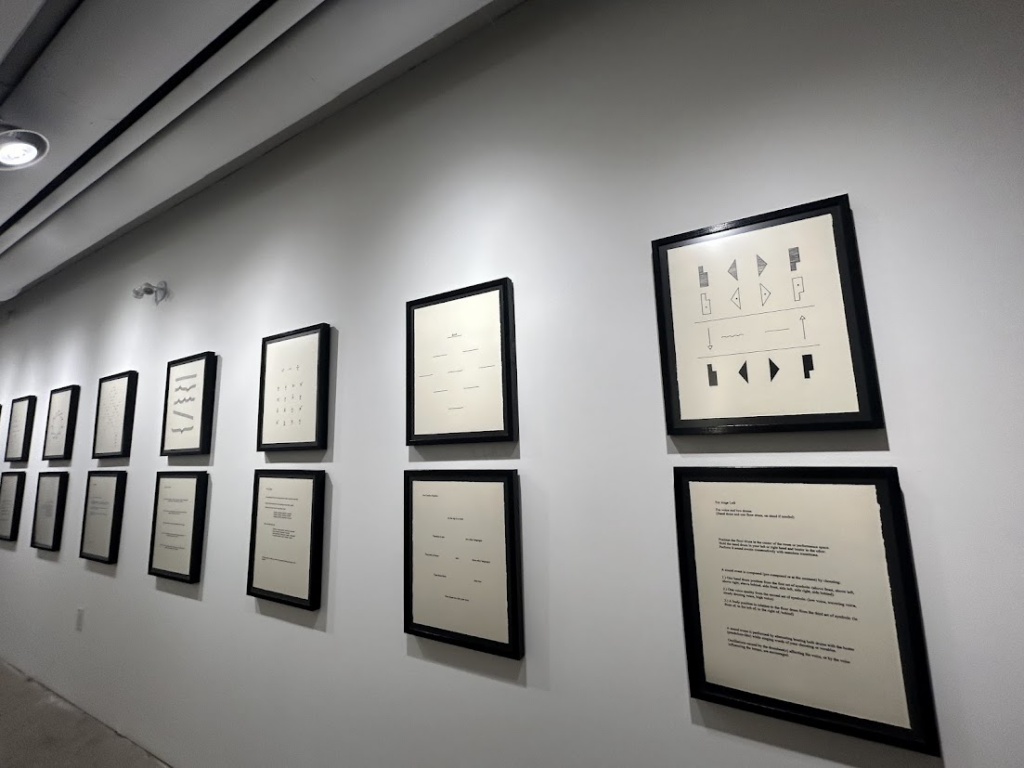
  • These frames represent the history of musicology.
    • The frames are arranged so the viewer glances first at the ‘pattern’ and then below at the correspondence poetry.
    • Musical notes inspire the patterns, hence a musician who played an instrument could read them and detect the flow.
      • Some of them are pitch, rhythm, and flow.
  • These frames were exhibited in a hallway, so one could hear the sound arts playing in other rooms along with looking at these musically inspired works.

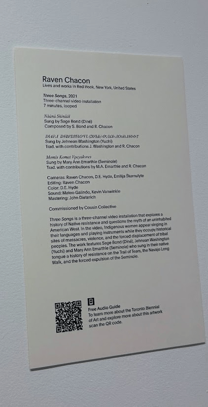
Three Songs – Raven Chacon {2021}

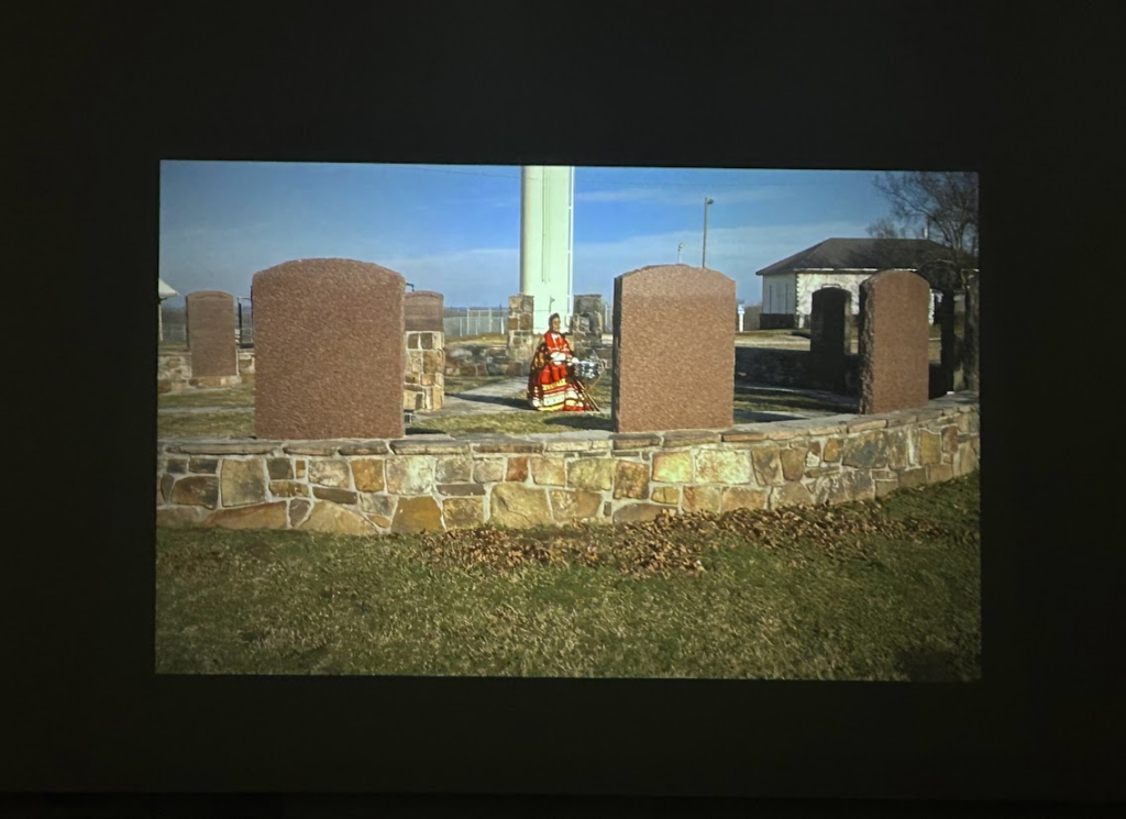
  • This piece by Raven Chacon consisted of three video art.
  • “Three Songs (2021) is a three-channel video installation that explores a history of Native resistance and questions the myth of an uninhabited American West.” (Toronto Biennial of Art)
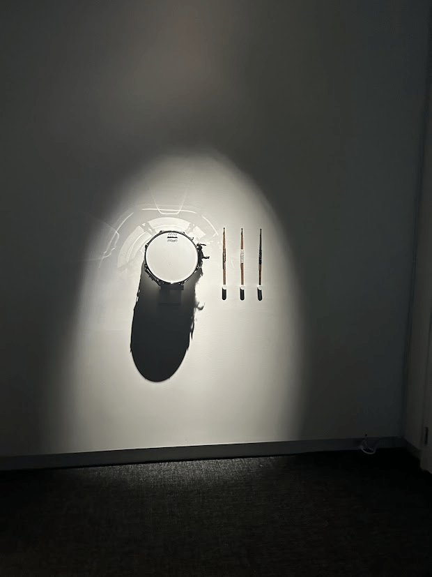
  • Each Video was presented on different walls of the room whereas the instrument used in the videos was displayed on a wall for the viewers to have the full experience and emerge in work.
  • All three songs are sung by Indigenous women and one can hear the struggles they have gone threw in their voices
  • This piece can be heard throughout the exhibition when walking by the hallways as well, so the viewer gets a sense of the before viewing it.

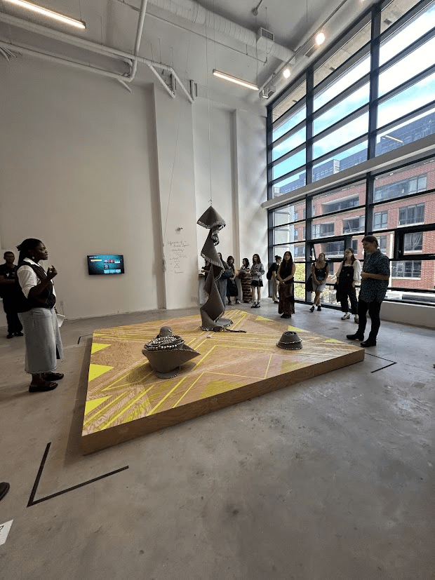
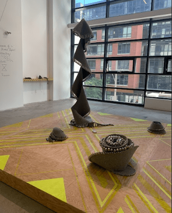
The Supernatural Powers of Fabulous Panther – Biimskojiwan by Maria Hupfield {2024}

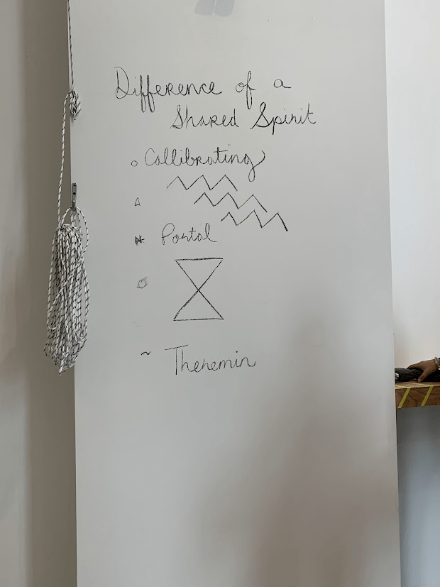
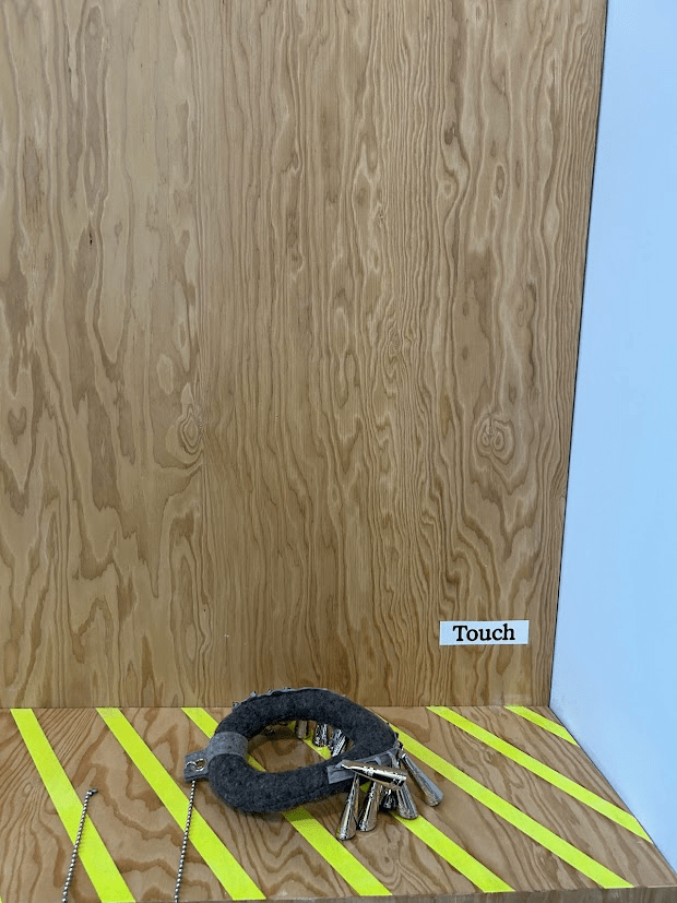
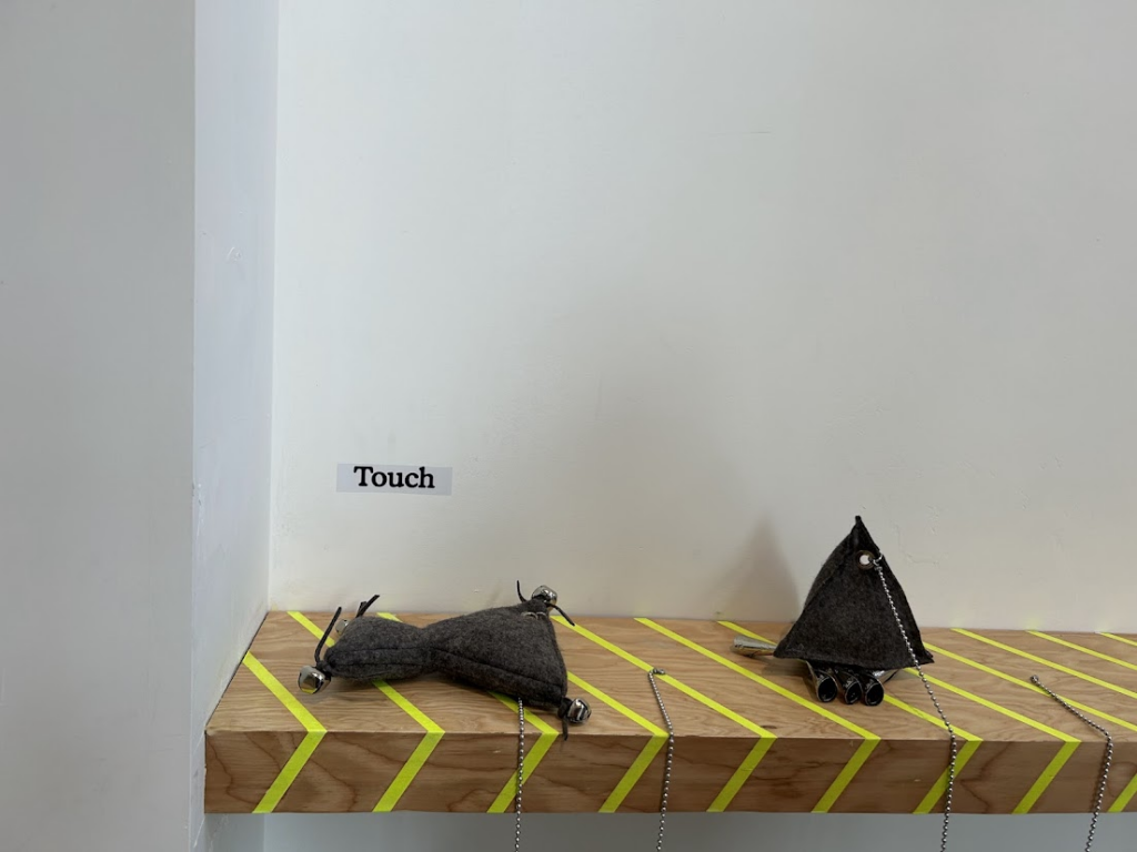
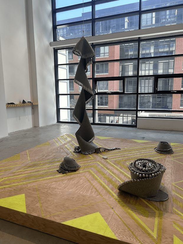
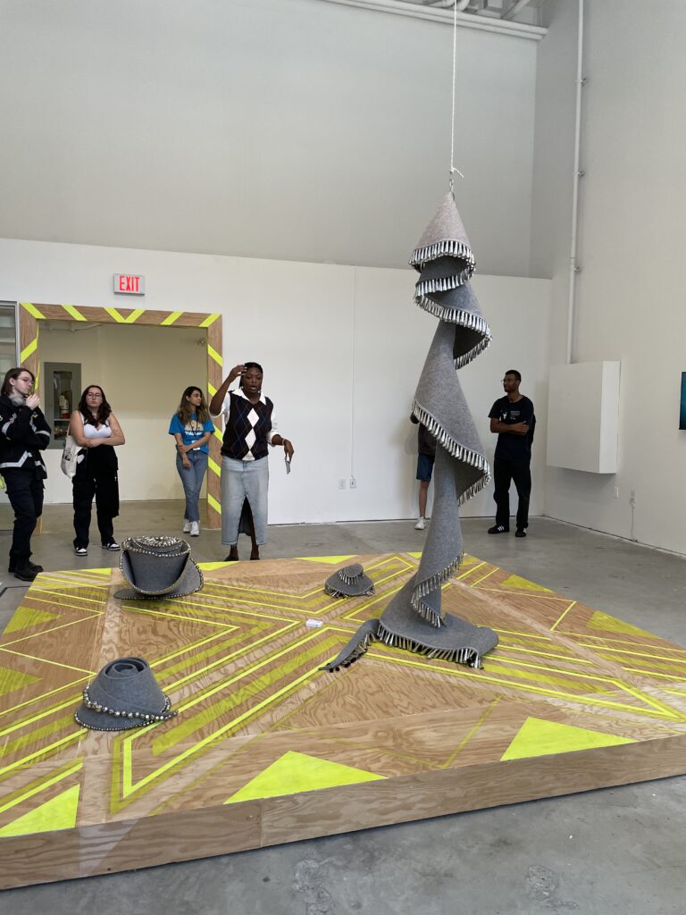
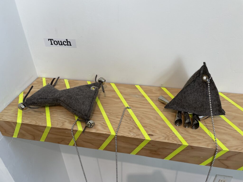
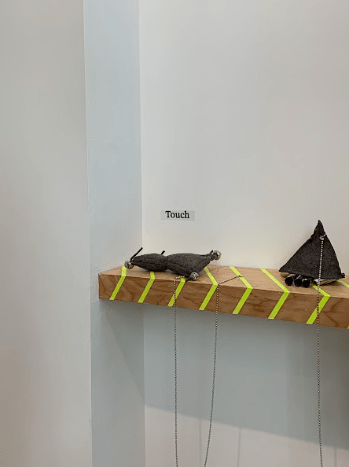
  • This is a sculptural installation based on the three spirals, made out of industrial felt and adorned with silver and tin jingles.
  • This is a sensory work exploring the surroundings and water.
  • It is meant to engage the crowd and give them rhythmic instruction, so the crowd follows the artist until the end of the performance.

Leila Zelli

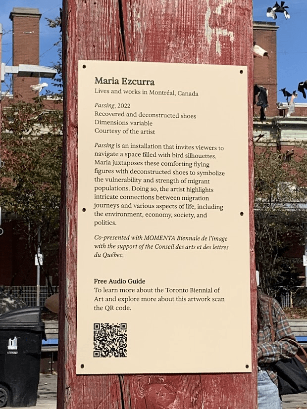
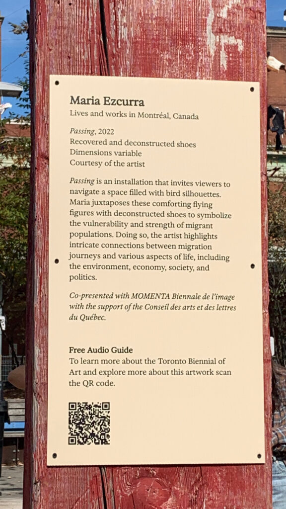
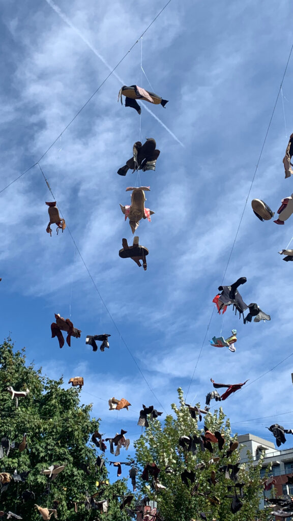
Passing by Maira Ezcurra {2022}

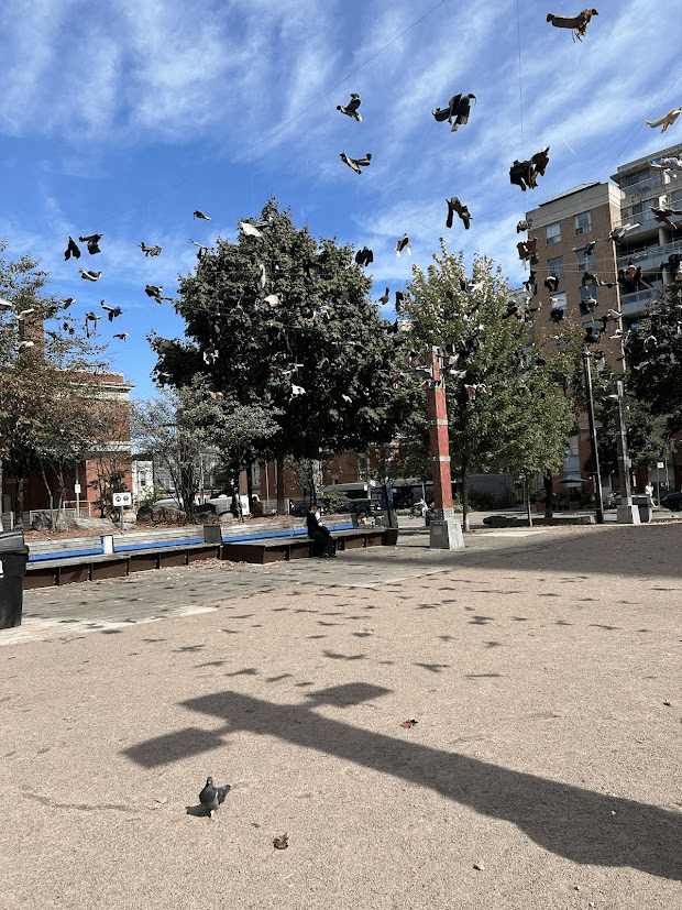
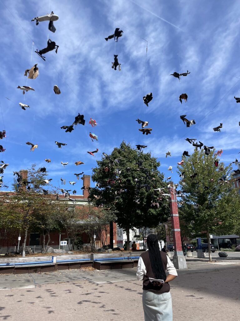
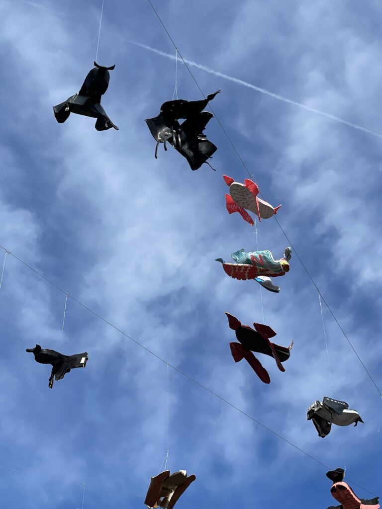
  • This is an installation meant to mimic the silhouette of birds, so the viewer can experience how it feels like to walk under birds flying in the sky.
  • The artist created these noticing the lack of migrating birds in Southern Ontario as compared to their hometown.
  • The deconstruction of shoes represents how the changing environment has affected not only humans but also many other species – migrating birds.
  • When introduced to this work during the tour, the first thought was, ‘What do the birds think of this piece?’

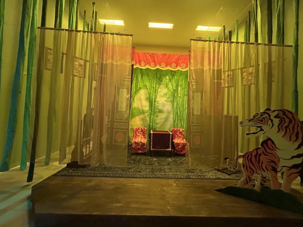
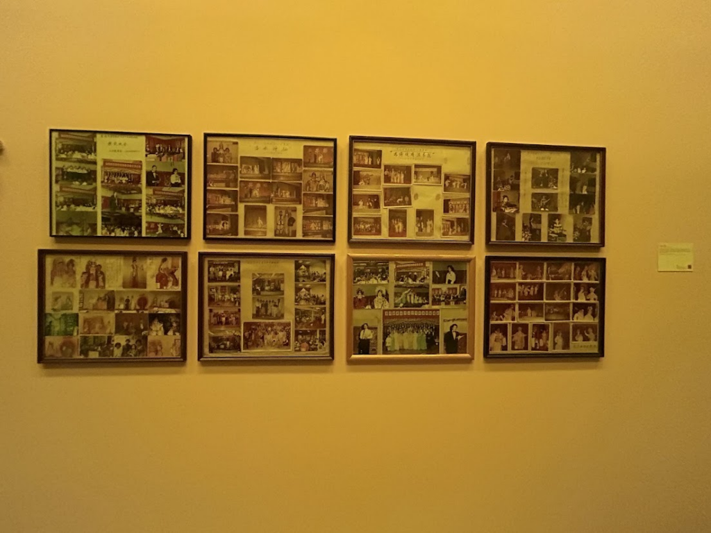
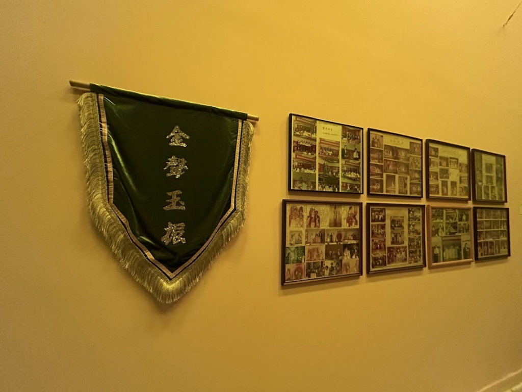
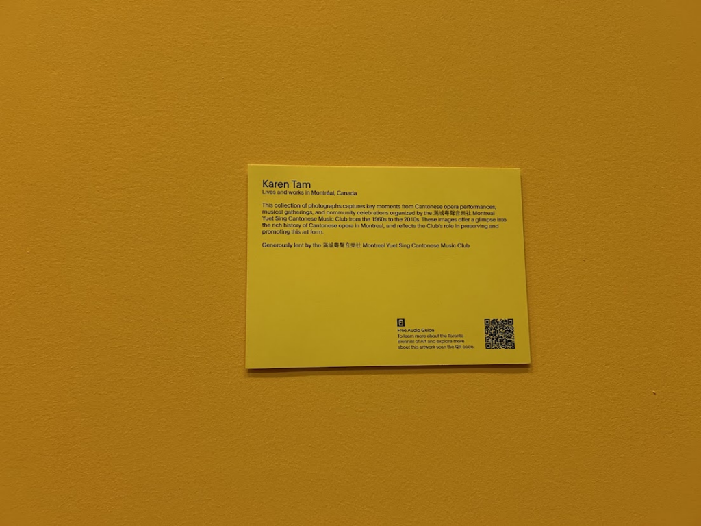
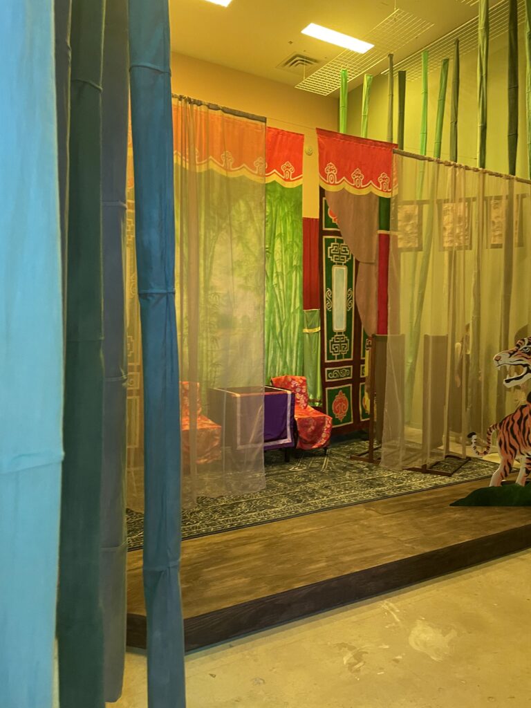
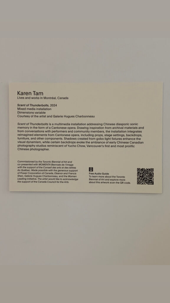
Scent of Thunderbolts by Karen Tam {2024}

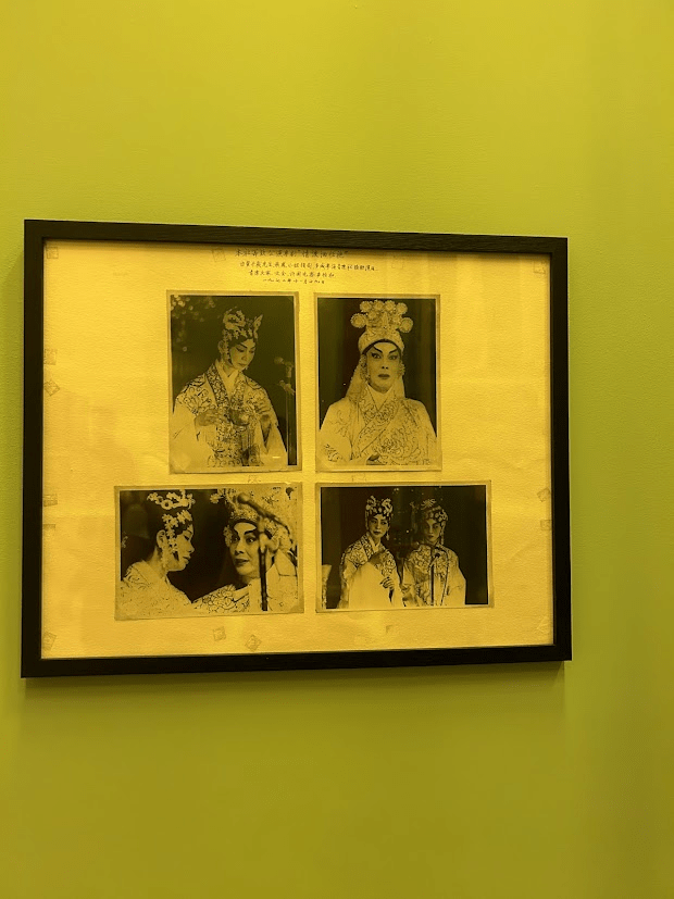
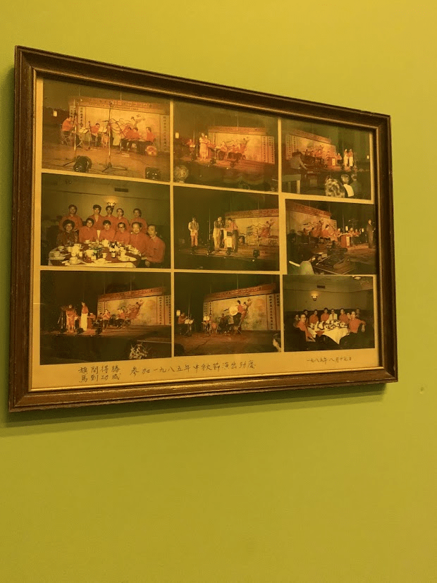
  • This is a piece created by the artist reminiscing about their childhood and the language barrier between them and their grandparents
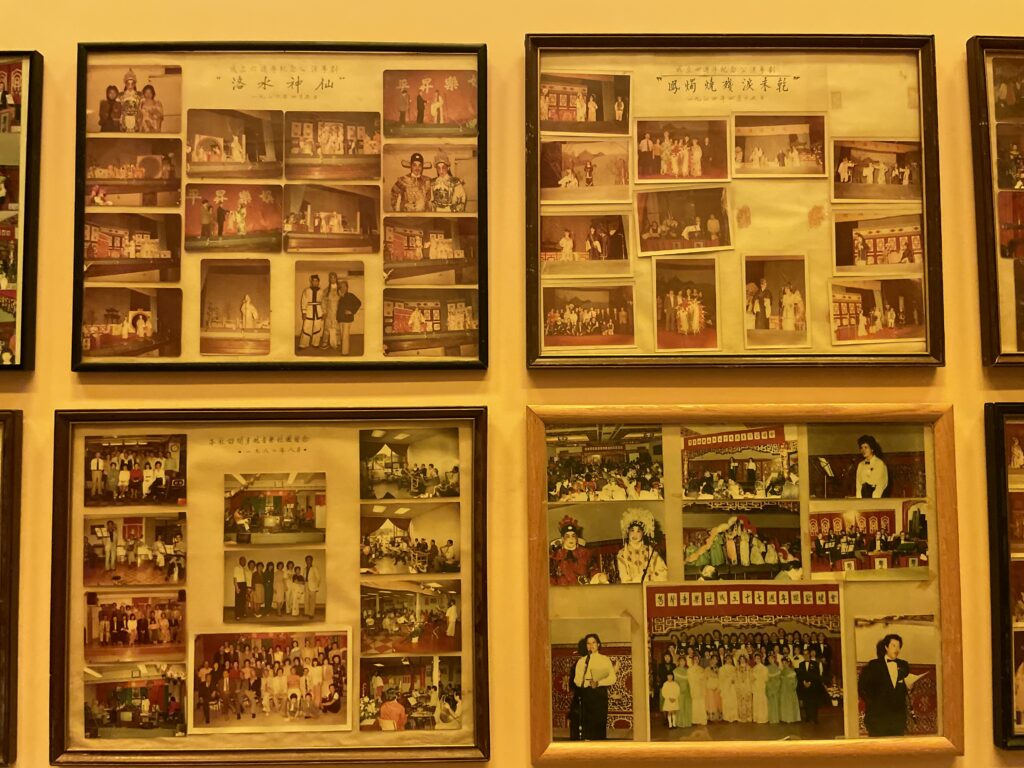
  • The work is a multimedia interactive installation that deals with the artist’s memories of watching Cantonese opera

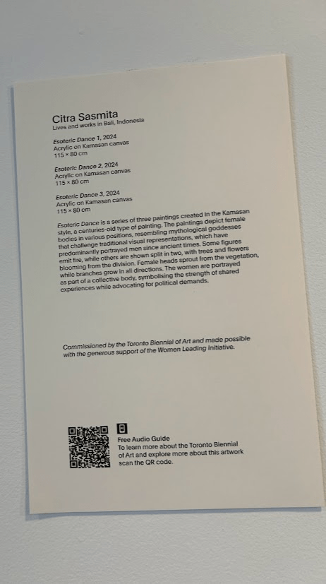
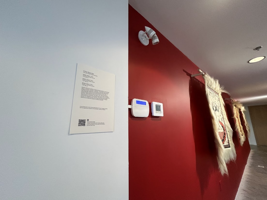
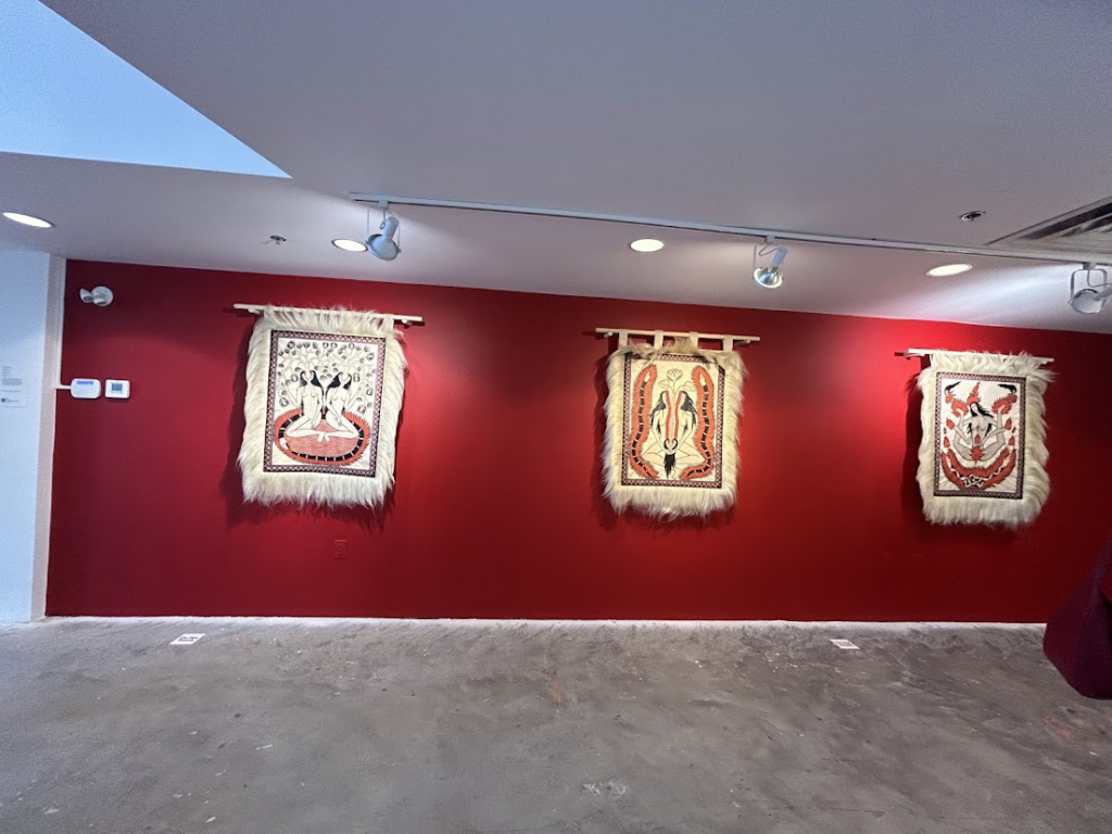
Esotric Dance by Citra Sasmita {2024}

  • These paintings depict mythological goddesses in the old Kamsan style.

Toronto Biennial of Art at 158 Sterling Road, Floor 9

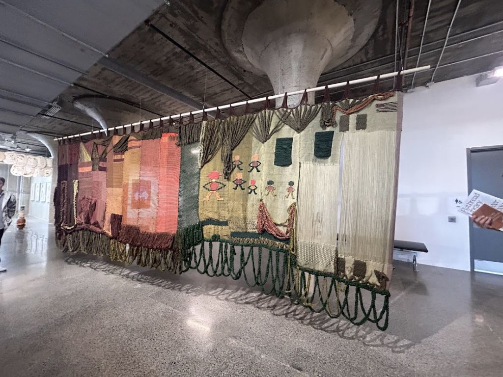
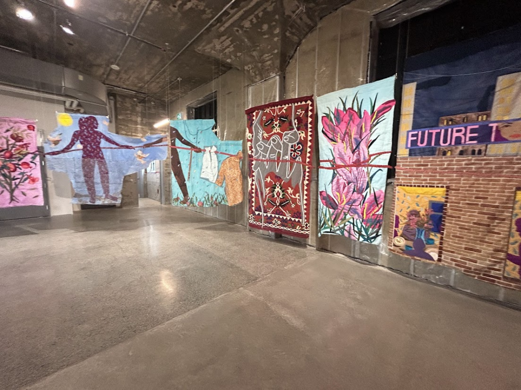
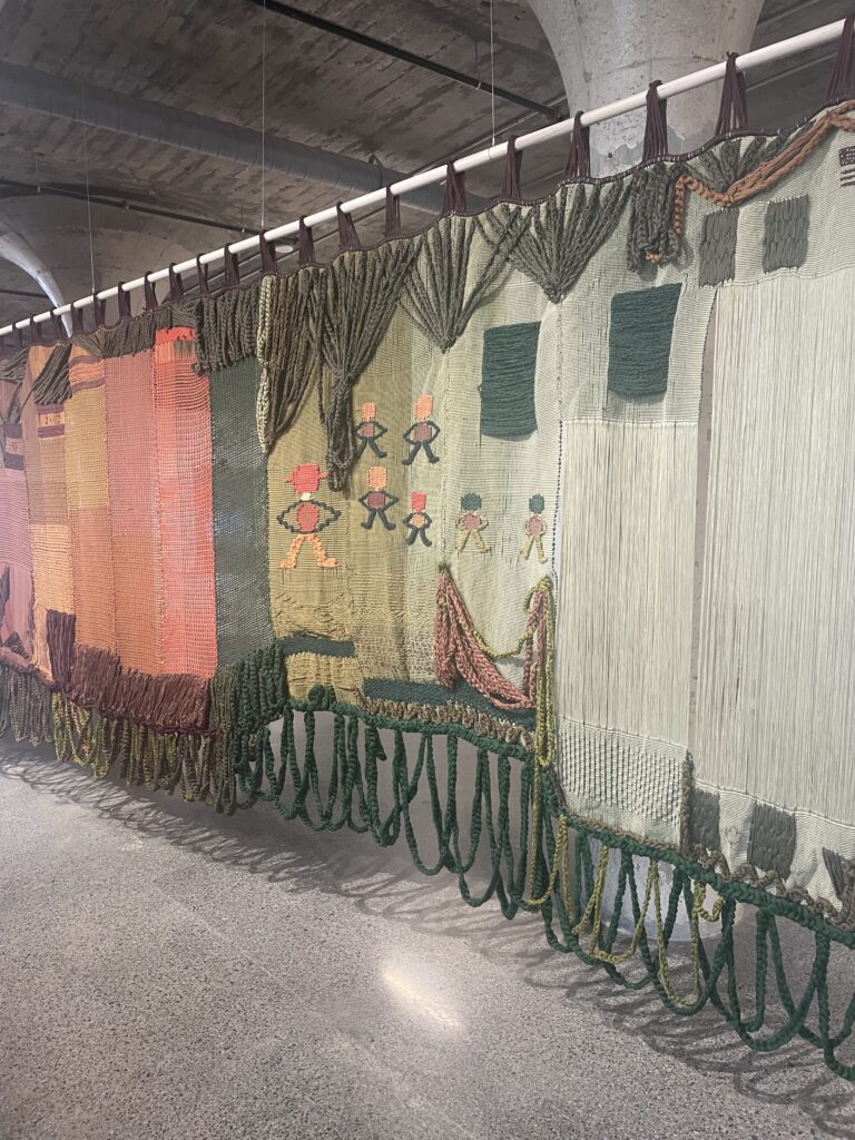
  • This textile art represents different flags.
  • the stitch on the right end is not the full stitch, here the artist is trying to communicate the political drift between the United States and Mexico

Sanitago Yahuarcani

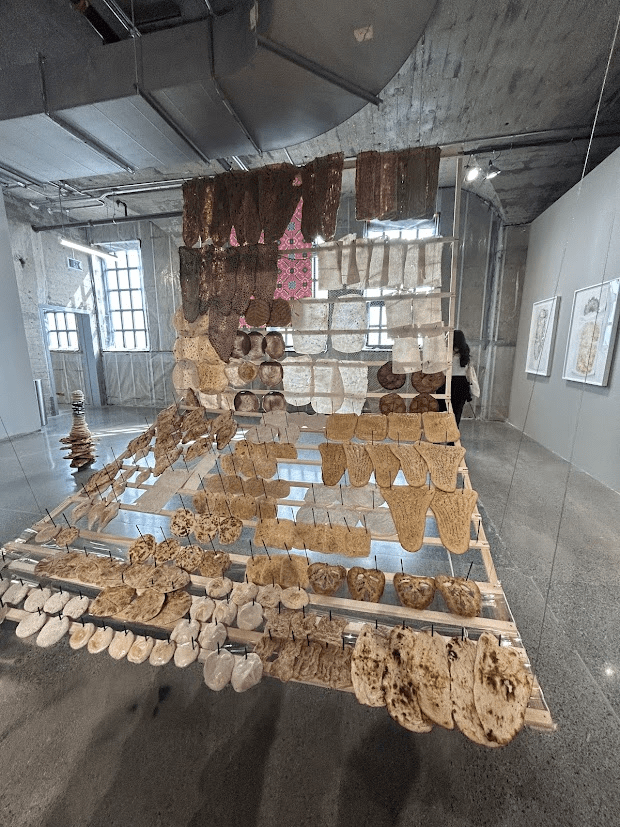
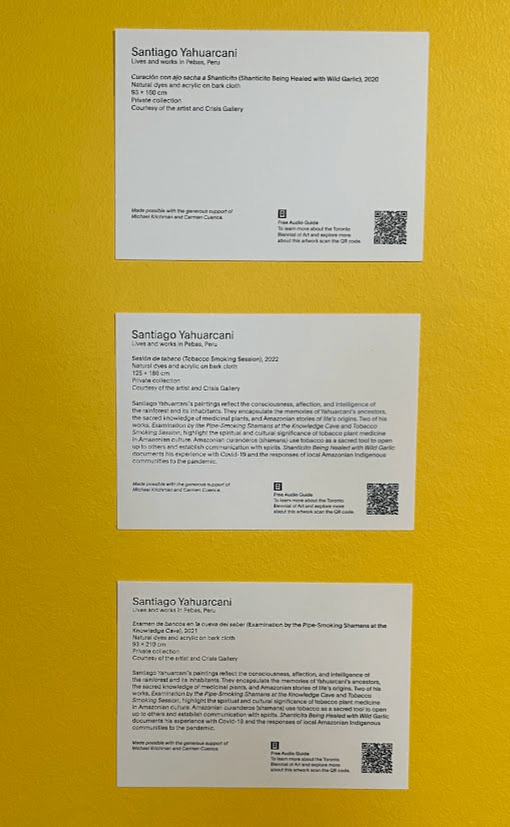
  • In these works the humans are represented in the form of animals to depict their struggles and similarities with them

The Other Home by Hangama Amiri {2024}

  • This textile artwork shows the struggles of Amiri having to move from place to place, the battle of having to pack up your whole life
  • The material used is from the Middle East and Central Asia, places where Amiri lived
  • The piece of fabric connecting all of them represents the pain the artist wants through didn’t end even after moving and leaving the places behind

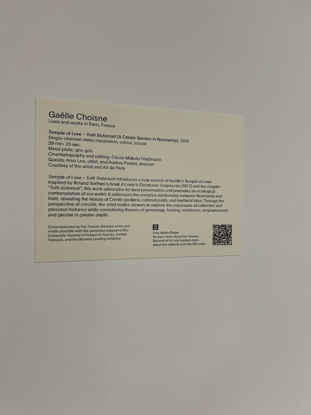
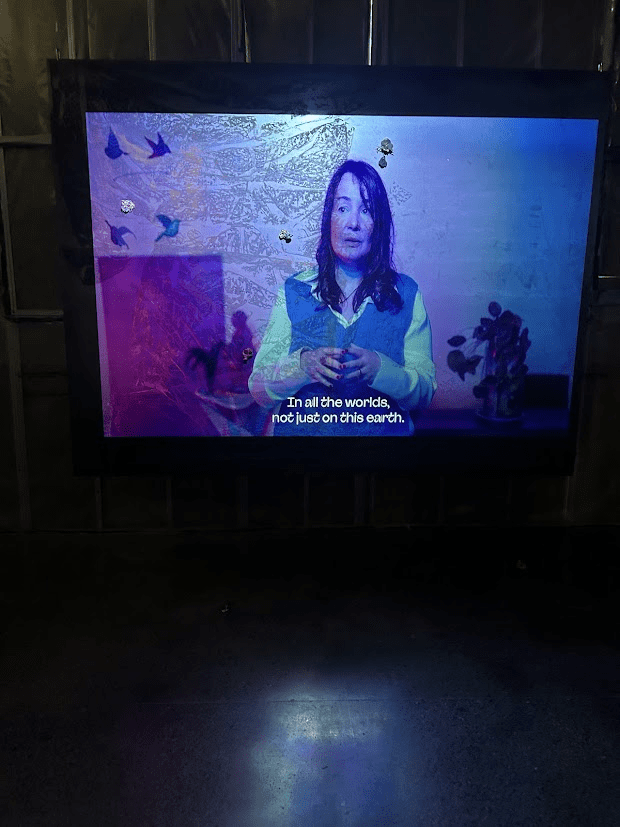
Temple of Love by Gaëlle Choisne {2024}

  • This Is a 29-minute long video art and is inspired by Roland Barthes ‘A Lover’s Discourse: Fragments’
  • The artist talks about the balance of the universe and the human body which sparked an interest in me but unfortunately, I could not watch the entire work due to the lack of time

MOCA – The Museum of Comtempary Arts


Week 4

Environmental Video at the Arboretum

Trees by Vanni & Yasmin

For this assignment, we knew we wanted to interact with nature. Our idea was to use the Arboretum as a location and involve it in our video. We chose tree-hugging as our gesture which was required to do.
Tree-hugging in Native culture

“In Native American cultures, for instance, the act of hugging trees was seen as a way to connect with the wisdom of nature and to heal both body and soul.” (Mastrantonio, 2024)

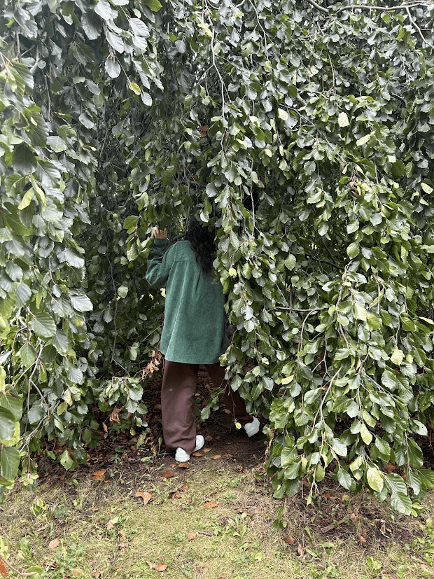
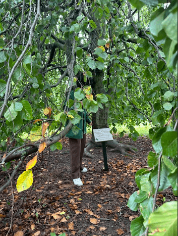
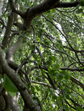
We were also influenced by the painters we studied in the studio, especially those who blended in with their natural surroundings through camouflage. The concept of “being one with nature” was explored by these artists very literally. Moreover, we were immediately drawn to embracing trees during our first visit to the Arboretum. We started looking for trees without poison ivy vines that we could safely embrace. Our first clip was shot under the canopy of the weeping willow, which caught our eye right away with its elegant branches.
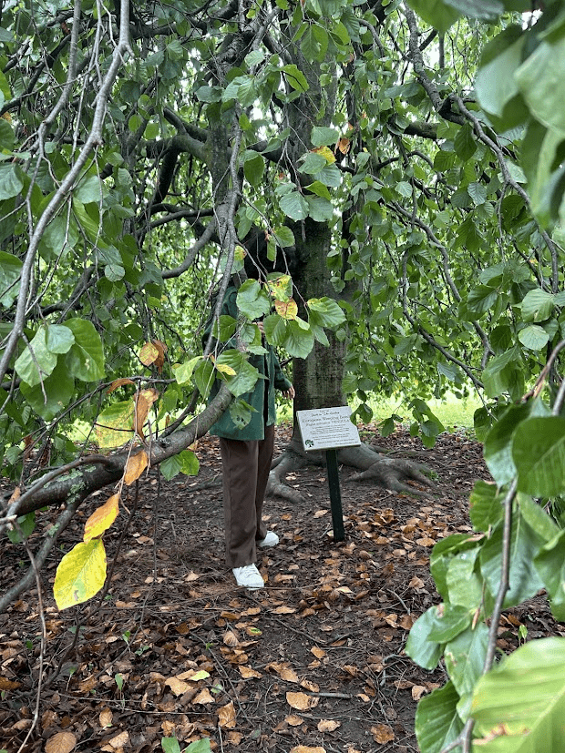
At first, we only concentrated on hugging trees. But as we went along, we thought an effective visual perception would be produced by using thinner trees. This made it possible for us to shoot in a way that gave the impression that we were merging with the woods. This camouflage effect was emphasized by the wide-angle, distant clips, especially as we wore brown and green clothing to further blend in with the surroundings. As we tried to blend in with the surroundings, the long shots heightened the sense of being one with nature.
Lastly, not facing the camera was an artistic choice we both decided on, other than the last shot, to depict our respect towards the surroundings along with our dependency and attachment to nature. Upon further observation with the group, we could have added more ‘close-up’ shots but we thought the long shots accentuated the camouflage aspect of our idea.
Week __

Blurb Books

Ideas for my book

  • Translate my childhood story book which is originally in Hindi into English
  • Inspired by an artist’s book shown in the studio
    • each spread would have a different brush stroke to show the different textures and how the particular brush works
  • A book that shows how a person with colorblindness views the world vs how people who do not have color blindness
    • It would contain images so one half is colorblindness, and the other is without
  • A book that would have the first and last sentence of other books but would change so the last sentence is typed first depicting “the end is only the beginning”
  • A book that would have scanned the last pages of other well-known novels – Winner!🎉

Final Book

This book contains covers of 21 Mystery Books’ and their corresponding last pages. Read at your own risk.

Week 10

Artist Multiples

Ideas for Artist Multiples

  • Ignorance is not a bliss / Ignorance is a sin
    • Make a banner in white and display it on a white wall to emphasize the ‘ignorance’ aspect.
  • Breath
    • Modify a card deck and add stickers or writing so the player remembers to breathe and be calm; it is just a game.
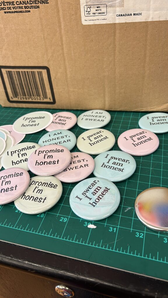
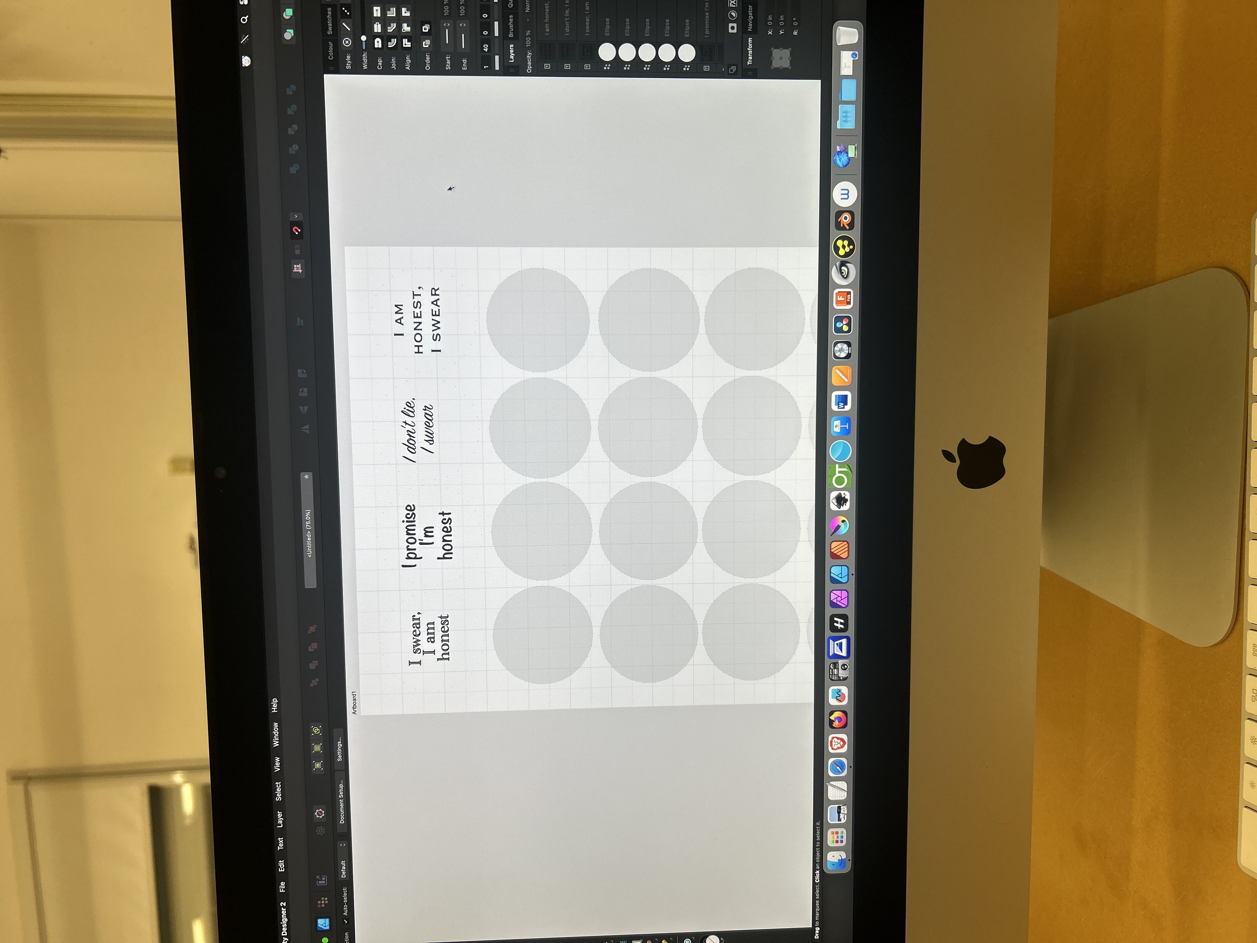
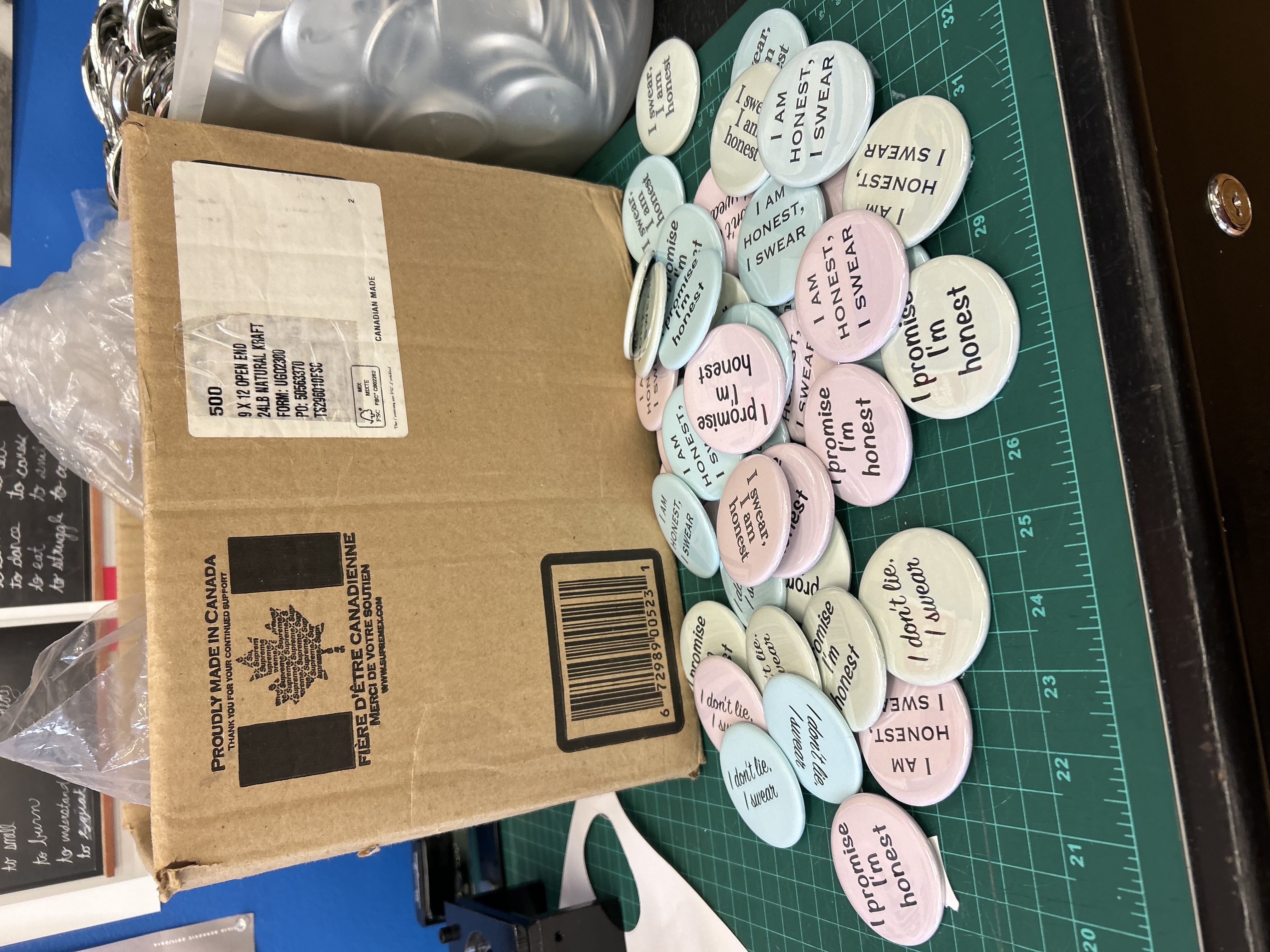
  • ” I swear, I am an honest person ”
    • Make pins that have this quote
    • Make pins with pictures of controversial people and the quote is underneath it.
      • Donald Trump
      • Diddy…? hope I don’t get attacked…. thank you Beyonce 🙏
      • Some Serial Killers maybe?

Final Artist Multiples

For my final artist multiples, I focused on the expression “I swear, I’m Honest” and made pins with synonyms but different fonts and colors. I wanted them to be subtle just like how one would use this expression in a conversation to depict the casualness but at the same time the impact our words can have based on how we use them.

Kat

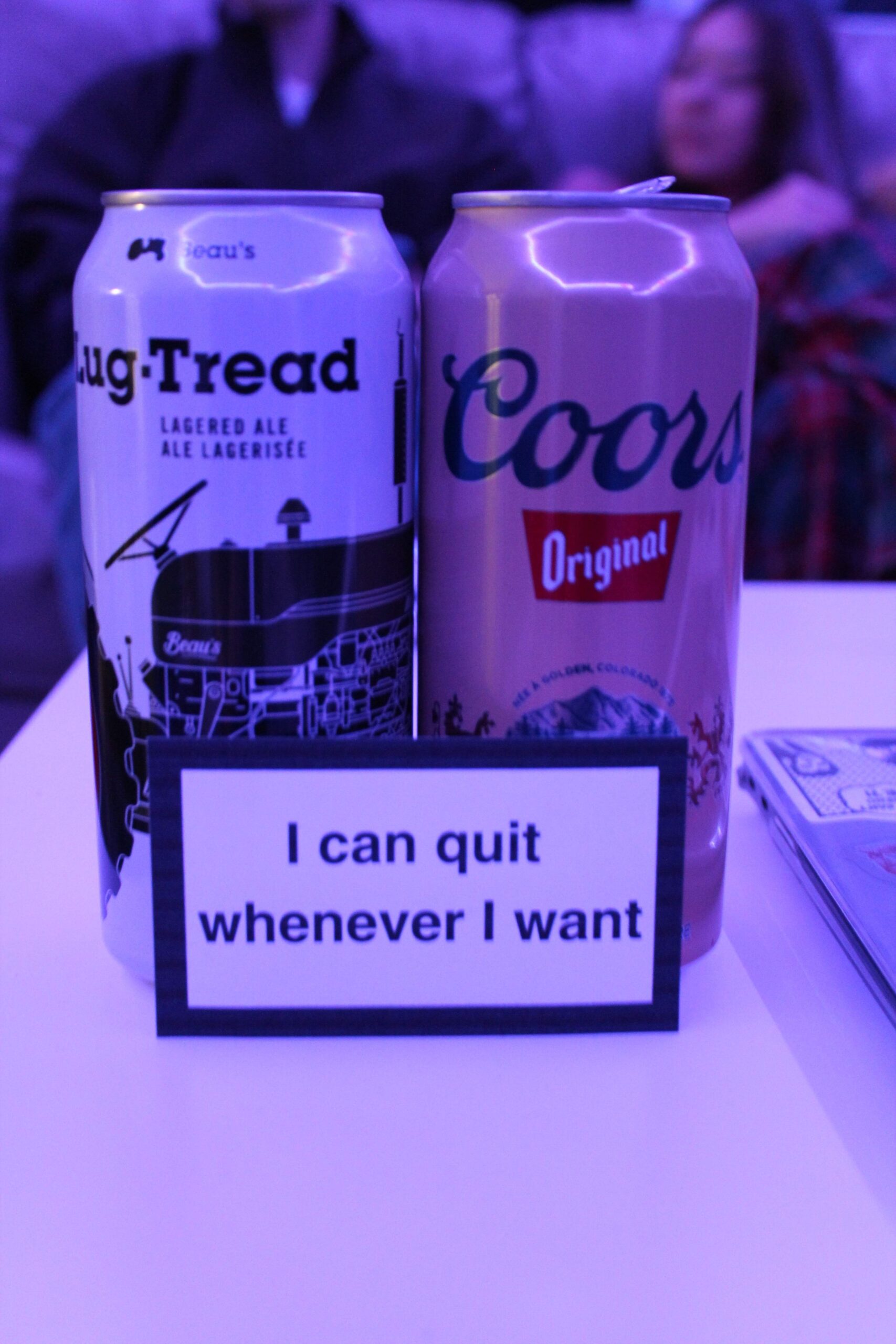
“I can quit whenever I want”

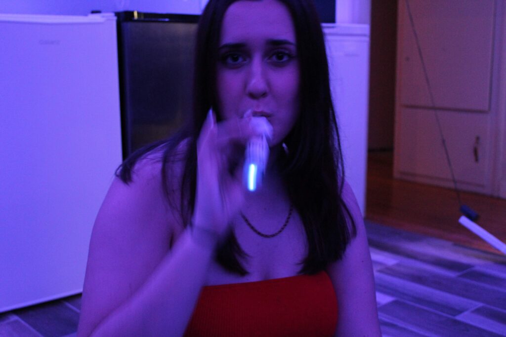
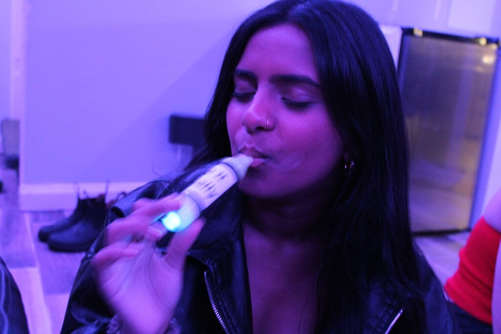
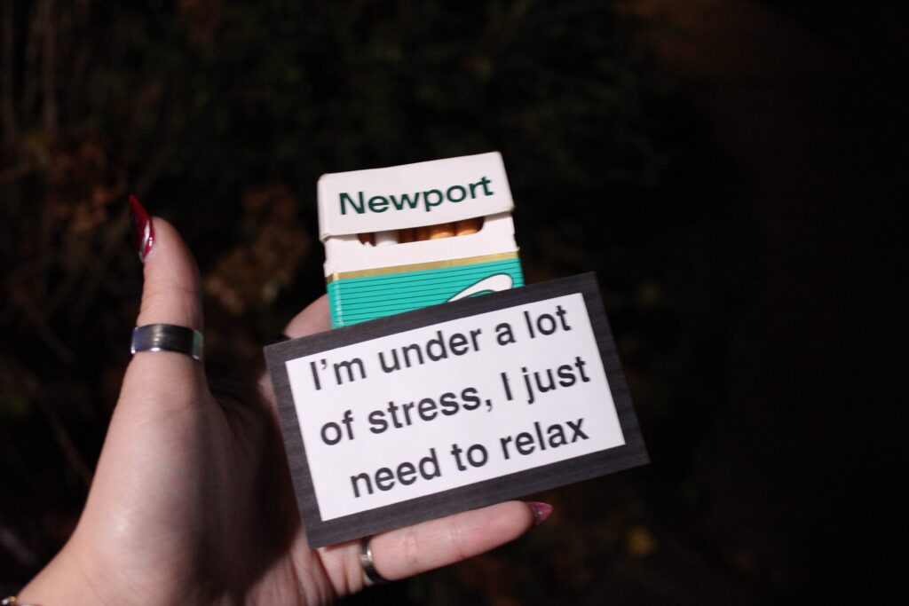
For my artist multiples, I chose to make stickers based on the “smoking kills” warning labels on cigarette packages and give it an ironic twist with more defensive phrases in relation to the same subject matter. I used all the listed phrases below but kept the phrase “I can quit whenever I want” as my main concept for this project. I wanted the stickers to be used on items that are addictive themselves, items that symbolize addiction, or things that conceptually can be addictive if not physically. In the photos below, my stickers are being used on things that are traditionally known to be addictive (alcohol, vapes, cigarettes). The stickers serve as a label of denial and defense, claiming not to be addicted and “being able to quite whenever they want” while still using or consuming the labelled product they are denying addiction to.

Despite the humorous and ironic phrases put on each sticker, it is important to acknowledge that, although addiction can be less serious and lighthearted in the context that I envision my stickers to be used, addiction can also be an extremely serious and severe topic that should not be joked about or taken lightly.

ADDICTION DENIAL
“it won’t kill me”
“i only do it occasionally”
“it hasn’t changed me at all”
“i just like the feeling”
“i am not addicted”
“i’m not hurting anyone”
“i’m under a lot of stress, i just need to relax”

“i can quit whenever i want”

[smoking kills] cigarette pack warning label-style sticker
OR groovy/hippie style font?
photographs of the sticker on various addicting items
– lighter and cigarette
– bong
– vape
– cellphone
– credit card
– computer
– alcohol
– gambling (not sure what item)
– coffee cup
– energy drink
– sex toy
– a man


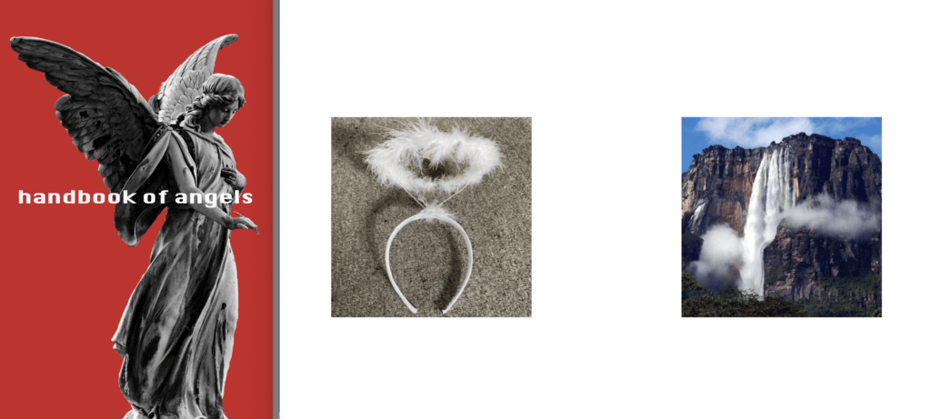
I found a book called “Knowledge of Angels” by Jill Paton Walsh at a thrift store and was immediately intrigued by this idea of knowing what an angel is. My artist book if loosely based on this book and it is titled “handbook of angels”. I really wanted to push this idea that no one really knows exactly what an angel is. There are always random posts or articles on the internet talking about experiences with angels and what a biblically accurate angel looks like. I realized that there are many different kinds of angels that I would never really think about normally so I wanted to bring those to light in a direct and sort of humorous way. Each page includes a small square image of a different item relating to the word “angel” in any context whether it be the word in its name or something that resembles a typical angel. These images include a variety of different subjects that I would never see together in any other context, but they all fit very well in their place in this book.

REFERENCE BOOK: Knowledge of Angels – Jill Paton Walsh

HANDBOOK OF ANGELS
24 pages — each page includes a different “angel”
– angel food cake
– angel hair pasta
– angel wing clam
– angel shark
– angel falls
– angel dust
– destroying angel
give definitions to my roommates and have them draw what they interpret from the definitions without knowing what the term is — i.e. “a deadly poisonous white toadstool that grows in woodlands and is native to both Eurasia and North America” and then scan their drawings and put them on each page with the term, “destroying angel” for this example.
OR
each page only has an image of a different “angel”
side-by-side pages should have some kind of connection or correlation that is not too obvious


“Elements” – Kathryn and Amelia

We began with our idea of running behind a tree and bursting into leaves as a conceptual display of the movement of air as well as the concept of life and death. However, we wanted to further our idea with multiple videos to explore the different elements (fire, water, air, earth) in a more conceptual context. With each element, we created a different gesture idea that would all be looping together in a grid-like formation. To keep each video interesting and intriguing in its own way, each element and its video is unique in the way it is filmed and in the gesture it presents. The first video, representing fire, shows the figure kneeled on a large stump we found in the Arboretum while rubbing a stick to create a natural fire. This video loops over this one singular action to act as the stable and consistent aspect of the entire video as a whole. The second video shows two people jumping up into the air and “transforming” into a pile of rocks that fall down, reversed and looped. This video symbolizes the element of earth. The third video was a tribute to our original idea of running behind a tree and bursting into leaves to represent air and the movement of air. The fourth and final video in the grid represents the element of water as the subject fills a vase with water from the fountain and dumps it on herself. All four videos together provide the viewer with a busy but simple interpretation of the four elements and the visual aspects help connect each video together as one.

VIDEO IDEAS (MP4 file for blog upload)

  • “When We Leave”
    • running around a tree, run behind, burst into leaves
    • jumping up and down, jump up, rocks fall
    • crawling under the bridge, crawl one side, other side water flows
    • costume — all black for all three or full colour matching each element (leaves, rocks, water)
    • 3 videos at once – maybe 4? for 2×2 grid
    • start with first video, make it flow into the second, third, fourth, until all of the videos are playing together (?)
  • Bear mask, honey on hands, attracting beers, ants, wasps, etc.
    • flip in nature — the insects eating the predator — cycle of life
    • GLOVES AND SHOES SAFETY FIRST
  • Blending into nature by burying body parts
  • Teaching the trees (call and answer) — easel, whiteboard/chalkboard, pointer, teacher costume/outfit
  • “I am a Tree” — wearing a sign that says “I am a Tree” around neck and standing in different parts of the forest
    • wearing an outfit that has nothing to do with trees or anything
    • mimic tree sounds and movements

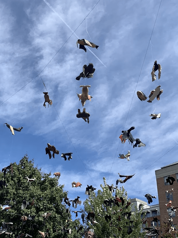
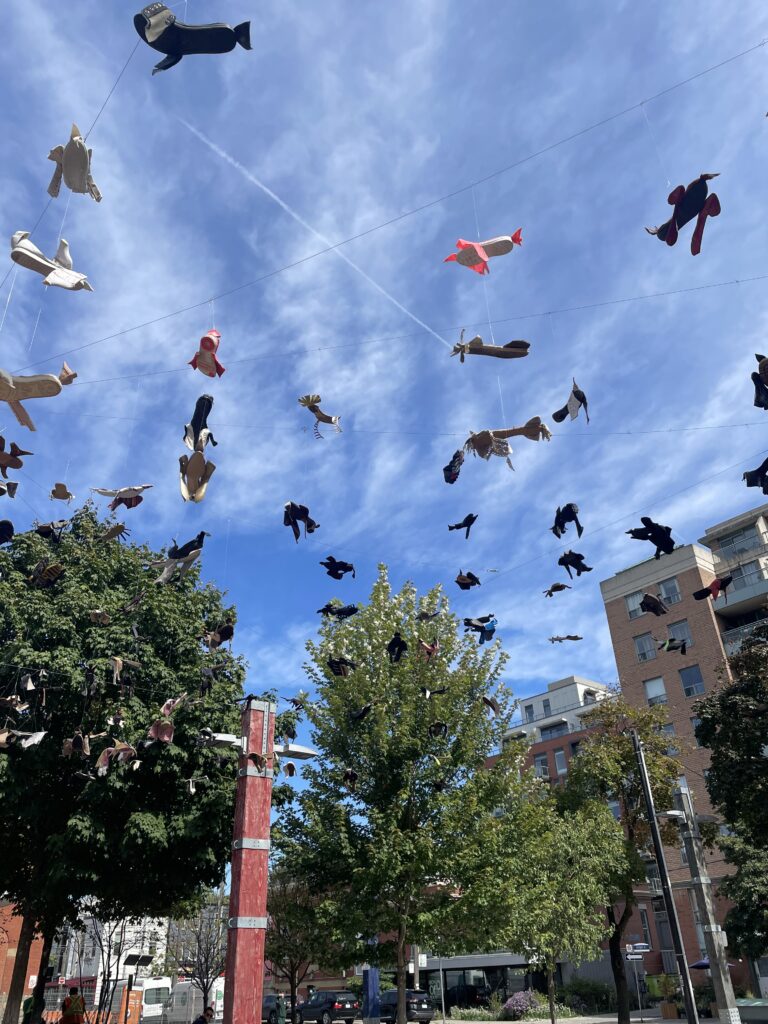
The Toronto Biennial of Art and the MOCA exhibitions we explored were amazing. The variety of different art mediums, themes, ideas, and installations made it easy to stay intrigued and curious. My favourite artwork from the entire trip had to be Passing by Maria Ezcurra located at 32 Lisgar and Park as part of the Toronto Biennial of Art, 2024. This installation, as pictured in the last photo, involved numerous different kinds of shoes cute into the silhouette of birds hung up on wires strung up on poles. From afar, the installation just seems to be sculptures of birds strung up in the sky, but once you get closer and directly under the work, you can see that every “bird” is actually a shoe. It was so cool to be able to see how each shoe was individually cut up in order to resemble the wings, tail, and beak of a bird. There was so much variety as well between the different shoes and how they were cut. Some shoes had sharp beaks, some had no beak, some had fringed tails and some had pointy tails. The weather was perfect on the day we went. The beautiful bright and blue sky functioned as the perfect background for this installation without taking away from the idea and creativity behind it.


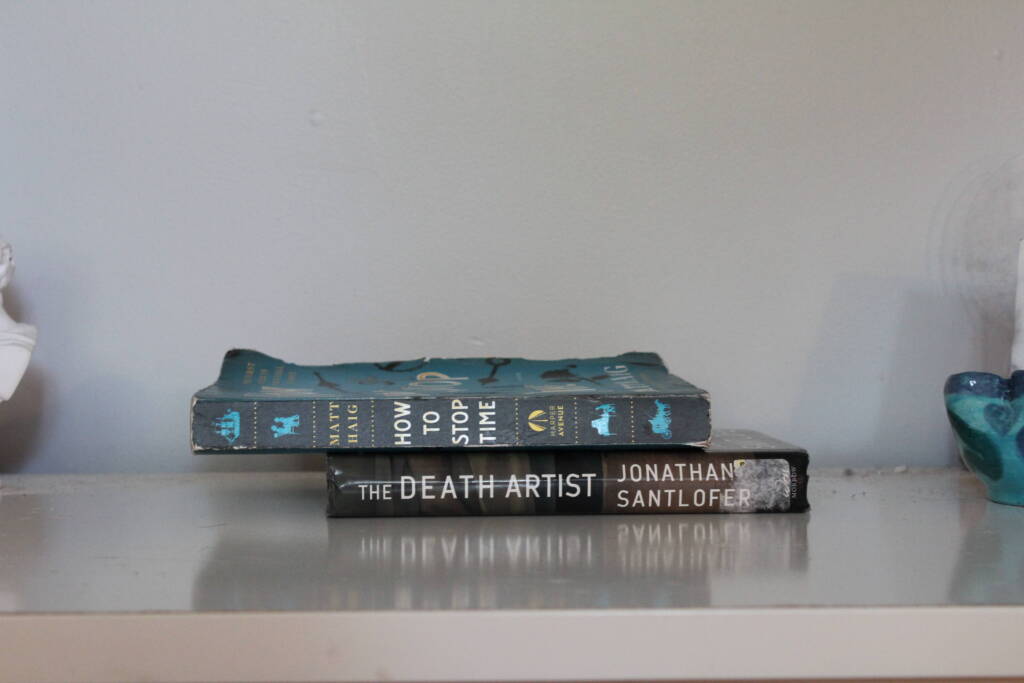
“How to Stop Time, Death”

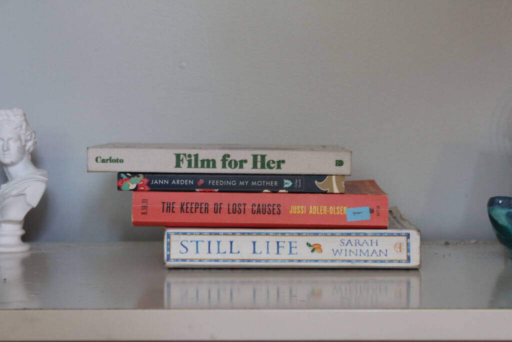
“Her Mother Causes Life”

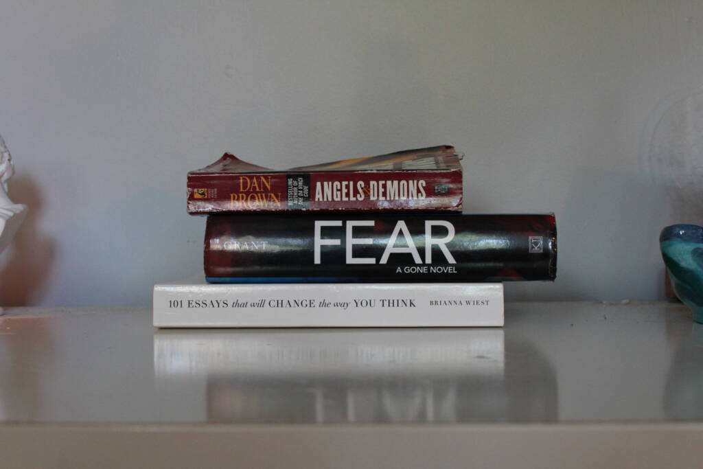
“Angels & Demons Fear the Way You Think”

Catherine

Assignment 1: Create 3 book stacks

To select my books, I used my dad’s library where I found many books about history and music, my sister’s book collection where I found numerous books about social issues and fantasy, as well as other books from around my house which gave me a wide selection to choose from. To begin, I focused on books which distinctly showed the titles as the authors’ names were much smaller. The colour of the spines and the letters as well as the font really attracted me to many of the books as well. I also leaned more towards books that had phrases as titles instead of one word titles; making it easier to mix and match according to several different themes/scenarios. I spent a lot of time creating the different stacks; changing the order around within themselves, and adding or taking books away as the themes became more apparent. Lastly, I chose to photograph my book stacks in front of a plain white background so that the main focus of the pictures are the books themselves… I didn’t want the background to take away from that and be distracting.

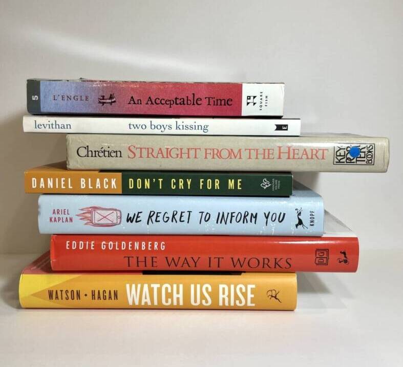
Book Stack #1 – “Acceptance”

While looking through my sister’s collection of books, “two boys kissing” really stood out to me. I like how each word is in lowercase letters; kind of like it’s suggesting that boys kissing each other is something so simple and casual/normal and not bold or should really stand out to people. The first book in the stack, “An Acceptable Time” seemed like a really fitting beginning. I chose “DON’T CRY FOR ME” because people should not feel sad or sorry for two people of the same gender who really love each other. Then to add some humour, I included the next three books: “WE REGRET TO INFORM YOU,” “THE WAY IT WORKS,” and “WATCH US RISE,” as if the two boys were really speaking up for themselves and giving it to people how it is. Lastly, I decided to add the third book, “STRAIGHT FROM THE HEART” directly after “two boys kissing” because I wanted to show that they had a true relationship or genuine love for each other; not just a fleeting moment. All of the books after the first two are written in capital letters which emphasize the importance of accepting everyone, no matter who they love and realizing that you can’t change how or who people love, so you should just let them be.

Book Stack #2 – “Emotions”

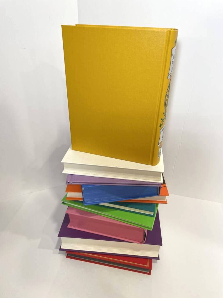
As I was going through the different books I had selected for their titles, I noticed the variety of colours around the perimeters of the books which gave me the idea to do a stack of books representing emotions. Having watched the popular movie, “Inside Out 2” this summer, as well as loving the original “Inside Out” movie when I was a kid… I wanted to create a stack with those specific colours and emotions (Yellow – joy, White – nostalgia, Light Purple – fear, Blue – sadness, Orange – anxiety, Turquoise – envy, Green – disgust, Pink – embarrassment, Dark Purple – boredom, and Red – anger). The books within this stack have been placed on different angles, as well as in a random order, excluding Yellow (joy) at the top, as your emotions are not a constant, intensity wise, and they can continually change throughout a single day, multiple days, weeks, months, or years depending on events happening in your life, relationships with others, and your reactions towards expected and unexpected circumstances. Yellow (joy) has been placed upright at the top of the book stack, being the most prominent and noticeable book, as this is the emotion everyone would ideally like to feel on a daily basis and strives for throughout their lives. The sizes of the books are different to show how the intensity of an emotion can sometimes be stronger or weaker than others at times. Lastly, some of the books reveal white pages while others have coloured pages which was done to add visual interest to the stack.

Book Stack #3 – “Secrets”

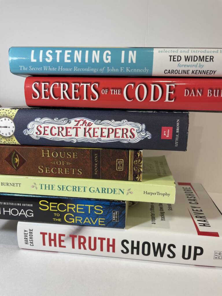
For my third stack, I wanted to focus on a theme and chose SECRETS because I find it very interesting how there can be numerous different types of secrets and the titles of the different books were very interesting and give a sense of secrecy (e.g. people keeping secrets, secrets taken to the grave, secrets within a garden). I also liked the different styles of font and the colours of the titles, maybe suggesting the various kinds of secrets that are kept; good or bad. As I was looking through the piles of books I had chosen from the shelves, I really liked two of the titles, “LISTENING IN” and “THE TRUTH SHOWS UP” which I tried to use in a variety of stacks I was experimenting with. After creating my stack of “secret books”, I had finally found a suitable place to put, “LISTENING IN” on the top as if you are listening in on the secrets and “THE TRUTH SHOWS UP” at the bottom to represent the truth eventually coming to light sometimes. 

Toronto Biennial of Art and MOCA Field Trip

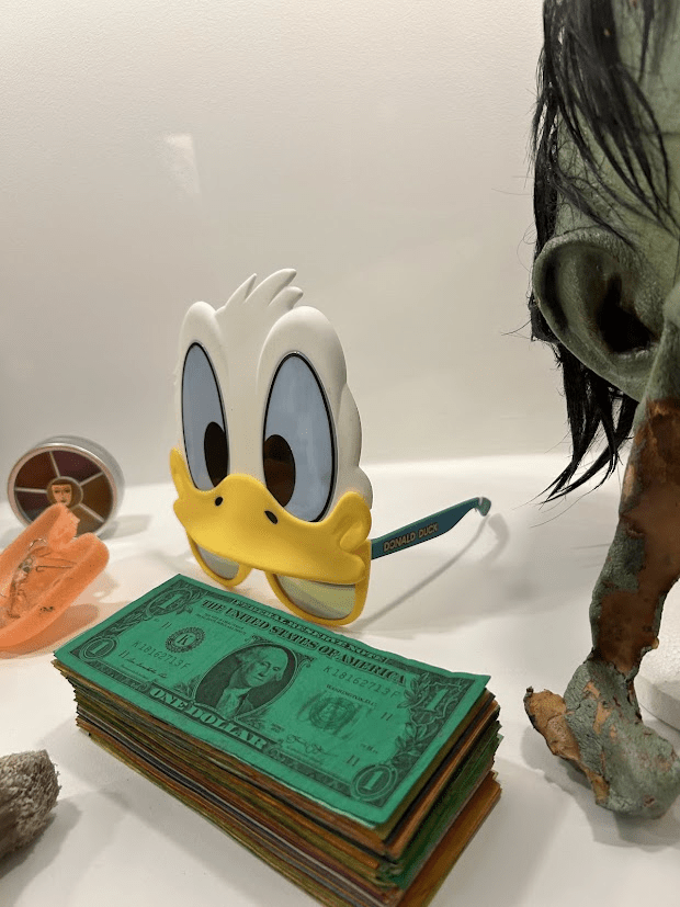
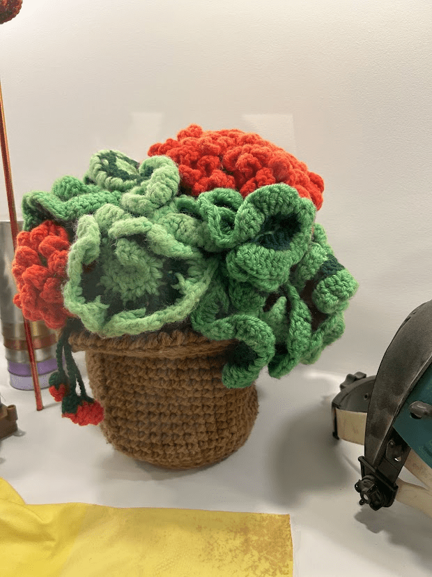
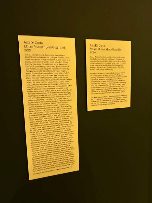
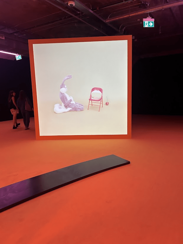
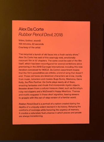
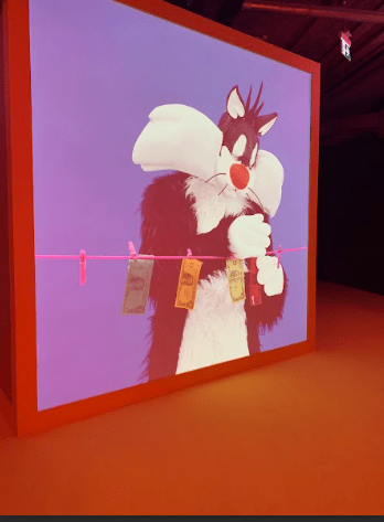
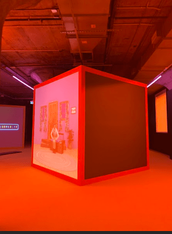
I found our field trip to the Toronto Biennial of Art and the Museum Of Contemporary Art (MOCA) to be very interesting and I really enjoyed looking at the different exhibitions and artworks that were on display. Some of my favourite exhibitions and artworks I saw were the hanging shoes made to look like birds, the video art displayed on the massive blocks in a dark, red lit room and the mixed media installation representing a Cantonese opera.

When we walked out and saw this installation, I was immediately captivated by it as I had never seen something like it before! I knew right away that the shoes were representing birds, but I didn’t know just how intricate each shoe was and how they were all altered with so much detail and thought. The artist used the soul of the shoe as the birds main body and stomach and then cut the top fabric part in 2 pieces and bent them outwards to make it look like the wings of the bird. I just loved how unique and creative this artwork was and not only that, I also loved the symbolism behind the artwork. The artist works with topics of immigration and migration and in this specific piece, they were showing the symbolism of the migration of humanity as the artist themselves is an immigrant and they were able to make that connection through shoes made to look like birds since birds also migrate.

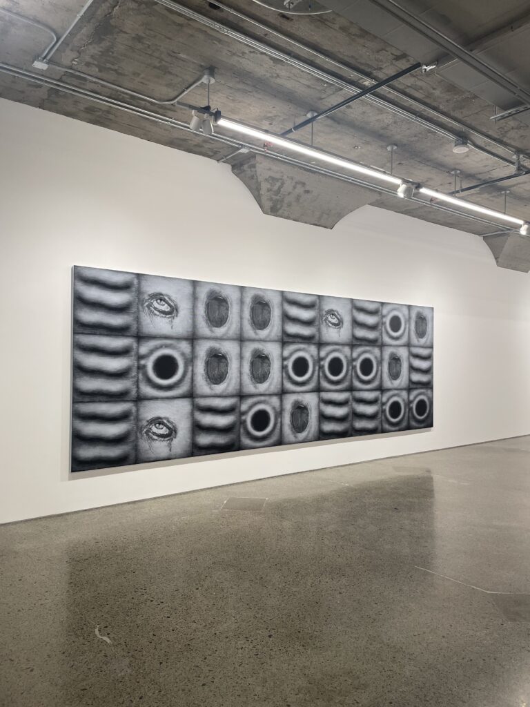
I also really liked the exhibition displaying multiple different videos on large blocks. I thought all the videos were very quirky and unusual in their own ways, but somehow it worked. I think the eerie feeling created by the dark, red light helped with this and once again, it was an art style and type of exhibition I had never seen before so I found it very interesting and fascinating. Especially, the video below of the green witch singing into a standing fan with Oscar the Grouch beside her swaying and bobbing his head along to her singing.

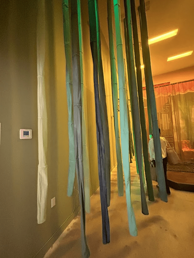
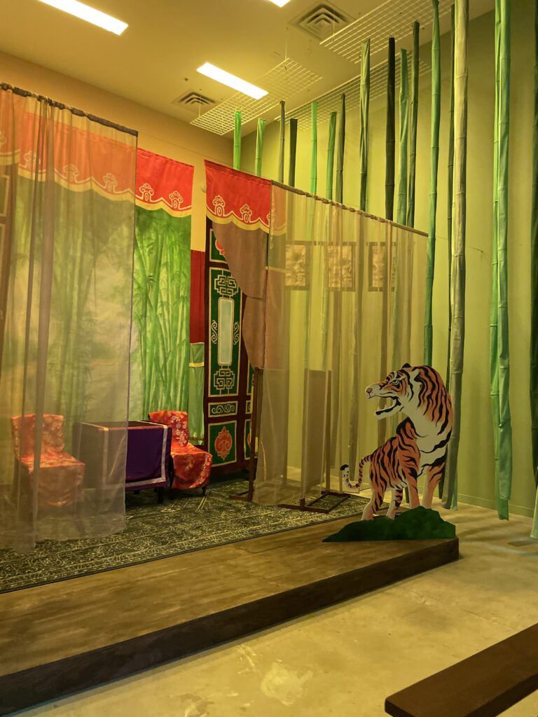
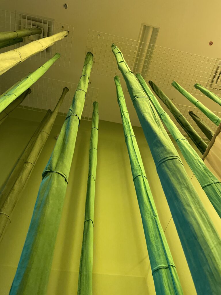
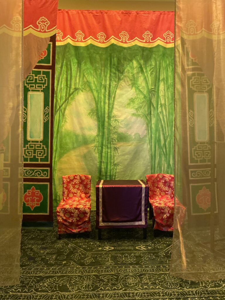
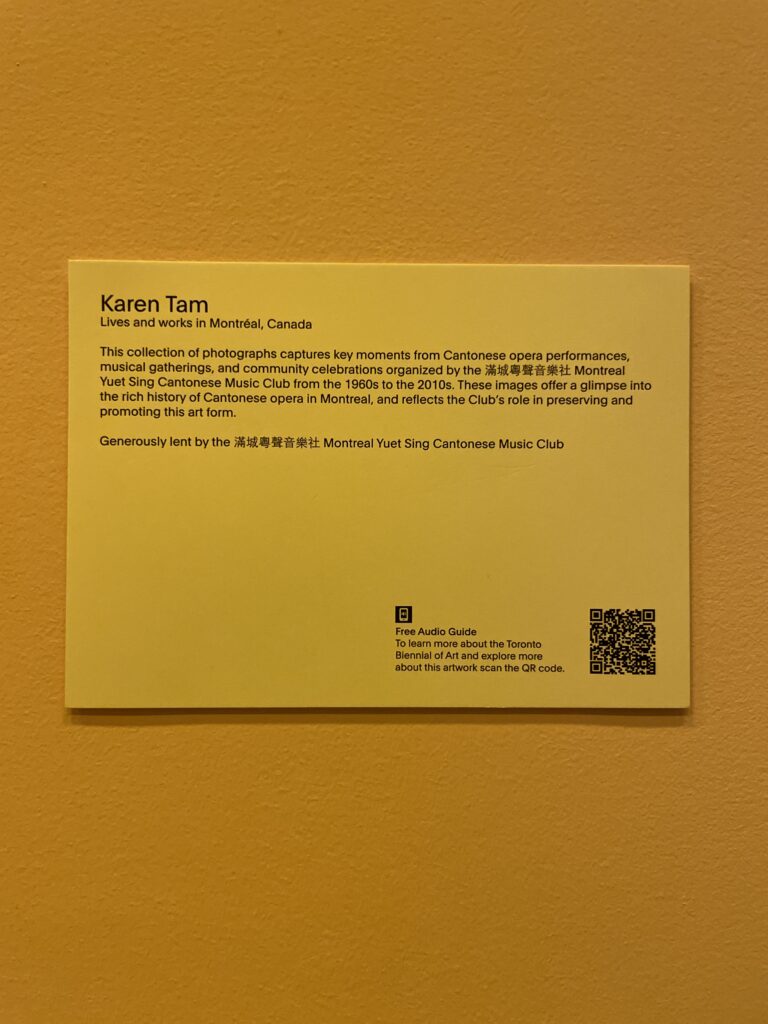
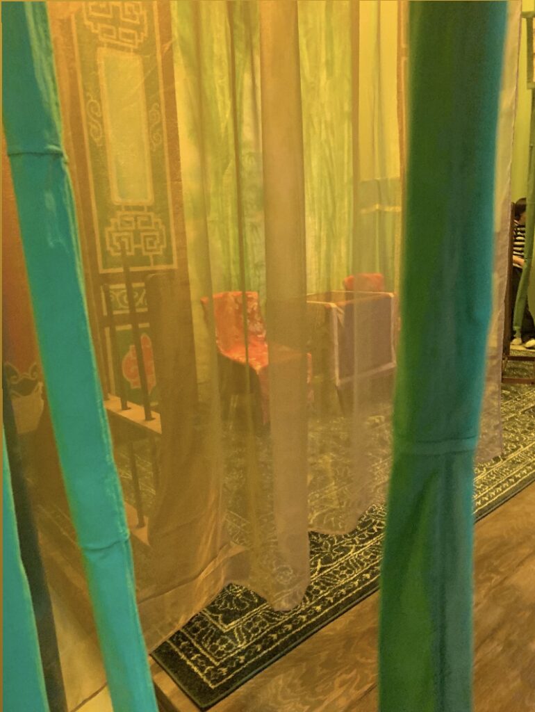
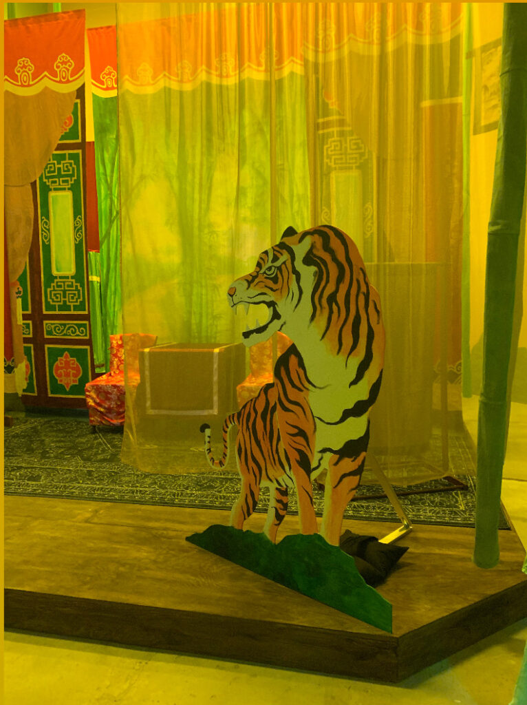
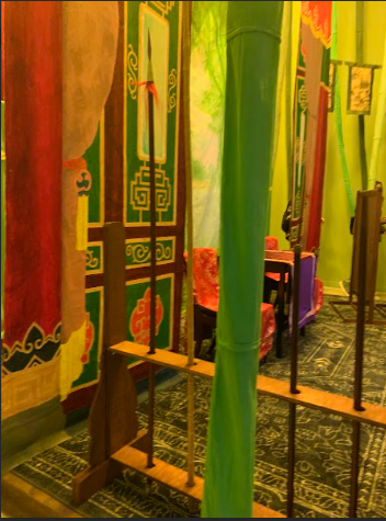
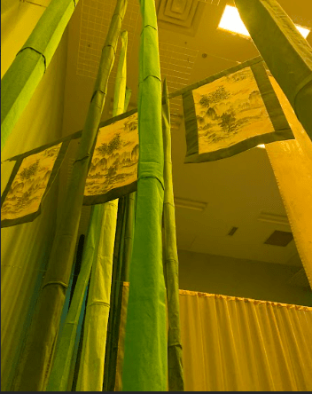
The mixed media installation by Karen Tam, representing a Cantonese opera also really caught my attention as I loved how immersive it was and also how bright and colourful everything was. The bamboo hanging from the ceiling was one of my favourite parts of the exhibition as it was visually interesting, but also interesting in the sense that we were allowed to touch it and walk through it, which I feel like most artists do not allow with their artworks.

Arboretum Video Project – Catherine, Simi and Yiyue

Video Idea #1

Our original idea kind of had two different routes before we ultimately all agreed on the 3rd option later on. The 1st idea we had was to dress up ourselves as birds and camouflage or place ourselves in nature to see how people react. We would also mimic the sounds of bird calls and their typical actions, like pecking at a tree or attempting to fly as our gesture in nature and really immersing ourselves into nature and with the birds in the Arboretum. We also briefly talked about how two of us could have roleplayed as the birds… with one of us being the mommy bird and the other one being the baby bird while the 3rd member of our group would be the bird watcher from afar with binoculars.

Video Idea #2: The Quiet Perch

For our 2nd idea, we thought about dressing up ourselves as birds again and this time our gesture would be perching on the benches in the arboretum and yawning to show moments of calmness and simple beauty. This lines up with the symbolism behind the arboretum benches as the benches represent rest and reflection; they are memorial benches and honor loved ones.

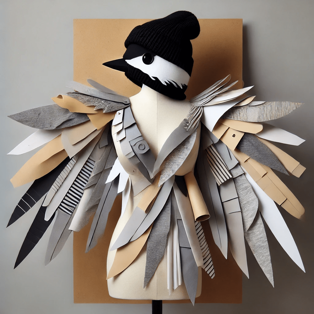
Costume idea made of different types of fabric

Video Idea #3: Fine Dining in the Arboretum

“The Wild Table”

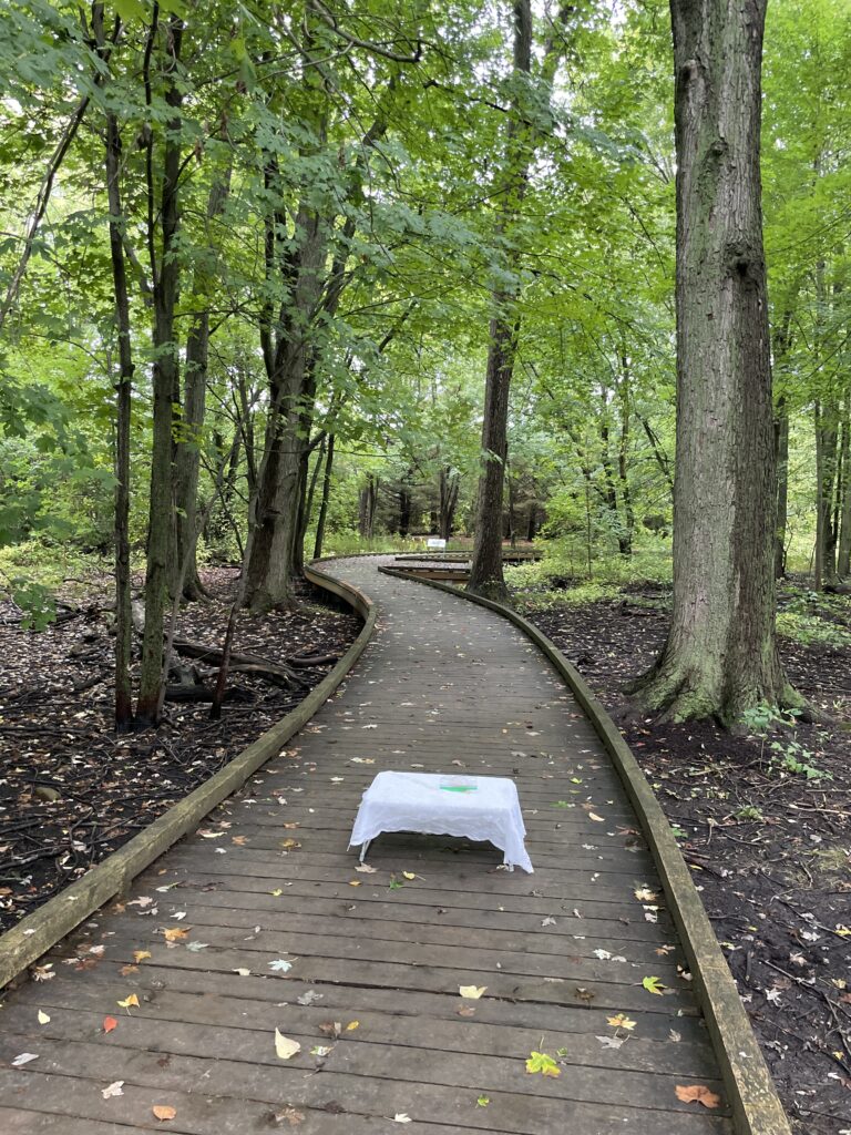
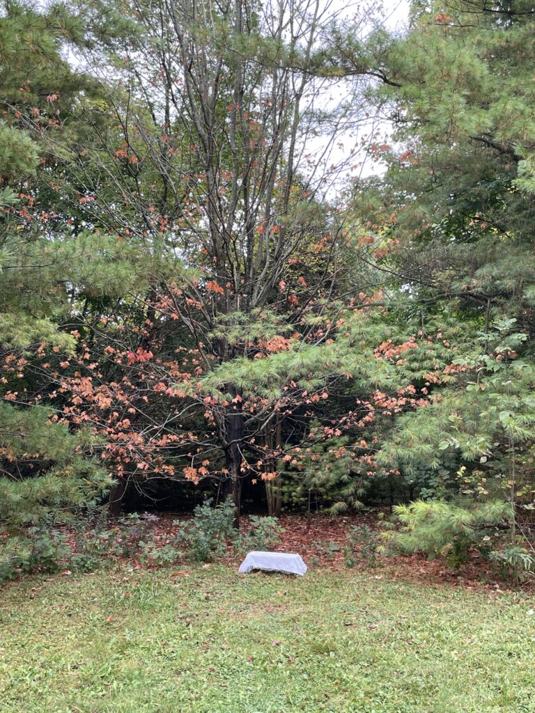
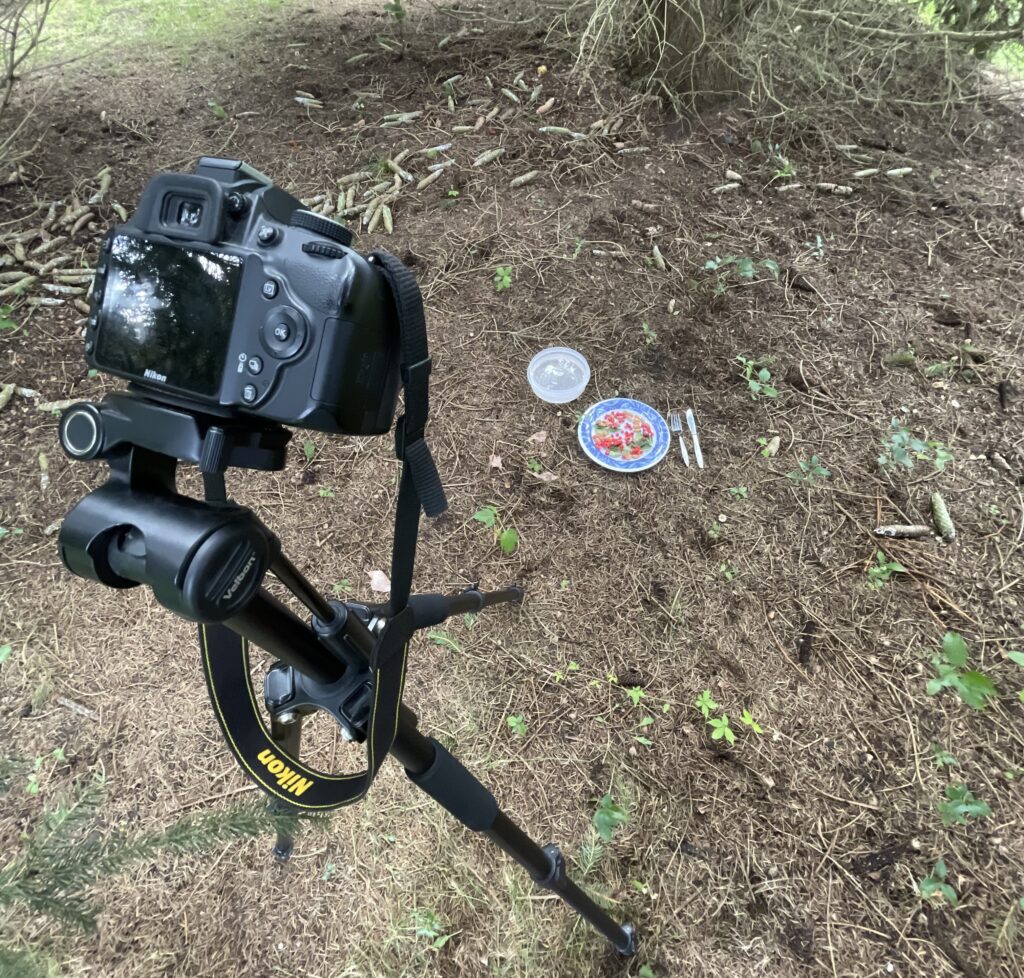
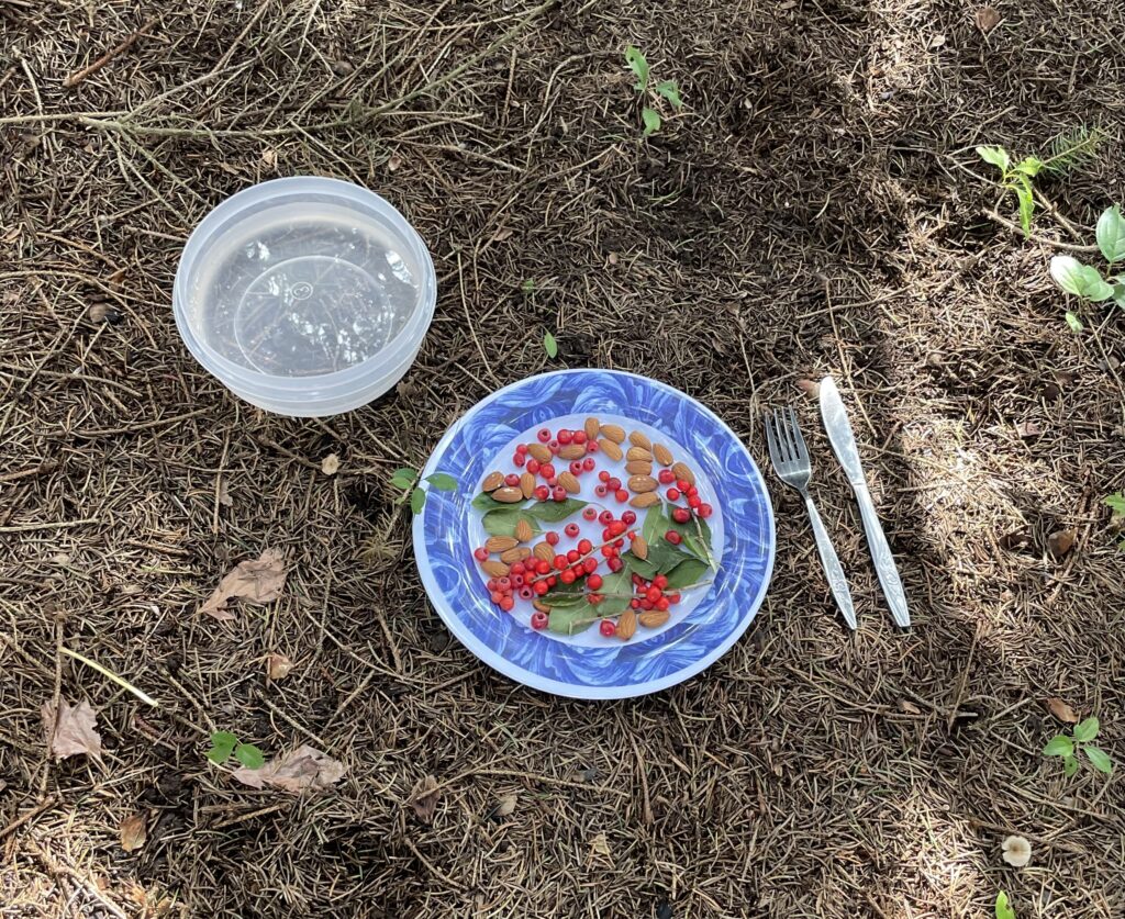
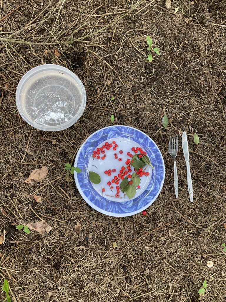
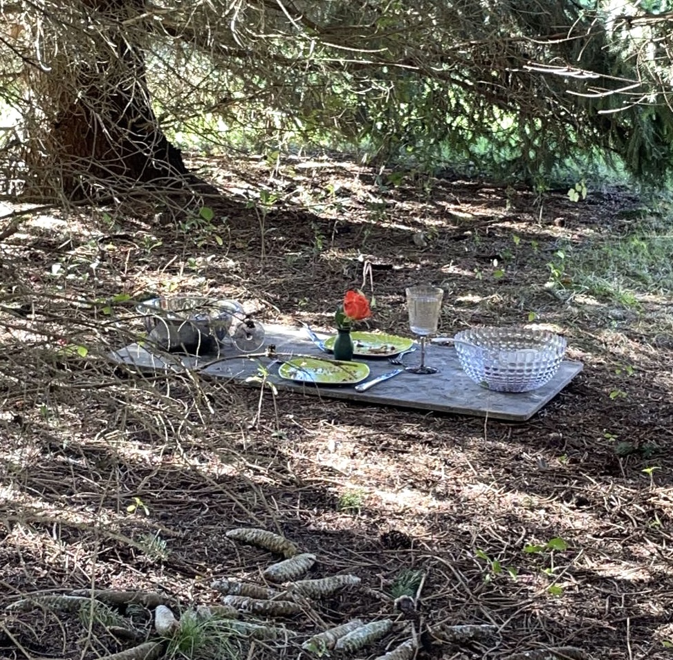
This is the 3rd and final idea we could all agree upon and ended up filming for the project. We wanted to explore the difference between human and wildlife interactions when it comes to eating as we know humans are more civilized and sit down for a meal, use a proper knife and fork and focus on our table manners; having the food displayed nicely on the plate so that it looks more appealing. Compared to the wildlife who do not focus on any of these and simply forage for food and eat it right away or store it for later. So we wanted to do an experiment and see what wildlife creatures, such as birds, squirrels, chipmunks and different types of insects maybe would do if we, as humans, set up a fine dining table and experience for them. We wanted to see how the animals would react if they were served their food instead of them having to hunt for it.

The significant difference between this and our previous ideas is that we don’t want to actually be in the video ourselves- whether that’s physically dressing up ourselves as birds or bird watchers or even recording voice-overs… we want the video to be entirely made up of the wildlife as the main actors while we observe their natural response and behaviour to what human designed table set-up and food we provide them with.

In Progress/Specific Details

The final video as you see it now, wasn’t just filmed in one day or in one shot. We knew from the beginning that it might take a while to film all our video clips or get any form of interaction from the animals, which was one of the most difficult and challenging parts when doing this project, as there was no way we could predict when or if the animals would actually come and interact with our table and food set-up.

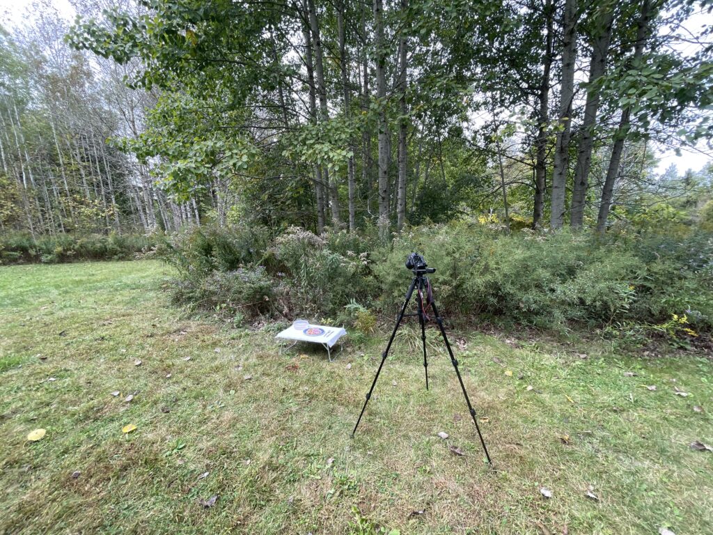
All 3 of us went out to the arboretum a couple times and experimented with different locations, like in an open and sunny grass area, a more sectioned off area near a tree and placing the table set-up on a path to hopefully figure out where the animals are more likely to approach our set-up. This proved to be very difficult as whenever we would set up the camera on the tripod and the entire table, the animals would stay far away the entire time. Even when we left and watched from afar for around an hour or 2 hours at a time, we could hear and see the animals surrounding us like the birds chirping or the squirrels chattering in the trees, but they would usually never actually come. I think either because they could sense that we were watching them or they were hesitant as many people and other animals, like dogs kept interrupting by simply walking through the Arboretum on the path.

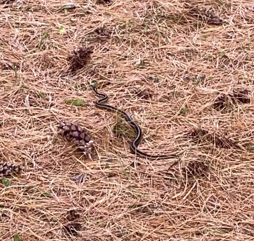
At this point, we had tried filming this on several different occasions and during different times of the day too, to experiment and see if the wildlife was more likely to come out during the early morning hours around 8am-10am or during the afternoon hours around 12pm-4pm. But we still weren’t getting any action except for the white caterpillar who inched up the table cloth and onto the plate of food, as well as a snake that slithered near the table, but didn’t actually make its way into frame or close enough to the food.

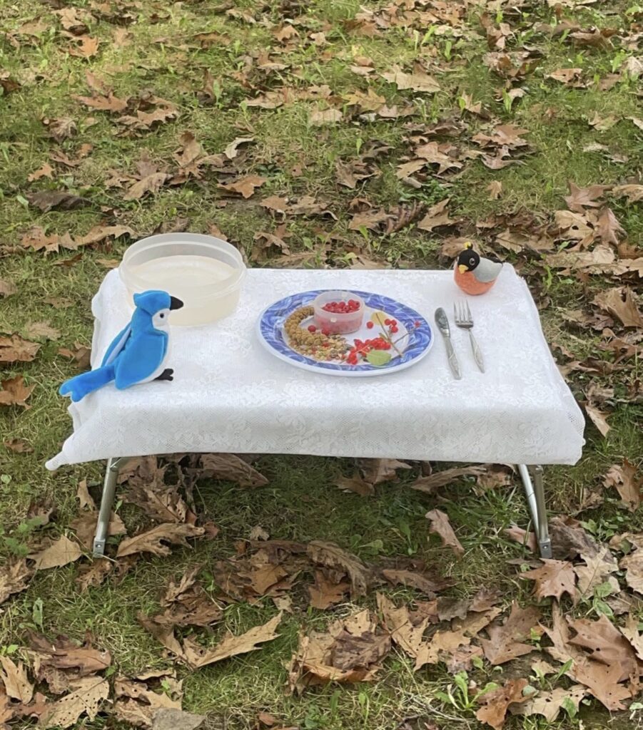
I experimented with different types of set-ups as well, for example laying the plates and cutlery directly on the ground to see if the animals were more likely to approach it since it was at their eye-level. I also tried laying a table cloth over a shorter table and some squirrels approached it, but wouldn’t actually climb up the table to get the food. We even put fake, toy birds in one of the set-ups to see if the animals would interact with them, thinking they were real wildlife. So it was actually pretty frustrating, but interesting to see what kind of trends were happening.

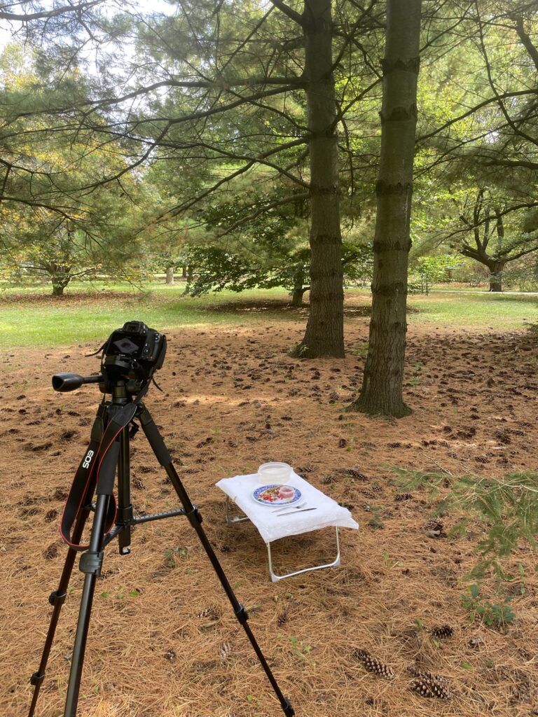
And after all of this trial and error for about a week, I finally figured out the best scenario and set-up for the animals to approach, which is what you see in the final video today. I discovered that if you hide the camera and tripod underneath a tree/multiple trees and blend it in with all the branches, the animals are less hesitant and scared as they can’t see it very well and with that, it’s a bit quieter and the trees are the animals home so if you put the food and table set-up directly under their home where they spend a lot of their time and are comfortable, they are significantly more likely to interact with it.

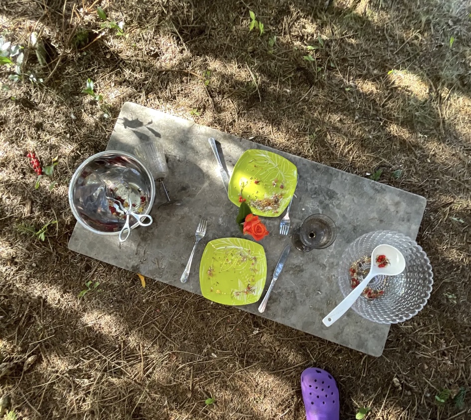
I also experimented heavily with what plates, serving bowls, cutlery and glasses to use. I ended up picking the ones you see today in the final video for aesthetic purposes, for instance as the wine glasses, the faux crystal bowl and the orange rose in a vase as the centrepiece, make the atmosphere seem more romantic and classy which perfectly aligns with our “fine dining” concept. However, I also specifically picked metal knives and forks and a metal serving bowl, for example, because I knew if the animals were to approach it and step or jump on it, it would clang and make a loud noise which further contributes to the experimental part of this project and seeing how the animals react to human objects we give them. Would the animals get scared by the loud noise and scurry away or would they not be bothered by it and keep eating the food in front of them? In addition, I purposefully chose a semi-clear crystal bowl to put food in as I thought it would be interesting to be able to see the animals from a different angle; actually through the bowl. Lastly, I decided to use tall wine glasses for a few reasons. The first being that the shape of it is kind of similar to that of a bird bath, so I was curious to see if any birds would treat it like a bird bath and try to bathe in it or drink from it… which ended up actually happening in the final video. The 2nd reason is because I know that smaller animals like squirrels and chipmunks are used to drinking water lower to the ground from bodies of water like: creeks, puddles, ponds and lakes for example. So it’s interesting to see how they react to water being served to them at a much higher level and if they avoid it completely or if they somehow try and knock it down.

Final Product

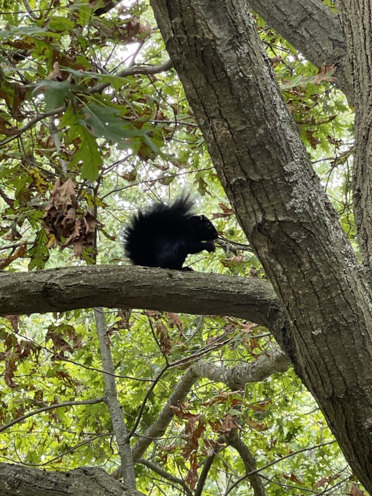
To sum it all up, “The Wild Table” is a 5 minute video that features scenes of different wildlife creatures interacting with the human “fine dining” table set-up we provided them with. Some highlights or most captivating parts of the video in my opinion, include the red squirrel scaring the blue jay away multiple times, the red squirrel looking directly at the camera and plunging himself deep into the bowl, the blue jay jumping onto the rim of the wine glass but knocking it over and spilling the water because of the red squirrel scaring him again and finally at the very end of the video the red squirrel hearing a predator and darting away quickly while making squealy noises.

HOMEWORK: Maira Kalman from the podcast On Being

The first thing that strikes me from Kalman speaking on the On Being podcast is when she talks about how museums are one of the deepest places of meditation there could be. Kalman says, “I absolutely think that a museum is one of the deepest places of meditation that there could be, maybe even more than a library, because you’re looking. In a museum, you’re not reading — I mean, you’re reading a little bit, but you’re basically just wandering and looking. And once again, the function of the brain, what happens to the brain is very different than, I don’t know, than being in a supermarket.” I fully agree with her as I think museums are known to be a fairly quiet place as people should be able to look at and enjoy artwork in peace. I think if museums were in a loud environment, people wouldn’t be able to concentrate as well on the art pieces and not appreciate them fully. For example, a personal experience of mine and how I can relate to this is that over my life I’ve been to many different museums, but in 2019 specifically, I had the privilege of travelling to Italy and France where my family and I went to several famous and historic museums. In Italy we went to the Vatican Museum and in France we went to the Louvre, the Musée D’Orsay and the Palace de Versailles. I can relate to what Kalman is saying as I felt like I really needed to be in a quiet and peaceful headspace as I was looking at all the amazing, classic and very famous artworks in order to reflect on them and their impact and meaning properly. I specifically remember just being in awe of the Mona Lisa and just staring at it for a really long time trying to wrap my head around the fact that it was the real, original painting hung right in front of my eyes and thinking about the effect it’s already had on the world and how much bigger it can still get in the future for centuries to come.

Another point Kalman made that stood out to me is her response to what it means to be human. Kalman says, “I joke about not knowing, but I think that as people get older, they tend to say, more clearly, “I really don’t know anything.” And of course, that isn’t completely true, but the only thing that I’m left with is, really, who do you love, and what do you love to do?” I completely agree and resonate with this as I believe it’s extremely important to be grateful and cherish the people you love in your life, including yourself. As well as, truly finding what you love to do and are passionate about. It can be very hard for some people to find what they truly love and are passionate about in their lifetime and unfortunately, sometimes people are never able to find that. However, I think if you can find whatever that may be in your life, it makes every aspect of your life so much more enjoyable and creates a purpose and even though this is cliché, I still believe it’s important to go by… if you love your job and you love what you do, it won’t feel like a job.

The image I chose from Kalman’s oeuvre is an image from her book, Still Life With Remorse. I really liked this image as I love this style of painting and all the bright and vibrant colours she chose to use in the painting, like the red, yellow, pink and orange flowers. I also really admire her commentary she wrote on the 2nd page and even though it’s very brief, I think it speaks volumes and has a deeper meaning behind it, while perfectly relating to what she painted on the 1st page. Her commentary reads, “Everyone continues to live. Everyone reconsiders despair. Everyone starts to have a good time. Everyone starts to enjoy life. And yet.” Her painting on the left resonates with this as some of the flowers are wilted and drooping while a few other ones are thriving and perked up. This perfectly relates to human life as we will all go through difficult times in our lives no matter what, it’s just the way it is and some people are currently thriving while others are just surviving, but it’s almost as if we take turns. Even if you’re thriving at one point, the next you could be suffering and if you’re feeling like you’re just surviving, you can also overcome that and take turns and start thriving.

A Book About A Book Project

Initial Ideas:

For my book about a book, I thought a lot about what I like and how I could combine things that interest me. My first thoughts were to use music lyrics from artists I enjoy and combine them with photographs of nature. I also thought about using lyrics to combine with well-known classic Disney movies. The animation from old Disney classics reminded me of my favourite childhood story books. After digging out my old story books from my closet and basement and going through the books, I noticed that many of them had to do with friends and families sharing and celebrating with food. This led me to think of combining the old children’s books with recipe books. 

Creation of my book:

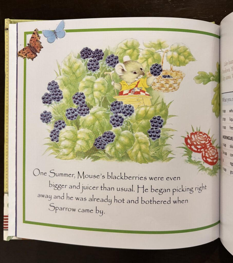
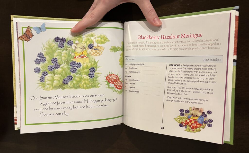
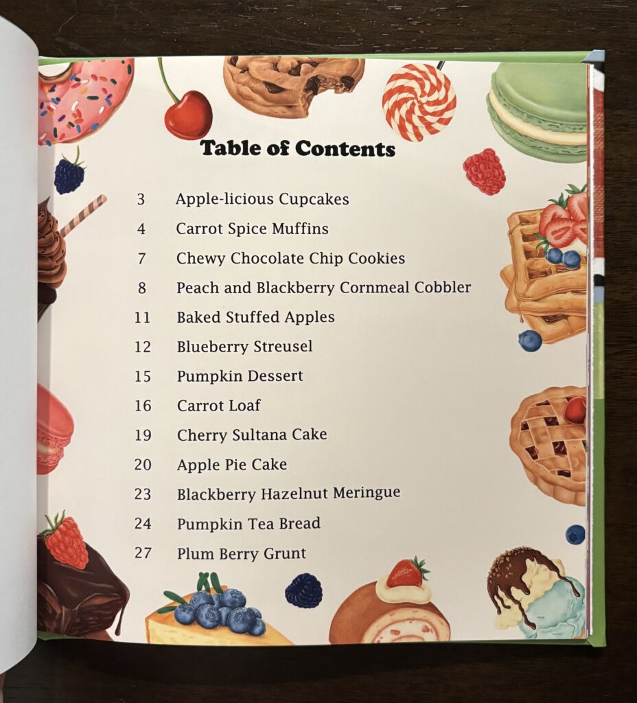
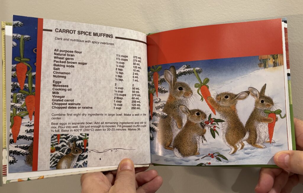
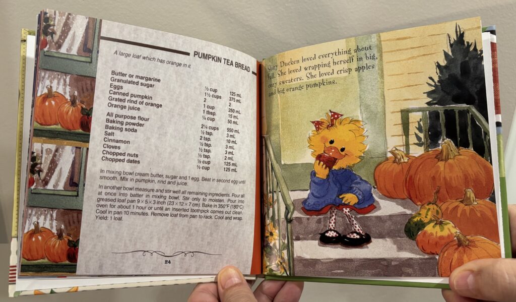
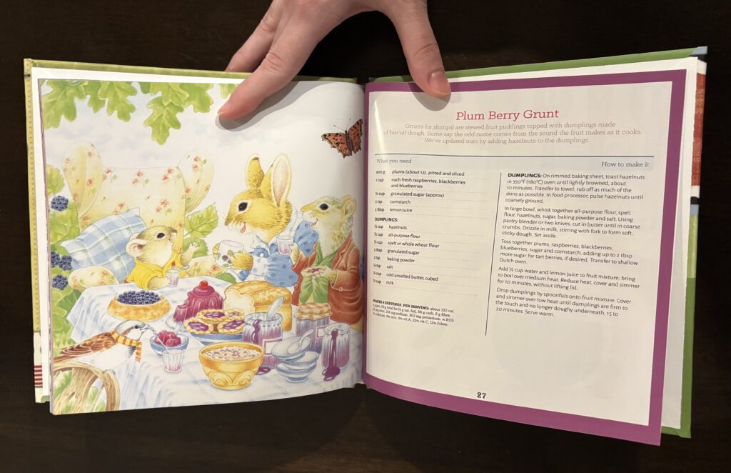
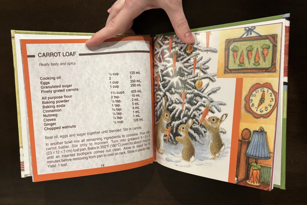
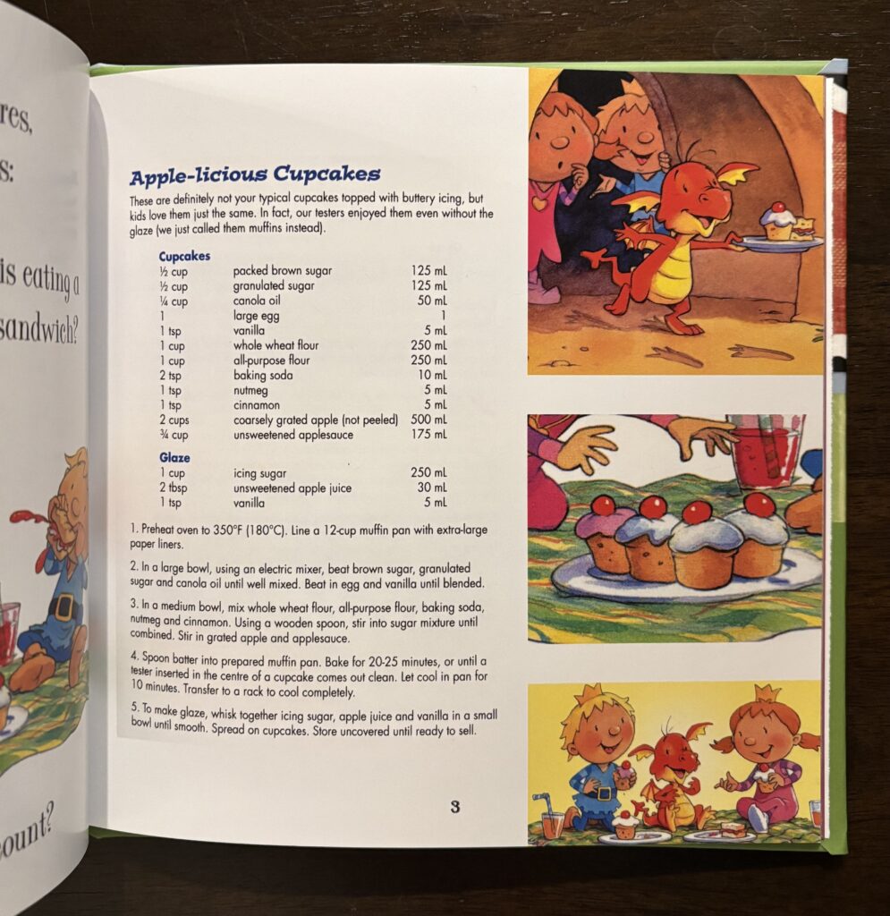
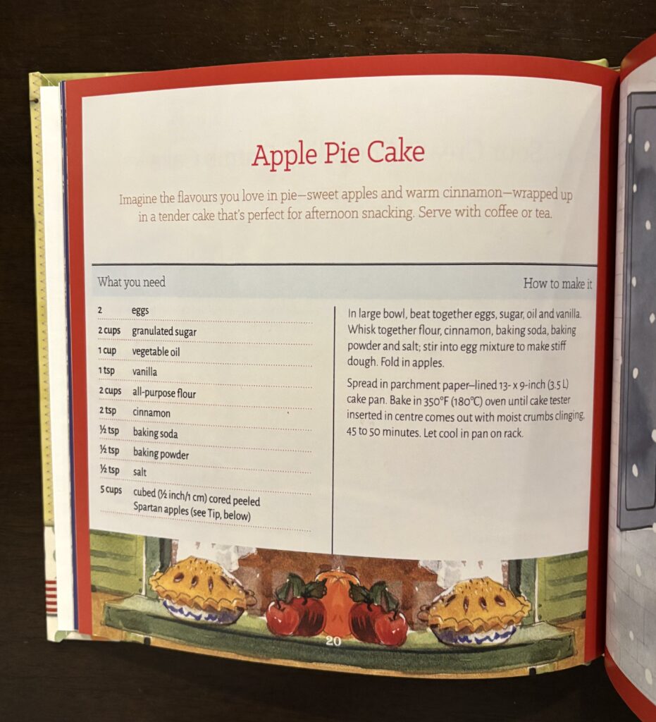
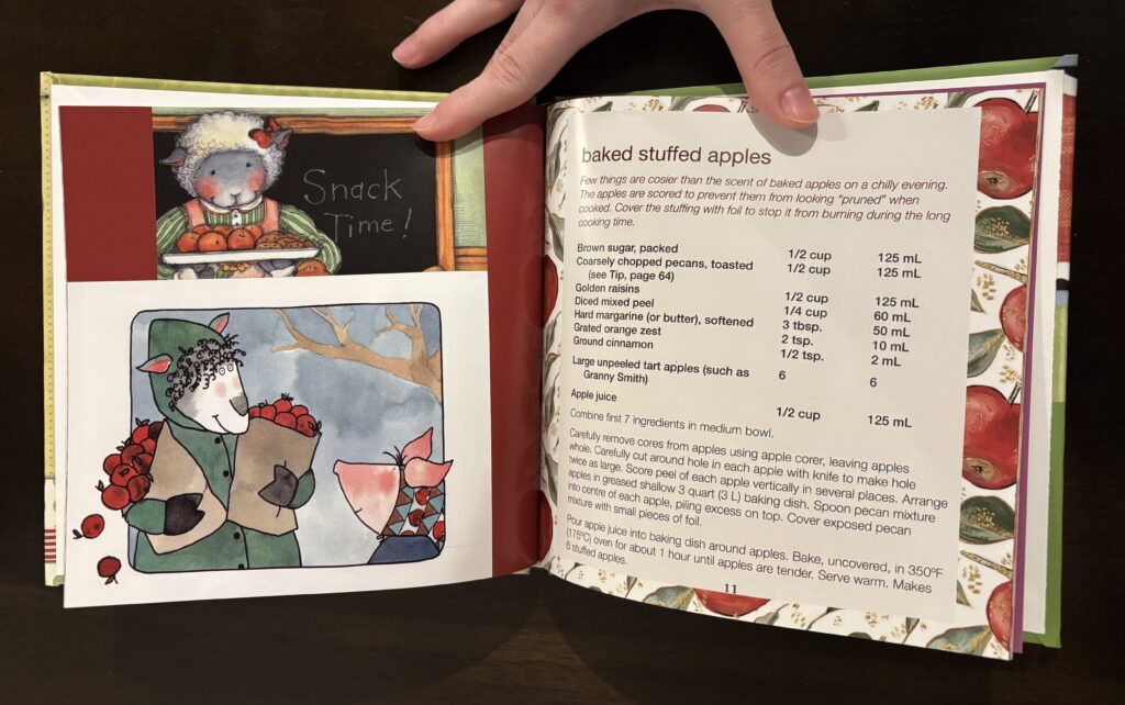
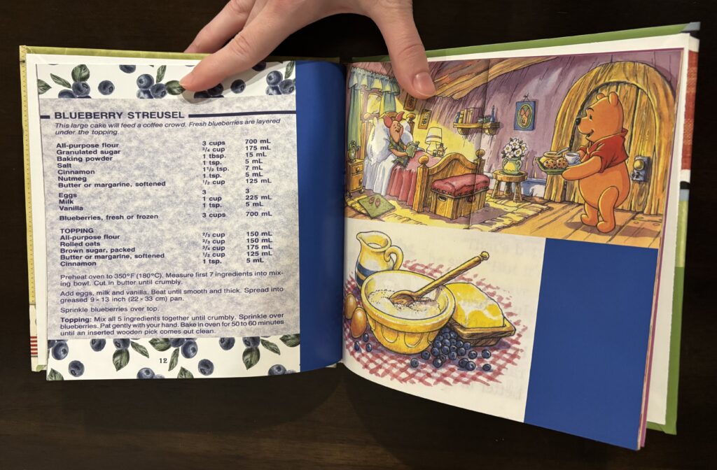
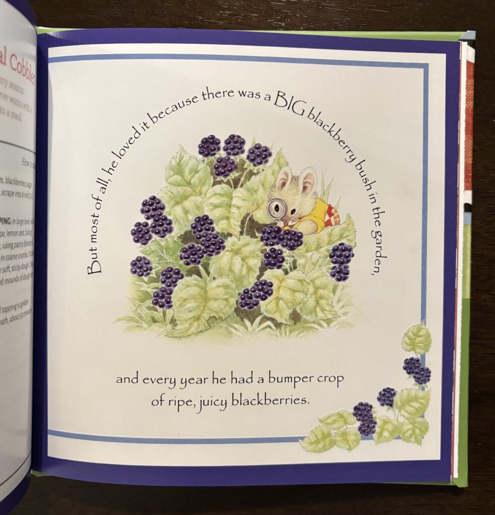
I was inspired by my childhood books which showed realistic or traditional cartoons as they use very vibrant colours and lifelike animation (opposed to computer generated cartoons) for both the characters and the settings. I used many different childhood books such as: Little Dragon and the Magic Wagon by Steve Smallman, The Christmas Hat by A.J. Wood and The Blackberry Mouse by Matthew Grimsdale. After selecting the specific pages from each storybook, I focused on what they were baking or sharing with their friends and families and then pulled out many of my cookbooks to find recipes which matched. For example, from the Company’s Coming series by Jean Paré, I used Carrot Spice Muffins, Blueberry Streusel and Cherry Sultana Cake.

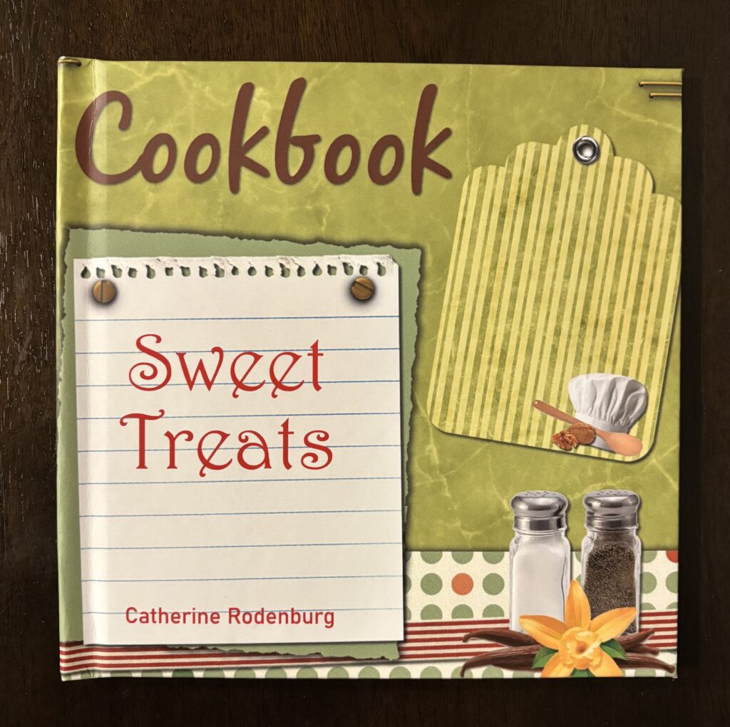
For the design of my book, I wanted to focus on creating a cookbook which would be especially attractive to children. As a young girl, I enjoyed baking with my brother, but couldn’t find any really appealing children’s cookbooks. The book I have created is intended for children to find appetizing recipes and be visually attractive at the same time; to give them something to enjoy looking at while sharing a special time with friends or family, baking and then eating together.  

To create the book, I scanned each storybook page and each recipe as well as using border templates and old fashioned clipart from the Internet. I really wanted to focus on colour and the layout for each page so I used the colour match tool to have one side of the page exactly correspond to the other, colour-wise. I also made sure no two pages of my book were the same and I spent a significant amount of time coming up with different layout formats so they weren’t all just the same and repetitive… I think my favourite page being the “Carrot Spice Muffins” page you can find on page 4 near the beginning of the book. In addition, I often left the text from the children’s storybook with the image to show the relationship between the cartoon picture and the recipe (considering the content, text, meaning, and image). For example, with the “Blackberry Hazelnut Meringue” recipe the story book text is, “One Summer, Mouse’s blackberries were even bigger and juicier than usual. He began picking right away and he was already hot and bothered when Sparrow came by.”

I hope this colourful book of Sweet Treats will provide adults with some great memories from their childhood and today’s children with an exciting, interactive cookbook as they enjoy the adorable characters and the delicious recipes, also while experiencing the pleasure of baking with and for others.

Artist Multiples

Idea #1: Cyanotype Bookmarks

As I was looking at the list of artists and their multiples work, I was very attracted to Sandy Plotnikoff’s Hunter and Cook Magazine issue 06 special edition (2010) because of the texture from the foil stamping and the use of multiple colours. After reading about his enjoyment with printmaking and using materials beyond their intended purpose, I thought I would create many different cyanotypes and then turn them into bookmarks which would be my colourful multiples. Realizing that the bookmarks would each show some uniqueness, I decided to focus on one ordinary object and alter it to create my multiples. 

Hunter and Cook Magazine issue 06 special edition (2010), by Sandy Plotnikoff

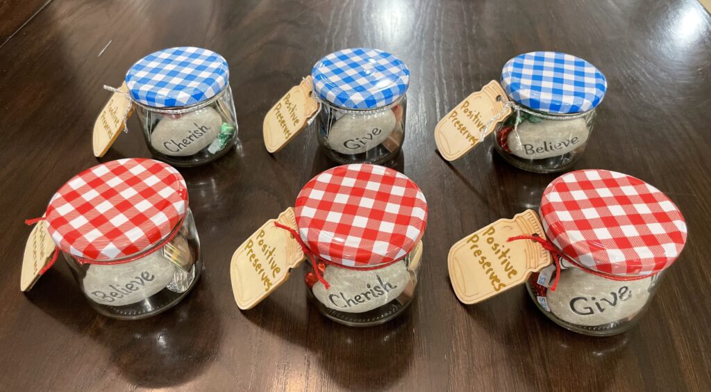
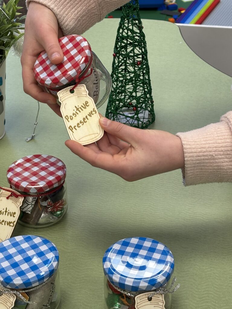
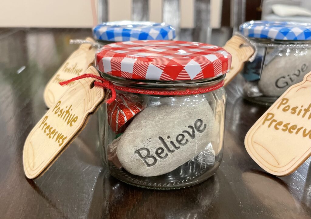
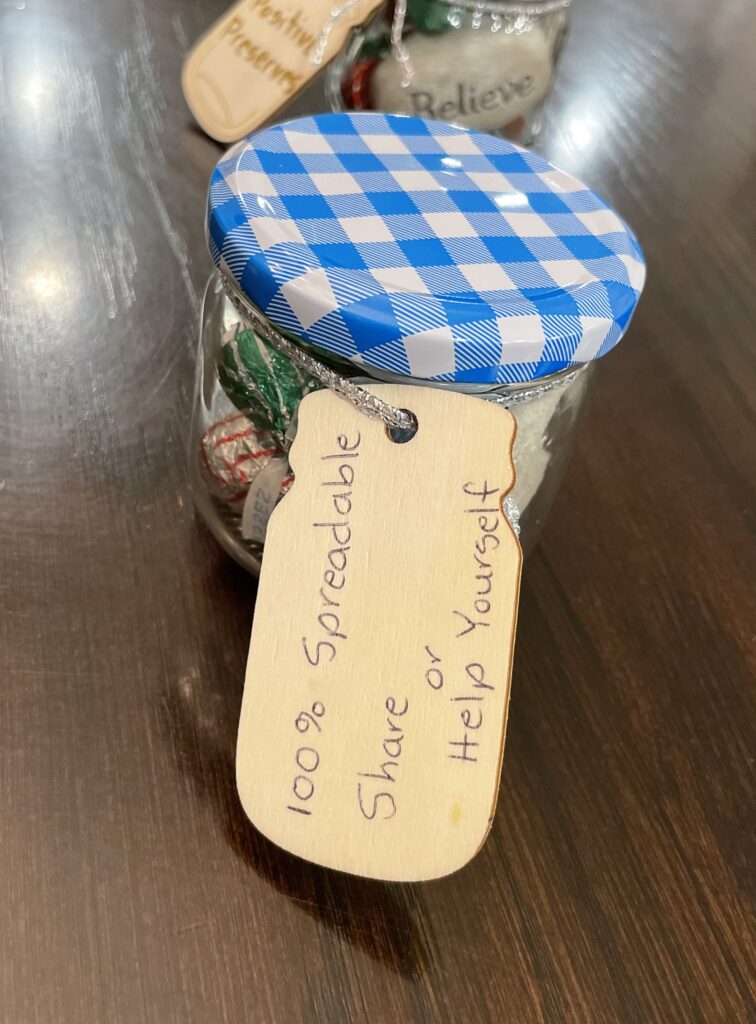
Idea #2: Using Jam Jars to Create “Positive Preserves”

I then focused on Roula Partheniou as inspiration for creating my multiples. I knew I wanted to use something that was three dimensional and I was very drawn to her acrylic on wood sculptures of everyday objects while using very vibrant colours.

Suckers, by Roula Partheniou (acrylic on wood sculpture)

Chalk to Cheese, by Roula Partheniou (acrylic on wood sculpture)

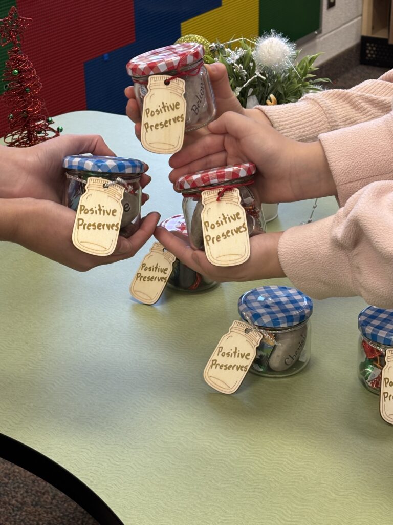
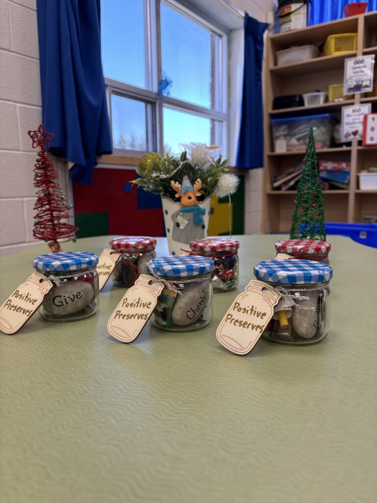
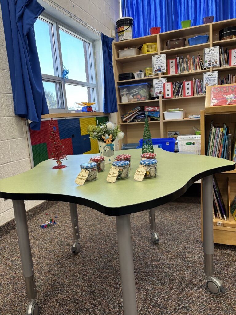
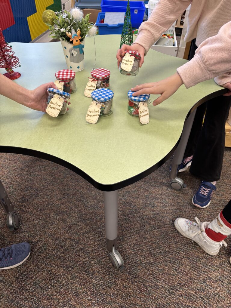
I selected traditional jam jars with checkered red or blue lids to turn into “Positive Preserves.” My creative, playful artist multiple is pleasing to look at while focusing on the issue of mental health. Each jar is filled with an inspirational stone, Hershey’s Hugs and Kisses, a Merci chocolate, two beautiful landscape stickers and a small colouring page with a mini pencil crayon. These little “pick me ups” can be given to others or for yourself; as the back of the tag indicates (100% spreadable, Share or Help Yourself). My “Positive Preserves” are going to be sold at a school Christmas market where all of the elementary children (ages 3-12) can go to shop for their friends and families for affordable Christmas gifts. All of the proceeds from the sales will go toward purchasing new outdoor equipment for the children to use at recess. I believe everyone should try their best to maintain a positive attitude and outlook on life if they can and to be resilient when faced with disappointment. Although my jars are small and have simple items of pleasure, I hope they will provide smiles and positive thoughts for many.

Yasmin

SHORT ASSIGNMENT 1:Nina Katchadourian’s book stacks

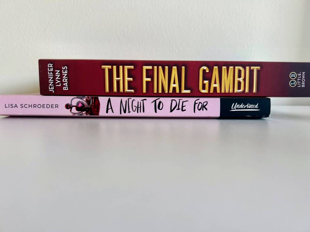
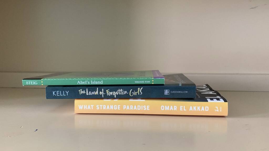
To complete this assignment I used books from my own collection. Each stack contains 3 books displayed using a neutral background of choice, that is, on my desk. I decided to display the stacks this way as my desk is a nice neutral colour, an area with lots of natural light, while it isn’t obvious from the photos these books are sitting on a desk I do most of my reading at my desk, and lastly, I also complete most of my assignments at my desk (ex: blog post’s for this class).

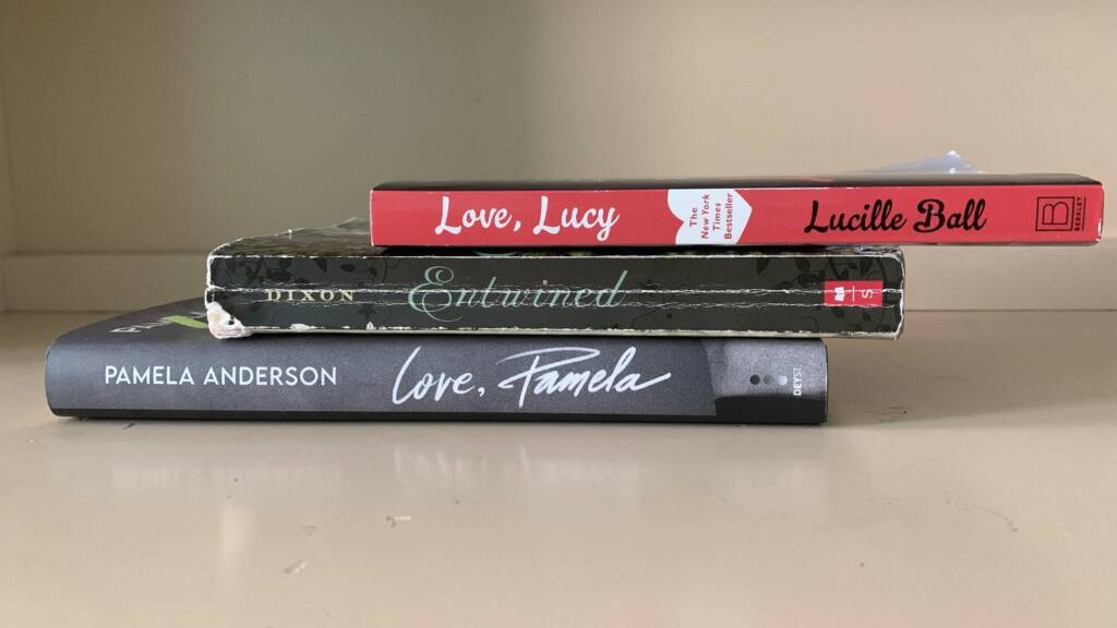
With Love

When I first took a look at my bookshelf for this assignment, I knew I wanted to use Love, Lucy and Love, Pamela for the sake of their similar titles which appear to mimic the personalized closing of a letter or handwritten note. I’ve had both books for about a year but recently noticed how similar the titles are. It makes me wonder if the title of Ball’s book inspired Anderson. Love, Lucy by Lucille Ball is a memoir of sorts while Love, Pamela is Pamela Anderson’s memoir, of course, she is well-known as a 1990s actress. Entwined is one of the oldest books in my collection, so it felt fitting to join the titles Love, Lucy and Love, Pamela. Both of these actresses are entwined per se, or associated with a particular era/ decade the 1950s vs the 1990s. (Interestingly, Entwined is one of the oldest books in my collection indicated by the worn-out spine which reminds me of the quote: “To be loved, it to be changed”.)

Snow Fairies

For this second stack, I selected the titles with the words fairy/fairies in them and then tied them together with Let it Snow. When the titles of this stack are read it sounds as though it could be the title of a collection of stories about fairies in a winter wonderland or fairytales. Two things are interesting about this image firstly, each book titled is stylized with capital letters, and secondly, on a personal note I’ve received/ purchased each book at a different stage of life. The third book Flower Fairies of the Winter- A Celebration was given as a present to my parents after I was born, my birth month is December, a winter month. I purchased the second book Let It Snow, when I was in 9th grade (2015/2016) and deep in my John Green reading phase. Lastly, I purchased the first book The Classic Fairy Tales as it was a required text for an English course I took in Fall 2022 (coincidently I took Experimental Studio 1 the same semester).

Girls are Strange

I wasn’t sure what I wanted my third stack to be but I knew that, What Strange Paradise could be an interesting title for this project. I keep reading this stack as follows “Abel’s Island: The Land of Forgotten Girls (What Strange Paradise)“, actually this could be a good title for children’s book. I like to think that my desk’s neutral/cream background helps each book’s colourful spine stand out. Green and blue are next to each other on the colour wheel just as the books above and yellow also sits across from yellow on the colour as a complimentary colour. (note: the third book in this stack has some water damage so unfortunately it appears to be very crooked in the photo)

Ideas for Video assignment– Yasmin & Vanni

1) Conversations with Squirrels

  • sitting down (possibly wide shot) with squirrels
  • luring them with peanuts
  • acting as though we (or chosen performer) understand them

2) Dressing as a tree and then hugging another tree

  • different shots of each of us hugging different trees
    • wearing green and brown to mimic the tree bark and the tree tops
  • not facing the camera/hiding
  • wide shots
  • filming the walk to the tree and a few seconds of hugging a tree
  • choosing different trees throughout the arboretum
    • we want to use the weeping willow tree, the one the class stood inside with Chris
      • one person follows the tree hugger into the tree
    • maybe choosing skinny trees to wrap ourselves around
    • climbing?

3) Dressing up as a tree/ bush and rolling down a hill

  • camouflaging
    • wearing green or brown tones
    • using fallen sticks and leaves to blend in possibly
  • probably not the safest

4 ) Use the weeping willow tree and emerge out of it dressed as an animal or another tree

Environmental Video: In progress pics

FIELD TRIP: 2 showings at the Toronto Biennial of Art and the MOCA

32 Lisgar St and Park

  • these works utilize poetry and pair them with inspired musical scores
    • musicology ebb and flow
    • could be played by instruments like the flute
  • In our walking tour, we discussed the possibility of code and drawing, range/ indication of volume,
  • Upon first glance, this collection of works reminded me of Fluxus works where an artist is given instructions and must complete them simply and effectively
    • the drawing uses musicology/ the scores to indicate what could be happening in the poem/ writing each is paired with

Karen Tam

  • Multimedia interactive installation dealing with the artist’s experience/ memory of watching Cantonese opera
    • Tam is inspired by memories of watching 1940’s opera with her grandmother who cannot/ can barely speak English and so the grandmother and granddaughter bond by watching the Opera’s
    • sense of nostalgia which feels culturally important to the artist
  • Chinese identity in North America

Maria Ezcurra Passing (2022)

  • recovered and deconstructed shoes meant to mimic bird silhouettes
  • vulnerability of migrant populations
    • show migrants movement
    • immigration is about people coming together
  • environmental protection
  • storytelling and creation (is part of the artist’s practice)

The Supernatural Powers of Fabulous Panther (Biimskojiwan) (2024) 

  • sculptural installation
    • materials include  industrial felt, silver jingle bells, and tin jingle
  • deals with stories of the Anishinaabe oral tradition
  • picture the space as being full of movement

158 Sterling Road, 9th Floor

Hangama Amiri The Other Home (2024)

  • the artistic experience of being seven years old fleeing with her family and becoming a refugee 
  • using fabric from across the Middle East and Central Asia
  • composed of various panels, textile collages
    • fabric, especially in the 1970s, was considered a woman’s medium, fabric or cloth relating to a woman’s traditional household chores of sewing clothing
    • female-centred mediums (fabric, textiles) vs traditional male-dominated mediums (painting)
      • traditionally been denigrated as mere craft rather than art, women’s work’ like textiles and embroidery
  • seems to categorize pain and loss, of growth, acceptance, and hopeful future experiences
    • deals with landscape and a human being’s place in the world (or finding their place/ safe space in the world

MOCA museum

Video assignment: Arboretum Video: Trees by Vanni and Yasmin

For this assignment, we knew we wanted to interact with nature, so we chose tree-hugging as our gesture. Our idea was based on the connection, and we camouflaged in trees in the Arboretum to hide for the sake of that personal connection.

Tree-hugging in Native culture

“In Native American cultures, for instance, the act of hugging trees was seen as a way to connect with the wisdom of nature and to heal both body and soul.” (Mastrantonio, 2024)

To create this piece we took inspiration from the artists shown in the studio who used camouflaging in nature depicting the concept of ‘being one with the environment’ with a different and literal meaning. The first day we visited the Arboretum, the idea of tree-hugging came naturally to us. From there on we started looking for trees that would be okay to hug as some trees had poison ivy vines. We both felt a special infinity for the weeping willow, hence we filmed our first clip under the tree’s shed. At first, our aim was just simply to hug trees but as we proceeded we discovered that using slimmer trees would be more appropriate so we could film as if we were becoming one with the trees.

Additionally, we intentionally decided to not only both we the characters or performers but to make sure we never directly looked at the camera (except our last shot) to portray a sense of determination and fixation and overall respect for the environment. On a personal (and critique) note, the far shots were so camouflage could be more prominent as we had chosen to dress in green and brown clothing. The long shots helped us appear to be blended with our surroundings.  

“It is shown that spending time with nature can give you an added boost of happiness!” –unknown

HOMEWORK: Maira Kalman from the podcast On Being

https://mairakalman.com/womenholdingthingsbook?srsltid=AfmBOoogqPeP2bsiWdX2y3fEX9Y9bgm3YkwRsmHVk16s6dv8zO2l_WsW

I decided to use the above image for the post because I love every image I’ve seen of the Women Holding Things book, but this one was most compelling to me because women do have to be precieved in different ways, and take on different roles in this image its a woman who is a mother. I think of my mother who is an eldest daughter, the mother of three children, a soon to be grandma, somebody’s sister, a wife, a dedicated worker (she works full time these days), an auntie, a friend, she also has homemaker responsibilities like cooking diner and cleaning and she is the only person I trust to cut my hair. Going back to the image, I think a lot of my own art work is about our mother- daughter relationship. An eldest daughter of eldest daughter.

Quote 1 I found compelling: Ms. Kalman: “I really thought that I was going to be a writer, and everything was born of that. I read Pippi Longstocking when I was 8 years old, and I thought, “That’s it, I’m going to be a writer. I can do that.”

  • Something I think about a lot is being about five years old and my dad asked me “what do you want to be when you grow up”and my immediate answer without any hestiation was “an artist”.
    • That’s something I’ve carried with me, like other children I went through phases of other professions I wanted to pursue (a fashion designer, a chef, a hair stylist) but I always came back to art, somehow I think it has felt most natural to me
  • I also remeber that same day in reply to my answer my dad then said “well you have to be really famous to be artist and put work in galleries” (or something very similar to that)
    • anyways my dad still (almost 20 years later) does not know much about how galleries work or what it means to be a living artist, per se
  • In addtion to this I decided around middle school that I wanted to be a writer, I remember telling a girl in eigeth grade (we were close friends all that year until she moved away the summer before we entered high school) that I would like to publish a book
  • I am now studying studio art major and a creative writing minor

Quote 2 I found interesting: Ms. Kalman: “I absolutely think that a museum is one of the deepest places of meditation that there could be, maybe even more than a library, because you’re looking. In a museum, you’re not reading — I mean, you’re reading a little bit, but you’re basically just wandering and looking. And once again, the function of the brain, what happens to the brain is very different than, I don’t know, than being in a supermarket — even though I love being in a supermarket. So wait a minute. I love supermarkets. I love to look at all the packaging. To me, that’s a little bit like a museum. But that’s a digression. I think that we have the opportunity to understand silence around us, and really looking, all the time. There’s always the opportunity. And there’s never a lack of things to look at, and there’s never a lack of time not to talk.”

  • This quote may be longer but it grabbed my attention in a different way
  • Personally I love running errands, in the event that I find out my mother has left to say run to grocery store without asking me to come along (or telling me she’s leaving) I feel left out. I love walking around supermarkets/ stores. Wether it’s Costco, the food basics near our house, or even wandering around homegoods for something neither of us needed.
  • The compariosn of supermarkets to museum makes a lot of sense I think since our class trip to the galleries of the Toronto Biannuel I have been waking around supermarkets and stores differently. I can’t help but feel that they are the same. The idea that the very act of looking feels the same in both spaces to me.
    • in both situations it a lot of wandering and looking
    • in a supermarket my mother may stop, pick an item and then tell me why she needs it or wants to try it or points out the packaging, or hands it to me because she forgot her reading glasses and wants to know what the label says
      • this reminds be of the walking tours we did at the Toronto Biannuel, walking until our guide pointed a piece out and introduced us to something new

Ideas for Artist Multiples

I decided that I would like to work with pins / button making as the medium for my artist multiples.

IDEA 1: Removable stickers (stickers on a pin)

  • this past year I have fallen back in love with stickers and have found new ways to integrate stickers into my artworks. As a result I have starting collecting/ hoarding stickers, the same as I did when I was a child actually, however I am quite indecisive when it comes to finding the perfect place to adhere a sticker.
  • I thought it would be nice to take images or scans of stickers (likely from my own collection, create an image for a pin full of said stickers and voila! Stickers you can kinda sticker wherever you want aka removable stickers!
  • when I look at stickers I can’t help but feel that there’s a sense of nostaglia

IDEA 2: Wearing “makeup”

  • I’m interested in the expression of “painting your face” or “putting on” or “taking off my face” as ways to describe putting on to taking off makeup
  • For this idea I would like to take images of my makeup products, for example my favourite lipgloss, and put said image of lipgloss on a pin.
    • that way once each of my makeup products are on a pin someone could “put on” or “take off my face/ makeup” on themselves.
  • Or I could use text on each pin to indicate what product I use, simply writing for example, “Brown lip liner” and “Brown eye pencil” in plain font on a white background to reference the product I use

IDEA 3:

  • LEFT: Failure is an important part of life RIGHT: We cannot stay silent about things that matter, medium, sharpie, Crayola markers, cardstock on newprint, 2020
    • Inspiration: A little Jenny Holzer, and a little Fiona Banner
      • I have always loved Jenny Holzers Inflammatory Essay series
  • The inspiration for these posters came out of the 2020 under the first major quartine lockdown. The one on the right was done for an art class in which the assignment was to respond or create an image that dealt with a public issue. I chose to respond to the murder/ lynching of George Perry Floyd at the end of May 2020. Instead of borrowing the phase of “Black Lives Matter” I utilized another: We cannot stay silent about things that actually matter.
    • I have been thinking about how to integrate text into my work recently
    • I strongly feel that the phrase: We cannot stay silent about things that actually matter can in open-ended enough that it can relate to a number of social and political issues (for example the devastating results 2024 American election and Women’s rights to abortion access)
  • In regards to Failure is an important part of life, the quote comes from my high school art teacher, I think it’s an important reminder for the end of the semester, but even more an important reminder for anyone in everyday life.
    • there is something so inherently “artsy” about this quote to me I think its a lot about creating art
    • “The act of creating something is more important than the result”
  • I like the idea of colourful bright backgrounds and bold unapologetic capitalized black text ( at the time I attempted a sort of jig-saw puzzle background on the image on the right)
    • especially on a pin, sticker, or poster
    • other possible phrases which speak to me:
      • PRODUCTIVITY ISN’T EVERYTHING
      • SICK OF LOSING SOULMATES
      • PERSONALITY IS IMPORTANT TOO
      • I’M SICK OF GOOD PEOPLE GETTING OVERLOOKED
      • I AM MOVING ONTO NEW POSITIVE THOUGHTS
      • WHAT DOES IT MATTER IF ONE PERSON DISLIKES ME
      • THE ACT OF CREATING SOMETHING IS MORE IMPORTANT THAN THE RESULT

Week 1

MONDAY

One Billion Years [Past and Future], Dave Dyment
A collection of books pertaining to the past and future, arranged chronologically from One Billion Years Ago to The Next Billion Years. 2012.

Introductions

Course Description, Assignments, Evaluation

Tech orientation to studio, blogs, and equipment

How to Make a Blog Post

Watch the video: Book Stacks by Nina Katchadourian)

See Nina Katchadourian’s examples:

http://www.ninakatchadourian.com/languagetranslation/sortedbooks.php

SHORT ASSIGNMENT 1:

MAKE THREE BOOK STACKS IMAGES

  1. In your own home library/bookshelf, or the home library bookshelf of someone you know – make three book stack sculptures and document them with their phone cameras, or cameras from our class equipment selection.
  2. Consider how the books are arranged to make the titles, or colours, or shapes you would like to highlight most legible to a viewer.
  3. Consider how the stack might create a portrait, or tell a story, or create an image that alters, exceeds or expands the intentions of the materials on their own.
  4. Avoid distracting from the books and their titles/colours by creating a plain background, and clear bright lighting. Be resourceful in how you solve this in a non-studio environment.
  5. Post your three best images to the blog with a short description of your ideas and processes to make them.
  6. DUE for in-class discussion from your blog page next week – see schedule for details.

Demo on using cameras/phones at home for shooting/high res.

Demo on using home lighting, being resourceful with available light.

WEDNESDAY

Lecture:

https://x23.experimentalstudio.ca/2022/09/environmental-video-art/

Environmental Video Art Assignment

Terrance Houle, from the Urban Indian series, 2004.

Based on research on environmental themes, and the approaches of artists discussed in class – you will create a work of video art up to 5 minutes in length with a partner.

Use a COSTUME for one or several performers – as a way to activate a site in the arboretum. You or your partners and friends may activate the costume in a simple gesture/ series of gestures.

We will go to the Arboretum together for a class visit and activity. And we will also have independent work time in the arboretum with our partner. Be prepared for any weather, and work time/consultations during class time.

Some approaches and motifs to consider with your costume and your gestures on site:

Curiosity and experimentation where you don’t know the outcome

Acts of resistance

Acts of submission

Blending in or standing out

Forms of communication with things in the natural world

Collisions of culture with nature

Rituals and ceremonies

How language meets landscape

Playing with perceptions of scale

Playing with perceptions of time

Identity and the culture of nature

Trying to relate across species

Works will be evaluated considering all of the following criteria are met:

Presentation of research and ideas in context of artists discussed in class

Showing work in progress, seeking support when needed

Working effectively during class time and managing production to meet deadlines

Using professional recording and lighting equipment effectively

Original and compelling subject matter

Thoughtful conceptual approaches

Focus and rigor in performance

Effort and effectiveness of costume

Considered video processing and editing to convey feelings/ideas central to the work

Considered video presentation and discussion for critique

Blog post with finished, revised video, and concise artist statement to describe ideas, research, and artistic references in the work.

PRODUCTION SCHEDULE:

  1. Research and brainstorming: Research an aspect of the arboretum/environment with your partner. Topics might include: Native trees, rare plants, seeds, flowers, birds, migration, weather, ornamental gardens, raptors, reptiles, mammals, “invasives”, clouds, astronomy, fungi, seasons, insects, conservation, camouflage, forest fires, drought, climate change, floods, maps, walking, bird calls, birders, nature guides, wind, swamps… etc. Discuss approaches to video artmaking in relation to strategies used by artists discussed in class.
  1. Develop a BLOG POST including research and ideas for your video to share with the class: Be as specific as possible and create a short blog postwith information about your topic, artists that have inspired your approach, and ideas/sketches for your own video. What would your costume/s be? How would you activate it on site? Where is the best location for your idea? How would you frame and record the action? Post production ideas? Etc. Be prepared to discuss variations and open to alternate strategies in a class brainstorming discussion.
  2. Record your videos in the arboretum: Edit and finish your final videos with feedback and support in studio.
  3. Post your final videos to the blog: Include a title, a short description of the work, and brief relevant notes about your ideas and process.

Be adventurous, but SAFE and RESPECTFUL at all times. See below:

______________________________________________________________________

*IMPORTANT NOTE:

As with all student projects and activities in Experimental Studio and while a student at the University of Guelph you should never do anything illegal, unethical, or that can harm yourself or others in any way. And dangerous/hazardous materials and tools are not allowed on campus or in the studios.

By agreeing to participate in this course you must adhere to these guidelines.

You must discuss your idea with your instructor if there can be any question about the safety of your projects. Students who do not follow this process will receive 0 on assignments, in addition to facing any other academic or legal consequences.

Be careful, be safe, use good sense, and be considerate of others always. Thank you!